E-Paper Monitors
Dasung 13K Color vs Black and White: Which E-Paper Monitor Fits Your Workflow?
A detailed comparison of two 13-inch e-paper monitors, covering readability, front light quality, touch functionality, and the trade-offs between color and monochrome.
Introduction
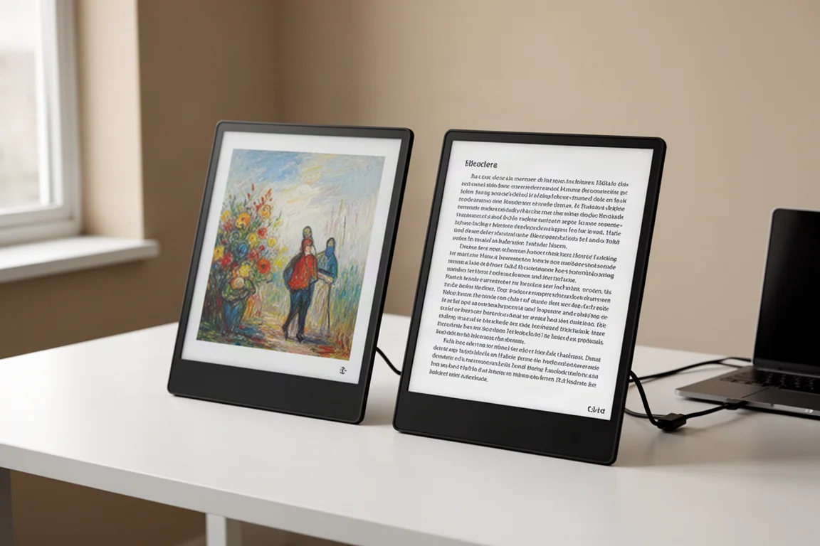
E-paper monitors have carved out a niche for people who spend long hours reading, writing, or coding and want to reduce eye strain. Dasung offers two 13-inch options that take different approaches: the 13K black and white version prioritizes crispness and contrast, while the 13K color version adds color at the cost of some sharpness. Both share the same 300 PPI panel, but the color filter array on the color model changes the experience in meaningful ways.
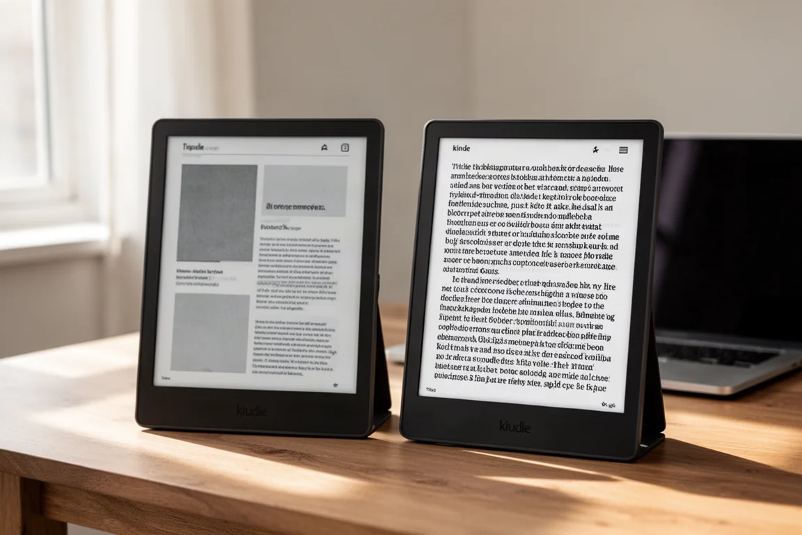
This comparison looks at how these two monitors perform side by side in the same lighting conditions, across different viewing modes, and in real-world use cases like reading, typing, and coding. The goal is to help you decide which one better matches your priorities.
Design and Setup
Both monitors are 13-inch e-paper displays with slim bezels and a portrait-friendly form factor. The black and white version includes a magnetic area on the back for VESA mounting, which the color version lacks. If you plan to mount the color model, you will need a third-party tablet holder that grips the sides instead.
Connecting both monitors to a computer at the same time is possible, but there are some caveats. The for Mac versions require the Dasung Paperlike client software to function at all. Without it, they will not work. The client only recognizes one display at a time, so if you connect two for Mac units, the order matters: connect the one you want to control via the client first, start the software, then connect the second. The color version can also connect via a single USB-C cable and supports touch without the client, though the client can interfere with touch when both are active.
The for Mac version also needs both an HDMI connection and a USB connection for the Paperlike client to communicate with the monitor. A USB-C cable to the computer, either A or C, handles the data communication.
Readability and Text Clarity
The most noticeable difference between the two monitors is readability. The black and white version delivers substantially crisper text with higher contrast. Characters are sharper and easier to read from a distance, and the screen feels cleaner overall. The color version, by contrast, has a natural fuzziness caused by the color filter array layered on top of the black and white panel. This softens the text and requires a bit more effort to read dense content.
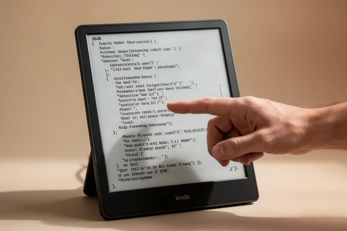
In text mode, the black and white version makes text pop, and you can comfortably read from more than a meter away. The color version is still readable, but reading is slower because the character definition is not as good. When the front light is turned off, the difference becomes even more pronounced. In a normally lit room, the black and white version is completely usable without any front light, while the color version becomes difficult to read and requires squinting and finding the right angle.
Front Light Quality
The front light is where the color version pulls ahead. In direct comparison, the warm front light on the black and white version has a noticeable greenish tint and some color bleeding, making it less pleasant to use. The color version, on the other hand, produces a warmer, more paper-like light that feels more natural and consistent.
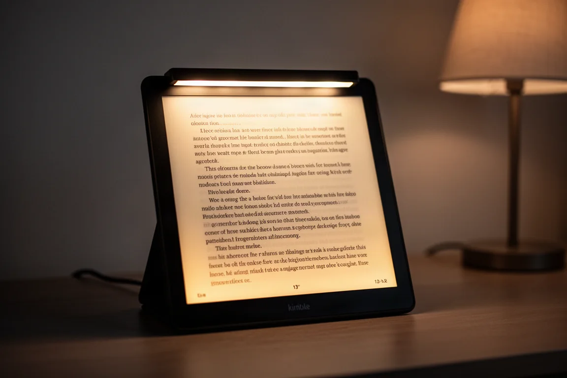
Even at maximum intensity, the color version’s front light maintains a pleasant hue, while the black and white version’s light looks greenish and uneven. The cold light on the color version also feels softer and more natural, likely because the color filter array diffuses the light. The black and white version’s cold light is brighter and sharper but has a harsher glow. For most users, the color version’s front light will be a significant advantage, especially in dim environments where you rely on it heavily.
Viewing Modes and Ghosting
Both monitors offer multiple viewing modes: clear, text, image, web, and active. Performance varies by mode, and the two screens handle them differently.
In web mode, both monitors perform well, but the black and white version has cleaner ghosting and better overall clarity. The color version shows some flickering, though it is not distracting. In text mode, the black and white version has punchier contrast, but the color version offers more fine-tuning range. Image mode is where the color version shines: it renders images with better calibration and less artifacting. The black and white version, in image mode, shows more prominent artifacts around dynamic changes and can even blink during scrolling, making it less pleasant to use.
Active mode degrades image quality on both monitors, but the effect is more noticeable on the color version, where text becomes washed out. The black and white version, starting from a higher baseline, handles active mode better. For video playback, the black and white version looks more natural to some viewers, while the color version’s muted palette can feel like faux color.
Color Rendering and Image Quality
The color version’s main appeal is, of course, color. It renders hues like blues and greens reasonably well, and the paper-like texture gives images a printed quality. However, the color filter array reduces sharpness and contrast compared to the black and white version. In a side-by-side color wheel test, the color version maintains differentiation between saturated hues at higher contrast levels, while the black and white version loses that distinction much earlier.
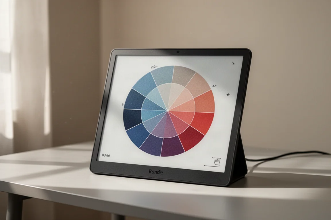
For image-heavy work, the color version is clearly better suited. It offers more contrast calibration options and produces finer results in image mode. The black and white version, while excellent for text, struggles with images in text mode and shows more artifacts in image mode.
Touch Functionality and Daily Use
Touch functionality is a major differentiator. The color version supports touch, allowing you to swipe, tap, and interact directly with the screen. This transforms the experience for tasks like coding, where you can scroll through code, tap to select, and use keyboard shortcuts without reaching for a mouse. The black and white version does not offer touch, so you will need to rely on a mouse or trackpad.
For reading and typing, the color version’s touch support makes it more convenient and comfortable. The ability to swipe up and down while reading or coding reduces the need to constantly move your hand to a mouse. If touch is important to you, the color version is the clear choice.
Which One Should You Choose?
The decision comes down to your priorities. If you value crispness, contrast, and the ability to use the monitor without a front light, the black and white version is the better pick. Its readability is excellent, and the image quality is difficult to beat, especially in well-lit environments.
If you prefer a more pleasant front light, want touch functionality, and appreciate having color for images and code, the color version is worth the trade-offs. Its front light is significantly better, and the touch support makes daily use more fluid. The color rendering is a nice bonus, even if the panel is not as sharp as the monochrome version.
For coding, the color version’s touch support and ability to distinguish classes and functions at a glance make it a strong contender. For pure reading and text-heavy work, the black and white version’s clarity is hard to ignore.
Conclusion
Both the Dasung 13K color and the Dasung 13K black and white are impressive e-paper monitors with distinct strengths. The black and white version excels at readability, contrast, and front-light-free use, while the color version offers a better front light, touch functionality, and color rendering. Your choice should depend on which features matter most to your workflow. Either way, you are getting a high-quality e-paper display that can reduce eye strain and improve focus during long work sessions.
Product link
View more details for Dasung 13K Color
This product is mentioned in the review. Check the specifications, options, and compatibility before buying.
View more details for Dasung 13K ColorFurther reading
Related Reviews
3D Scanning Equipment
Best 3D Scanners Under $1000: Four Practical Options for Enthusiasts
A detailed comparison of four sub-$1000 3D scanners for larger scans and detailed parts, tested on real projects with accuracy measurements and usability insights.
Coffee Equipment
Best Automatic Coffee Makers: Six Models Tested for Brewing Quality and Design
We tested six automatic coffee makers across temperature stability, extraction, and user experience to help you find the right brewer for your needs.
Coffee Equipment
Best Electric Gooseneck Kettles: Eight Models Tested for Pour Quality and Speed
A detailed comparison of eight temperature-controlled electric gooseneck kettles, tested for heating efficiency, pour quality, and everyday usability.