Fountain Pen Inks
A Fountain Pen Ink Haul Full of Color: Standout Picks from a Vanness Order
From fiery reds to shimmering literary-inspired inks, these are the standout fountain pen inks from a recent haul, swatched and assessed for everyday writing.
Introduction
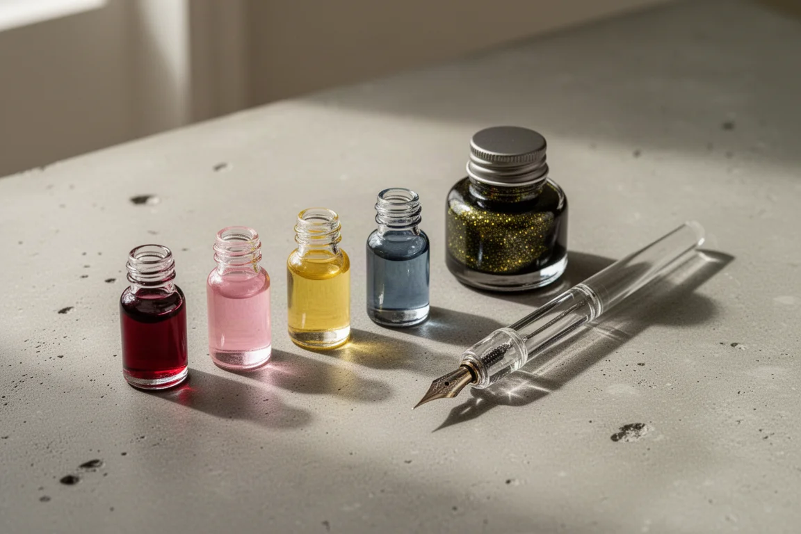
Few things test a pen collection like a big ink order, and this one delivered. The haul covered a random sample six-pack, two deliberately chosen bottles, and a long run of literary-inspired Wearingeul samples. Everything was swatched in an A6 graph notebook using a glass dip pen for the large swatches and a medium-nib dip pen for the writing samples, which makes it easy to judge both color and real-world legibility. Here are the inks that stood out, and who each one is actually for.
The Random Sample Pack
The random six-pack turned out to be a surprisingly strong spread of standard shades: a red, a pink, a yellow, a blue, and a grey. One sample duplicated an ink already chosen for the haul, so five unique colors made it to the swatch page. As a low-commitment way to test unfamiliar brands, a random pack like this works better than expected.
KWZ Flame Red
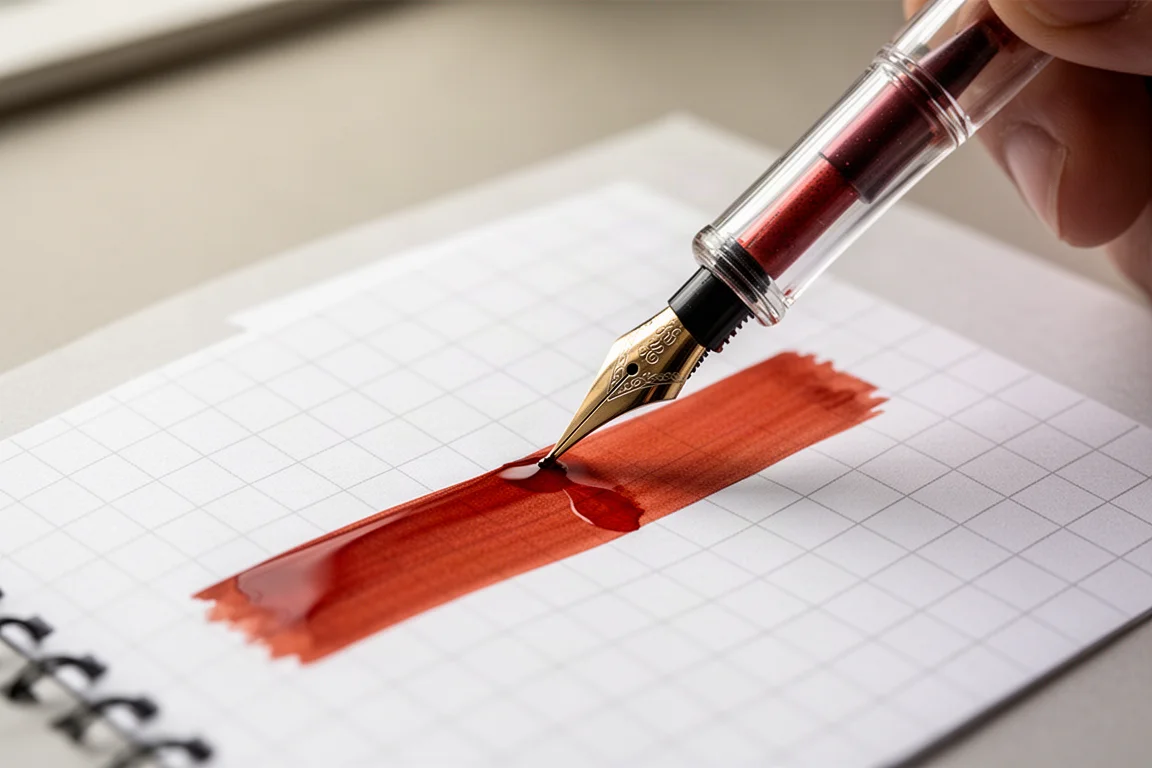
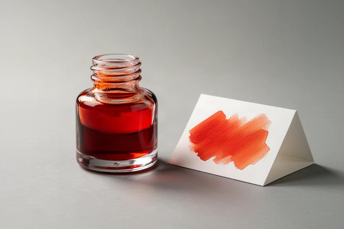
KWZ Flame Red is a fiery red with a touch of orange warmth in it. It is bright without crossing into neon territory, and it fills a gap that many collections have: a genuinely warm, lively red rather than a deep blood shade. If your ink shelf skews conservative, this is the red that wakes it up.
Ferris Wheel Press Malibu Blush
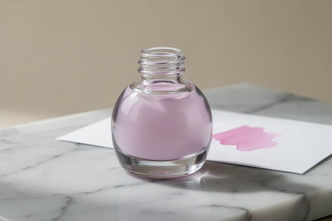
Malibu Blush is a soft, cool-toned pink and a very strong candidate for anyone hunting the perfect light pink ink. It is delicate and not overly bright or saturated, yet it stays legible on the page, which is the hardest balance to strike in this shade family. The soft appearance makes it ideal for journals, letters, and planning pages.
Inkebara Dandelion
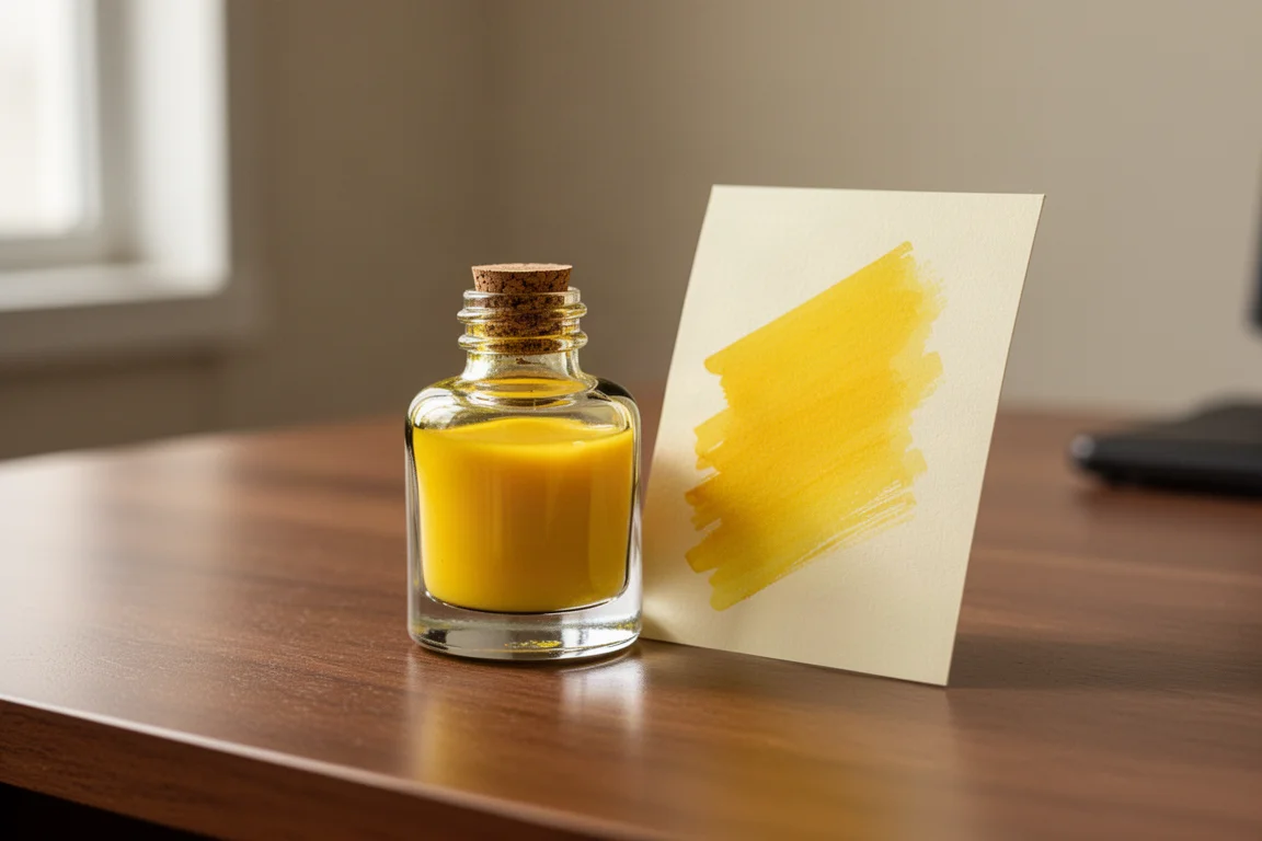
Yellow is one of the least popular ink shades for a good reason: most yellows are nearly impossible to read. Inkebara Dandelion threads the needle. It is light enough to look fresh and sunny but not so light that it disappears, and it avoids the dark, vintage-leaning look of many alternatives. For a legible standard yellow, this is an easy recommendation.
3 Oysters Blue
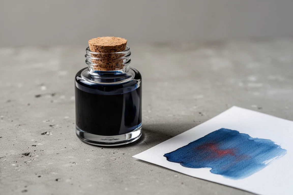
3 Oysters Blue is a slightly warm-toned mid blue with a surprise: once dry, it shows a faint purply red sheen. It is a lovely everyday blue that sits apart from the usual navy and royal blue defaults, making it a simple but worthwhile addition to any rotation.
Laban Athena Grey
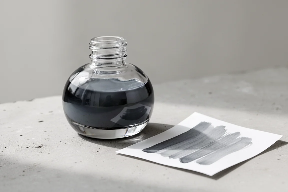
Laban Athena Grey is a cool-toned standard grey. Grey inks are quiet workhorses, and this one brings a clean, cool character rather than a warm charcoal. It is a sensible pick for anyone whose collection lacks a neutral everyday grey.
Shimmer Picks Worth the Hype
Two deliberately chosen bottles anchored the order, and both lean into the red end of the spectrum in very different ways.
Colorverse 2026 Red Horse Glistening Gold pairs a slightly deeper red with gold shimmer, and the pairing works beautifully. The deeper shade makes the gold particles stand out far more than a brighter red would, which is exactly what you want from a shimmer ink. Diamine fans may recognize the comparison here: this is the festive red-gold combination done with restraint.

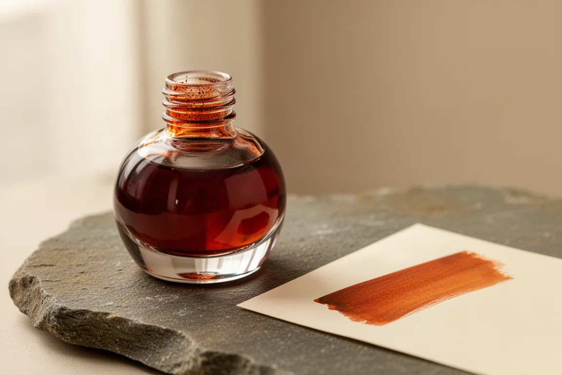
Pilot Iroshizuku Yuyake is a burnt reddish orange with no shimmer at all, chosen specifically to compare against a beloved autumn classic, Diamine Autumn Oak. The verdict is clear: Yuyake leans noticeably more red, while Autumn Oak sits on the yellow side of burnt orange. If you already own Autumn Oak, Yuyake is a complement rather than a duplicate.
Wearingeul Highlights
Wearingeul, a brand that builds its color palette around literary classics, earned the largest share of this order, and for good reason: the inks have performed consistently well, with shimmers that behave and no clogging, hard starts, or flow issues so far. Three samples stood out from the pack.
1984
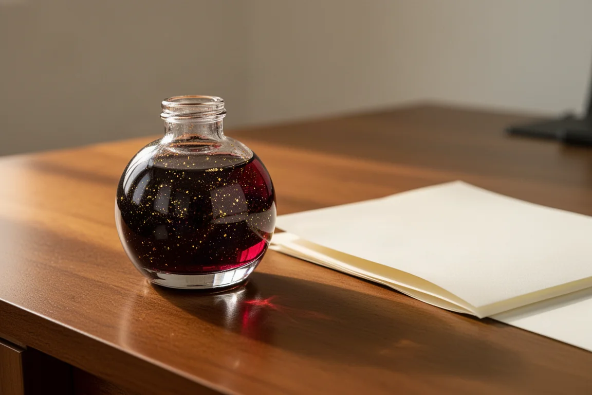
Named after the Orwell novel, 1984 is a very deep red with red shimmer. It reads serious and saturated on the page, the kind of ink that suits formal writing as much as it suits the theme. Of the reds in this haul, it is the moodiest.
Lost
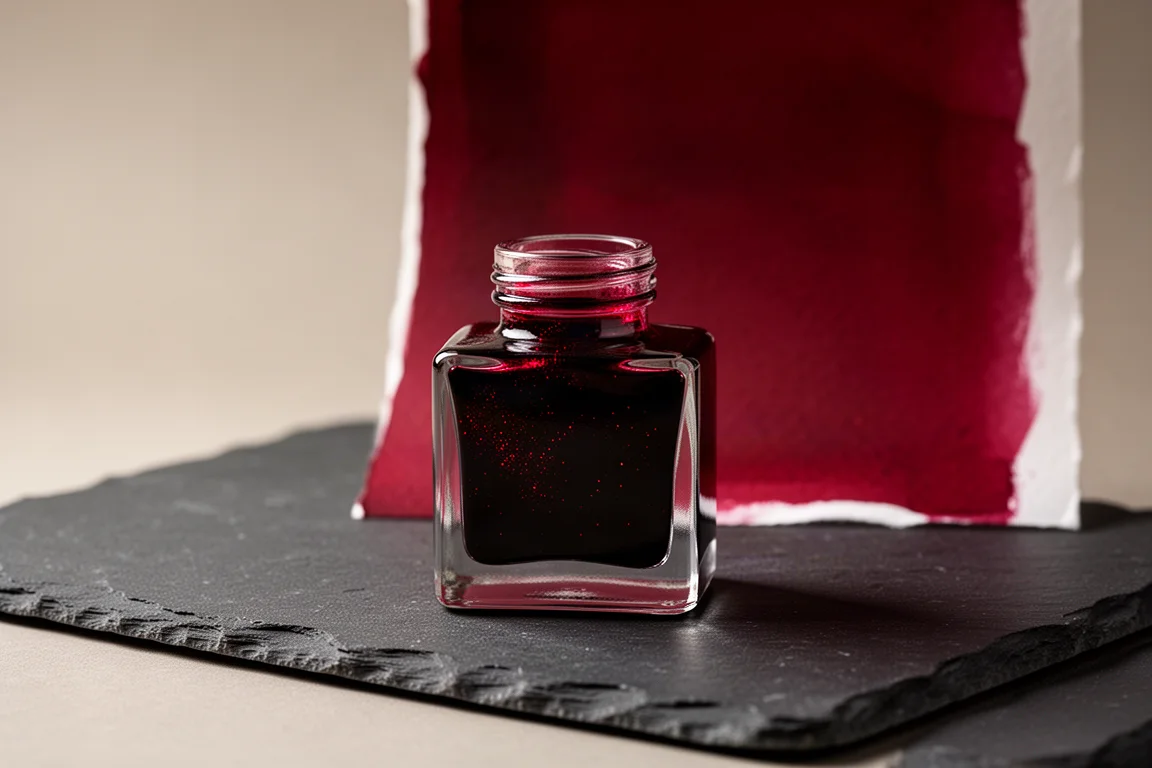
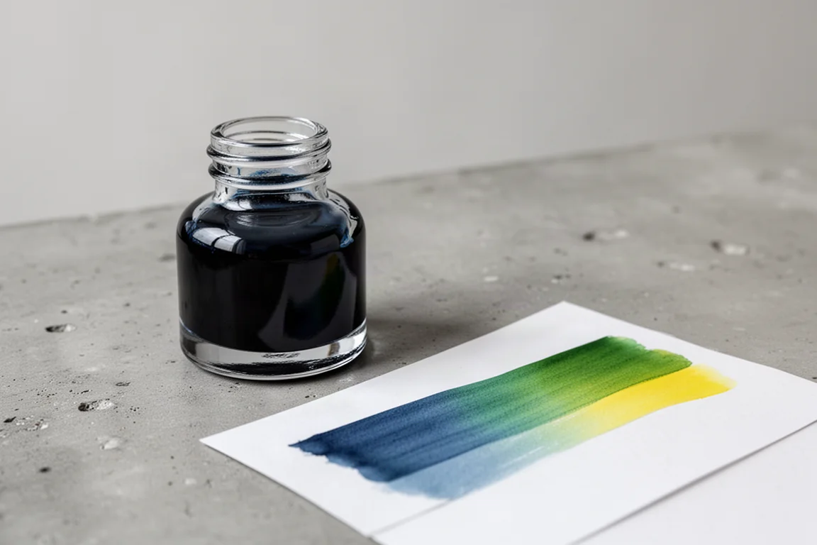
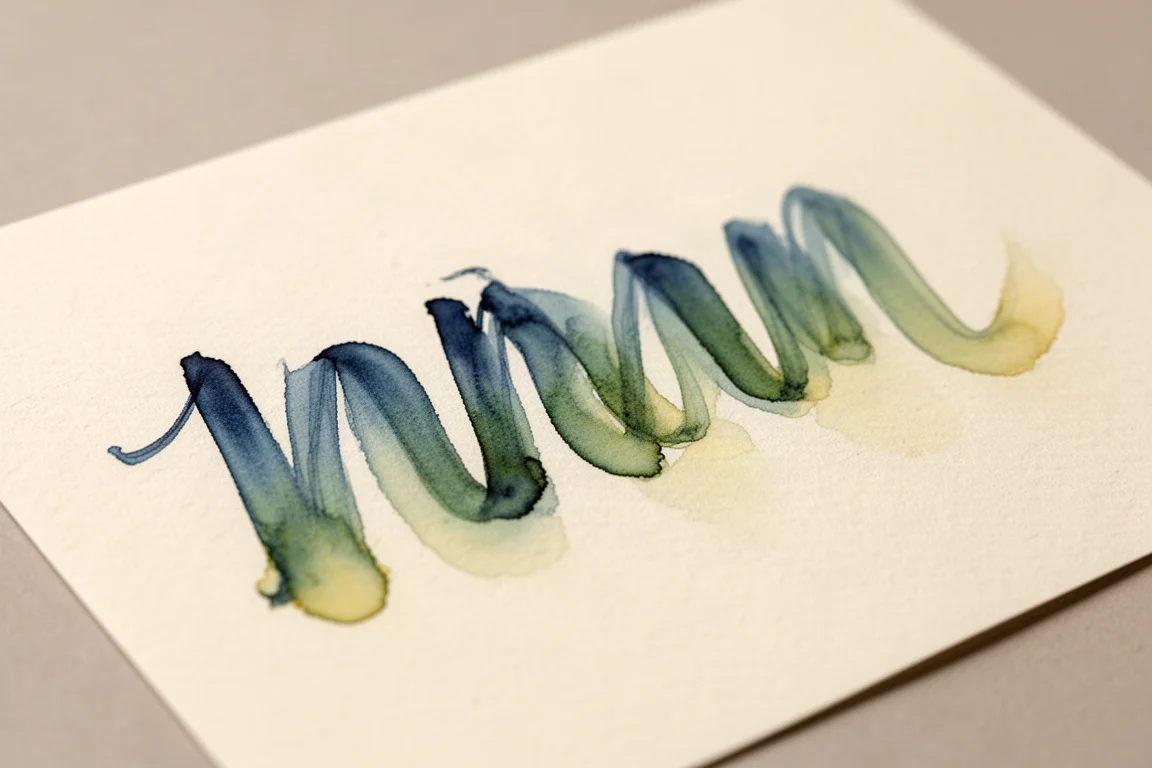
Lost is a desaturated, muted mid-tone blue with some of the most fascinating behavior on the swatch page. As it dries, the chroma shading shifts from blue through green into yellow, an effect reminiscent of the popular Sailor Manyo inks. If you enjoy inks that look different on every stroke, this is the one to watch.
The Death of Ivan Ilyich
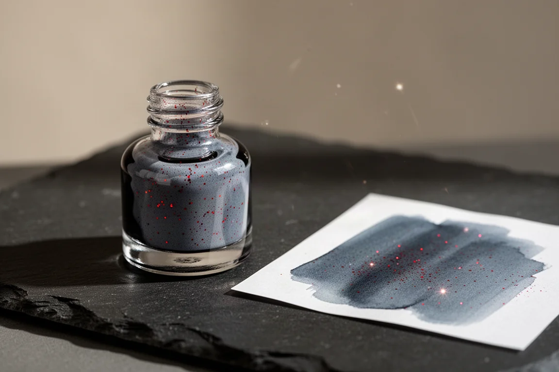
This may be the most striking ink of the entire order: a muted bluish grey laced with red glitter. The contrast between the cool, dusty base and the hot, fiery shimmer creates an ominous juxtaposition that is captured beautifully in ink. There is simply nothing else like it in a typical collection.
More Wearingeul Inks Worth Noting
Beyond the three highlights, the rest of the Wearingeul samples rounded out the haul with impressive range:
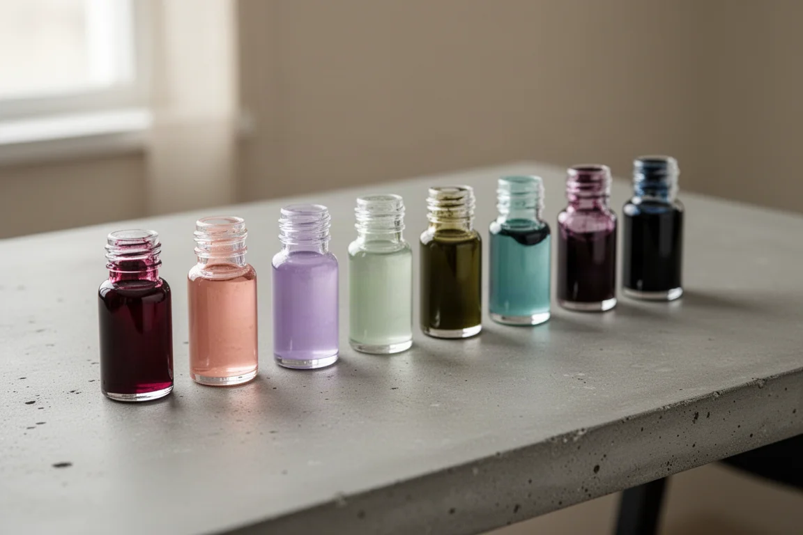
- China the Great Sage Heaven’s Equal: a burgundy with gold shimmer that runs cooler and slightly lighter than the Colorverse Red Horse, with more of a blue-toned red base.
- Geppetto: a mid-tone peachy pink, shimmer-free, with strong shading that adds dimension and legibility once dry.
- Carmilla: a cooler muted pink than Geppetto, with gentler shading and lovely restrained tones.
- Daddy Longlegs: a cool muted lilac leaning toward purple, with subtle shading and a well-behaved gold shimmer.
- Siddhartha: a rusty reddish orange that, like Yuyake, leans more red than Diamine’s Autumn Oak.
- Secret Garden: a soft pale green with rose gold shimmer, a striking contrast of lush green against rusty sparkle, and a good alternative to a long out-of-stock similar shade from another brand.
- Autumn Night After a Thousand Years: a deep olive green with gold shimmer that feels unmistakably like fall.
- Mad Hatter: a deep muted seafoam green with interesting shading that can shift toward blue or purple depending on how it dries.
- Macbeth: a deep, subtly blue-toned grey reminiscent of Payne’s Gray, with purple, blue, and silver shimmer like a night sky.
- Purgatorio: a desaturated, shimmer-free ink whose muted quality and shading are its main appeal.
- Don Quixote: a deep muted aubergine with subtle shading; reportedly discontinued, so grab it if you find stock.
- No Longer Human: a mysterious greyish violet with shading that adds variation as it dries.
- Narcissus and Goldmund: a deep, rich bluish black with gold shimmer, a far more exciting option than a plain black for anyone who rarely uses black inks.
Buying Advice
If you are new to a brand, a random sample pack is a low-risk way to explore, and this one produced five genuinely usable colors. For shimmer lovers, Colorverse Red Horse Glistening Gold is the safest crowd-pleaser in this haul, while The Death of Ivan Ilyich is the boldest conversation starter. Fans of muted, complex shading should prioritize Lost and the Wearingeul pinks, and anyone chasing a legible yellow or a perfect light pink now has two clear answers in Inkebara Dandelion and Ferris Wheel Press Malibu Blush. If you already use Diamine Autumn Oak, know that both Yuyake and Siddhartha lean more red rather than replacing it.
Conclusion
This haul covered bright reds, delicate pinks, a rare legible yellow, and a deep bench of literary-inspired inks with beautifully behaved shimmer. The strongest overall impression is Wearingeul’s consistency: distinct colors, reliable flow, and shimmer that never got in the way. Whether you start with one sample or a dozen, any of these picks would be a welcome addition to a fountain pen rotation.
Further reading
Related Reviews
Fountain Pen Inks
Six Fountain Pen Day Ink Picks Worth a Second Look
From a true sepia to a soft Delft blue, these six inks cover browns, greens, oranges, and blues with shading worth watching.
Fountain Pen Inks
Pelikan Edelstein Golden Lapis Review: A Deep Blue Ink Loaded With Golden Shimmer
Pelikan's 2024 Ink of the Year delivers a true medium blue with an enormous amount of gold shimmer, with a few practical trade-offs to weigh before buying.
Fountain Pen Inks
Kittywink Pot Ink Samples: 23 Shades Swatched and Reviewed
A full first look at 23 Kittywink Pot fountain pen inks, from muted greens and smoky browns to dual-shading purples, swatched and compared on paper.