Fountain Pen Inks
Six Fountain Pen Day Ink Picks Worth a Second Look
From a true sepia to a soft Delft blue, these six inks cover browns, greens, oranges, and blues with shading worth watching.
Introduction
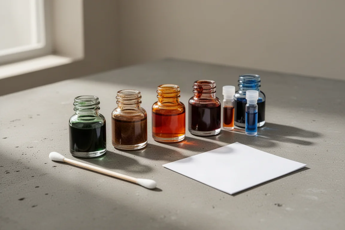
Fountain Pen Day, held on the first Friday of November since 2012, is a retail holiday that supports and celebrates stationery businesses worldwide, with deals, specials, and giveaways across the pen community. This year’s haul was kept deliberately small: four ink samples and two bottles. Swatched on both a swatch card and Tomoe River paper, each ink earned its spot for a different reason. Here is how the six stack up.
The Matcha Test: Pen BBS 342 Matcha Ice Cream
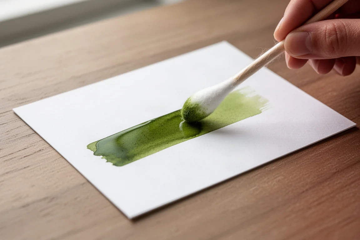
This one is hard to find, but the hunt makes sense if you love matcha. The color genuinely resembles fresh, good-quality matcha: bright and light, which is exactly what fresh matcha should look like. The concern with this shade of green is that it can read too bright or too light for everyday writing, though it dried slightly darker than it went down, which is promising.
On drying, the shading shows immediately, moving from a light yellowish green to a duller, darker green with darker edges. It is a good matcha color, though it may be a hair too bright for some.
The True Sepia: Rohrer & Klingner Sepia
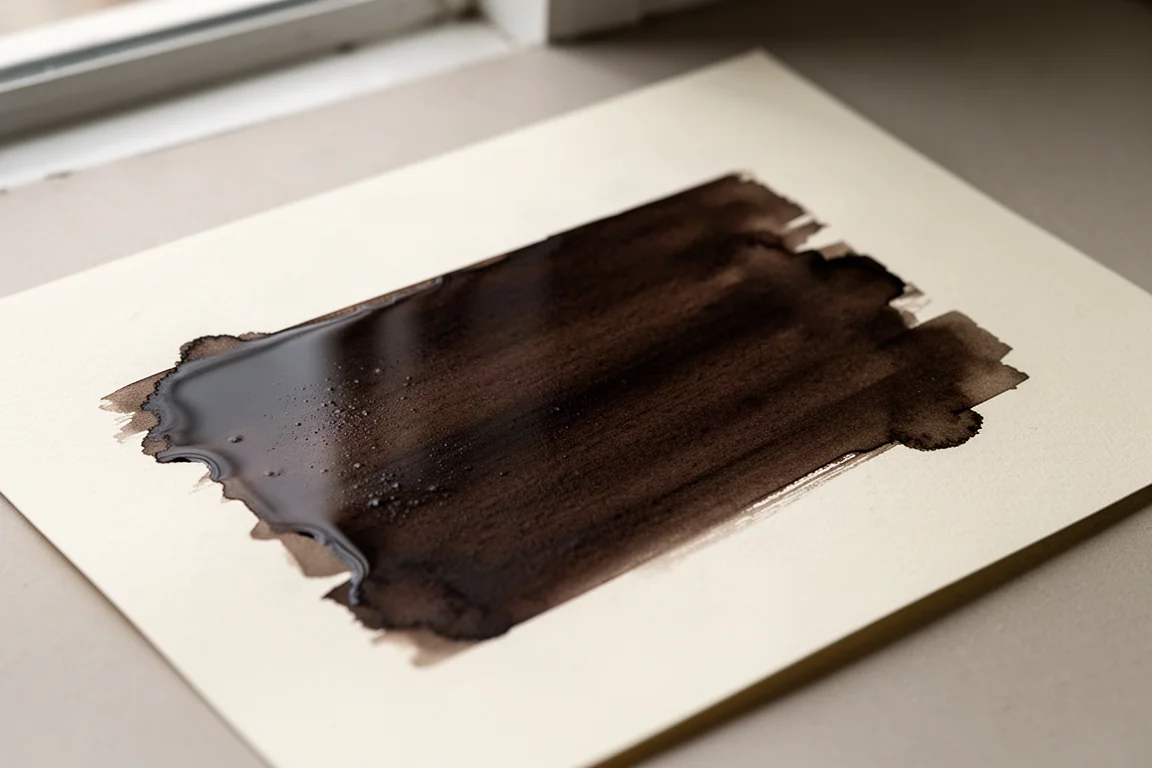
Many inks labeled sepia are really light browns. True sepia comes from cuttlefish ink and sits closer to a brownish black, and this one lands convincingly in that territory: a brown that almost reads as black, or a black with brown in it. It is also noticeably wetter than the Pen BBS sample, which bodes well for how it will feel in a pen.
It is a flat, honest sepia rather than a flashy one, so it may not be for everyone, but as a faithful rendition of the color it is hard to argue with. If it performs well in a pen, a full bottle is an easy call.
The Orange Hunt: KWZ Grapefruit
The ongoing search was for a darker or reddish orange rather than something too bright and highlighter-like. KWZ Grapefruit is bright but not too bright, and readable, and it dried slightly duller, which suits that goal.
A nice detail: KWZ inks are known for a vanilla scent that people either love or dislike, but it reads as calm and pleasant here. The ink is true to its name and genuinely resembles the flesh of a grapefruit. One caveat: once dry, it leans quite red, more orange-red than red-orange, so it may sit slightly out of range if you want a true orange.
The Contender Brown: KWZ Honey
KWZ Honey is one of the most popular brown inks, well loved for its gorgeous shading. The worry was that it would sit too close to an existing favorite brown, but on comparison it looks brighter and a touch yellower, different enough to justify a bottle. The color genuinely looks like honey, with a greenish yellow-brown character and a lot of tones in play.
The shading is the star here: it moves from a darker, woodier brown to a light yellowy gold-green brown. It also feels wet and nicely lubricated, which suggests it will be a joy to write with.
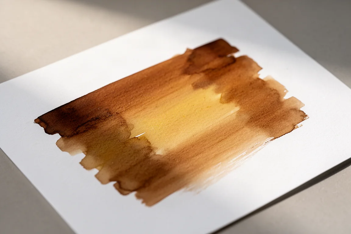
First Robert Oster: Charred Hickory (A Drink for Your Pen)
Robert Oster inks are made in Australia and draw on colors of the country, and this one is a retailer exclusive. The name alone sells it: Charred Hickory sounds like exactly the kind of brown worth owning. On paper it delivers, with a reddish brown that genuinely resembles wood.
There is a little shading, and when laid down heavily a hint of black sheen appears. It is a very evocative ink that lives up to its name, and it seems almost certain to appear in a pen for the holiday season.
The Blue You Do Not Need But Want: Akkerman Delfts Blauw
Do you need another blue ink? Absolutely not. Will another blue ink get bought anyway? Probably. This one has been on the wishlist for a long time, and Fountain Pen Day plus available stock was the excuse. It comes in a beautiful, unique box and a distinctive bottle topped with a marble, which makes the unboxing part of the appeal.
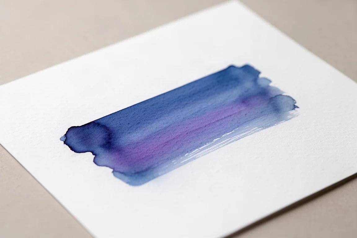
The color is inspired by the blue of Dutch Delft pottery and is a nice, calming blue that leans slightly purple. It is a shading ink more than a sheen ink, with maybe a faint pinkish edge when laid down heavily, and it remains absolutely beautiful even if it is not the most unique blue out there.
Overall Buying Advice
If you want a faithful sepia, Rohrer & Klingner Sepia is the standout of the group. KWZ Honey and Charred Hickory both serve brown lovers but in different registers: golden and shaded versus reddish and woody. KWZ Grapefruit is the pick if you like readable red-orange, Pen BBS 342 Matcha Ice Cream if you want a genuine matcha green, and Akkerman Delfts Blauw if the bottle presentation and a calm Delft blue appeal to you. Samples are a smart way to test before committing to bottles, since a 4ml sample usually gives two or three pen fills.
Conclusion
None of these six will rewrite the ink catalog, but each is genuinely usable and each nails the color it sets out to be. Whether you picked up anything for Fountain Pen Day or not, these are worth a look for your next ink order.
Product link
View more details for Pen BBS 342 Matcha Ice Cream
This product is mentioned in the review. Check the specifications, options, and compatibility before buying.
View more details for Pen BBS 342 Matcha Ice CreamFurther reading