Fountain Pen Inks
Kittywink Pot Ink Samples: 23 Shades Swatched and Reviewed
A full first look at 23 Kittywink Pot fountain pen inks, from muted greens and smoky browns to dual-shading purples, swatched and compared on paper.
Introduction
If you love soft, desaturated, mood-setting fountain pen inks, Kittywink Pot deserves a spot on your radar. This was a first experience with the brand, and it delivered 23 samples ordered from Soandso, an Australian retailer. The haul leans heavily toward muted, watercolor-like shades rather than vivid saturations, and the shade names alone paint pictures: atmospheric, nature-inspired, and quietly poetic.
The brand’s approach to naming is part of the appeal. Each name evokes a scene or feeling, and the inks largely live up to those expectations once on paper. Many have genuine dual-shading properties that only reveal themselves after drying.
How the Swatches Were Done
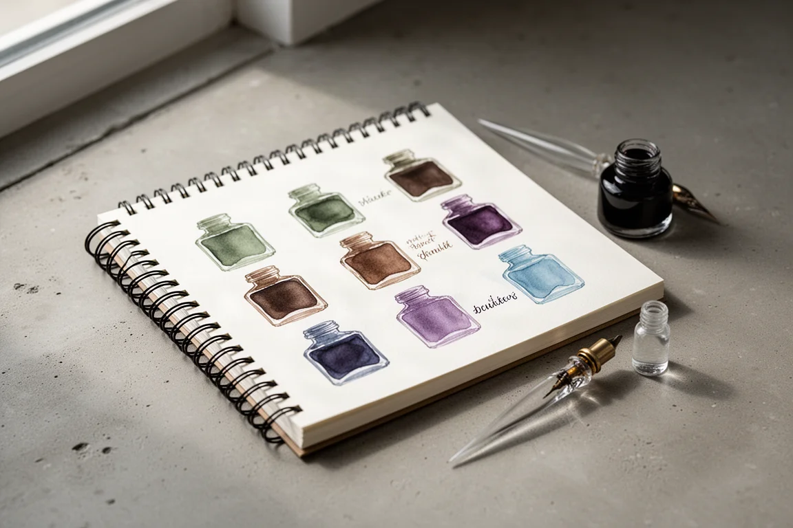
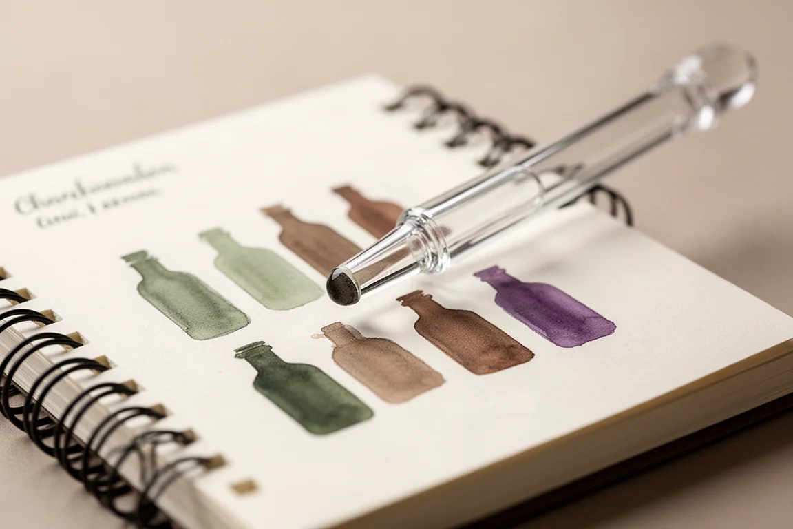
All samples were swatched in a spiral-bound swatch book with around 40 pages, each holding nine pre-printed ink bottle outlines to color in. Swatches were applied in alphabetical order using the blunt end of a glass dip pen for concentrated swatches, with writing samples done using a Pilot Erote Sushi dip pen with a medium nib. Each entry gets the brand name in print on one line and the shade name in cursive below, showing how the ink behaves in both formats.
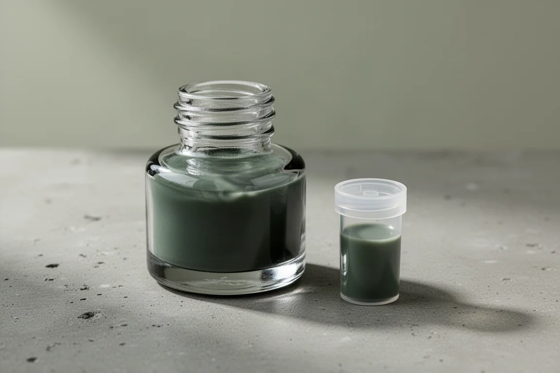
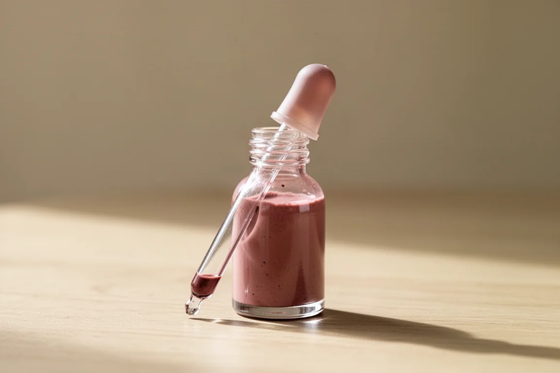
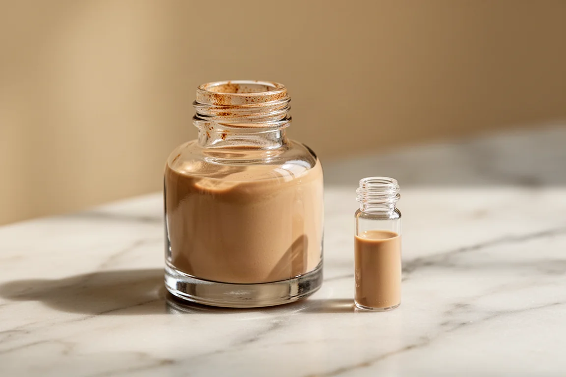
One practical note: samples mostly come in 2ml vials, though one shade arrived in a larger dropper vial of roughly 4 to 5ml because the smaller size was out of stock. The order shipped from Australia, so allow extra time for international delivery.
The First Page: Soft Browns and Muted Greens
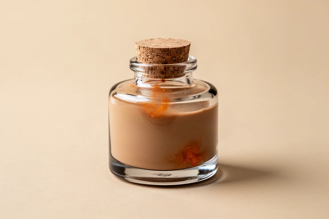
The opening page is the most neutral and brown-heavy of the set, and it is arguably the most interesting in terms of color variety. A Certain Smog is a warm gray with hints of brown that dries to a deep, fairly flat neutral brown. A Certain Yam is a highlight of this page: a soft, desaturated pinkish-brown with a slight orange pull at the concentrated edge, the kind of color you could journal with for months without tiring of it.
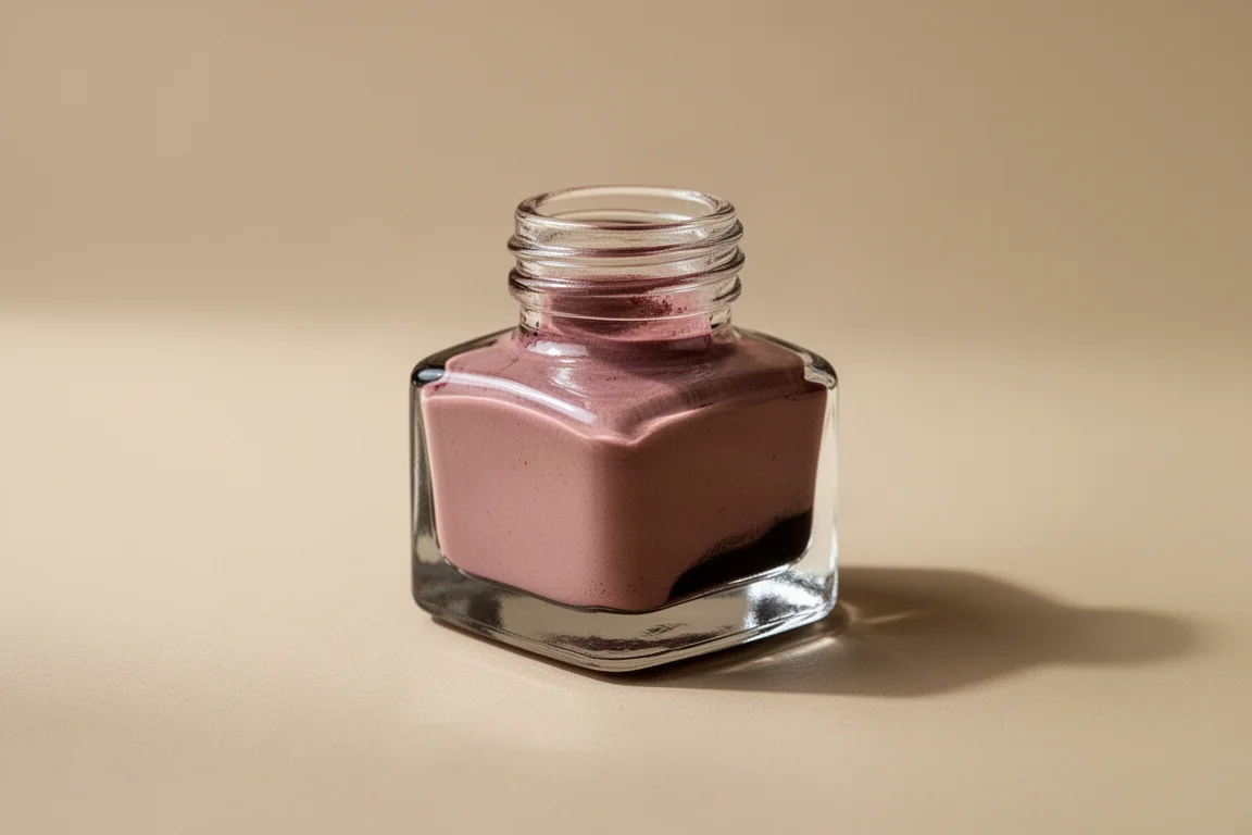
A Rabbit Doll with Pointed ears is a very cute peachy-tan with a touch of brown, sitting close to some well-known white rabbit-style inks but leaning more brown than pink. Birds and Cicas Listening to the Rain is the moodiest shade here: a dark, stormy purple-blue with blooms of orangey red peeking through, evoking a midsummer thunderstorm.
Butter and Strawberry Bagel is a surprise. Despite the name suggesting pink or red, the swatch shows purple tones that mostly disappear in writing, leaving a mostly sunny yellow. Caressing the Pale Moon looks similar but with a touch more orange coming through as it dries, with subtle fresh green hints in the concentrated swatch.

Dual Shading Shades Worth Highlighting
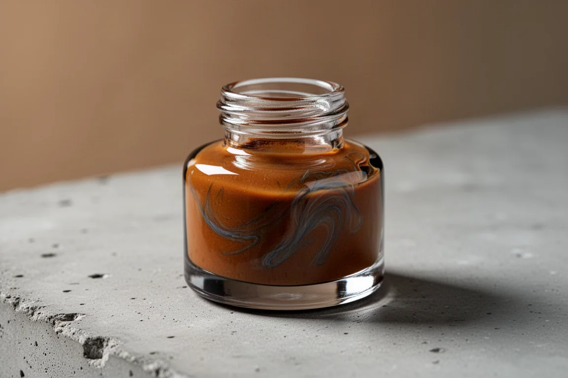
Several inks here show genuinely interesting two-tone behavior, which is a big part of what makes this brand fun to explore. Caramel Almond Waffles applies as a warm brown but reveals grayish blues and yellowish tan as it dries, with an unexpected intense red bloom in the concentrated area. Elegy of the Fallen applies like a dark red but settles into a striking contrast of a bright red halo around a soft, charcoaly gray center.
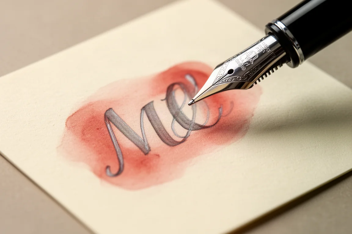
Fading Rainbow After Rain, the one shade that came in a larger dropper vial, dries to a muted pinkish brown with potential for darker brown shading in concentrated areas. Fireflies and Midsummer Forest is a standout: a muted seafoam-sage green with only a faint peachy pink halo in the most saturated spots. Fox Trot is a cute muted purplish gray with random splotches of pale yellow coming through as it dries.
The More Saturated Side
Half Spring Break is the most saturated shade in the haul, though still firmly on the muted side. It reads as a soft berry red with reddish peach tones and golden yellow warmth peeking through in concentrated areas, a lovely dusty spring shade. Idle Afternoon is brown-leaning with an orangey halo effect tempered by cool grayish tones that tone down the saturation in writing.
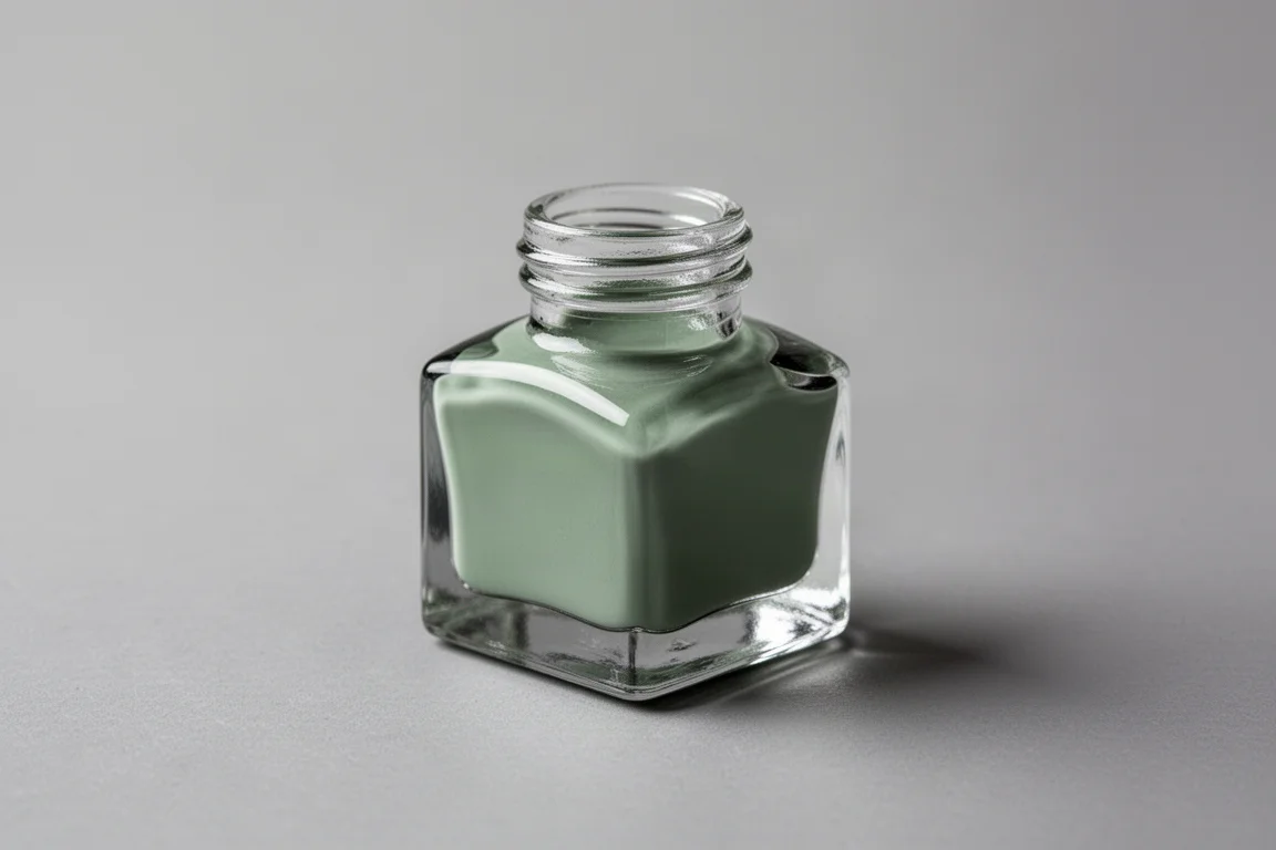
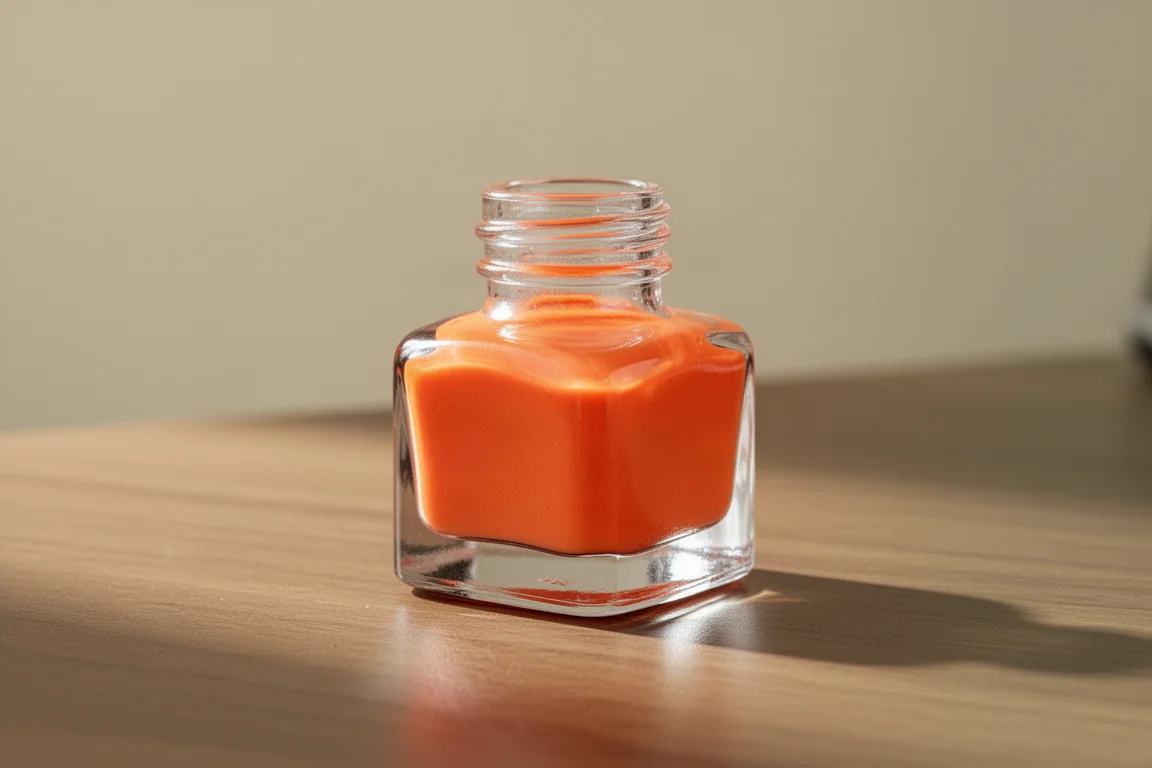
Mint and Sea Salt Swirl is a soft, summery sage-leaning green, slightly punchier than Fireflies and Midsummer Forest and cooler in tone, with a faint hint of yellow in the concentrated swatch that barely shows in writing. If soft greens are your weakness, this haul covers that ground well. The Overtones of Secondhand is the brightest surprise: a sherbet-like orange that is brighter than expected, but one that looks lovely in writing, especially for springtime use.
Blues and Purples: The Moodiest Shades
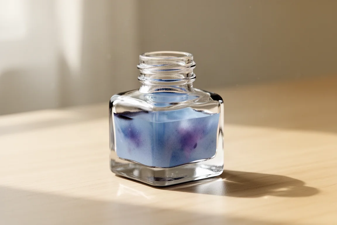
This is where the brand’s dreamy, ethereal personality really shows. Mist Shrouded Waves is a mysterious, ethereal dark purple, slightly more muted and less saturated than Birds and Cicas Listening to the Rain, though the two are different enough in writing to justify owning both.
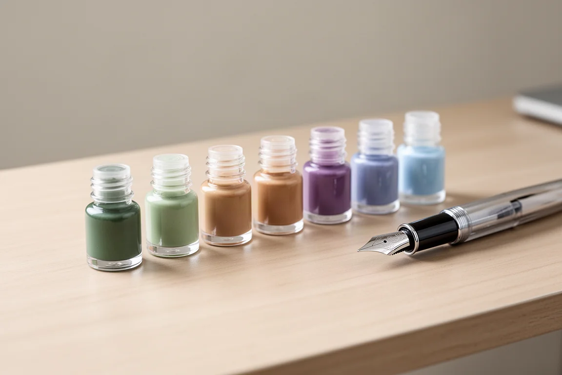
Moon Jellyfish Travel Journal is a beautiful soft, delicate blue with hints of purple, and its dual-shading properties are noticeable in the writing sample. Moonlit Rose Garden is close to it on paper but a bit more desaturated and neutral, while Moon Jellyfish keeps more of its blue tone. Both are worth keeping if moody blues are your thing.
Tans, Olives and Lookalikes
The final grouping is where the closest duplicates appear. Orange Seawater and Shadows of Osmanthus look very similar in writing on this paper, both a beige-tan, with Osmanthus showing more orange blooming in the concentrated swatch. Idle Afternoon is warmer and peachier than both, and Butter and Strawberry Bagel is more neutral and slightly brighter.
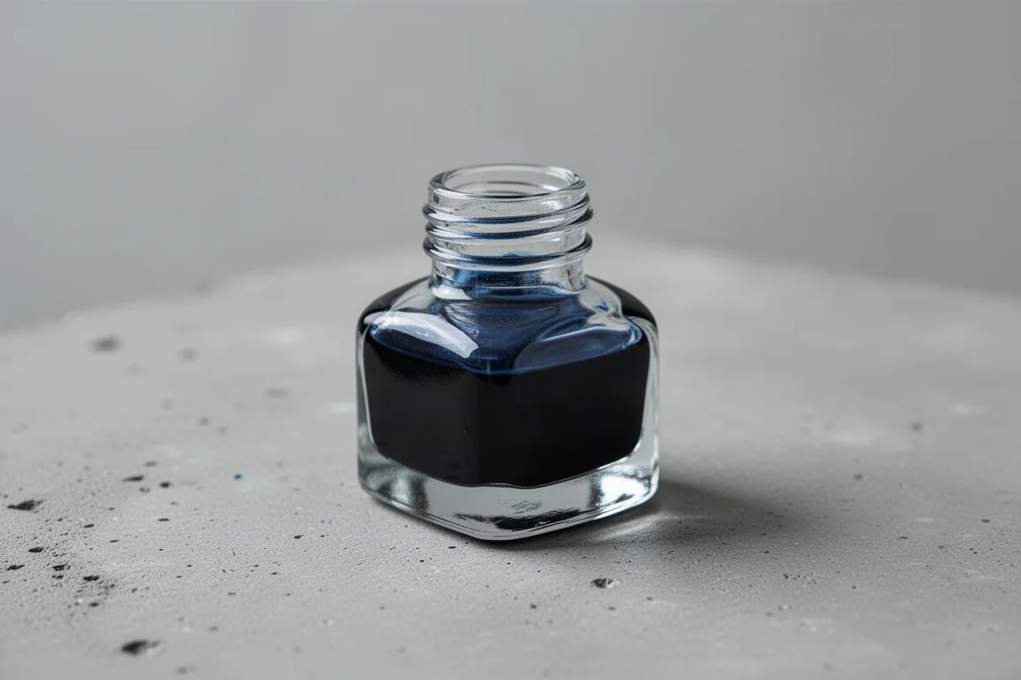
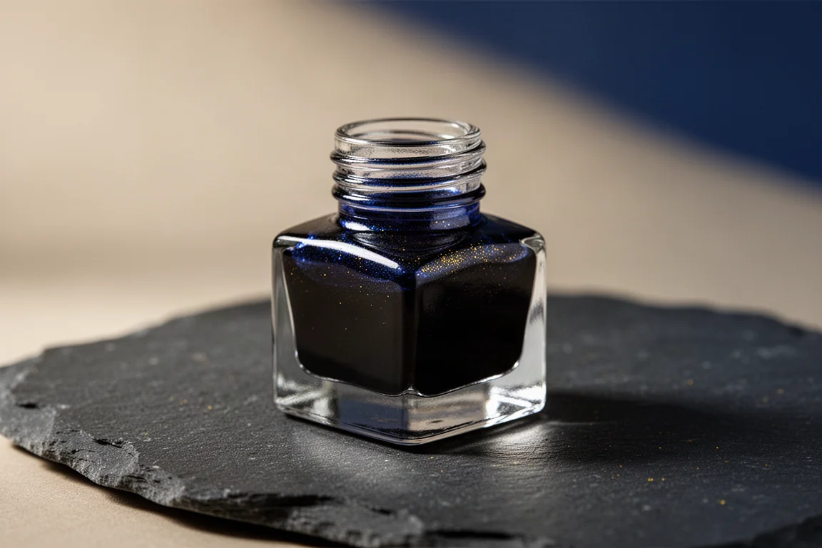
Scattered Stars in the River leans greenish brown, an olivey shade a bit lighter and more neutral than the mystery ink that arrived with the order, which itself is a lovely rosemary-dusty olive green. Wisp of Blue in the Twilight closes things out as a pretty dark blue with an interesting golden halo effect and satisfying shading in the writing sample.
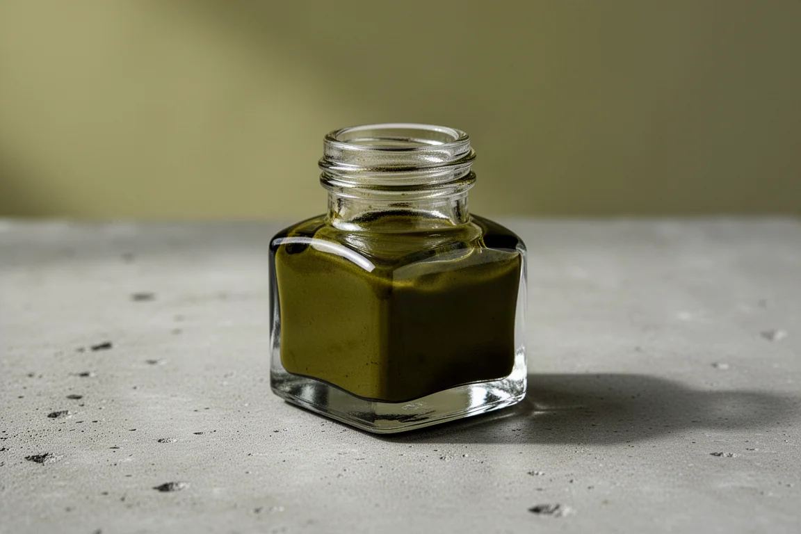
Wisp of Blue in the Twilight
The final shade of the haul is one of the most rewarding. It looks convincingly like its name suggests: a twilight blue, darker and moodier than Moon Jellyfish Travel Journal, with a golden halo effect that gives the writing sample real dimension.
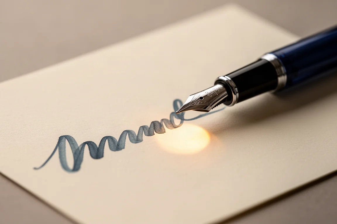
It is a strong example of what this brand does well: atmospheric color that shifts subtly as it dries, backed by shade names that put you in the right frame of mind before the pen even touches paper.
Buying Advice
A few honest takeaways before ordering. First, some shades look similar to each other on paper, especially in the tan and olive families, so if you are choosing a smaller selection, compare swatches carefully. Second, if you prefer vibrant, saturated inks, this brand may not be for you: the palette here is delicate, muted, and watercolor-like by design. Third, ordering samples before committing to bottles is the smart move with any niche brand, particularly when international shipping and customs are involved.
One bonus worth knowing: orders have been known to include a mystery ink in an adorable little jar, an unidentified color that does not appear to match any of the numbered shades in this haul. It is a charming touch, if a frustrating one for completists.
Conclusion
Kittywink Pot delivers exactly what its aesthetic promises: soft, atmospheric, thoughtfully named inks with real dual-shading character. Standouts include A Certain Yam, Fireflies and Midsummer Forest, Elegy of the Fallen, Moon Jellyfish Travel Journal, and Wisp of Blue in the Twilight. If muted pastels, smoky neutrals, and dreamy blues sound like your kind of palette, this brand is well worth a sample order.
Further reading
Related Reviews
Fountain Pen Inks
Six Fountain Pen Day Ink Picks Worth a Second Look
From a true sepia to a soft Delft blue, these six inks cover browns, greens, oranges, and blues with shading worth watching.
Fountain Pen Inks
Pelikan Edelstein Golden Lapis Review: A Deep Blue Ink Loaded With Golden Shimmer
Pelikan's 2024 Ink of the Year delivers a true medium blue with an enormous amount of gold shimmer, with a few practical trade-offs to weigh before buying.
Fountain Pen Inks
Sheen War: Birmingham Pen Company Tesla Coil vs Krishna Moon View 2
Two fountain pen inks famous for their metallic red sheen go head to head on paper, with a clear verdict on which one deserves your money.