Fountain Pen Inks
Top 10 Go-To Fountain Pen Inks: A Personal Shortlist Worth Exploring
Ten fountain pen inks that earn permanent rotation status, from color-shifting teal-greens to vibrant blues and characterful reddish browns.
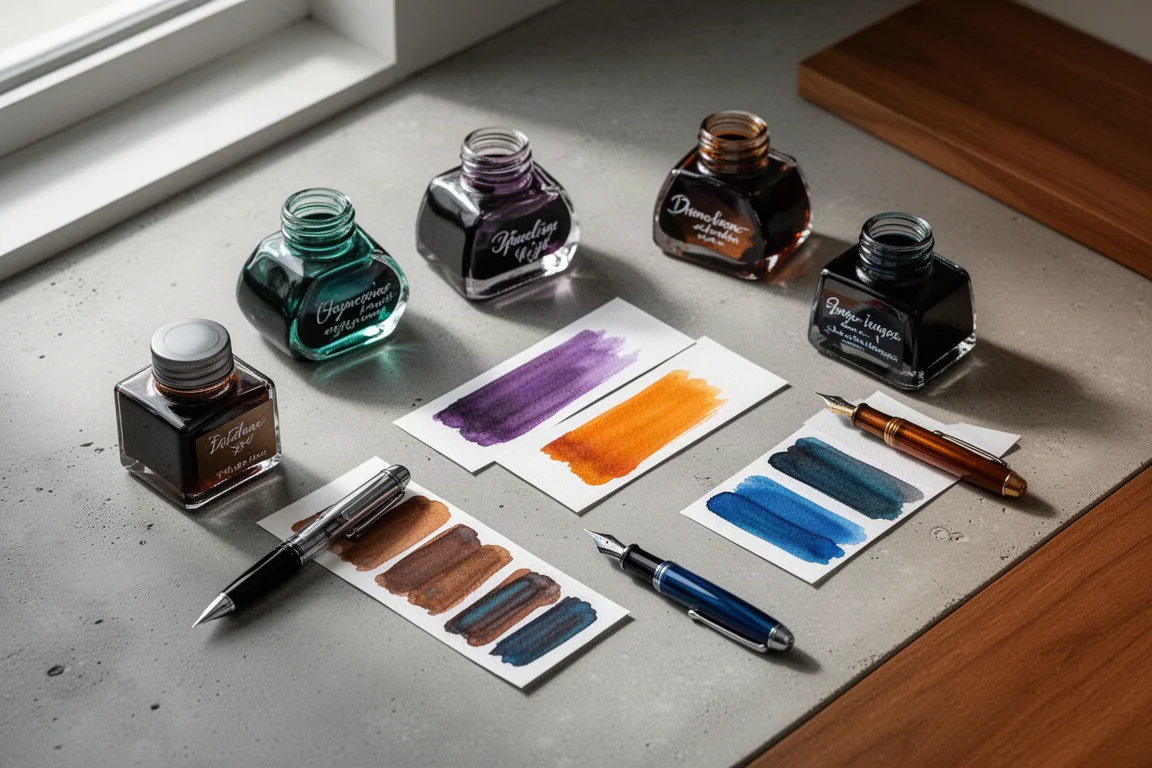
Introduction
Ask any long-time fountain pen user what their favorite ink is and you will usually get the same answer: it depends on the week. Tastes shift as collections grow. But over time, certain inks keep calling you back, the ones you reach for again and again no matter what is new on the shelf. This list is about those inks: ten go-to bottles that have earned a permanent spot in the rotation.
Before we get to the top ten, it helps to see how a collection evolves. Many journeys start with a basic black like Parker Quink, which performs fine but rarely stays exciting. From there, things usually branch out into blue-blacks such as Diamine 1864 Blue Black and Diamine Midnight, then into vibrant blues like Private Reserve Naples Blue, Kobe No. 17, and Robert Oster Bondi Blue. Stages follow for saturated oranges (Leonardo Oraia Toco, Araman Orange, J. Boven Mont Blanc Lucky Orange), purples (Birmingham Andy Warhol Pop Art Purple, Lamy Dark Lilac), greens (Apple Glory, Montblanc Irish Green, Lamy Petrol), reds (Levenger Pomegranate, Diamine Red Dragon, Diamine Poppy Red), and browns (Faber-Castell Hazelnut Brown, Private Reserve Copper Burst).
That said, retired and limited-edition inks like Franklin-Christoph Terraferma and Pap Plume’s House of the Rising Sun prove a point worth remembering: the inks you love most are not always available forever. If something on this list speaks to you, it is worth picking up while you can.
The Color Shifter: Taccia Sabimidori
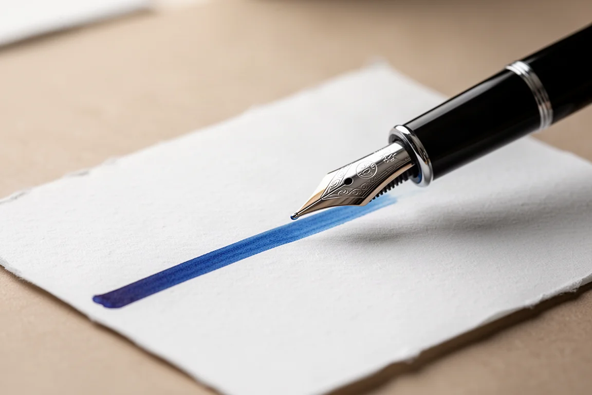
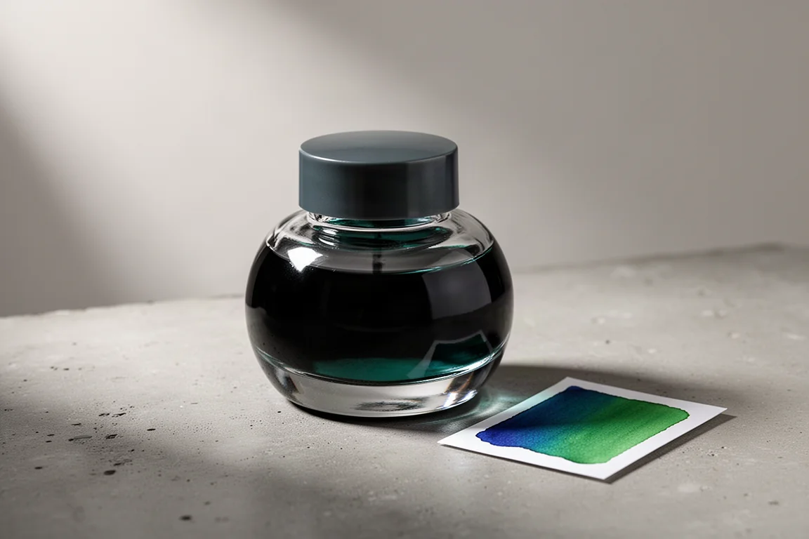
Taccia Sabimidori is an ink with genuine personality. It goes on blue and then dries into more of a green, a color-changing property that never stops being fun to watch. That transformation, plus the finished color itself, pairs well with a wide range of pens and has made it a repeat reach over the past couple of years.
If you want an ink that offers a little theatre every time you write, this is an easy recommendation.
Two Purples, Two Personalities
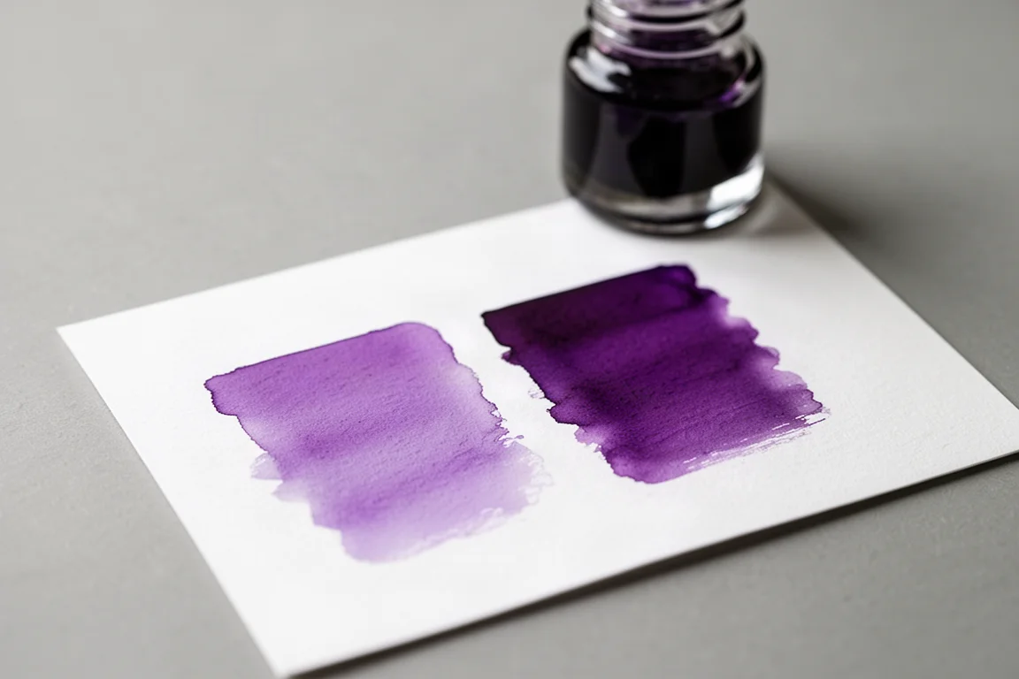
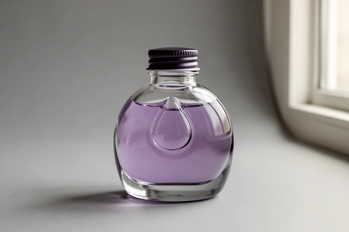
Pilot Iroshizuku Murasaki-shikibu sits on the lighter purple side, delicate and easy to live with. The Iroshizuku bottles themselves deserve a mention too: with their teardrop detail, they rank among the best-looking ink bottles around. The name also nods to Murasaki Shikibu, a fascinating figure in Japanese history.
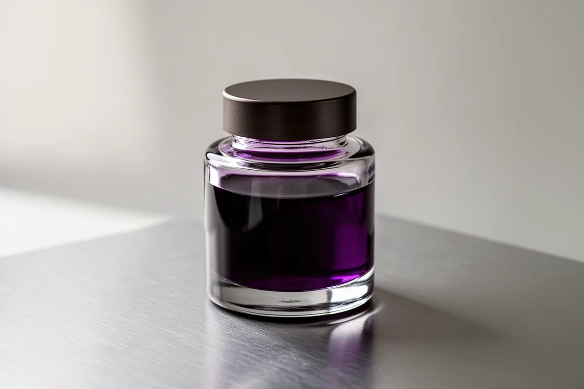
Cross Violet, by contrast, is more saturated. When a deeper, bolder purple is the right call, it is the more appropriate choice between the two.
Two Closely Related Teal-Greens
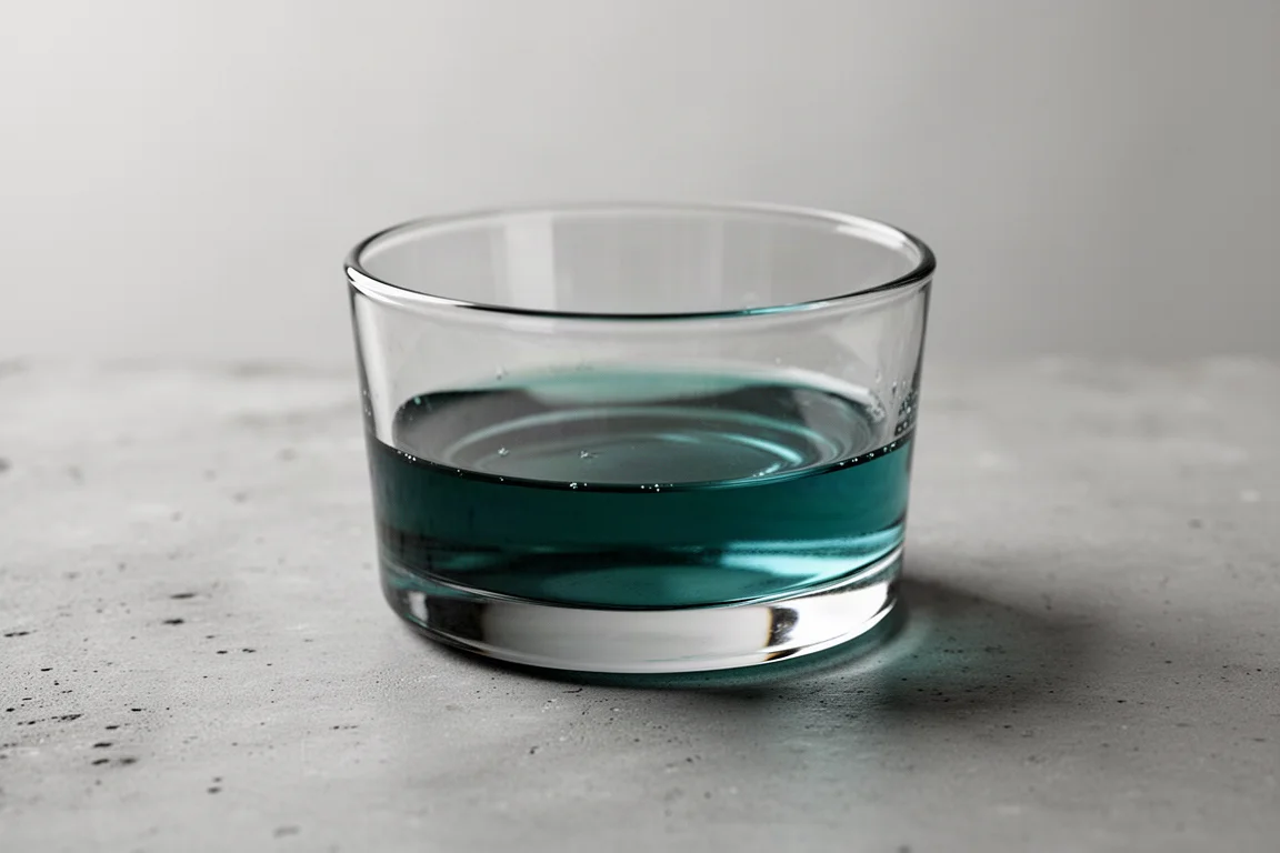
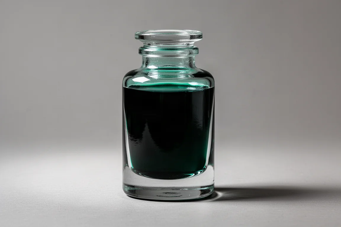
This is a bit of a cheat, because two inks here are so similar they share a spot: Stilou Roman Bronze Oxidation and Leonardo Smeraldo. Both fall into that bluish turquoise-green territory that is genuinely enjoyable to write with.
The Stilou bottle is the main drawback of that option: it is a shallow container with relatively little ink, which makes it harder to fit larger nibs. The Leonardo bottle accommodates significantly larger nibs. Whether or not the two are produced in the same facility, the colors are extremely close, so if one is unavailable the other should suffice.
A Magenta-Tinged Purple: Pilot Iroshizuku Yama-budo
Pilot Iroshizuku Yama-budo is a more magenta-leaning purple that behaves beautifully on paper. Several pens in a well-loved collection end up dedicated to it exclusively: the Pilot Custom Urushi, the Custom 845, and Namiki Nippon Art pens are all classic pairings.
One honest warning: it is an ink you will burn through. Running low prompted a replacement bottle purchase at the recent DC Pen Show, which says everything about how often it gets used.
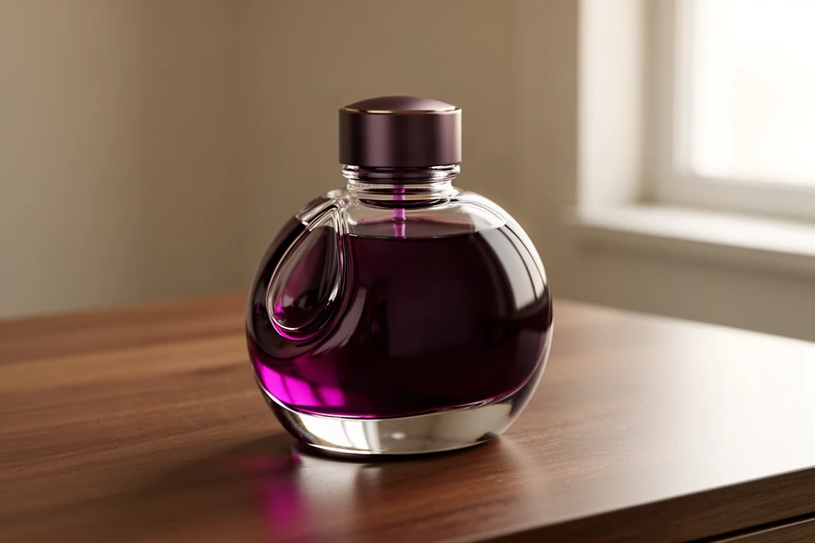
A Dependable Brown: Montblanc Toffee Brown
Montblanc Toffee Brown is a well-behaved, well-saturated brown that looks refined coming out of nearly any pen. The bottle, which Montblanc calls the shoe because of its resemblance to one, has a clever trick: tilt it and ink flows into a shallower reservoir section, making it easy to fill even when the bottle is getting low.

A Signature Orange: Robert Oster Pen Addict Fire on Fire
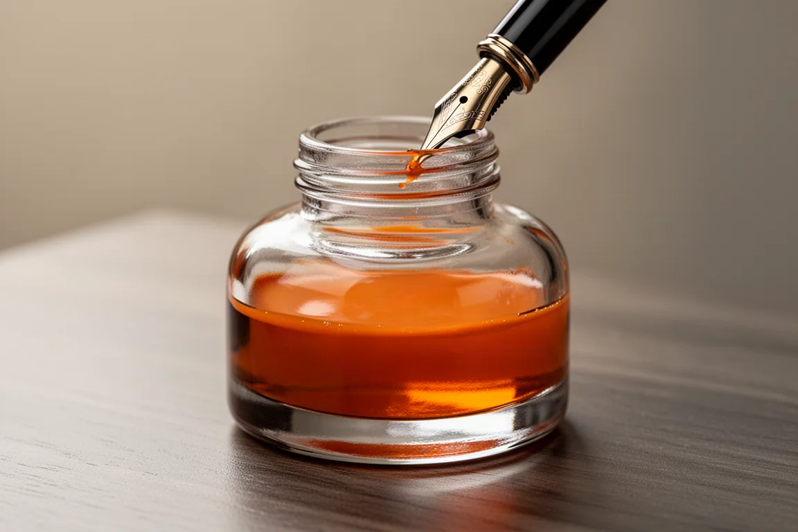
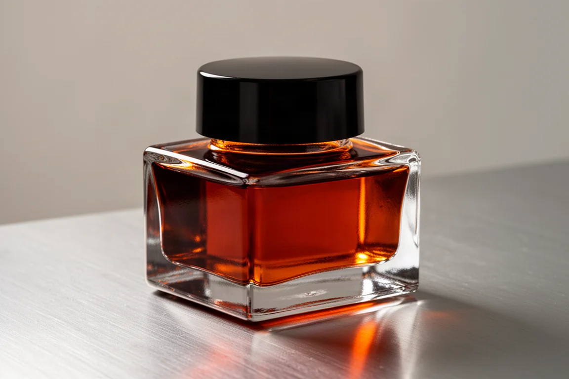
Among all the saturated oranges out there, Robert Oster Pen Addict Fire on Fire is the one that gets reached for most often. It was sold through the Pen Addict website, and availability can be intermittent, sometimes it is in stock and sometimes it is not.
For anyone who loves deep, saturated orange inks, this one earns its place in heavy rotation across many different pens.
A Characterful Red-Brown: Diamine Communication Breakdown
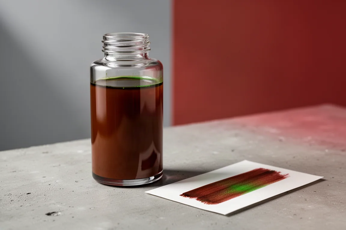
Diamine Communication Breakdown is a brownish red with green sheen, an ink with real personality that looks great out of a lot of different pens. Diamine inks in general have a reputation for being solid and well-behaved, and this one fits that mold while adding something extra.
The name comes from the Led Zeppelin song off their first album, part of a rock-and-roll themed series produced by a German retailer alongside inks like Purple Haze and Skull and Roses. Many of these can now be found on Amazon in Europe. The combination of a great ink and a great name makes it a real winner.
A Favorite Reddish Brown: Diamine Ancient Copper
Diamine Ancient Copper is a go-to reddish brown with a bit of personality. The 80ml Diamine bottles offer plenty of room for just about any nib, and the ink looks especially good in wooden pens, where the coppery tone complements the material.
This is an ink that gets used up: multiple bottles have been emptied over the years, and it is a safe bet that will not be the last.
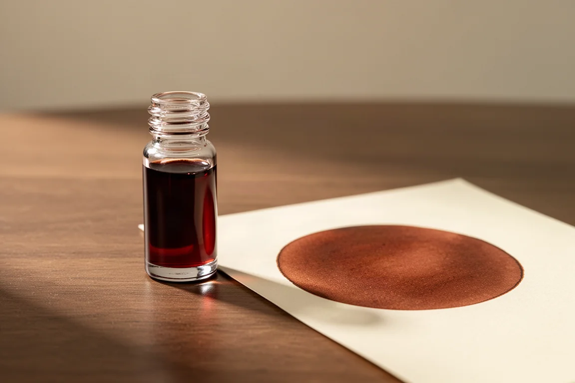
The Long-Standing Favorite: Pilot Iroshizuku Kon-peki
And then there is the number one. Pilot Iroshizuku Kon-peki is the favorite ink in the entire collection, and it has held that throne for quite some time. It will take something truly special to knock it off.
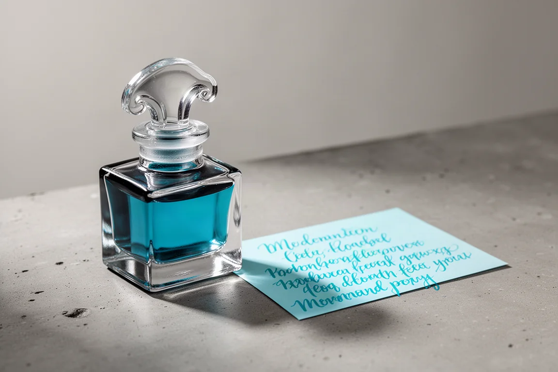
Kon-peki is a vibrant blue that really pops and looks fantastic in a wide range of pens. When a blue pen needs a blue ink, this is the first bottle pulled from the shelf. The proof is in the consumption: this is already the third bottle in use, with a fourth already ordered as backup. Combined with the striking Iroshizuku bottle design, it remains an all-time favorite.
Buying Advice
A few lessons fall out of this list. First, well-behaved inks with personality beat flashy novelty: Diamine’s Communication Breakdown and Ancient Copper show how much character a reliable ink can have. Second, bottle design matters more than you might think: the Iroshizuku bottles and Montblanc’s shoe bottle make daily refilling genuinely pleasant, while shallow bottles like the Stilou make large nibs awkward. Third, if an ink is a limited edition or has spotty availability, like Pen Addict Fire on Fire, do not wait indefinitely.
Most importantly, treat favorites as a starting point, not a shopping list. The inks that become go-tos are the ones you keep reaching for after the novelty wears off. Start with one or two from this list, live with them in a few different pens, and see which ones earn a permanent place in your own rotation.
Conclusion
From the blue-to-green transformation of Taccia Sabimidori to the enduring vibrancy of Pilot Iroshizuku Kon-peki, these ten inks represent the kind of bottles that survive every changing phase of an ink journey. Some are beloved for their color, some for their behavior on paper, and one or two simply for the bottle they come in. Any of them would make a worthwhile addition to a collection, and any of them might just become your next go-to.
Further reading
Related Reviews
Fountain Pen Inks
Six Fountain Pen Day Ink Picks Worth a Second Look
From a true sepia to a soft Delft blue, these six inks cover browns, greens, oranges, and blues with shading worth watching.
Fountain Pen Inks
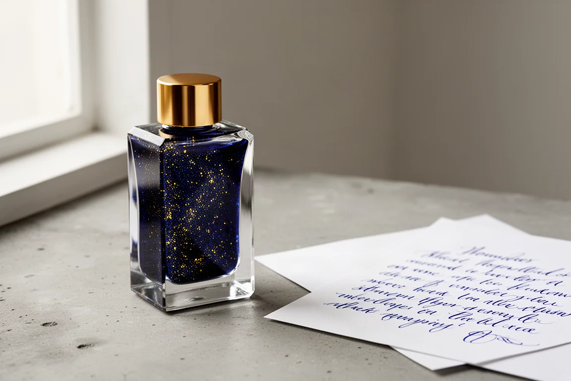
Pelikan Edelstein Golden Lapis Review: A Deep Blue Ink Loaded With Golden Shimmer
Pelikan's 2024 Ink of the Year delivers a true medium blue with an enormous amount of gold shimmer, with a few practical trade-offs to weigh before buying.
Fountain Pen Inks
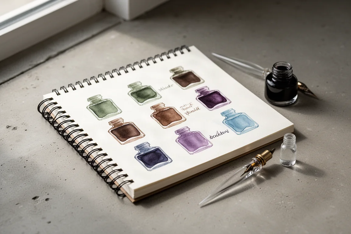
Kittywink Pot Ink Samples: 23 Shades Swatched and Reviewed
A full first look at 23 Kittywink Pot fountain pen inks, from muted greens and smoky browns to dual-shading purples, swatched and compared on paper.