Fountain Pen Inks
The Three-Ink Collection: Black, Blue, and Red Essentials for Fountain Pen Lovers
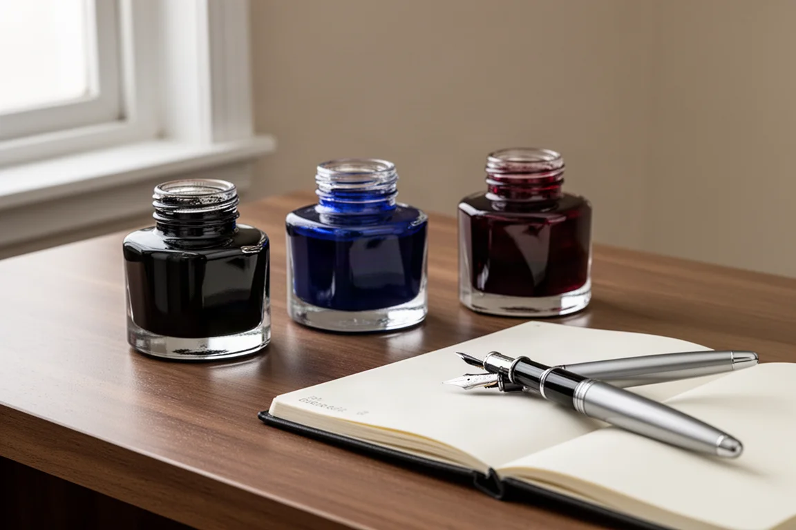
If you could only keep three fountain pen inks, which would they be? A practical look at one classic black, one standout blue, and one grounded red worth considering.
Introduction
Owning more than a hundred bottles of ink sounds wonderful until you try to categorize, store, and actually use them. There is a case to be made for going the other way: stripping the shelf down to a small set of inks you genuinely love and reach for again and again. For many writers, the more a favorite ink is used, the more it becomes a signature shade, and the harder it becomes to justify the rest.
That exercise leads to an interesting question: if you had to limit yourself to three inks, which three would survive? The most defensible answer is black, blue, and red. Black is the most widely used ink color, blue is the daily workhorse and the color of signatures, and red covers everything passionate and expressive. Greens, browns, and dozens of other shades would have to go, but these three cover nearly every writing need.
Why a Three-Ink Collection Makes Sense
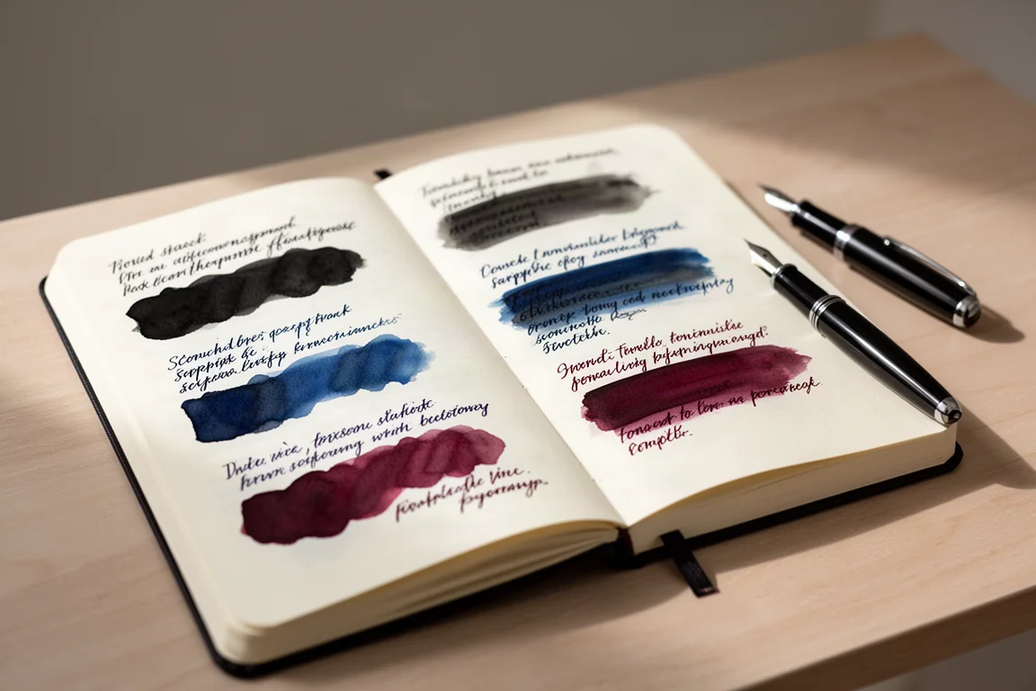
A useful way to judge inks is to swatch each new bottle in an ink library, writing a short paragraph in the color so you can see its full expression: tonality, shading, and shimmer if it has any. Over time, you notice which inks keep migrating into more and more pens. Those are the keepers.
A three-ink collection also forces honest decisions. Do you need waterproofness for documents and signatures? Do you want shimmer, or would you rather have consistency and flow? Restricting yourself to three makes those trade-offs explicit, and it reveals which colors truly express how you write. For this exercise, one ink per color wins: a black, a blue, and a red.
The Essential Black: J. Herbin Perle Noire
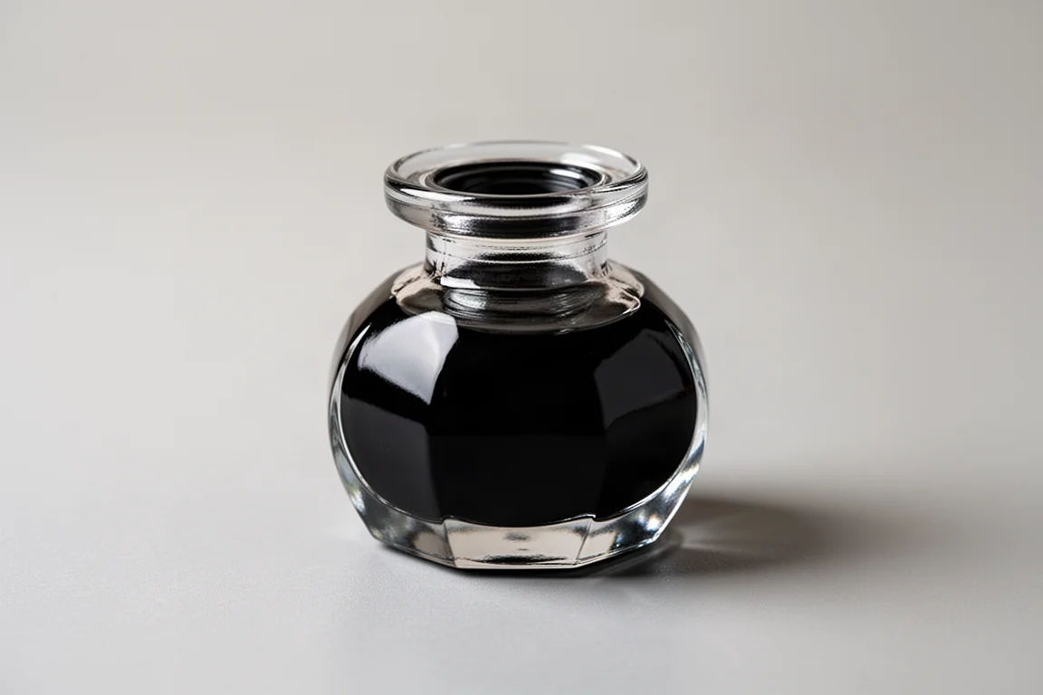
Black is the most numerous ink color there is, and yet one of the most rewarding through a fountain pen. Even a common color comes to life as the nib lays down little streaks that glisten glossy wet and stretch into elegant shapes across the page. The darkest blacks suit a refined, commanding line best, though it is worth noting that no black ink examined stays truly glossy and shiny once it dries.
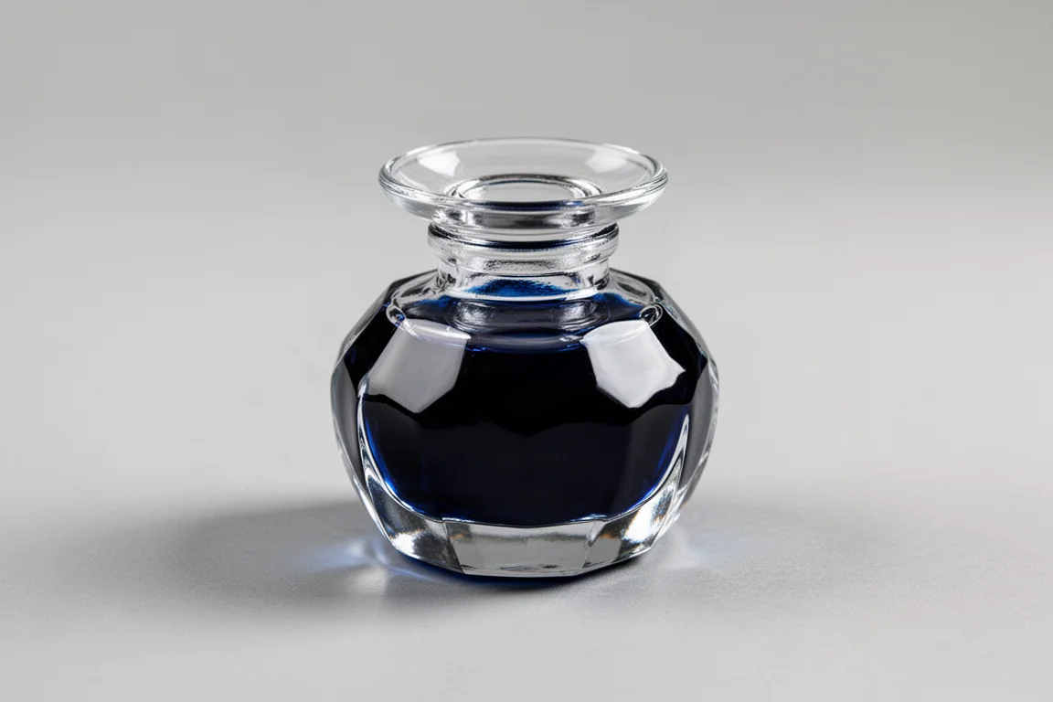
Among the many blacks available, J. Herbin Perle Noire stands out. The French brand’s classic bottles are a pleasure to use, with a pen holder built into the bottle shape that makes filling easy. Most importantly, the ink itself is smooth, wet, free-flowing, and brilliant on the page. It behaves beautifully in nearly every pen, and in more elegant pens it brings out a commanding, simple, refined line that never grows tiring.
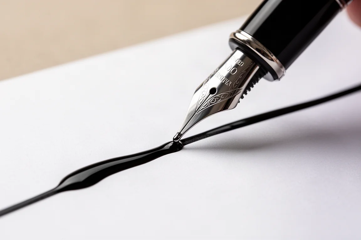
An elegant, classic black for everyday writing and formal documents alike.
The Essential Blue: J. Herbin Eclat de Saphir
Blue deserves its place as the second essential color. It is the natural choice for correspondence, and it also delivers practical contrast: against a black printed background on legal documents or forms, blue ink makes your writing lift right off the page.
One consideration comes up here. A waterproof blue would protect signatures from being washed away, and if document security matters to you, it may be worth balancing out one of your three slots with a water-fast option. For pure writing pleasure, though, J. Herbin Eclat de Saphir is hard to beat. It is a saturated sapphire blue that leaps off the page without ever feeling strange or off-tone: a jeweled, brilliant blue that makes writing look sophisticated, perhaps a touch soft and warm, and perfectly suited to correspondence.

Few blue inks are as consistently beautiful, wet, and flowing. If a signature ink were needed, this would be a strong candidate.
The Essential Red: Diamine Oxblood
Red inks span an enormous range, from pinks and purples to burgundies and brownish reds. The lighter end of that spectrum can look like correction red, the kind that covered school papers, which is why a grounded, dark-shading red is the better choice for anyone who wants presence rather than markup.
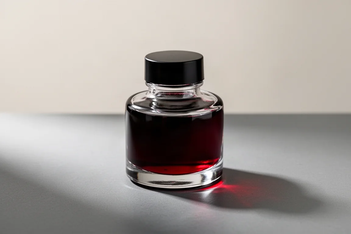
Diamine Oxblood is that grounded red. It carries rich reddish tones with beautiful shading that gives it real presence on the page, and it looks magnificent in journals. There is a vintage quality to it, something almost elemental: red is the color of blood, fire, and passion. Through flex and wider nibs the ink shows its full character as words are drawn across the page. It reads as a deep, leathery burgundy, brilliant for correspondence, journaling, and anywhere a bit of distinction is welcome. Other well-regarded dark reds exist, but Oxblood is the one writers keep returning to.
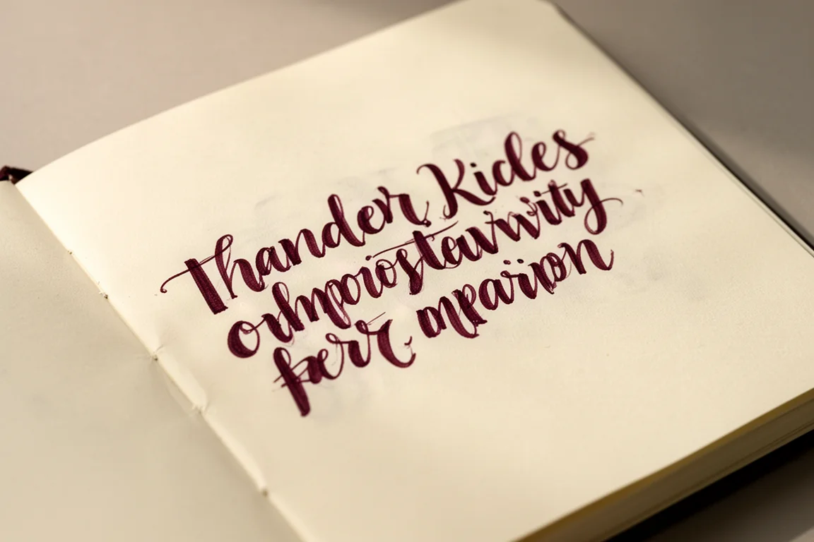
A deep, characterful red that brings distinction to everyday writing.
Buying Advice
Choosing only three inks is not easy, and it becomes harder the moment you weigh factors like waterproofness or shimmer. Still, the exercise is valuable: it shows which inks you truly love and which ones express who you are in your writing. Black, blue, and red is the most practical foundation. If any slot is negotiable, consider whether a waterproof ink should replace a color you use less often, since signatures and formal documents are where ink choice has real consequences.
Conclusion
A curated three-ink shelf can do almost everything a hundred-bottle collection does, with far less fuss. J. Herbin Perle Noire delivers an elegant, classic black; Eclat de Saphir provides a saturated, sophisticated blue; and Diamine Oxblood supplies a grounded, passionate red with beautiful shading. Together they cover daily writing, correspondence, formal documents, and expressive journaling, and each one is the kind of ink that earns a permanent place in your pens.
Further reading
Related Reviews
Fountain Pen Inks
Six Fountain Pen Day Ink Picks Worth a Second Look
From a true sepia to a soft Delft blue, these six inks cover browns, greens, oranges, and blues with shading worth watching.
Fountain Pen Inks
Pelikan Edelstein Golden Lapis Review: A Deep Blue Ink Loaded With Golden Shimmer
Pelikan's 2024 Ink of the Year delivers a true medium blue with an enormous amount of gold shimmer, with a few practical trade-offs to weigh before buying.
Fountain Pen Inks
Kittywink Pot Ink Samples: 23 Shades Swatched and Reviewed
A full first look at 23 Kittywink Pot fountain pen inks, from muted greens and smoky browns to dual-shading purples, swatched and compared on paper.