Fountain Pen Inks
Fountain Pen Ink Swatch Haul: First Impressions of 29 New Inks
A first-look swatch session covering Diamine, Sailor, Pilot, Wearingeul, Jacques Herbin, and De Atramentis inks, with honest impressions of shades, sheens, and shimmer.
Introduction
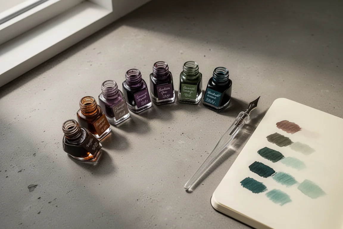
Every now and then a stationery haul deserves a proper swatch session, and this one earned it. This roundup covers a fresh batch of fountain pen ink samples spanning Diamine, Sailor, Pilot, Wearingeul, Jacques Herbin, and De Atramentis. All of them are completely new colors, with a clear lean toward warm autumnal tones, muted desaturated shades, and inks with interesting sheening or dual-shading behavior.
Everything below reflects first impressions from swatches and writing samples on smooth Tomoe River-style notebook paper, plus a few comparison notes now that everything has fully dried.
How the Swatches Were Made
Each ink got two treatments: a large swatch laid down with the blunt end of a glass dip pen, and a writing sample from a medium-nib dip pen. The larger swatch reveals sheen, shimmer, and color shifts better, while the writing sample shows how the ink actually behaves where it matters most, in text.
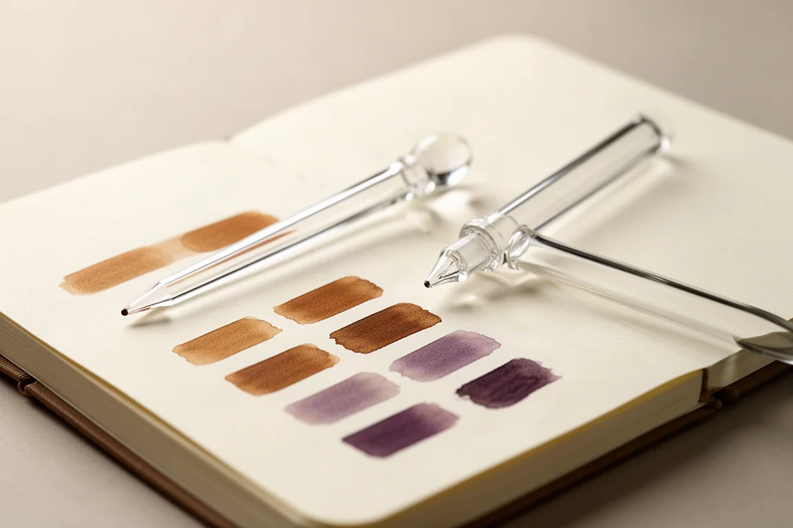
One practical takeaway for anyone swatching at home: sheening inks showed their character well on smooth, coated papers like this one, and the sheen on some shades was far more pronounced in the larger swatch than in the writing.
Diamine Standouts
The Diamine samples formed the first group, and the warm brown and terracotta shades immediately set the tone for the whole haul.
Diamine Seia
Diamine Seia is a warm, orangey brown that lands squarely in the cozy autumnal category. There is no shimmer, but the color looks like it should shade nicely, and it dried down just as rich as it went on. For anyone whose collection lacks a warm everyday brown, this one is an easy pick.
Diamine Ancient Copper
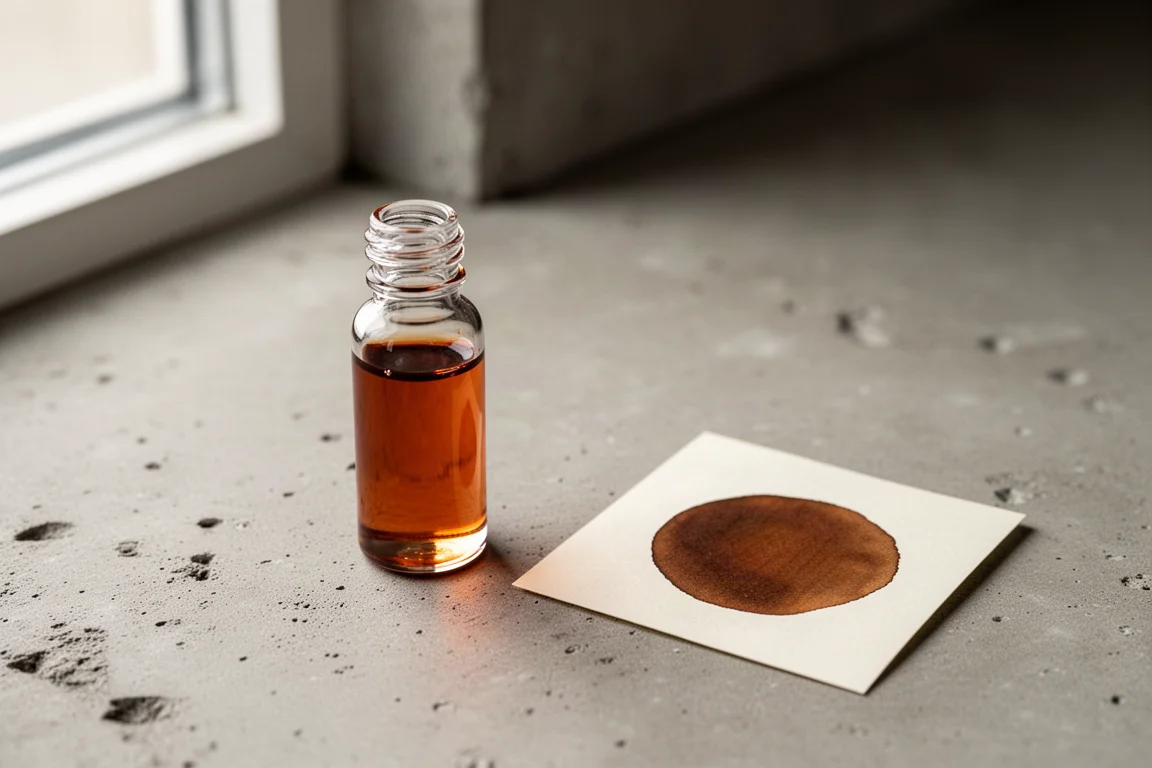
Ancient Copper reads redder on application, but as it dries the brown and a hint of orange peek through, making it deeper and more layered than the first impression suggests. Compared side by side, Ancient Copper leans red and slightly deeper while Terracotta leans more orange and appears a touch lighter, so the two are different enough to justify owning both.
Diamine Sleigh Ride
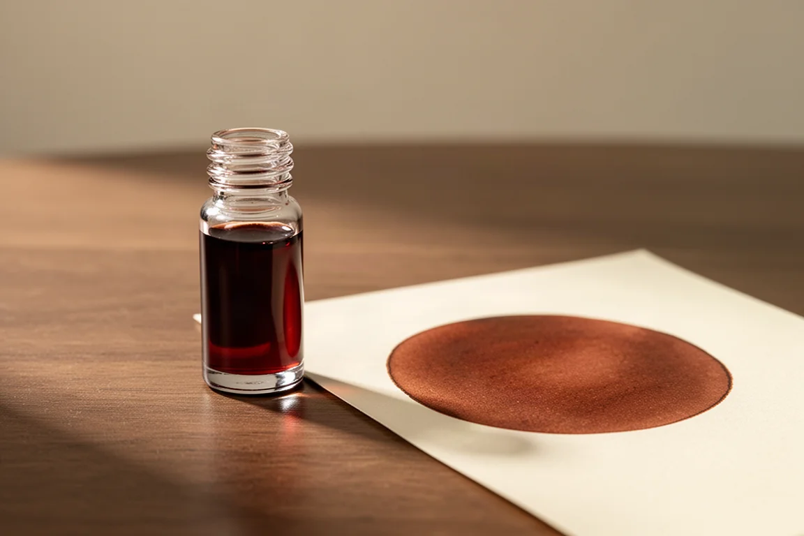
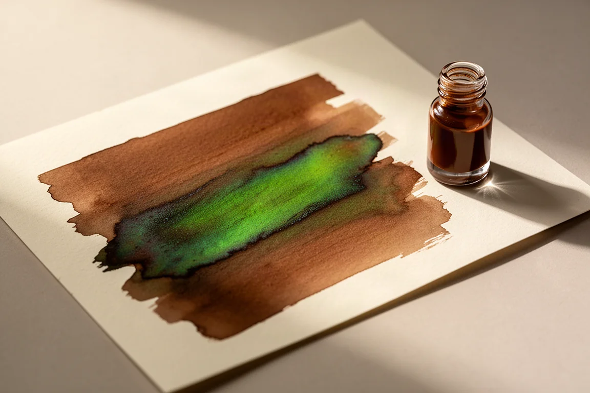
Sleigh Ride, believed to be from a previous Inkvent calendar, was the surprise of the group. On the page it looks almost foiled, shifting from a warm brown at some angles to a vibrant green under direct light, with a strong sheen coming through in the writing sample as well.
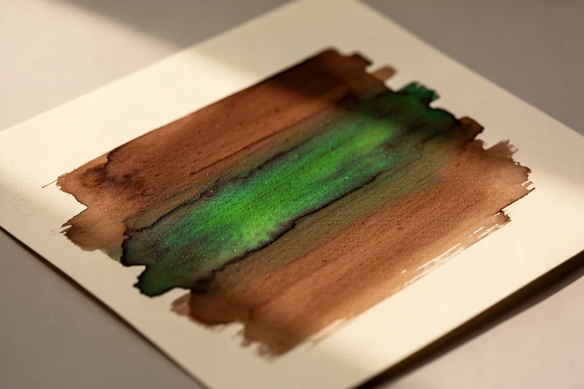
This is a high-sheening ink, plain and simple. If a visible sheen in writing is not your thing, it is one to skip. If you want an ink that adds dimension to journaling, it is genuinely fun to use.
Diamine Forever Smoky Mauve
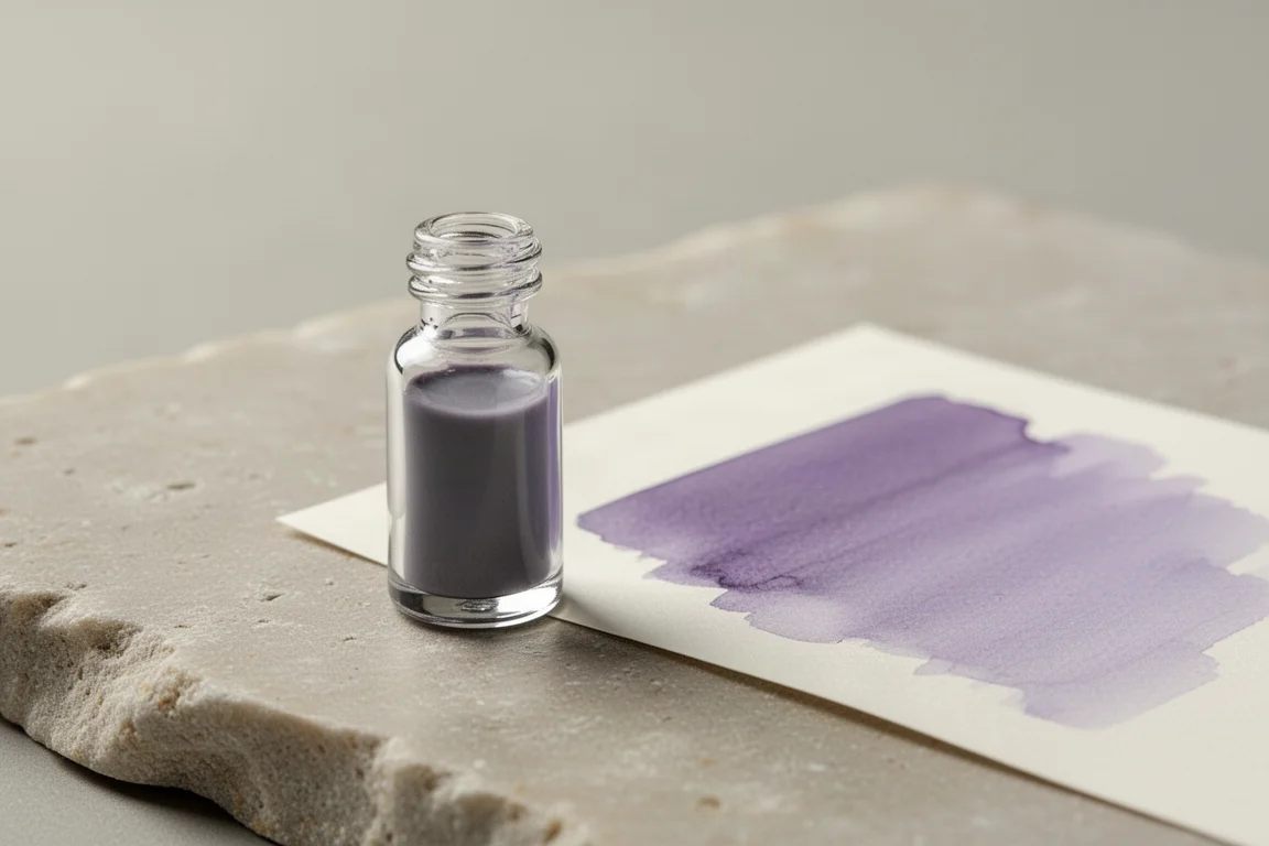
The Forever line is Diamine’s newer formula, described as water resistant and slower to dry out in a pen, so a capped-pen lapse is more forgiving. Smoky Mauve itself is a gorgeous muted, grayed-out pale purple with a translucent, subdued quality. It was reminiscent of a certain literary gray-purple shade from another brand, which says a lot about how well executed the tone is. Red Ochre from the same line also earned praise as a beautiful muted red.
Sailor Inks: Soft Shades and Shifting Colors
The Sailor group was the softest page of the haul, full of pale, nature-inspired shades that reward a second look as they dry.
Sailor Ink Studio 273
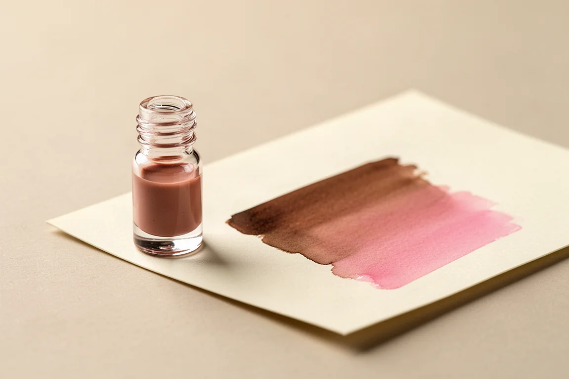
Ink Studio 273 applies like a soft brown and dries toward a rosy pink, a two-stage shift that makes it feel like two inks in one. It is light but still legible, and it makes an excellent stand-in for popular brown-to-pink shifting shades that are harder to find. Shikiori Hana Kanmari sits close by, applying similarly but drying to a warmer, peachier pink, so there is variation between the two.
Sailor Manyo Curry
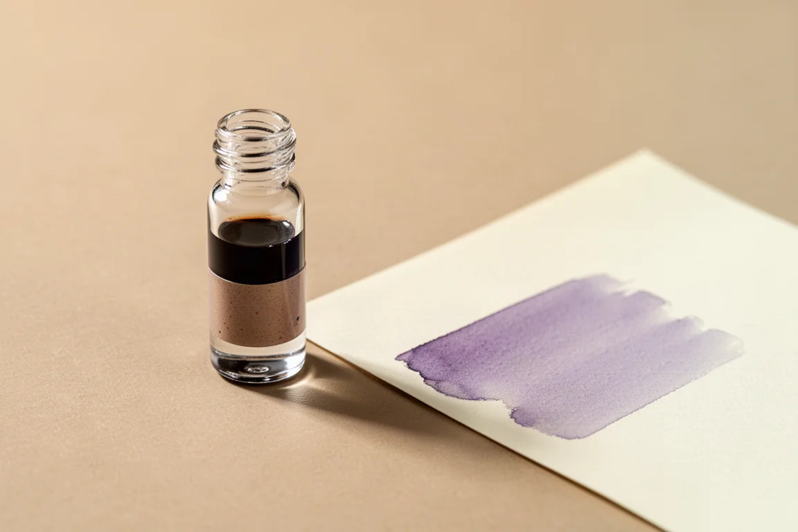
Manyo Curry goes down as a cooler, lighter brown than expected, but the drying stage is where it earns its spot: a soft lavender-purple tone surfaces as the ink settles. That dual-shading effect is exactly what makes the Manyo line interesting, and it is far more visible in a concentrated swatch than in writing.
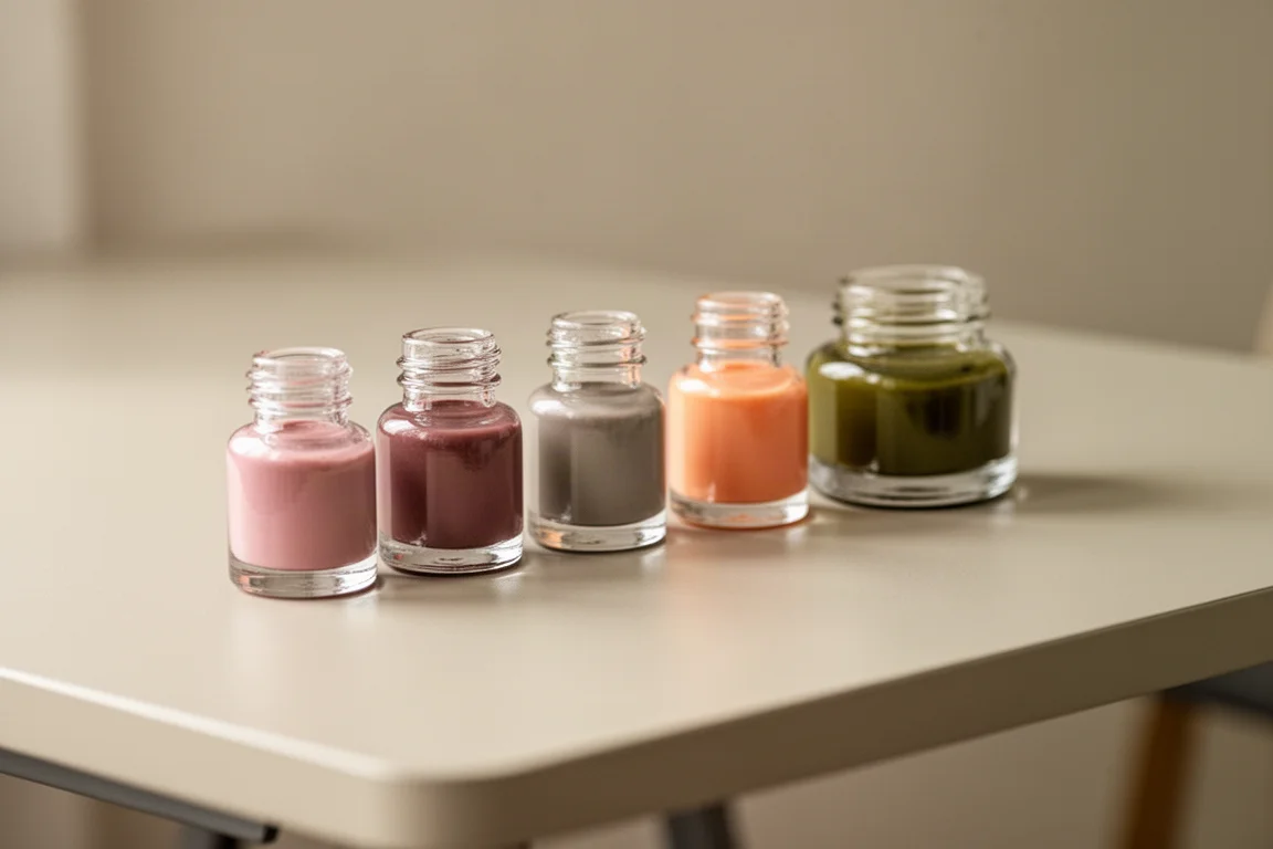
Manyo Khaki also deserves a mention from the same line: it looked more orange than the brown on the product page suggested, landing as a soft sherbet-orange pastel. Not love at first sight, but a refreshing option for spring. Manyo Isuki, meanwhile, is a delicate, romantic berry-pink-purple, and Yurameku Mamoy turned out to be the shapeshifter of the entire haul, shifting from brownish green to peachy pink to bright emerald as it dried. Shikiori Chu is a moody blue-violet that looks nearly black in writing, which may bore some users, while Tokiwa Matsu surprised by drying to an olive yellow-green instead of the cooler emerald it appears in the vial. Ink Studio 462 is a quiet turquoise with a faint purple sheen, and Yurameku Suki Go Coral went down dark teal then lightened to a grayish green with occasional red sheen.
Wearingeul, Jacques Herbin, and the Rest of the Haul
The final group mixed literary-inspired inks, shimmer blues, and a pair of classic greens.
Wearingeul Nightingale and the Rose
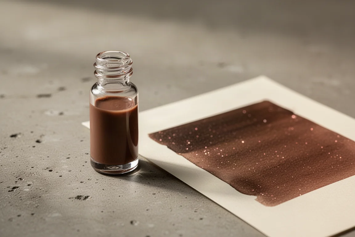
Nightingale and the Rose is a soft mid-tone neutral brown with rose gold shimmer, a glitter color that feels genuinely unusual. The shimmer emerges gradually as the ink dries rather than announcing itself immediately, which keeps it elegant. From the Earth to the Moon from the same brand is a muted navy, Payne’s-gray-adjacent shade with a soft blue-green glitter, and Sorrows of Young Werther is a dusty grayish tone with no shimmer. Compared to Diamine Celadon Cat, Werther is dustier and grayer, while Celadon Cat is more saturated and turquoise, so the two coexist fine.
Jacques Herbin 1670 Opal Nocturn
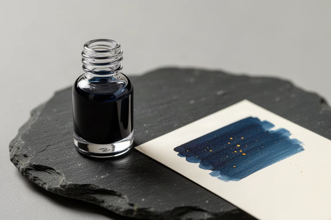
Opal Nocturn, a recent release from the 1670 collection, is a deep dusty blue with gold shimmer and a slightly warmer, deeper character than the other blues in this haul. The shimmer is present without being loud, which suits the muted quality of the ink well.
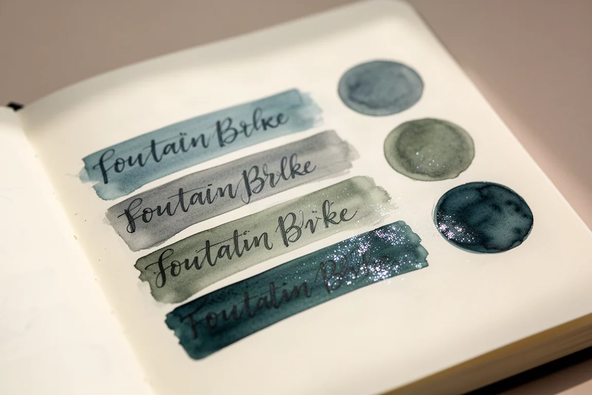
The blues compared favorably as a set: Opal Nocturn is deeper and warmer thanks to its gold shimmer, From the Earth to the Moon sits a shade lighter, and Sorrows of Young Werther leans more green. Herbin Gristoids reads as another dusty blue a shade lighter still, while Herbin 350 Vert Atlantid is a beautiful aquatic turquoise-green with gold shimmer, sitting slightly lighter and greener than Sailor Ink Studio 462. Pilot Iroshizuku Hana Ikata rounds out the softer pinks, though in the swatch it veers toward fluorescent-highlighter pink; the writing sample looks fine, so inking it up may change the verdict. Finally, the two De Atramentis inks are both shimmmer-free greens: Charles Dickens is a deep foresty green leaning slightly blue, and Jane Austen is a shade lighter with more yellow-green in it.
Overall Buying Advice
A few patterns emerged once everything dried. The muted, desaturated, slightly translucent inks consistently stole the show, with the Diamine Forever pair and the Sailor soft shades leading the pack. The sheening inks, Sleigh Ride and Cosmic Glow, are fun but dramatic, best treated as accent inks for journaling rather than daily writers. And for anyone worried about near-duplicate shades, the near-miss comparisons mostly worked out: Seia, Ancient Copper, and Terracotta are distinct enough, and the dusty blues each keep their own identity.
If you are new to ink sampling, this haul is a good template: pick one or two shapeshifters, one high-sheen ink, one shimmer ink in your favorite glitter tone, and fill the rest with muted everyday shades you will actually reach for.
Conclusion
This was a haul of firsts, and very few inks disappointed. The safest crowd-pleasers are the warm Diamine browns, the soft-shifting Sailor inks, and the literary muted shades from Wearingeul and Jacques Herbin. The riskiest buys are the sheening inks and the pastel pinks, which depend heavily on personal taste. Taken together, it is a strong argument that swatching before committing to full bottles is worth every minute.
Further reading
Related Reviews
Fountain Pen Inks
Six Fountain Pen Day Ink Picks Worth a Second Look
From a true sepia to a soft Delft blue, these six inks cover browns, greens, oranges, and blues with shading worth watching.
Fountain Pen Inks
Pelikan Edelstein Golden Lapis Review: A Deep Blue Ink Loaded With Golden Shimmer
Pelikan's 2024 Ink of the Year delivers a true medium blue with an enormous amount of gold shimmer, with a few practical trade-offs to weigh before buying.
Fountain Pen Inks
Kittywink Pot Ink Samples: 23 Shades Swatched and Reviewed
A full first look at 23 Kittywink Pot fountain pen inks, from muted greens and smoky browns to dual-shading purples, swatched and compared on paper.