Fountain Pen Inks
Our Top Five Fountain Pen Inks: Blue, Black, Red, Shimmer, and Sheen Winners
Five inks that earn a permanent spot on the desk: a flawless blue, a high-contrast black, a vintage-style red, a sparkling brown, and a sheen ink that borders on iridescence.
Introduction
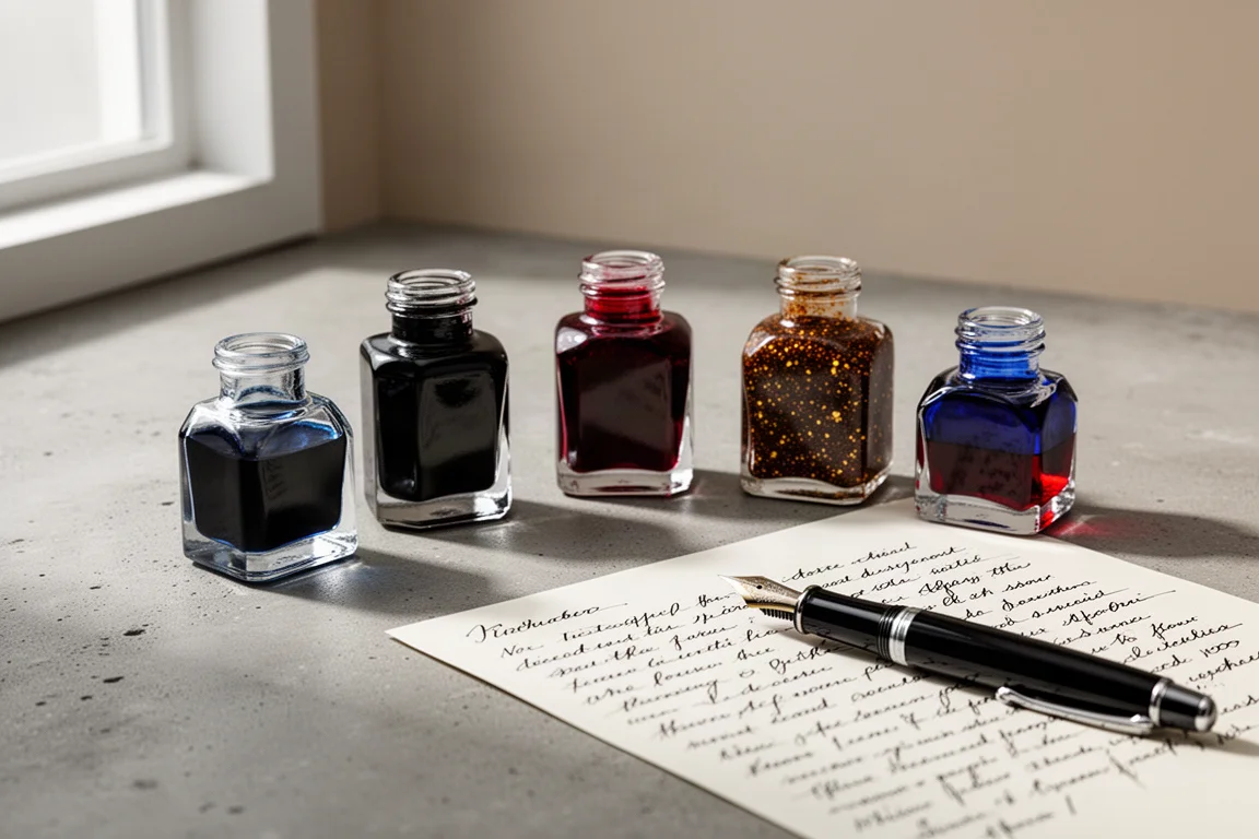
Some inks earn a permanent spot on the desk. These five are the ones that see the most use, each with a very specific job: a go-to blue, a black with real character, a red that avoids the “corrections” look, a shimmer ink for special correspondence, and a sheen ink that genuinely dazzles. Along the way, there are a few honorable mentions that deserve shelf space too.
Best Blue Ink: Pilot Iroshizuku Kon-peki
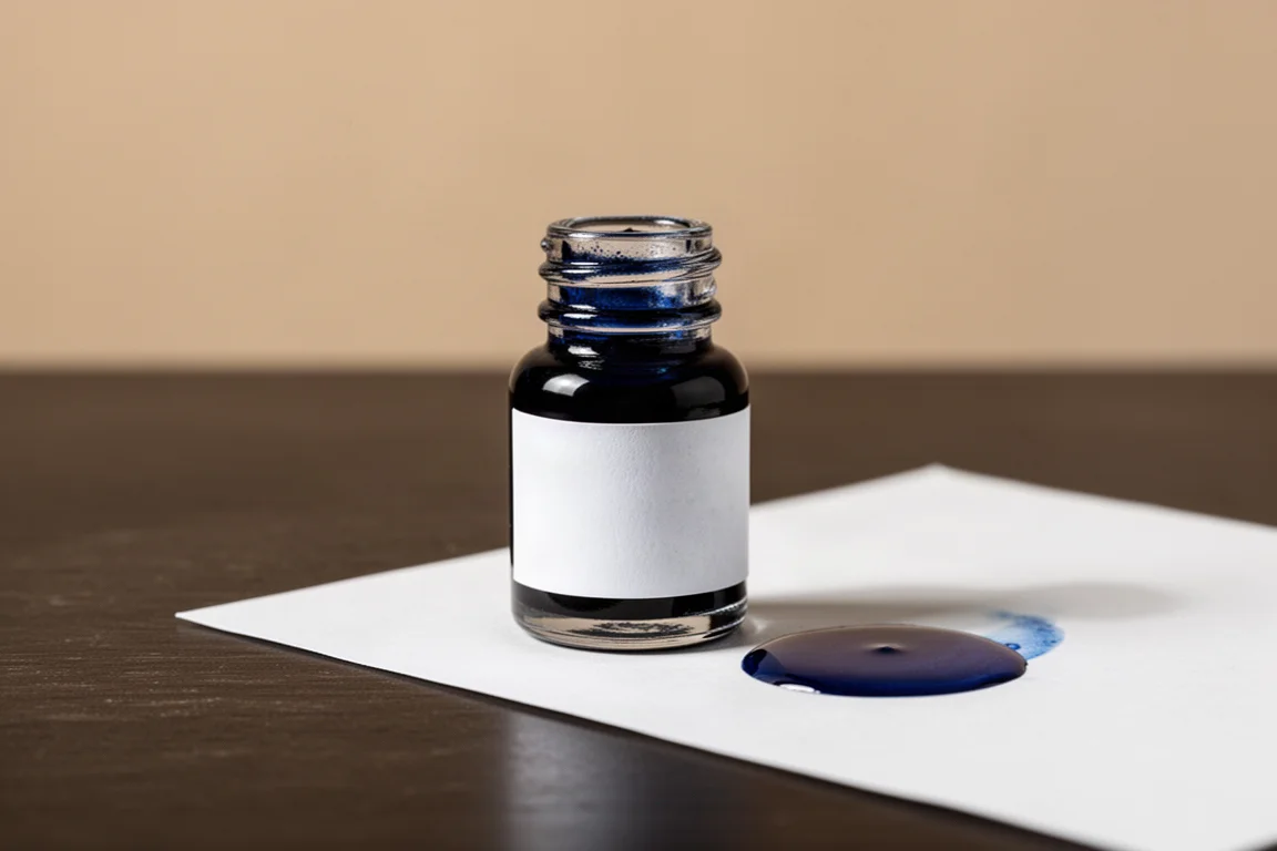
Blue is arguably the superior everyday ink color. Unlike red, pink, or green, it does not draw attention to itself, yet it still differentiates what you wrote from standard black print on forms and printouts. And because it is such a common ink color, the choices are almost endless.
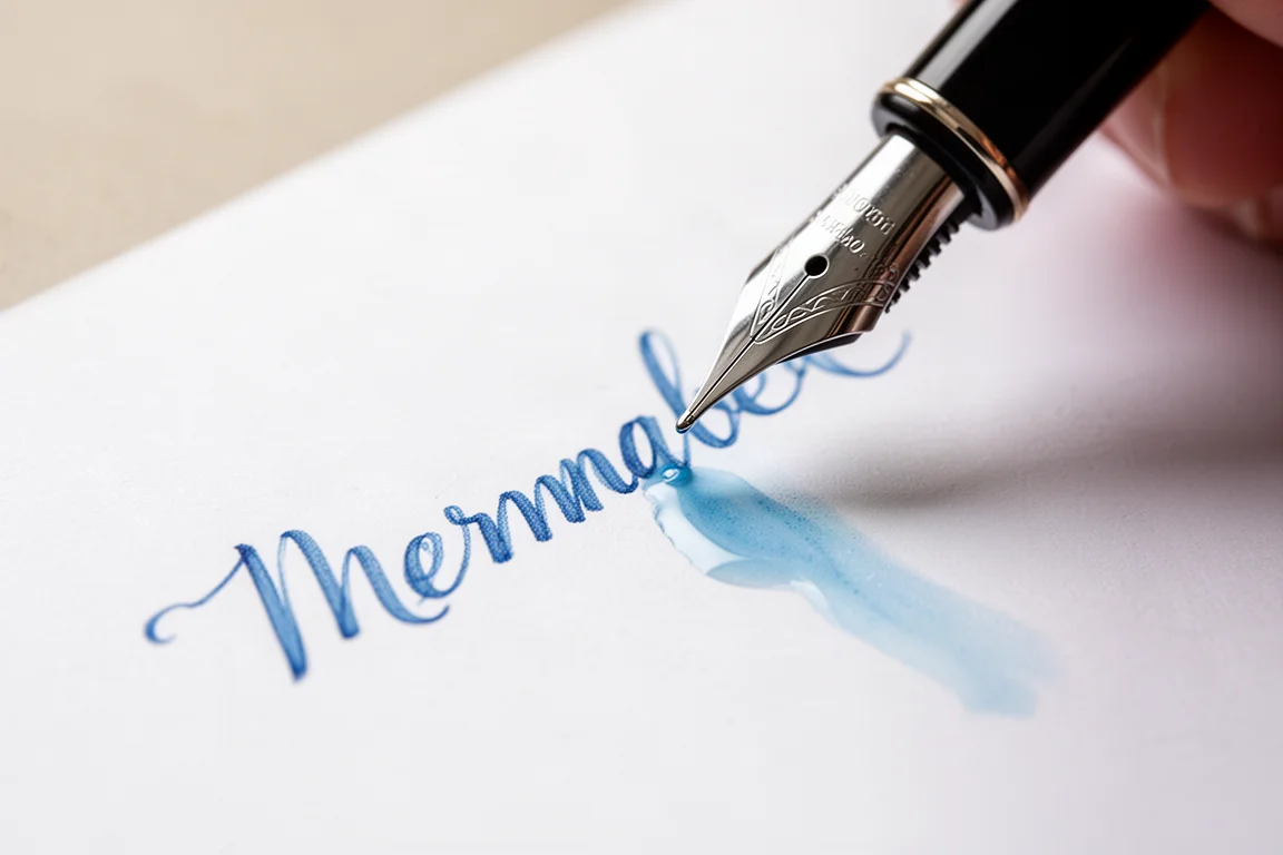
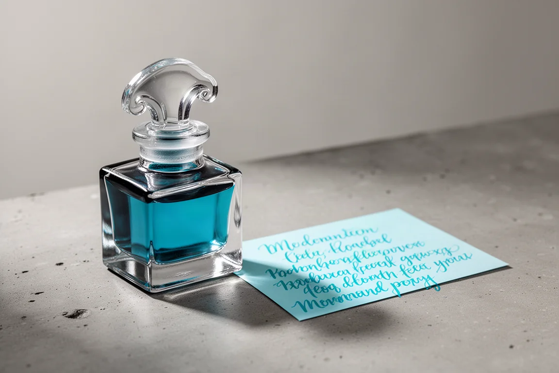
The pick here is Pilot Iroshizuku Kon-peki, an ink that is practically magic. Put it in a pen that is not flowing well and it solves the problem. On the page it delivers a delightful, slightly lighter, brighter blue with just the perfect bit of shading. J. Herbin Clairfontaine Bleu de Sapphire comes remarkably close and gets plenty of use too, but Kon-peki takes the crown.
Best Black Ink: J. Herbin Perle Noire
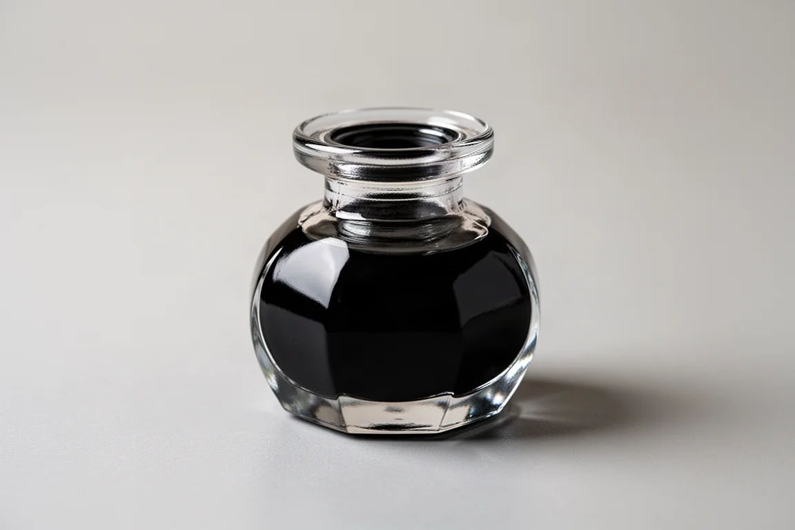
Black ink is the most common ink in the world, and it can be boring, but it does not have to be. After revisiting a range of options, from inks that get a little washed out to stronger competitors, the winner is J. Herbin Perle Noire.
It is a high-contrast black that looks fantastic against a lighter page. The brand behind it is part of the appeal: J. Herbin was founded in 1670, making it one of the oldest ink makers around, and many of its inks are a genuine bargain while remaining beautifully made. Perle Noire is the black ink of choice, though there are still more blacks left to explore.
Best Red Ink: Diamine Oxblood
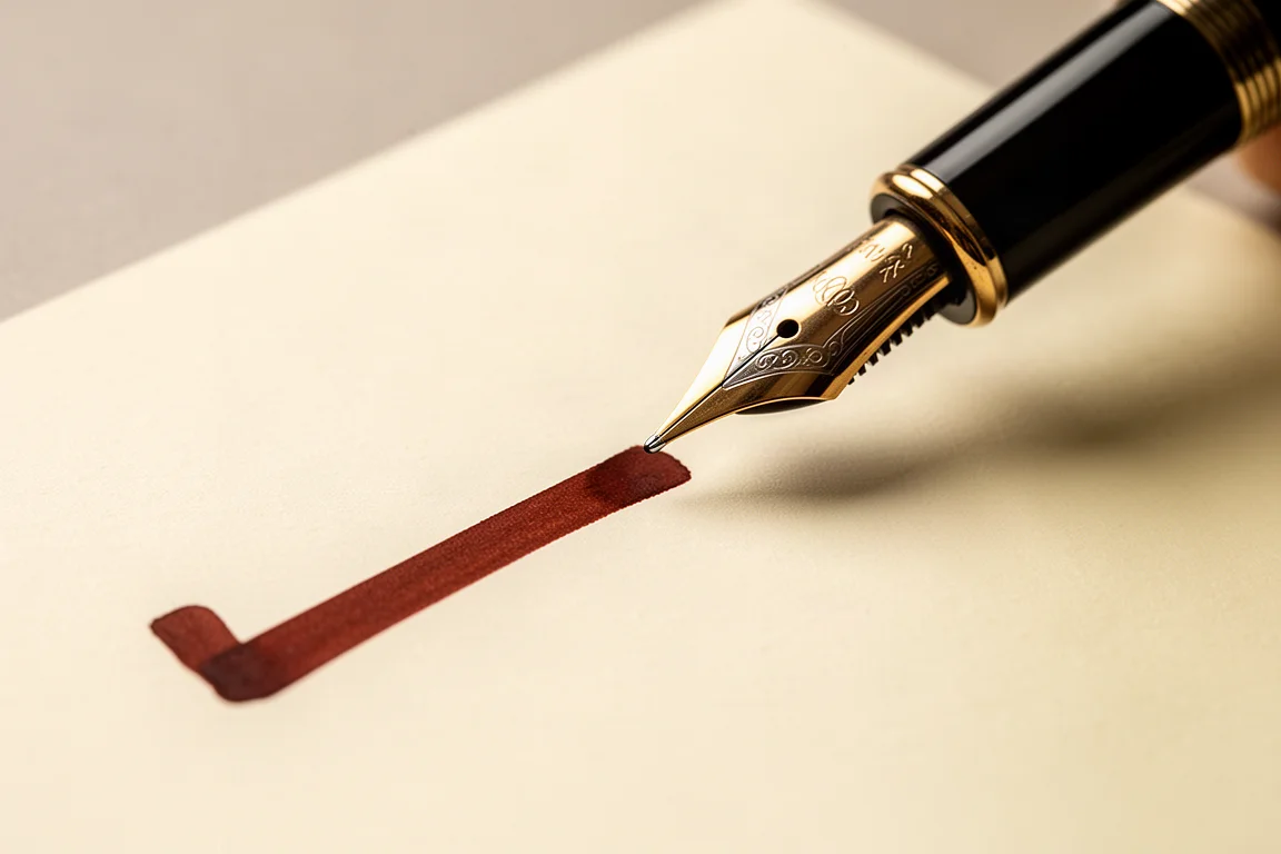
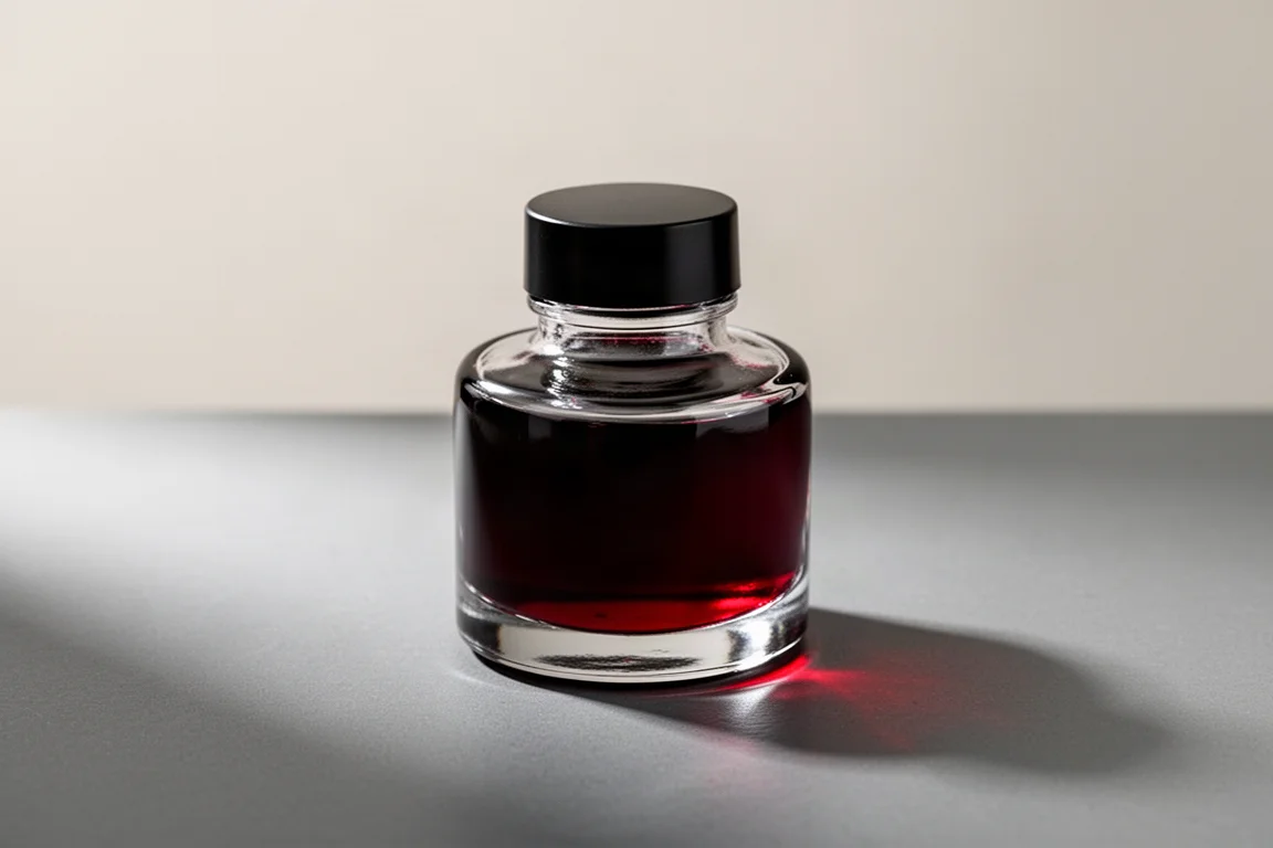
Red runs the gamut from dark brownish shades all the way to the bright correction-pen red from school essays, so the first question is what you want from a red. The goal here was high contrast on brighter paper, strong legibility, and nothing that signals corrective ink. That points to the darker shades, and there are many worth considering, including Diamine’s Dragon’s Blood and Writer’s Blood.
The favorite is Diamine Oxblood. It strikes a perfect balance of light and dark, looks magnificent on the page, and carries a vintage character, almost like ink from a 16th-century manuscript. Pair it with a stub nib and the wide downstrokes carry the ink beautifully and make it pop.
Best Shimmer Ink: J. Herbin 1670 Caroube de Chypre
Shimmer inks need a little care. Once loaded into a pen, the glitter settles to the bottom, so you need to agitate the pen before writing to distribute the shimmer evenly. Forget that step and the nib can end up clogged with a glittery mess. For that reason, shimmer inks belong only in pens that can be fully disassembled and cleaned, which is why twist-fill pens are the natural home for them, ideally with a wider nib to carry more particles onto the paper.
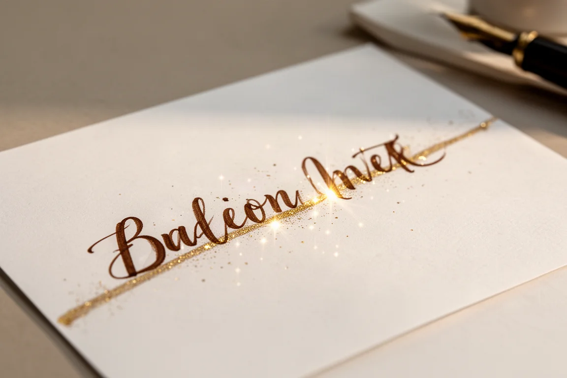
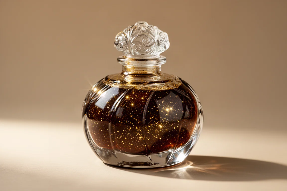
There are many lovely options here, including Colorverse Cat, a beautiful shimmery blue from a brand with charming snail-shaped bottles and consistently interesting colors, and the romantic little genie bottles of Ferris Wheel Press with their glittery gold labels and nut-shaped caps. But the all-time favorite is J. Herbin 1670 Caroube de Chypre, a rich brown ink with gold dust, as if a pixie sprinkled magic into the bottle. It looks fantastic, it dazzles when you sign your name, and it is a guaranteed conversation starter in correspondence.
Best Sheen Ink: Krishna Moon View 2
Sheening inks show a different character when you tilt the page and view the writing from another angle. The effect varies by ink, and it is arguably too flamboyant for business use, though plenty of fun for personal writing. Notable contenders include Van Dieman’s For Whom the Bell Tolls, with an incredible red sheen over greenish-blue tones, and Birmingham’s Tesla Coil, which pairs a blue base with a red sheen that looks great caught in the light.
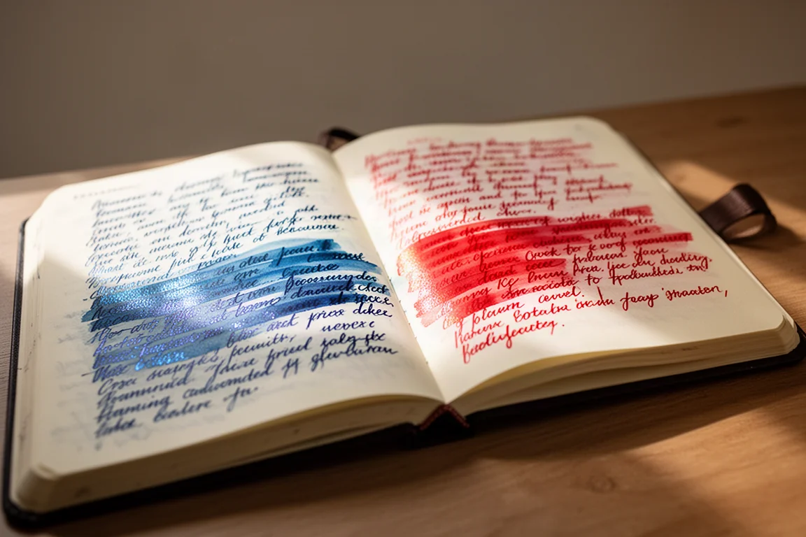
The winner, and the most magnificent sheen encountered so far, is Krishna Moon View 2 from India. “Sheen” almost undersells it; it is closer to iridescence or two-tone. It dries to a consistent red contrasting with a magical metallic blue. It is fantastic for journaling, since long pages reward you with shifting views in different light, and it is unforgettable in letters. Recipients will absolutely notice it.
Honorable Mentions Worth a Look
A few more inks deserve a mention. Diamine Ancient Copper is a great orangey brown that matches so many pens perfectly, including brass pens where copper and brass seem made for each other, and it is excellent in any pen on its own. Pilot Iroshizuku Yama-budo is stunning even for those who normally avoid pinkish inks, leaping off the page and pairing beautifully with a demonstrator-style pen. For green, Diplomat Moss Green offers nice contrast, both bright and dark in the shaded areas, and never gets lost on the page. Its closest rival, Pelikan Golden Bream, is very similar and also excellent, but Diplomat gets the nod.
Buying Advice
Match the ink to the job. Kon-peki is the everyday blue that revives stubborn pens. Perle Noire is the black that makes handwriting look its best. Oxblood brings vintage drama without reading as corrective ink. Caroube de Chypre is the special-occasion shimmer, best kept to pens you can fully clean. Moon View 2 is pure joy for journals and letters. Start with the category you use most, and remember that shimmer inks demand a cleanable pen.
Conclusion
These five inks cover the full range of what fountain pen writing can be, from quietly practical to outright magical. Pick the one that fits how you actually write, and it may well earn a permanent place in your rotation too.
Further reading
Related Reviews
Fountain Pen Inks
Six Fountain Pen Day Ink Picks Worth a Second Look
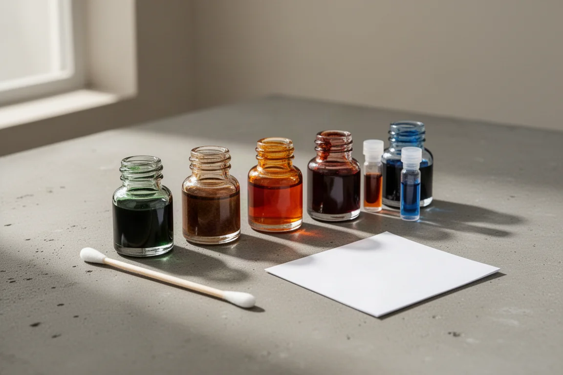
From a true sepia to a soft Delft blue, these six inks cover browns, greens, oranges, and blues with shading worth watching.
Fountain Pen Inks
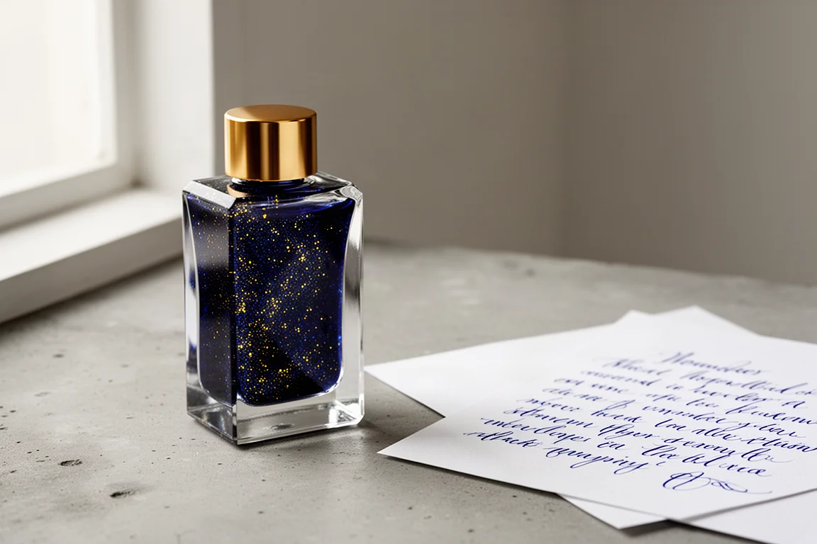
Pelikan Edelstein Golden Lapis Review: A Deep Blue Ink Loaded With Golden Shimmer
Pelikan's 2024 Ink of the Year delivers a true medium blue with an enormous amount of gold shimmer, with a few practical trade-offs to weigh before buying.
Fountain Pen Inks
Kittywink Pot Ink Samples: 23 Shades Swatched and Reviewed
A full first look at 23 Kittywink Pot fountain pen inks, from muted greens and smoky browns to dual-shading purples, swatched and compared on paper.