Fountain Pens
Xezo Maestro Jubilee Classic of the Ocean Review: A Handmade Mother of Pearl Fountain Pen
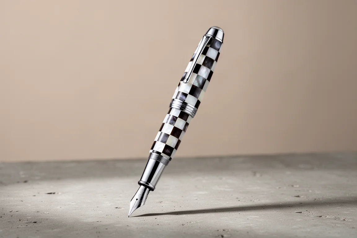
A limited edition fountain pen with hand-cut oceanic white and Tahitian black mother of pearl, chrome plated brass trim, and a stainless steel German nib.
Introduction
Xezo, founded in 2001 and based in Eugene, Oregon, builds watches, eyewear, leather goods, and writing instruments. Parts for its pens are produced in several regions, but assembly happens in the United States. Many of its fountain pens use mother of pearl and abalone, and today’s subject is one of the most interesting examples: the Maestro Jubilee Classic of the Ocean.
This pen celebrates the 20th anniversary of the Maestro all mother of pearl series from 2003, and it is a limited edition of just 223 numbered units. At $225, it sits in a price range where expectations are reasonably high, so this review covers design, materials, handling, and real writing performance.
Unboxing and Packaging
The pen arrives in a box with a sleeve, and the box itself has one of the more unusual designs you will encounter: it opens at the middle, splitting apart like a clamshell. Inside you get a converter, a set of ink cartridges, a polishing cloth, and a warranty card that lists the individual pen number.
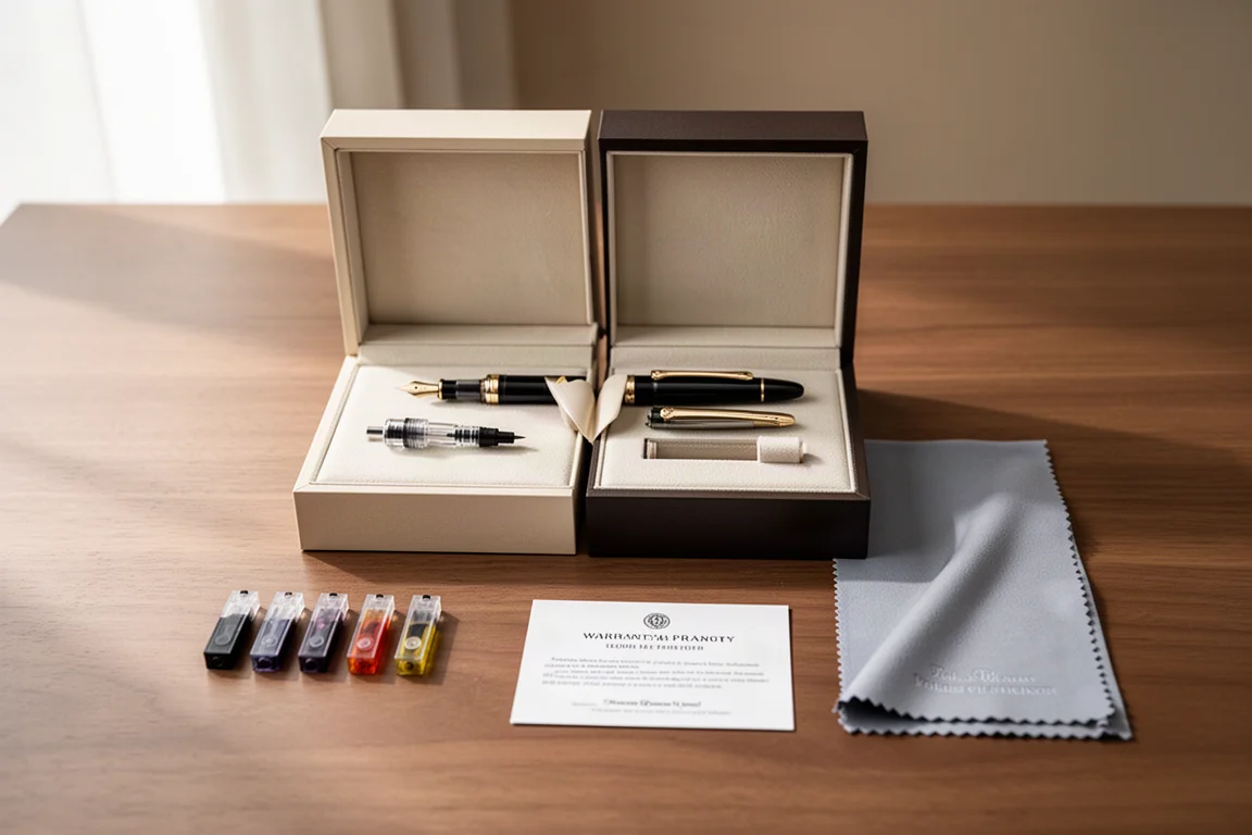
One small quirk worth noting: the product page mentions Montblanc ink cartridges, but the cartridges included in this box were unbranded, so that detail may simply be a listing inconsistency. Either way, the accessories cover the essentials for a cartridge-converter pen.
Materials and Craftsmanship
The defining feature is the barrel. The 240 checkerboard squares are cut from oceanic white mother of pearl and Tahitian black mother of pearl, applied by hand, with chrome plated brass trim. The shell material measures 4.5 on the Mohs scale, about as hard as steel, so it is genuinely durable for a natural material.
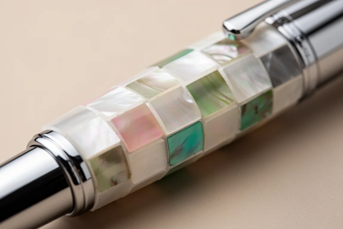
Colors shift across the surface, ranging through whites, pinks, reds, greens, purples, turquoises, blacks, and greys. Every pen is unique in color and texture, and the material really comes to life when you twist the pen under light. The squares are crisp and cleanly applied, and the overall construction feels solid.
The design details are generally tasteful: a black resin finial at the end, a tiered look reminiscent of some classic German pen makers, a cap band with a leaf pattern, and a rounded step down to a straight barrel. The cap twists off in roughly one full rotation, which is convenient.
Nib, Section and Filling
Under the cap sits a stainless steel number six Bock nib branded with the Xezo name, available in fine and medium. It is a two-tone design; a plain silver nib might arguably suit the chrome trim better, but there is nothing wrong with the two-tone finish. The section is chrome plated brass, slightly concave, though it is a touch on the slippery side. A bit more concavity or texture would have improved grip security.
The cap threads are metal but not sharp, and the rounded step up to the barrel is accentuated with a ring, so it never feels uncomfortable even if it lands near your fingers. The pen is a cartridge-converter filler, and both cartridges and converter are included. Given the amount of metal in the barrel, this is not a pen you would want to eyedropper.
Handling, Weight and Posting
Weight varies from roughly 39 to 43 grams depending on the natural material and bonding in each individual pen; this example came in at 42 grams, or about 45 grams with a filled converter. That gives it a solid, substantial feel that is pleasant rather than fatiguing.
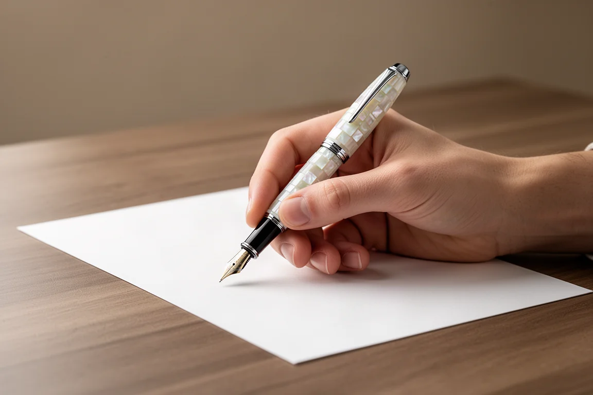
The cap posts with about one rotation of twisting, and despite its weight it does not overbalance the pen when posted. The pen is long enough to use unposted comfortably, and posted it remains fairly well balanced. For extended writing, most people will likely prefer it unposted, but posting remains a viable option.
Writing Sample and Performance
On the company website, the fine and medium versions have separate listings rather than a single product page with a nib selector, so make sure you find the right listing when ordering.
The medium stainless steel Bock nib has noticeable feedback rather than a glossy glassy feel, with medium ink flow. Pushing harder produces a little line variation. Reverse writing is slightly scratchy but produces a crisp extra-fine line, and the feed keeps up well with fast writing.
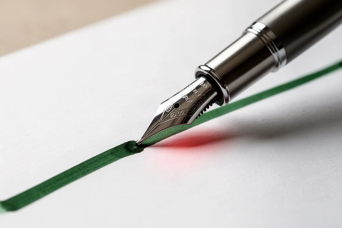
Tested inks included a dense green with a reddish sheen from Guitar (Lady Emerald), which looks similar to Diamine November Rain, plus Endless Alchemy Mystic Forest. The nib handled all of them cleanly.
Buying Advice
At $225 and limited to 223 numbered units, this pen offers something genuinely different from the usual resin or lacquer fare. The hand-cut mother of pearl checkerboard is the entire reason to buy it, and the craftsmanship behind that pattern justifies the price for anyone who values natural materials and one-of-a-kind aesthetics. If you want a smooth, invisible nib above all else, the feedback-heavy nib and slightly slippery section may give you pause, but neither is a dealbreaker.
Conclusion
The Maestro Jubilee Classic of the Ocean is an intriguing pen with a truly unique look. Between the durable mother of pearl mosaic, the solid brass build, the quick twist-off cap, and a serviceable stainless steel Bock nib, it delivers a distinctive writing experience well worth checking out.
Product link
View more details for Xezo Maestro Jubilee Classic of the Ocean
This product is mentioned in the review. Check the specifications, options, and compatibility before buying.
View more details for Xezo Maestro Jubilee Classic of the OceanFurther reading
Related Reviews
Fountain Pens
Best Budget Fountain Pens Tested: 9 Pens, One Clear Winner
A hands-on comparison of nine affordable fountain pens for everyday writing, calligraphy, and sketching, with a clear standout for flexible nib fans.
Fountain Pens
Aurora Optima Review: An Italian Piston Filler That Punches Above Its Price
A 14k gold nib, ebonite feed, and a beautifully deep oraloid body make the Aurora Optima one of the most rewarding piston fillers around.
Fountain Pens
Cross Bailey Light Review: The Entry-Level Fountain Pen Worth Keeping at the Office
A plastic-bodied Cross with a metal clip, snap cap, and famously smooth extra fine steel nib. Around $15, available almost everywhere, and easy to recommend.