Fountain Pens
Waterman Carène Review: A Sleek Inlaid-Nib Fountain Pen Worth a Second Look
A close look at the Waterman Carène, from its lacquered brass body and inlaid 18K stub nib to the small filling quirks you should know before buying.
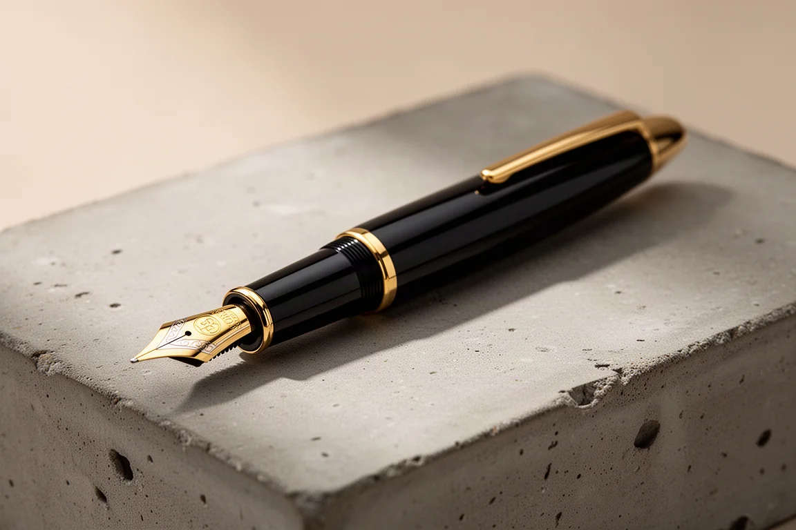
Introduction
The Waterman Carène is a pen that tends to divide people, mainly because of its inlaid nib, and it is exactly that distinctive writing experience that makes it worth a closer look. It sits near the top of Waterman’s range, below the flagships like the Edson and the Sérénité, with pricing in the region of €447 depending on the finish. Inspired by luxury yachts, the Carène “rides on a wave of vibrant inspiration,” according to Waterman’s own marketing, and the sleek nautical design language carries through the whole pen.
This review covers the Marine Amber finish, a deep dark red and black marbled lacquer over a brass barrel, fitted with an 18K gold stub nib. If you have ever been curious about Waterman’s higher-end offerings, here is what makes the Carène special, and a few caveats worth knowing before spending the money.
First Impressions and Design
The Carène arrives in a simple presentation box, consistent with Waterman’s typically understated packaging. Inside you get a starter cartridge and a small instruction booklet covering how to fill the pen. The Waterman long cartridges hold a generous amount of ink, noticeably more than the standard international short cartridges, which is a practical touch.
The pen itself is genuinely sleek. The cap tapers elegantly, the barrel ends in a sculpted finial that serves no function other than visual aesthetics, and the spring-loaded clip features the open slot design Waterman uses across many of its pens, complete with the Waterman logo. The center band and cap front carry the branding, and when you align the cap with the end of the barrel, the pen looks very sharp indeed.
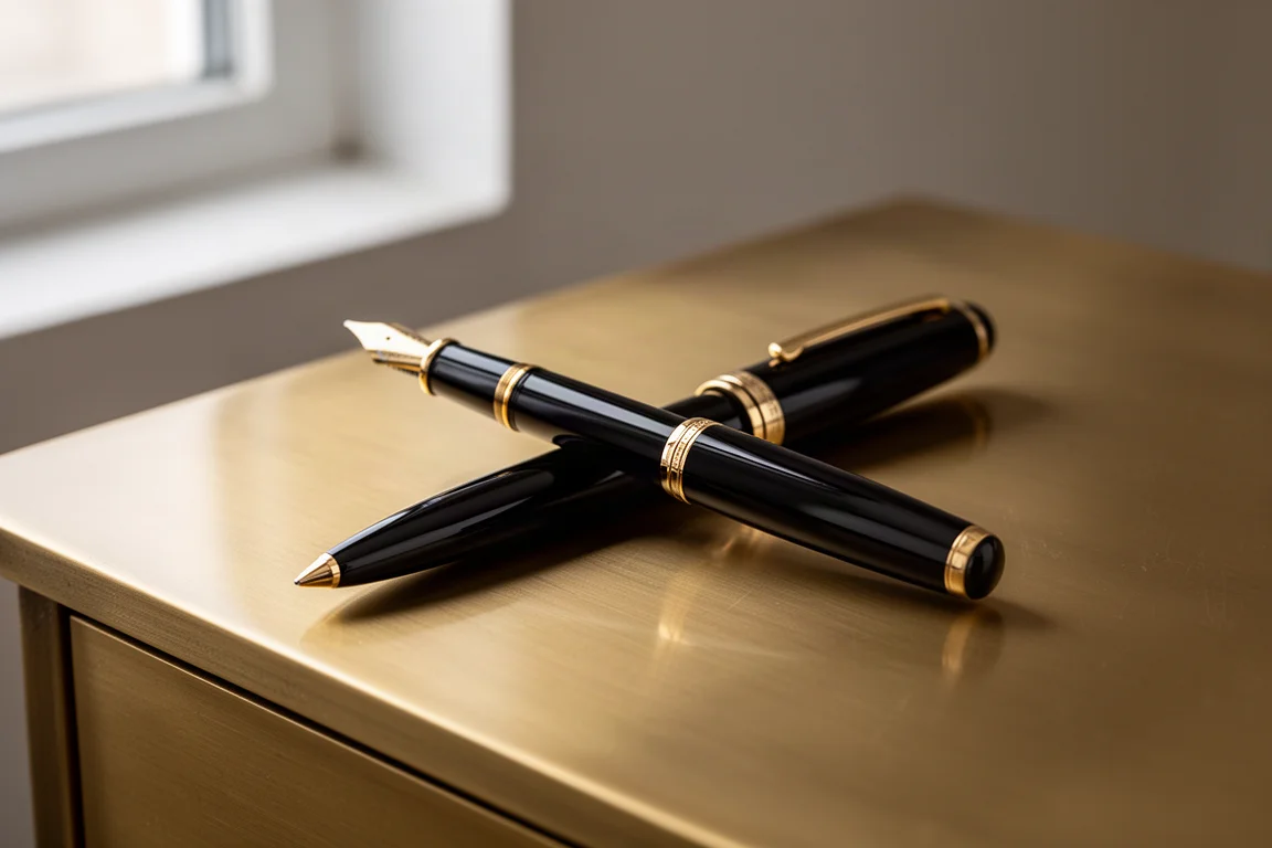
The Marine Amber finish is a standout: a deep, dark red and black marbled pattern under a high-quality lacquer. The brass barrel underneath gives the pen a satisfying solidity. It is not a heavy pen, but it feels well made for its size, neither too light like thin metal nor plasticky. The section is nicely contoured and well proportioned, and the pen posts securely and quite deeply if you prefer writing posted.
The Inlaid 18K Nib
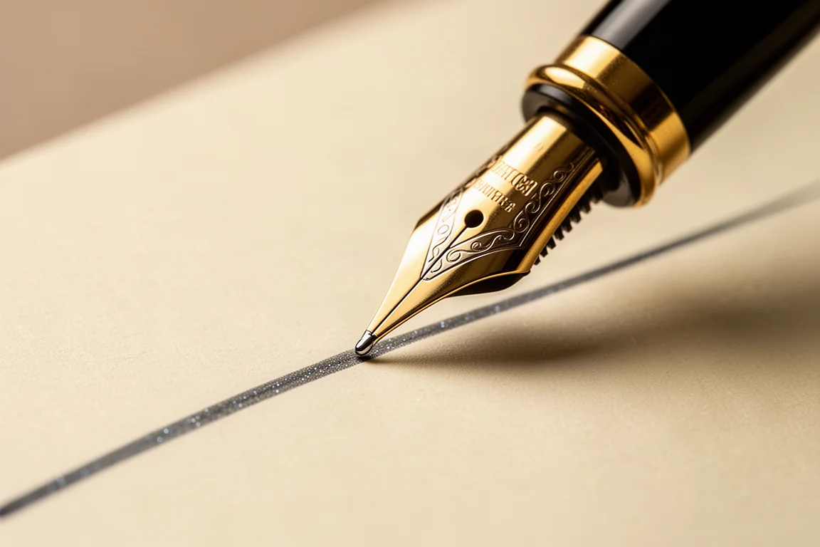
The main event is the inlaid nib. Inlaid nibs are not for everyone, but on this particular model they really work. The 18K gold nib is marked 18K 750 for the gold content, with the Waterman logo and the nib designation visible above the ink hole. Waterman offers the Carène in extra fine, fine, medium, broad, and stub, which is genuinely welcome at a time when many companies have dropped stub options entirely and offer only finer and medium points.
The stub fitted here leans quite far toward an italic, with fairly crisp, sharp edges. That crispness is what produces the lovely line variation, but it also means the nib has a defined sweet spot: it must be aligned properly to the paper or it will skip. Once you learn the correct angle, writing becomes comfortable enough to go faster, and the nib writes quite wet, especially paired with a wet ink.
The Writing Experience
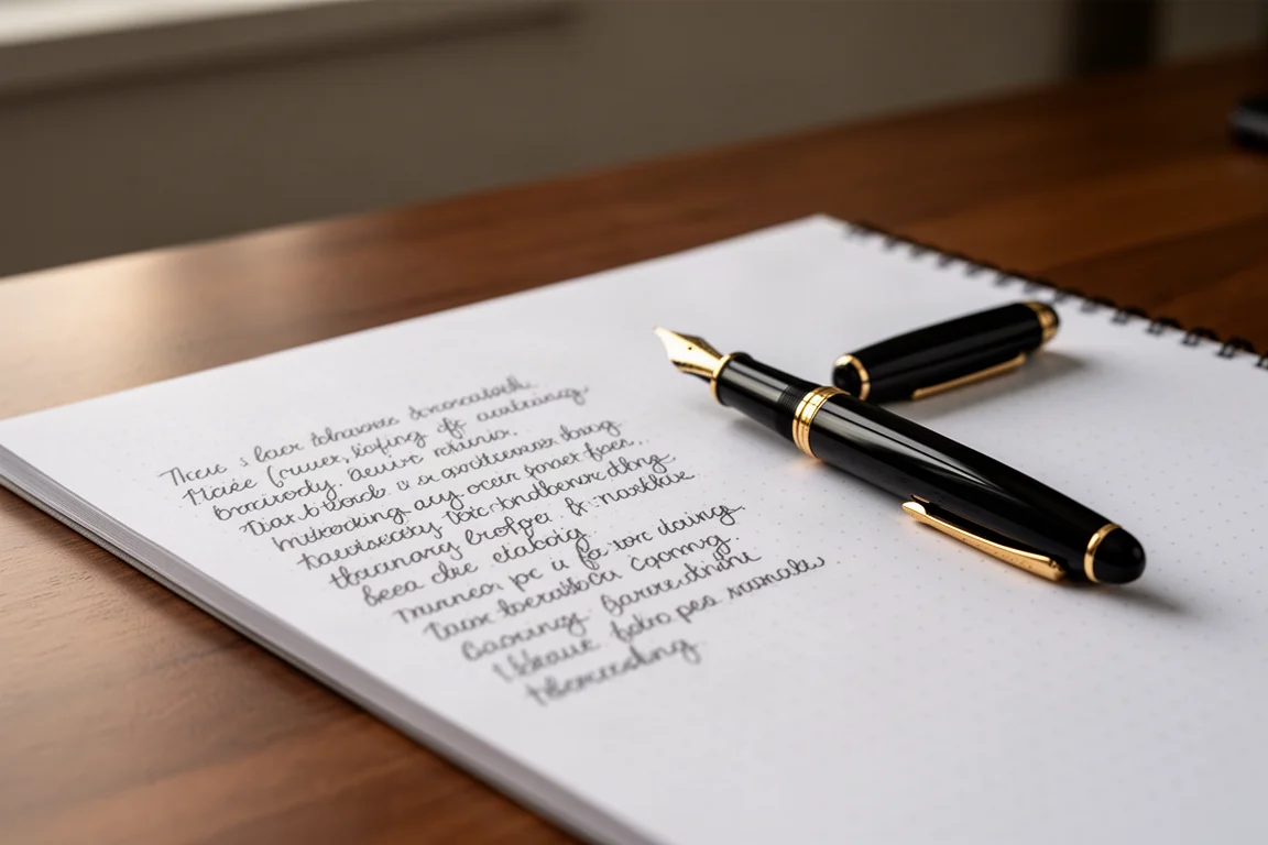
The writing experience is the strongest reason to consider this pen. With a stub nib you get a genuine line variation that adds real panache to your handwriting, and this one is crisp without needing pressure. Tested with a dark ruby red ink, the line was wet, rich, and consistently attractive.
One honest limitation: reverse writing is not great on a stub nib in general, and this one is no exception. Do not buy it with upside-down writing in mind. Also be aware that the alignment requirement takes a little getting used to, but after a short adjustment period it becomes second nature.
Filling and Maintenance
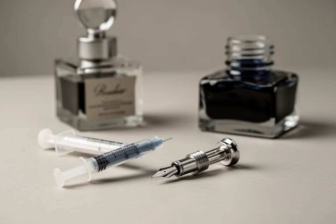
The Carène accepts either Waterman long cartridges or the included converter. There is not much to disassemble: the nib cannot simply be pulled out, so cleaning means repeatedly drawing up ink or water and expelling it through the converter.
A few practical warnings apply if you fill from bottles. This model has been known to leak when overfilled, so a sensible routine is to fill the converter, then expel two or three drops, wipe the section, and write. That approach has proven leak-free. There is one more quirk: unscrewing the barrel can seem to activate the converter knob, allowing a little ink to escape. The advice is simple, only unscrew the barrel when you actually need to refill or check ink levels, and do not fidget with the barrel and threads.
Should You Buy the Waterman Carène?
At €447, with finish prices varying somewhat around that level, the Carène is by no means cheap, though it is positioned below Waterman’s Edson and Sérénité flagships. The case for it is straightforward: a classy, sleek design, a beautiful inlaid nib, an excellent writing experience with real line variation, and a solid, well-balanced feel in the hand. It is a great size that works for a lot of people, and posting the cap helps if you prefer a longer pen.
The counterpoints are the price, the alignment-sensitive stub nib, the minor filling quirks, and the fact that you cannot swap the nib out yourself. None of these are dealbreakers, but they are worth weighing against what you want from a pen in this range.
Conclusion
The Waterman Carène is a distinctive, well-made fountain pen whose inlaid 18K stub nib delivers a genuinely enjoyable writing experience with beautiful line variation. The sleek yacht-inspired design, solid brass construction, and crisp wet writing make it easy to recommend to anyone who values style and character in a pen, provided you are comfortable with the price and the small filling quirks. For those who appreciate a stub nib and a classic silhouette, this is a pen worth every bit of consideration.
Product link
View more details for Waterman Carène
This product is mentioned in the review. Check the specifications, options, and compatibility before buying.
View more details for Waterman CarèneFurther reading
Related Reviews
Fountain Pens
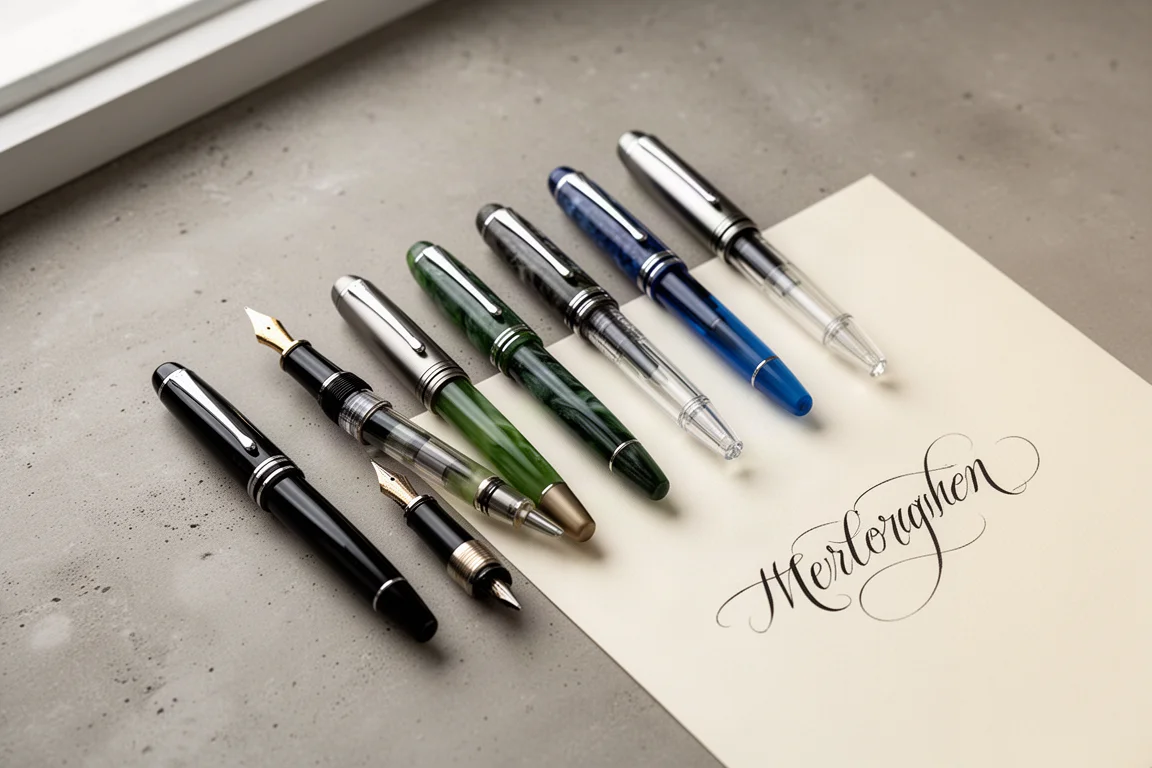
Best Budget Fountain Pens Tested: 9 Pens, One Clear Winner
A hands-on comparison of nine affordable fountain pens for everyday writing, calligraphy, and sketching, with a clear standout for flexible nib fans.
Fountain Pens
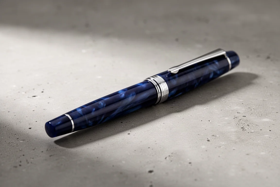
Aurora Optima Review: An Italian Piston Filler That Punches Above Its Price
A 14k gold nib, ebonite feed, and a beautifully deep oraloid body make the Aurora Optima one of the most rewarding piston fillers around.
Fountain Pens
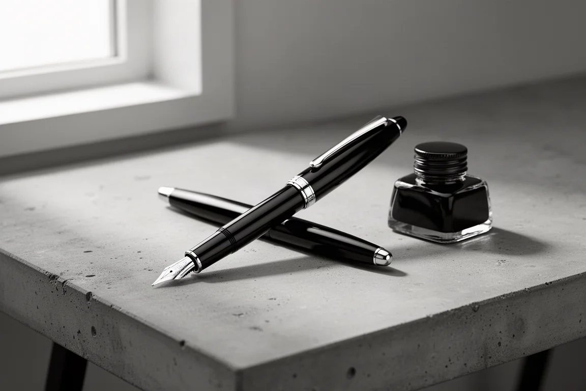
Cross Bailey Light Review: The Entry-Level Fountain Pen Worth Keeping at the Office
A plastic-bodied Cross with a metal clip, snap cap, and famously smooth extra fine steel nib. Around $15, available almost everywhere, and easy to recommend.