Art Supplies
Six Watercolor Colors Worth Trying: M. Graham and Daniel Smith Swatched
A closer look at six watercolor paints from M. Graham and Daniel Smith, plus why a small palette of primaries goes a long way.
Introduction
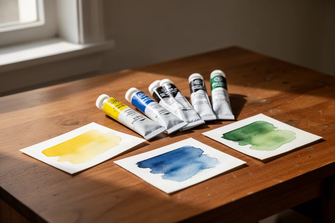
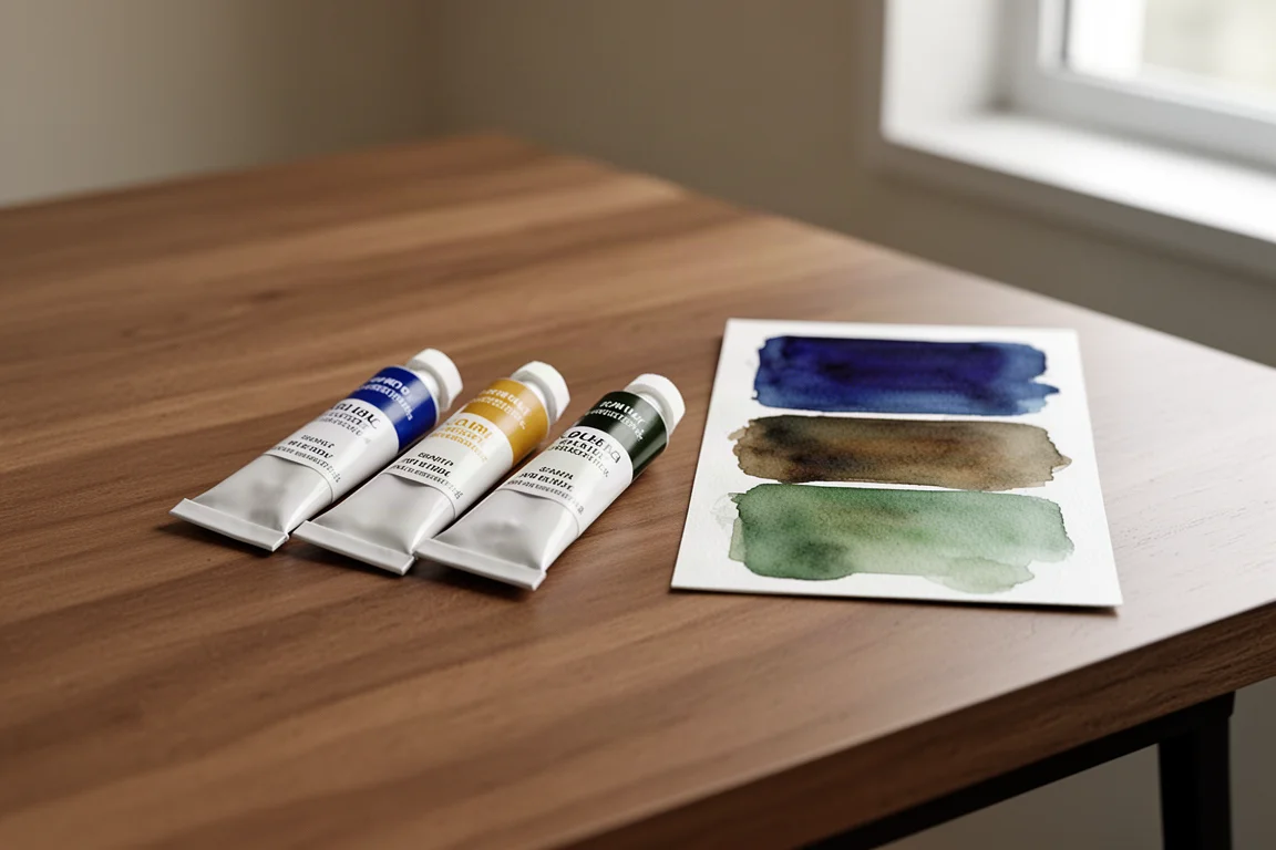
Sometimes the best way to evaluate a paint is simply to swatch it out. That is exactly what happened with a recent trip to a local art store, where six new colors came home: three from M. Graham and three from Daniel Smith. The lineup covers a cadmium yellow, a cerulean blue, an azo green, a phthalo blue, a greenish raw umber, and a terra verde. Here is how they performed on paper and who each one makes sense for.
The M. Graham Colors
The M. Graham trio starts with cadmium yellow, which sits at series five, making it the most expensive of the group. Cadmium pigments are known for their strength, and this one delivers a solid, dependable yellow for the palette.
Next is cerulean blue, described as great for skies, water, or adding coolness to shadows and mixtures. One observation from swatching: it looks almost opaque at first, but once it is washed out with a little more water, its transparency becomes clear. That behavior makes it a flexible sky and shadow color rather than a one-note wash.
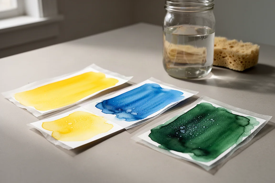
The third M. Graham pick is azo green, a series three paint. It produces a bright, lively green straight from the tube, which is handy for anyone who does not want to mix every green from yellow and blue.
The Daniel Smith Colors
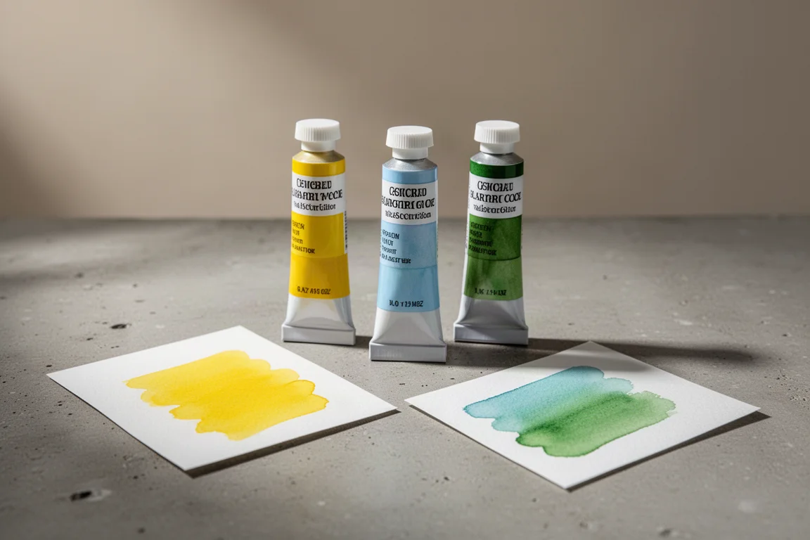
The Daniel Smith side of the swatch test begins with phthalo blue, described as a really nice paint: dark, rich, and a cool workhorse. Phthalo blue is a staple in many palettes, and this version earns its place.
Then there is the charmingly named German greenish raw umber. The “greenish” in the name suggests an umber with a green tint, and that subtle shift makes it a more interesting earth tone than a standard raw umber. As for why it is “German,” that remains part of its mystery.
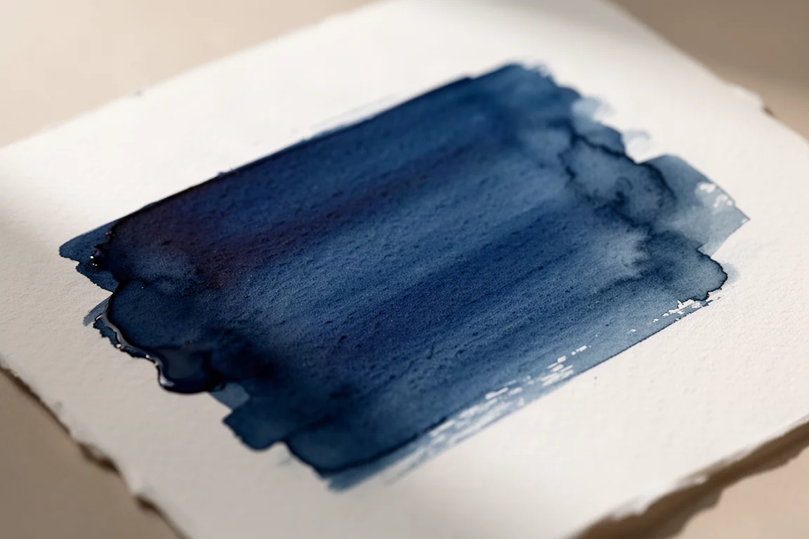
The last color is terra verde, a green earth tone that rounds out the experimental trio. It sits well alongside the umber for anyone building a more natural, muted green range.
Mixing: Why Primaries Still Matter
The reasoning behind the selection is worth noting. Phthalo blue, cadmium yellow, and cerulean blue usually live in the palette anyway; the azo green, greenish raw umber, and terra verde were pure experiments.
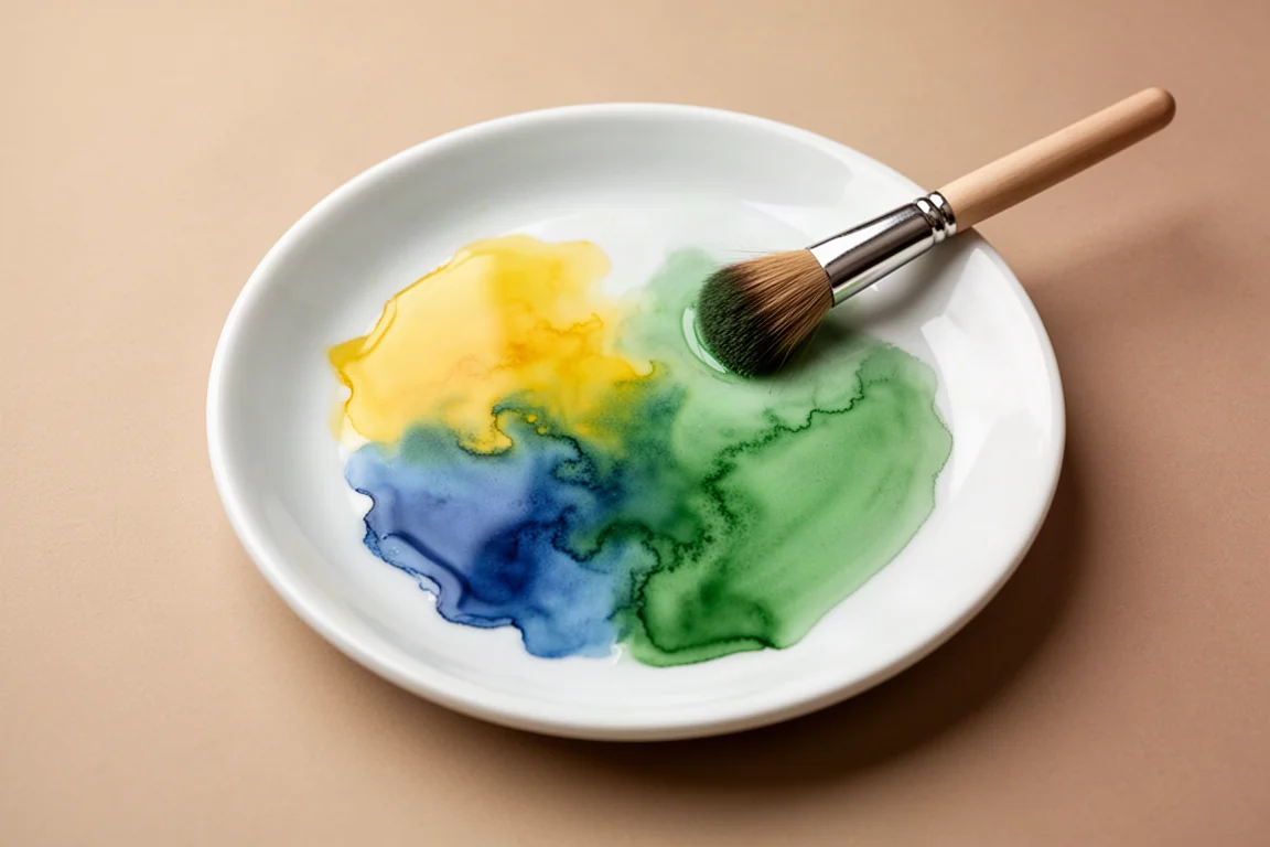
The practical takeaway: cadmium yellow and phthalo blue can be mixed together to produce a green, and a basic primary set can generate a huge range of colors. The trick is knowing how to mix, which is where a color wheel earns its keep. The three extra colors are enjoyable, but a solid primary set remains the foundation.
A Note on Schmincke
There is one more name that belongs in this conversation. For many watercolor painters, the favorite paints in the world are Schmincke, which are made in Germany. In this comparison, Schmincke holds the top spot, with M. Graham and Daniel Smith landing as a very close second. For anyone building a long-term palette, Schmincke is well worth exploring alongside these two.
Buying Advice
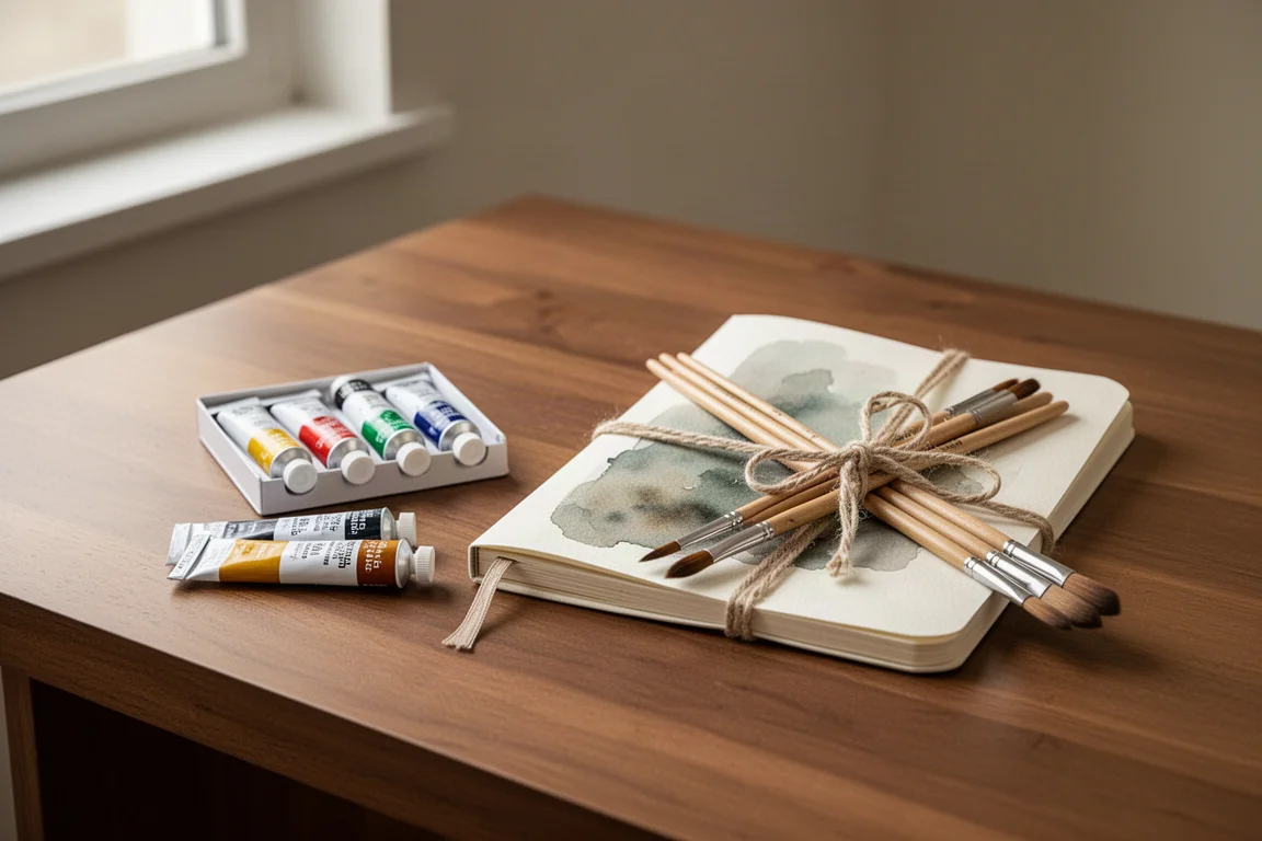
Watercolor paint makes an excellent gift for artists or anyone who likes to draw and paint. Any decent watercolor paint is a good starting point, but these M. Graham and Daniel Smith colors are genuinely strong choices. The smart approach for a new painter is to begin with a primary set of cadmium yellow, phthalo blue, and cerulean blue, then add experimental colors like azo green, greenish raw umber, or terra verde once the mixing basics feel comfortable.
Conclusion
Six colors, two trusted brands, and one clear lesson: strong primaries plus a willingness to experiment covers most of what watercolor asks of a painter. M. Graham and Daniel Smith both earned their place here, and Schmincke remains the benchmark for those who want to go further.
Further reading
Related Reviews
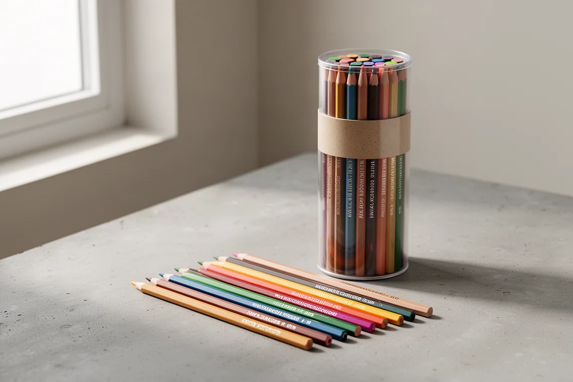
Art Supplies
Art Pop Watercolor Pencils 48-Color Set: A Thoughtfully Designed Student-Grade Option
The Art Pop 48-color watercolor pencil set blends well, dissolves smoothly, and includes artist-friendly details like barrel-printed color names, all at an affordable price.
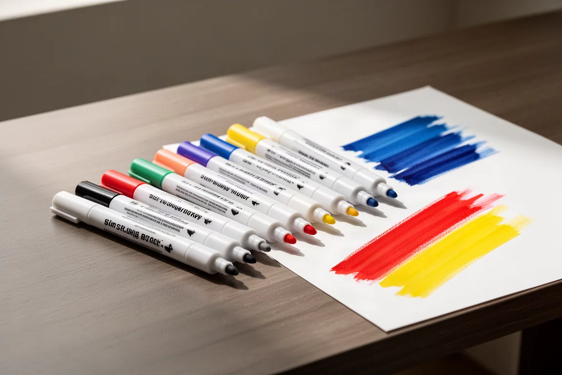
Art Supplies
Artics Acrylic Markers 3mm Review: Versatile Paint Markers With a Few Caveats
A 48-color set of water-based acrylic paint markers that blend while wet, dry permanent, and keep the price low, though safety transparency remains a question.
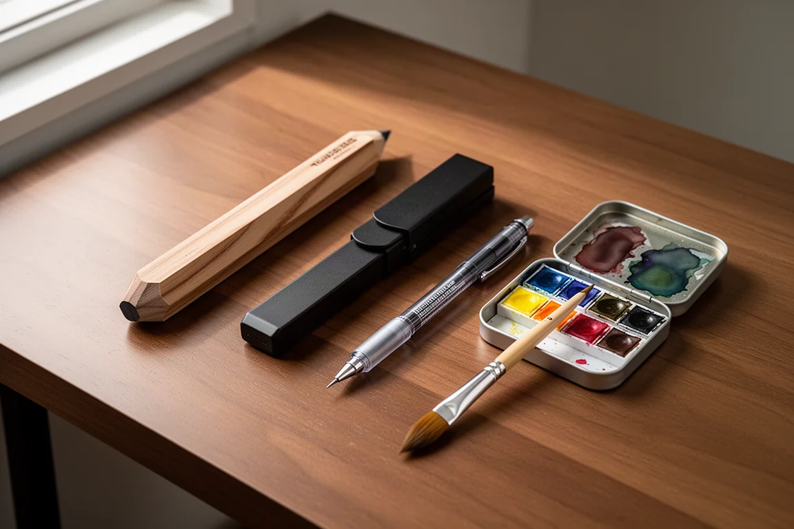
Art Supplies
Best Art Supplies Worth Your Money: Pencils, Pens, Paints, and Paper That Earned Their Spot
After years of daily use and testing, these are the pencils, pens, watercolors, gouache, brushes, sketchbooks, and erasers that stand above the rest.