Fountain Pens
Wancher Kiru Nib Review: A Specialty Grind Built for Flow, Not Precision
A close look at Wancher's Kiru specialty nib, hand-ground by nibmeister Mr. Nagahara, with a writing sample and what to know before ordering.
Introduction
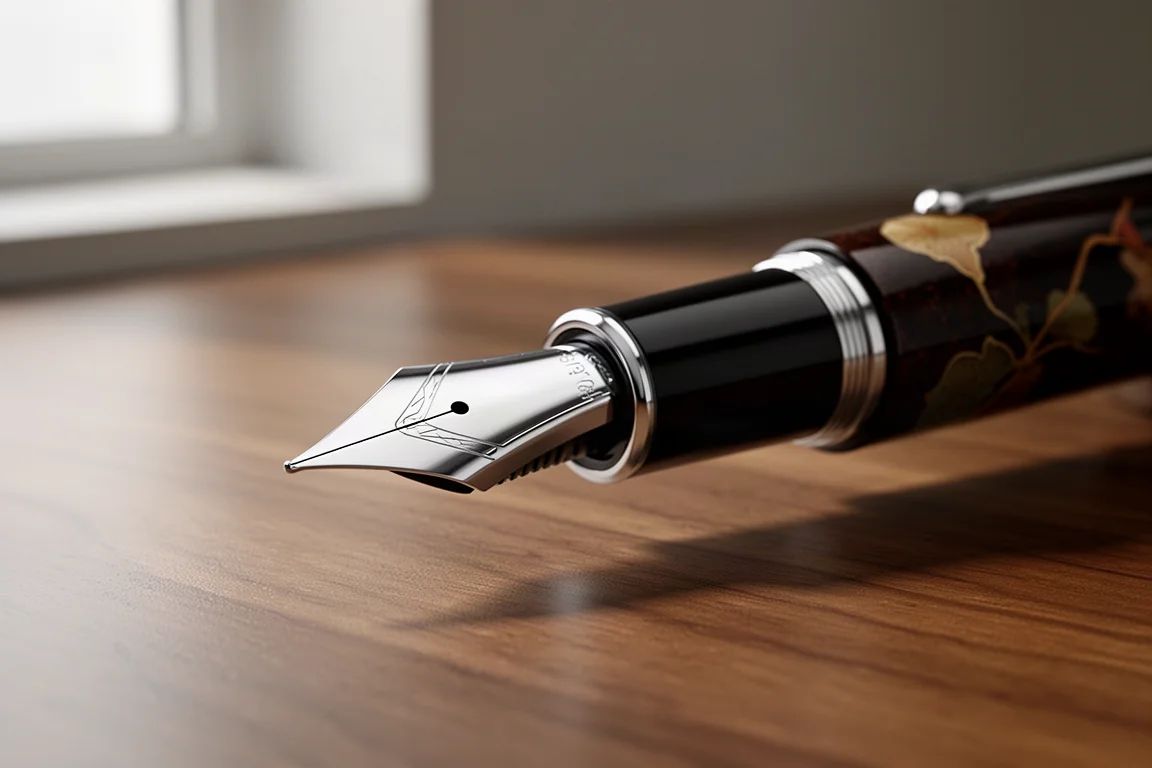
Specialty nibs are where nibmeister work really shows, and the Kiru nib from Japanese brand Wancher is a fresh example of that craft. Designed and ground by Wancher nibmeister Mr. Nagahara, the Kiru is a new addition to the brand’s nib lineup, and it takes a very different approach from the fine, precision-oriented points most Western buyers default to.
This is a nib about strokes and flow. If you enjoy the look of architectural-style writing and want a nib that produces that effect straight out of the box, the Kiru deserves a close look.
Who This Nib Is For
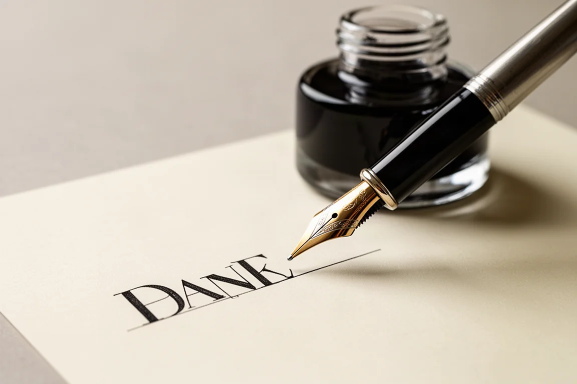
By Wancher’s description, the Kiru is designed to write medium to large letters, and it prioritizes the character of the stroke over pinpoint precision. If you are familiar with an architect grind, the Kiru is a close cousin: thin lines on up and down strokes, broader lines on the side strokes. Think of it as Wancher’s own take on that specialty grind.
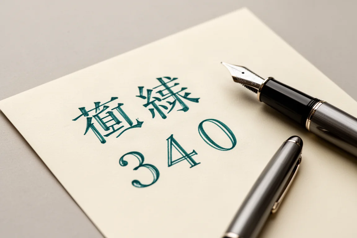
The brand also points to kanji, the characters adapted from Chinese script used in Japanese writing, as a natural fit, since the nib’s stroke contrast suits the layered structure of those characters. If your writing leans small and dense, this is probably not the nib for that job.
Main Strengths
The stroke contrast is the headline feature. Where a stub nib gives you thicker downstrokes and thinner side strokes, the Kiru flips that: broad strokes on the sides, thin lines on the downstroke. The effect is elegant, and it happens without any pressure or technique from the writer.
In testing, the ink flow was decent, and the feed kept up very well even during faster writing. The nib offers a fair amount of pleasant feedback; it is not glossy smooth, but it has just enough texture to remind you that you are writing with a fountain pen. Reverse writing is possible in a limited way, but it is not what this nib is designed to do, so treat it as a bonus rather than a feature.
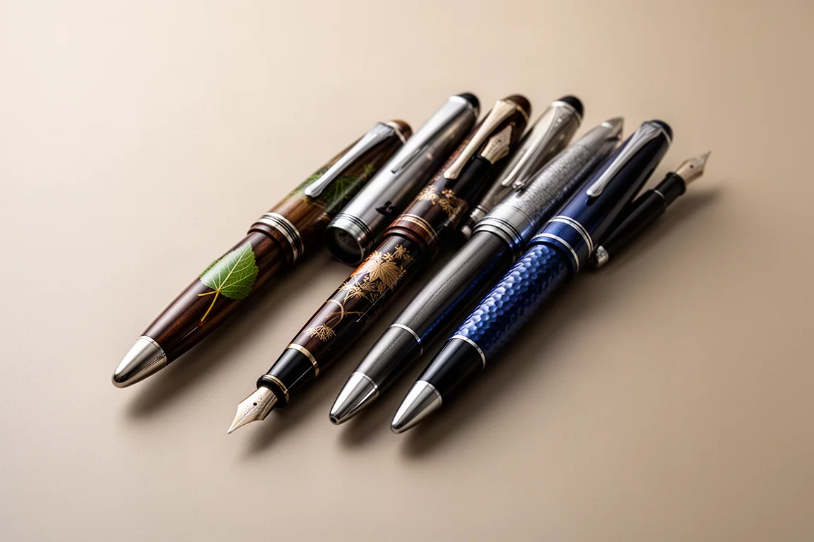
Flex is also not the point here. Pressing the nib produces something counterintuitive rather than a dramatic line variation, so buy the Kiru for its grind, not for flex. Mounted on a Wancher pen with lacquer artwork, it makes for a genuinely striking writing instrument.
Things to Consider Before Buying
There are a few practical points worth weighing before ordering. The Kiru is available as an option on most Wancher pens, but because it is a specialty nib it carries an additional cost of $50 on top of the pen. That is not unusual for a specialty grind, but it is real money, so it should be a deliberate choice rather than an impulse add-on.
If you want an even finer line, Wancher offers a variation of this nib called the Kodachi. Note that the Kodachi involves a wait time of several weeks, so patience is part of that ordering.
Buying Advice
The Kiru makes the most sense for two kinds of buyers: writers who love the architect-grind aesthetic and want it from a Japanese maker, and anyone practicing kanji or other stroke-heavy scripts where the alternating thin and broad lines add real character. Pair it with a flowing ink and a pen you already enjoy, and it becomes a genuinely enjoyable daily writer.
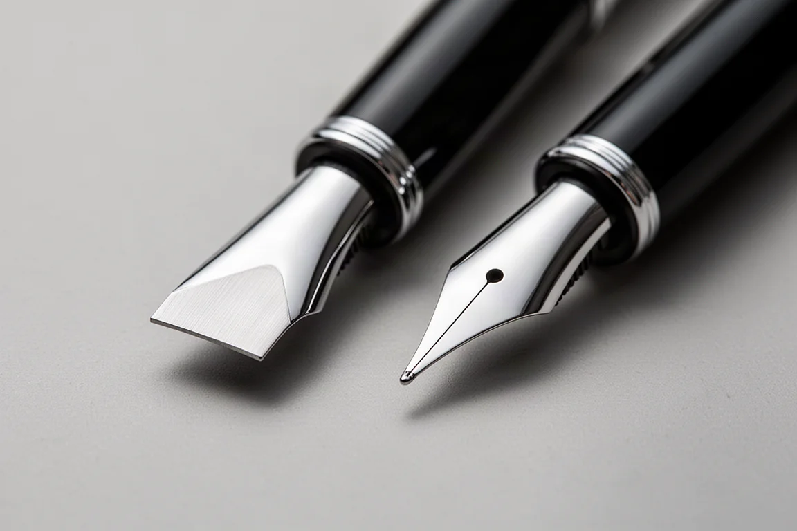
Wancher’s wider lineup is also worth browsing. The brand offers a large number of quality pens, including entry-level urushi-style offerings at accessible prices alongside more expensive pieces, so there is a range of entry points if the Kiru nib itself is what draws you in.
Conclusion
The Wancher Kiru nib is a confident, characterful specialty grind: thin downstrokes, broad side strokes, reliable flow, and honest feedback. At a $50 specialty surcharge it is an indulgence rather than a necessity, but for writers who value stroke expression over precision, it is a very easy indulgence to justify.
Product link
View more details for Wancher Kiru Nib
This product is mentioned in the review. Check the specifications, options, and compatibility before buying.
View more details for Wancher Kiru NibFurther reading
Related Reviews
Fountain Pens
Best Budget Fountain Pens Tested: 9 Pens, One Clear Winner
A hands-on comparison of nine affordable fountain pens for everyday writing, calligraphy, and sketching, with a clear standout for flexible nib fans.
Fountain Pens
Aurora Optima Review: An Italian Piston Filler That Punches Above Its Price
A 14k gold nib, ebonite feed, and a beautifully deep oraloid body make the Aurora Optima one of the most rewarding piston fillers around.
Fountain Pens
Cross Bailey Light Review: The Entry-Level Fountain Pen Worth Keeping at the Office
A plastic-bodied Cross with a metal clip, snap cap, and famously smooth extra fine steel nib. Around $15, available almost everywhere, and easy to recommend.