Art Supplies
Do You Already Own the New Faber-Castell Polychromos Colors? 4 Pencil Sets Compared
The 20 new Polychromos shades overlap more than you might expect with sets from Castle Arts, Holbein, and Tombow. Here is how the colors line up.
Introduction
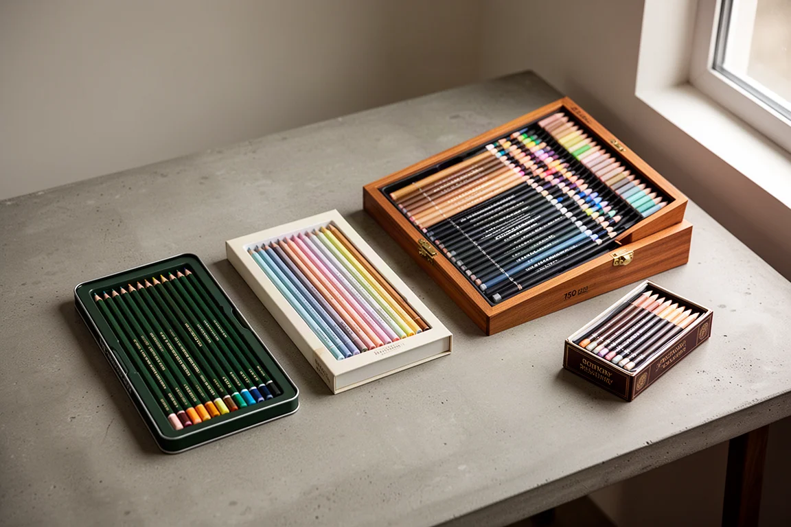
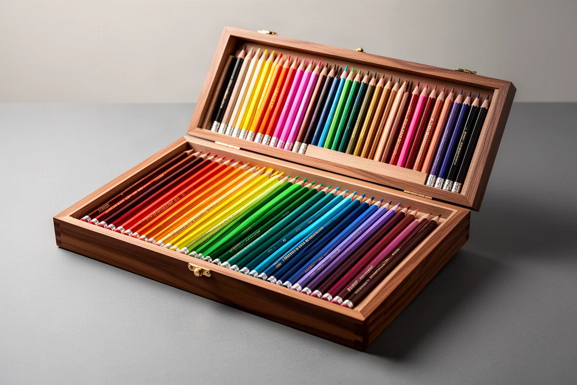
Faber-Castell has added 20 new colors to the Polychromos range. They are sold as a small supplemental set rather than a standalone collection, and it is not yet clear whether the brand will eventually fold them into a larger full range. Whenever a manufacturer extends an existing line, the practical question for artists is simple: do I already own colors like these?
That is exactly what this comparison looks at. We lined the 20 new Polychromos shades up against three sets many colored pencil artists already have on the shelf: the Castle Arts Harmonious Collection, the Holbein Artists’ Colour Pencils, and the Tombow Irojiten. One important caveat up front: this is purely a color comparison. Polychromos pencils have their own texture, layering, and blending behavior, and they will feel different in use from any of the alternatives below.
How the New Polychromos Colors Stack Up
The 20 new colors split roughly into two groups. The top half is fairly vibrant, while about 10 of the shades are quite pale and pastel-toned. Polychromos cores are also on the harder, more translucent side compared with something like Prismacolor Premier, which is noticeably more opaque. That translucency is neither good nor bad in itself, but it shapes how these pale tones behave on paper.
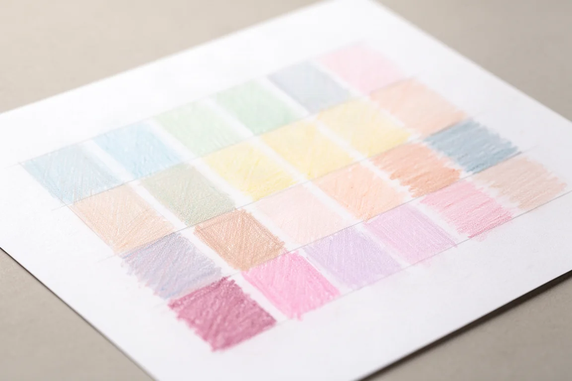
One observation from swatching: the saturation levels of both the Castle Arts Harmonious and the Holbein pencils read as more prominent than the new Polychromos shades. When you apply heavy pressure at the base of a swatch and ease off toward the top to show a gradient, several of the palest Polychromos tones become very difficult to see in a light application, especially on white paper.
Closest Matches in the Castle Arts Harmonious Collection
The Castle Arts Harmonious Collection turned out to have fewer matches than expected. The set is quite muted and subtle overall, with colors that lean subdued rather than bright or vibrant. The shades that did correlate include sweet lilac alongside Tyrian purple, wild berry near quinacridone magenta, dark iris echoing dark ultramarine violet (though notably darker), pewter matching serpentine gray, and amethyst sitting close to dark purple.
On the warmer and greener side, firelight reddish lines up with calamine, wheat grass is close to light zircon red, gossamer resembles slate green, pale apple mirrors green jasper, and the duck-egg-toned aquamarine corresponds to aquamarine blue. Beyond those, the remaining colors in the new Polychromos set did not find a good partner in this collection. Castle Arts also offers a separate pastel tint set that may contain closer matches for the palest shades, so it is worth checking if pale tones are what draw you to the new release.
Closest Matches in the Holbein Artists’ Colour Pencils
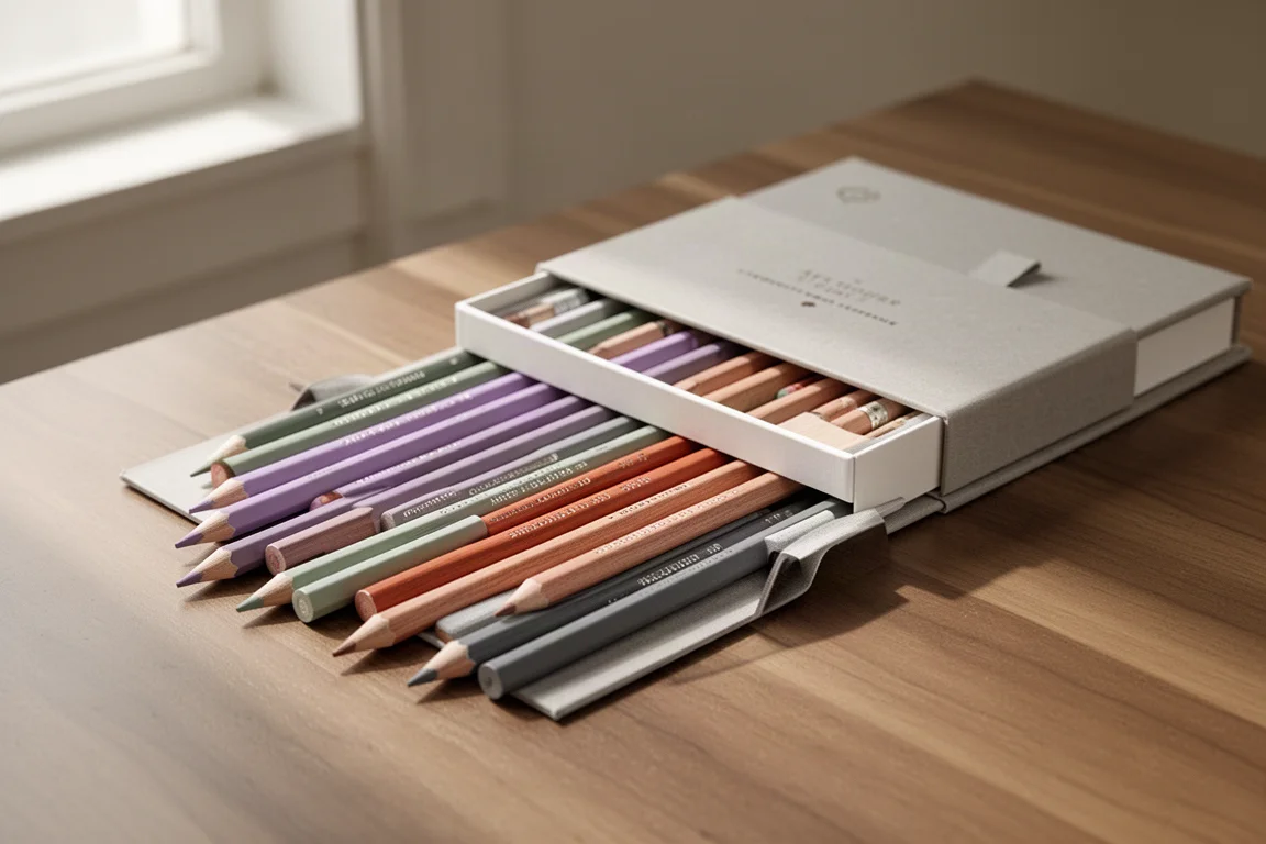
The Holbein Artists’ Colour Pencils come in a large 150-color range, so there is simply more to choose from. The matches here were strong across the board. Lemon approximates arylide lemon yellow, chartreuse green corresponds to lazarite green, yellow ochre matches golden ochre, and a straightforward orange sits close to perylene orange. Burnt sienna is very much like red jasper, scarlet matches pyrrole red, and carmine also lands near pyrrole red.
In the pink-to-violet band, fuchsia lines up with quinacridone magenta, wisteria matches Tyrian purple, and ultra blue is close to dark ultramarine violet. Cobalt blue was the closest available match to fra angelico blue, though not an exact one. The pale tones are where Holbein really shines against the new set: forget-me-not blue corresponds to aquamarine blue, a soft celadon green matches green jasper, opal green echoes bohemian green earth, sand resembles slate green, and shell pink matches light zircon red.
For the through-light shades, peach approximates through-light reddish, a pale brilliant yellow corresponds to through-light yellowish, cork matches through-light brownish, smoke blue is close to amethyst gray, and cool gray 2 was chosen over a darker Holbein gray as the better tonal match for serpentine gray.
Testing the Pale Tones on Black Paper
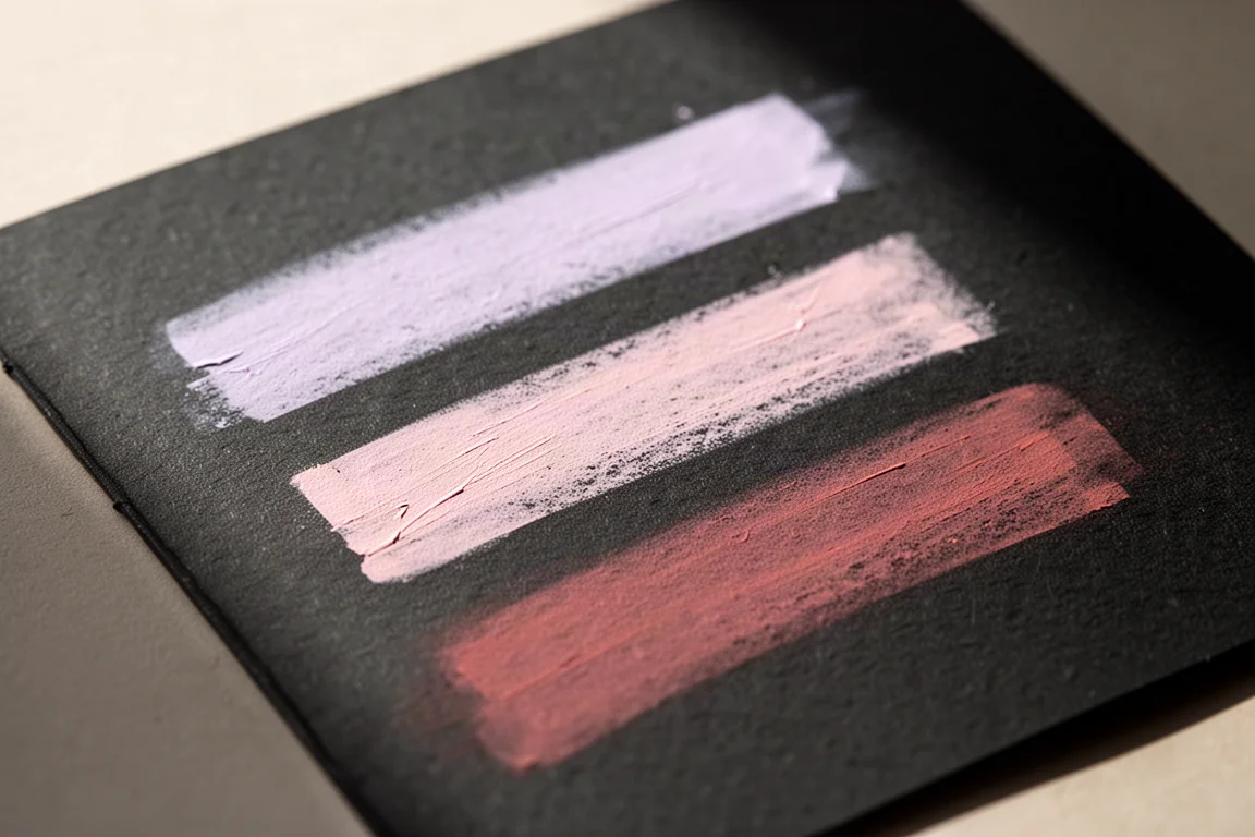
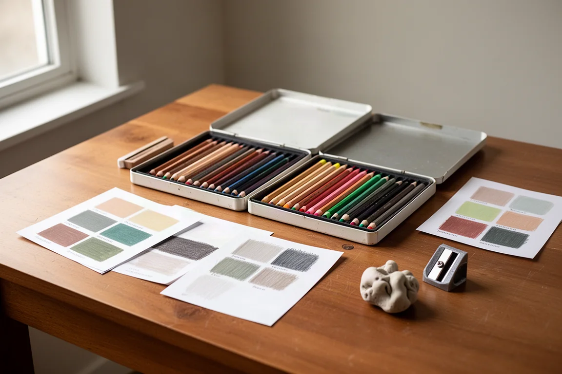
Pale colors are hard to judge on white paper, so three of the palest new Polychromos shades were swatched on black paper alongside their closest counterparts. The trio tested was light zircon red, through-light reddish, and Tyrian purple, each paired with its nearest match from the other sets.
The results were encouraging. On the first pairing, wheat grass and shell pink sat alongside light zircon red, and all three showed relatively good opacity on the dark surface, with wheat grass reading slightly more translucent. In the second group, peach and through-light reddish looked quite opaque, while calamine leaned a little more translucent. The third group, Tyrian purple, wild berry, and wisteria, performed the most evenly: all three were quite opaque with good saturation on dark paper.
The takeaway is that these pale tones benefit enormously from dark paper. On white, the lightest applications of shades from aquamarine blue through serpentine gray are genuinely difficult to see.
Which Set Makes Sense for You
If you are the kind of artist who wants the complete set the moment it appears, the new Polychromos release is an easy decision. The pencils are Faber-Castell quality, and any expansion of the colored pencil range is a good thing for the community. This set was purchased independently rather than supplied for review, which says something about the pull of a new Polychromos release for collectors.
If you are more economical about purchases, the picture is different. Holbein owners in particular already hold close color matches for most of the 20 new shades, and the Holbein cores are softer and more opaque, which some artists prefer. Castle Arts Harmonious owners have partial coverage only, and that set is positioned more as student grade than artist grade, with a muted palette that does not replicate the more vibrant half of the new release. Tombow Irojiten owners also have some genuinely beautiful pastel tones in their collection that overlap with the pale end of the new set, and a deeper comparison there is worth a separate look.
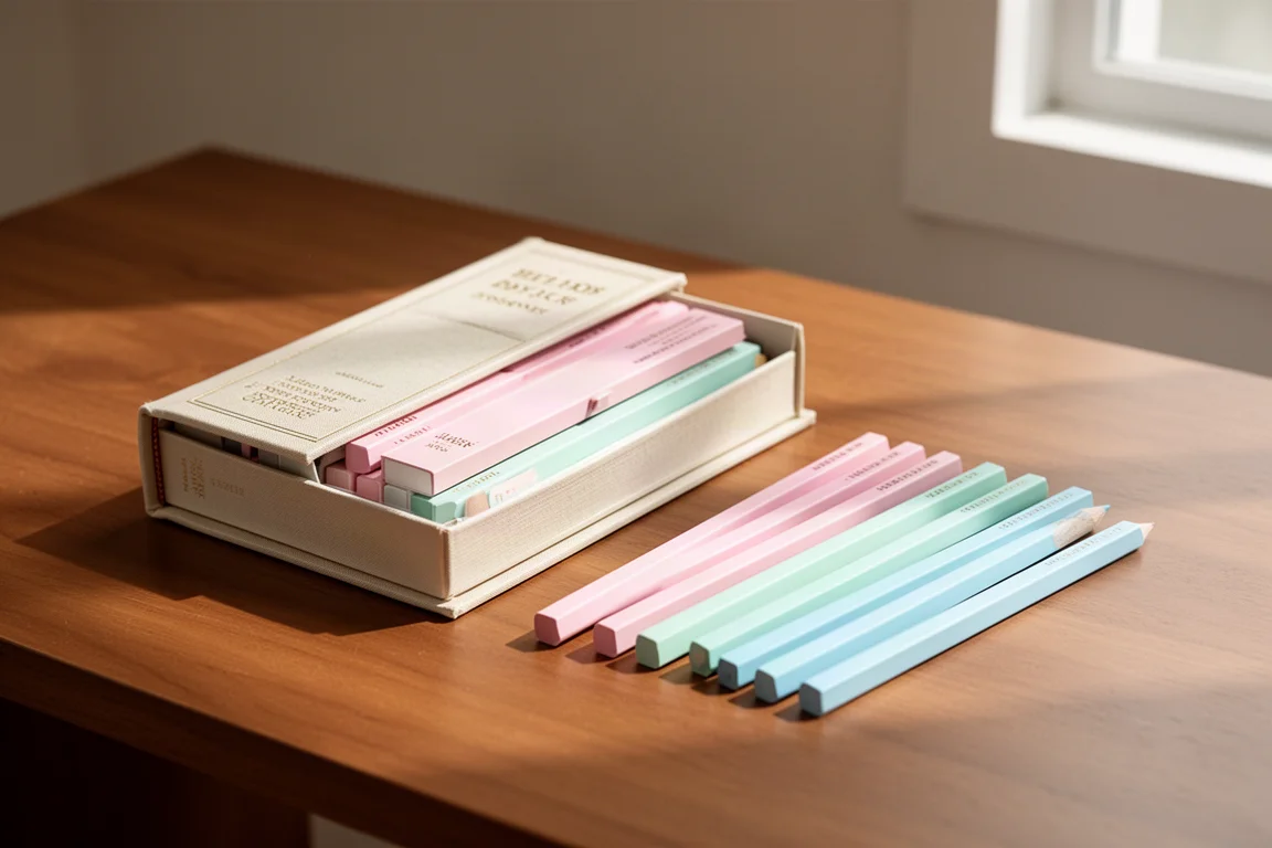
A quick note on other sets: if you own one of the very large multi-hundred-color ranges, you will almost certainly find colors that match most of this new release. Swatches from the Holbein pastel-toned Pastelo set, for example, contain several shades that correlate with the pale half of the new Polychromos colors.
Greens, Foliage, and Botanical Work
When evaluating any new set, the green range is a priority. In the new Polychromos release, the standouts for foliage work are green jasper, bohemian green earth, slate green, and to a lesser extent serpentine gray. Those four shades feel naturally suited to botanical pieces, particularly the greenery and foliage around flowers, where dark greens, pale greens, and decent mid-tones all earn their place.
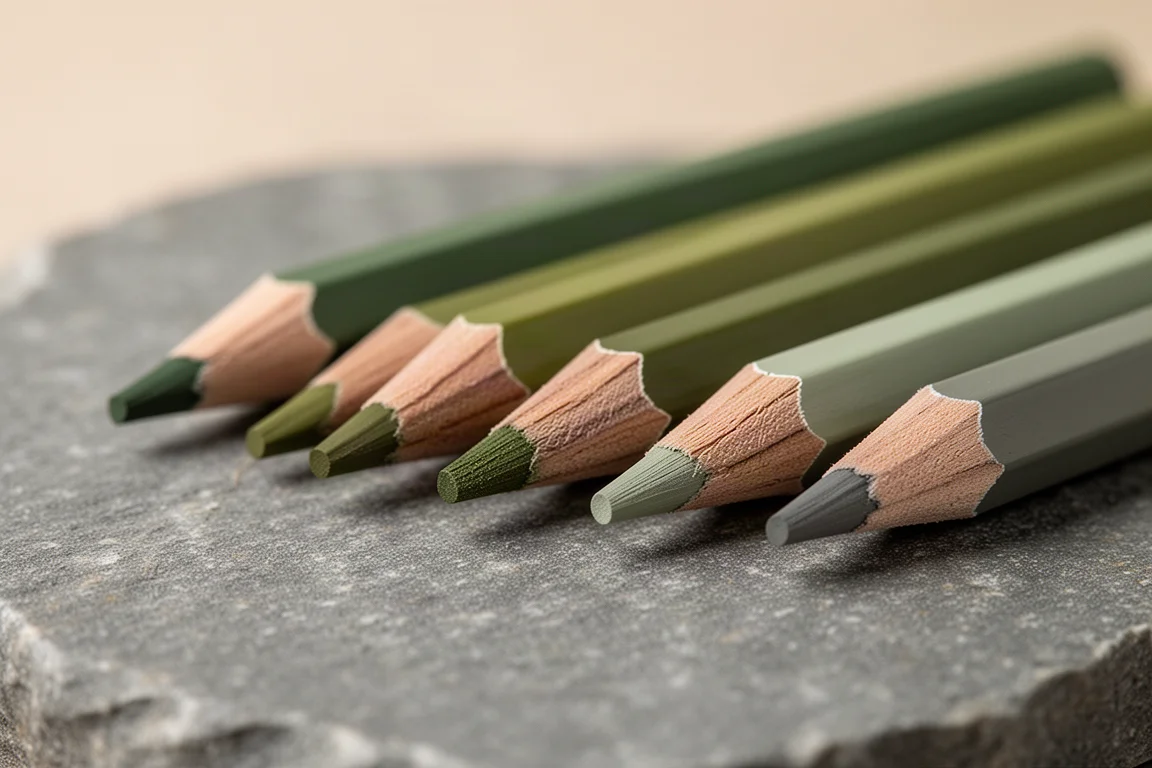
That said, the overall palette of the 20 new colors leaves something to be desired as a cohesive collection. If botanical work is your main focus and you already own Holbein’s celadon, opal green, and sand, the case for buying the new set purely for its greens weakens considerably.
Conclusion
The 20 new Faber-Castell Polychromos colors are not redundant, but they are far from essential if your existing collection is deep. Holbein owners will find the closest matches for nearly every shade, Castle Arts Harmonious owners will find a handful, and Tombow Irojiten owners already hold some lovely pastel alternatives. Remember that a color match is not a pencil match: Polychromos remain a harder, more translucent core with their own blending character. If having the full range matters to you, buy with confidence. If you are chasing specific colors only, check your existing sets first.
Further reading
Related Reviews
Art Supplies
Art Pop Watercolor Pencils 48-Color Set: A Thoughtfully Designed Student-Grade Option
The Art Pop 48-color watercolor pencil set blends well, dissolves smoothly, and includes artist-friendly details like barrel-printed color names, all at an affordable price.
Art Supplies
Artics Acrylic Markers 3mm Review: Versatile Paint Markers With a Few Caveats
A 48-color set of water-based acrylic paint markers that blend while wet, dry permanent, and keep the price low, though safety transparency remains a question.
Art Supplies
Best Art Supplies Worth Your Money: Pencils, Pens, Paints, and Paper That Earned Their Spot
After years of daily use and testing, these are the pencils, pens, watercolors, gouache, brushes, sketchbooks, and erasers that stand above the rest.