Fountain Pens
Platinum 3776 Century Chartres Blue Review: A Distinctive Japanese Fountain Pen Worth a Test Write
Platinum's Chartres Blue combines cathedral-inspired styling, a Slip Seal cap, and a deliberately feedback-rich 14k gold nib at a reasonable price.
Introduction
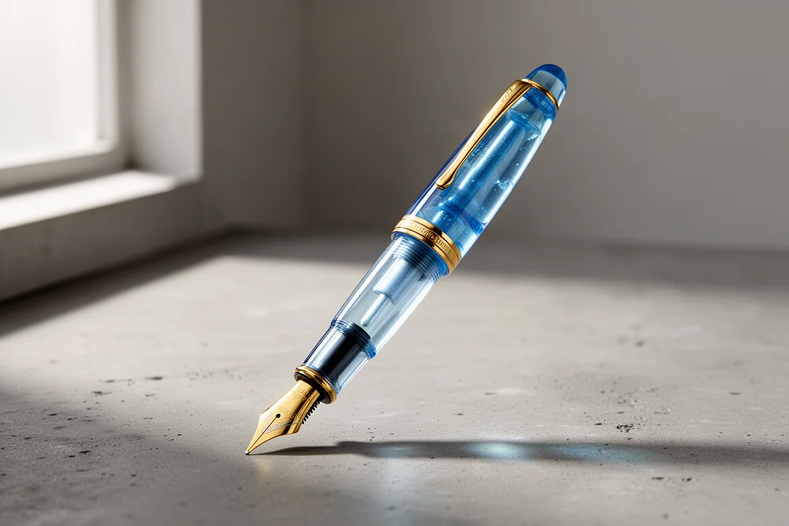
The Platinum 3776 Century Chartres Blue is one of those fountain pens that manages to stand out without shouting. Platinum has been making fountain pens since 1919, and the company has a long record of firsts, including practical cartridge-based pens and, in 1967, a model that used a platinum-coated nib. This pen carries that heritage into a modern, affordable package, and its semi-transparent blue body has made it popular since launch. After filling it with the included blue-black cartridge and writing with it for a while, here is how it holds up.
Design and Build
The Chartres Blue finish takes its inspiration from the stained glass of Chartres Cathedral, a famous sight in France. The body is semi-transparent, and while that might sound cheap on paper, in practice it reads as genuinely premium. The coloring is beautiful, and it is a rare thing to find an attractive, stylishly colored domestic Japanese pen at this price point.
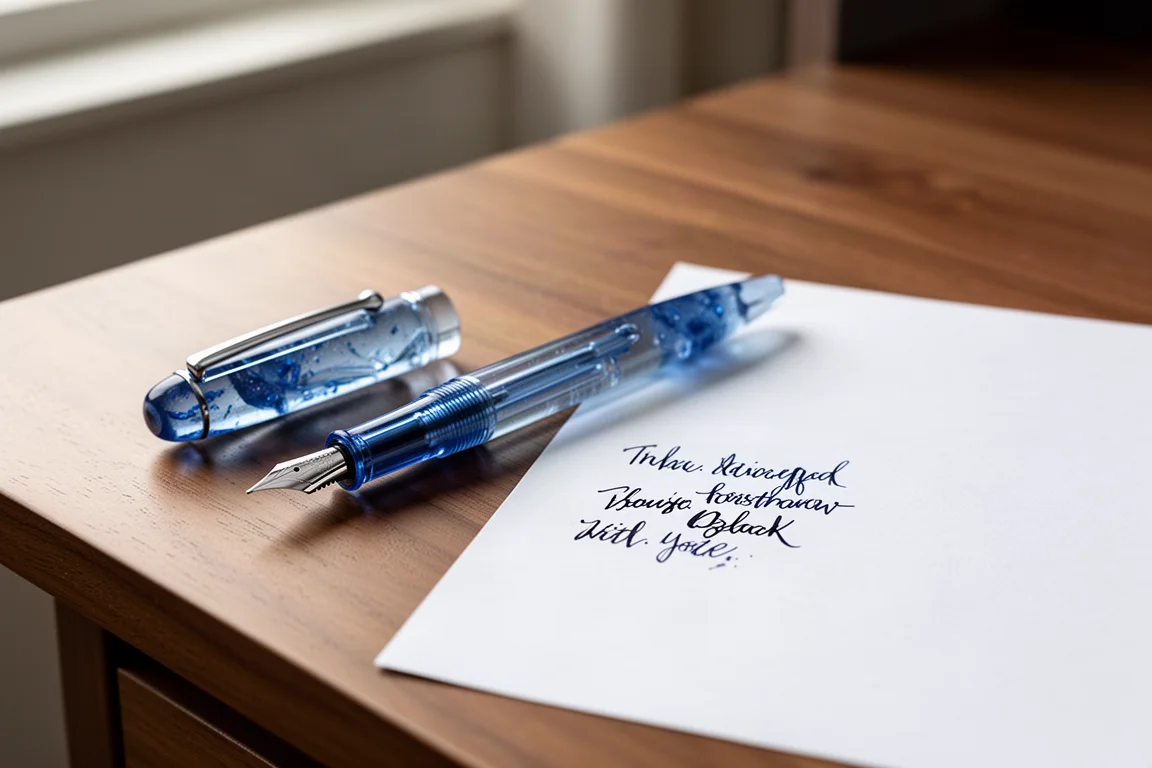
The trim on this version is gold, but Platinum also offers a Rhodium Finish series with silver trim if you prefer a cooler look. The cap ring is engraved with 3776 branding, and the clip is a simple oval shape that grips firmly without being overly stiff. The cap is a screw-on type with Platinum’s Slip Seal mechanism, a fully airtight design that is said to keep ink from drying out for up to two years with the cap closed.
Specifications are sensible for daily carry: 139.5mm overall length, 20.5g in weight, and a maximum diameter of 15.4mm. The balance point sits low in the hand, though posting the cap noticeably shifts the balance upward, so try both if you can.
The Nib and Writing Feel
The nib is large and made of 14k gold, engraved with the 3776 mark, a nod to the altitude of Mount Fuji. Platinum offers the Century in seven nib grades: EF, F, MF, SF, M, B, and C. This unit is the F, a fine point.
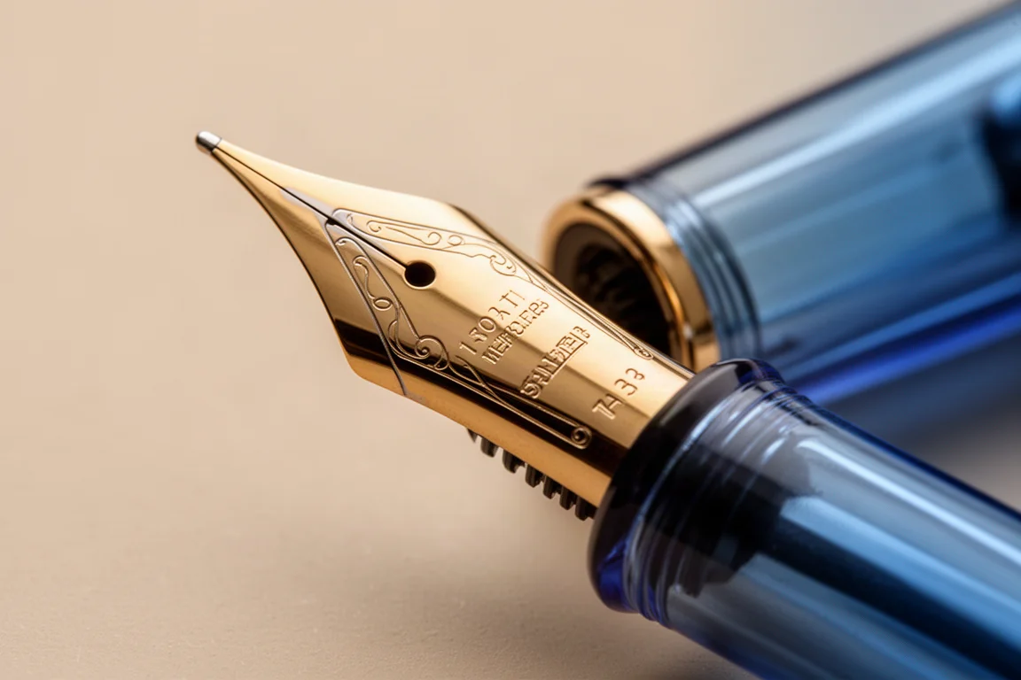
The writing character is the most divisive part of this pen. There is a noticeable, slightly scratchy feedback that Platinum appears to have engineered deliberately. If you believe smoothness is everything, this may not be your pen. But the character is distinct, and that is precisely why some writers fall hard for it. Because the nib is gold, it does not feel stiff or sterile the way a steel nib in this class can. Having a gold nib at this price is one of the genuine pleasures of the Century line.
Everyday Use
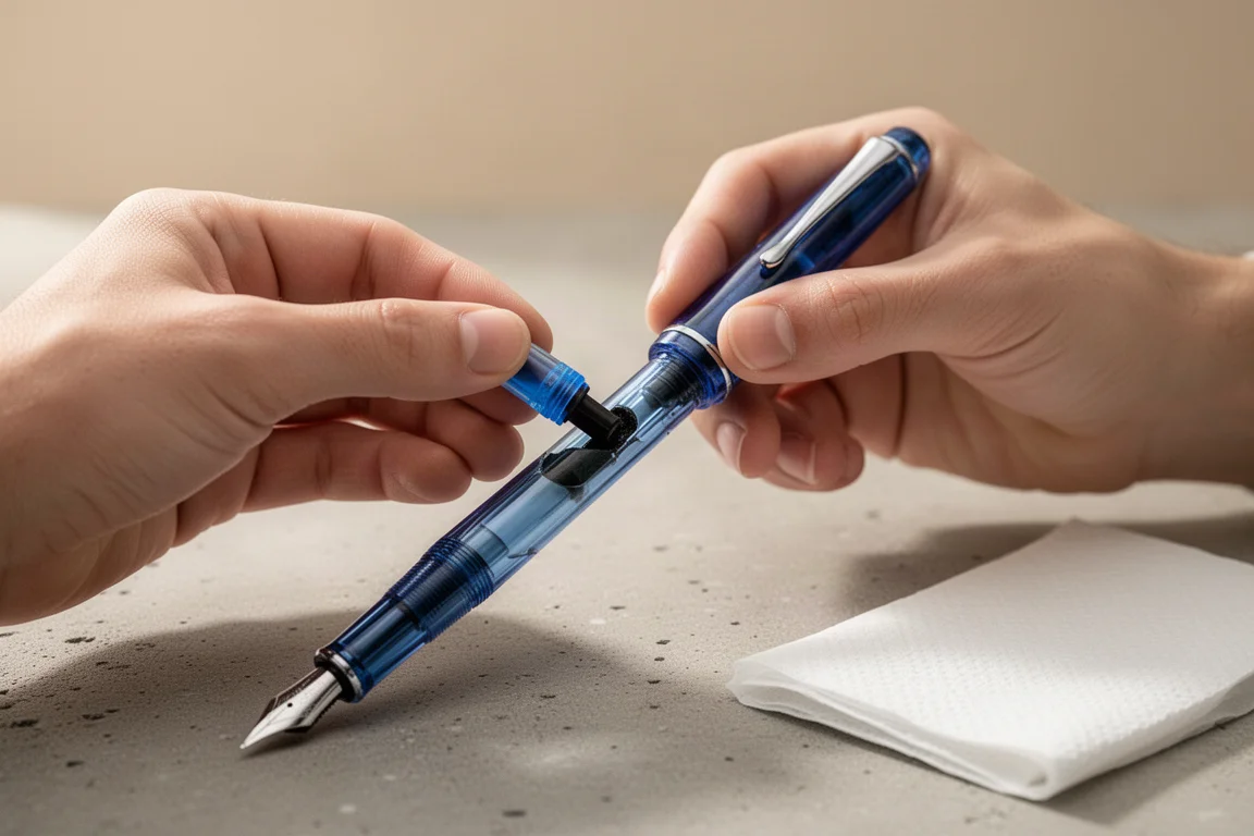
Ink installation is straightforward with the included blue-black cartridge, which contains a small steel ball inside to help ink flow. Once writing, the fine nib lays down a crisp line, and the accompanying ink performs well.
The one real concern is durability of the finish: the body scratches easily. Unless you store it in a proper pen case with a pen holder, scuffs will show up quickly and be quite visible on the translucent resin. That is honestly the only significant drawback found during use.
Buying Advice
The Chartres Blue is popular for good reason: it is one of the more affordable Century variants, and the body coloring is arguably the prettiest in the lineup. It suits writers who want a distinct, feedback-rich nib rather than a glassy-smooth one, and who value a cap that seals completely for long-term storage.
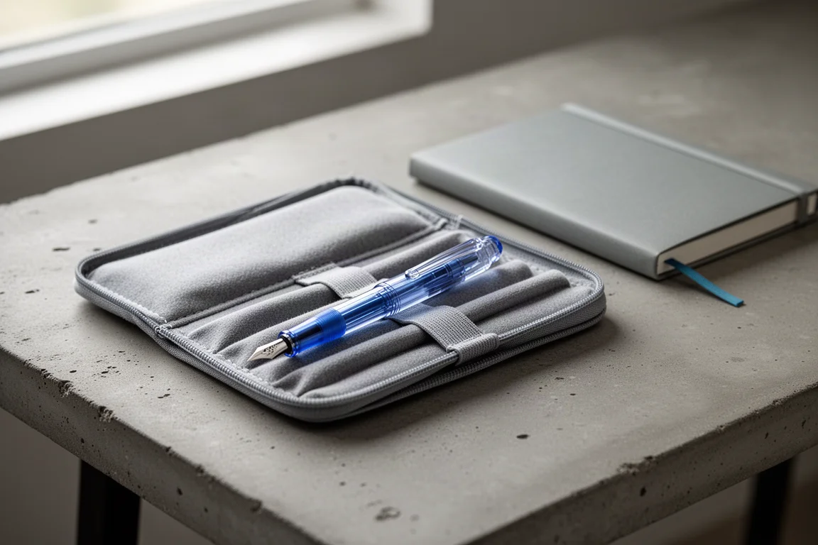
Because fountain pens are so personal, and because this nib’s character divides opinion, it is worth trying a test write at a store before committing if you have the chance. If the feedback sounds like your kind of writing experience, this is an easy pen to recommend.
Conclusion
The Platinum 3776 Century Chartres Blue pairs a striking cathedral-glass body with an airtight Slip Seal cap, a 14k gold nib, and a deliberately tactile writing feel. Its only clear weakness is a scratch-prone barrel. For writers who want character over pure smoothness at a sensible price, it is a pen that rewards a test write and may well become a favorite.
Product link
View more details for Platinum 3776 Century Chartres Blue
This product is mentioned in the review. Check the specifications, options, and compatibility before buying.
View more details for Platinum 3776 Century Chartres BlueFurther reading
Related Reviews
Fountain Pens
Best Budget Fountain Pens Tested: 9 Pens, One Clear Winner
A hands-on comparison of nine affordable fountain pens for everyday writing, calligraphy, and sketching, with a clear standout for flexible nib fans.
Fountain Pens
Aurora Optima Review: An Italian Piston Filler That Punches Above Its Price
A 14k gold nib, ebonite feed, and a beautifully deep oraloid body make the Aurora Optima one of the most rewarding piston fillers around.
Fountain Pens
Cross Bailey Light Review: The Entry-Level Fountain Pen Worth Keeping at the Office
A plastic-bodied Cross with a metal clip, snap cap, and famously smooth extra fine steel nib. Around $15, available almost everywhere, and easy to recommend.