Fountain Pens
Montblanc Writers Edition Franz Kafka: A Subtle Tribute to The Metamorphosis
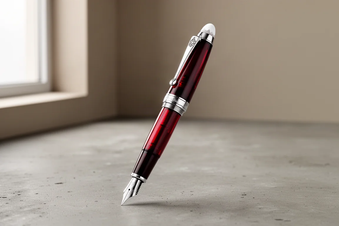
A deep, translucent red fountain pen with sterling silver trim and one of the most understated designs Montblanc has released in the Writers Edition line.
Introduction
The Montblanc Writers Edition Franz Kafka is one of the more interesting entries in the Writers Edition line, and one of the easiest to admire. Released in 2004 as a limited edition of 18,500 pens, it takes its theme from The Metamorphosis, Kafka’s story about a man who wakes up transformed into a cockroach. What makes this pen notable is how quietly it tells that story. Where many themed editions pile on details, the Kafka keeps things restrained, and that restraint is a big part of its appeal.
This pen is a fairly large, sizable fountain pen without being obscenely oversized, so it sits comfortably in the hand for most writers. It uses an 18 karat gold medium nib, sterling silver trim, and a filling system that is unusual for a Montblanc in this range. Below is a full breakdown of the design, the writing experience, and the trade-offs to weigh before buying.
Design and Theme: The Metamorphosis in Metal and Resin
The first thing to understand about the Kafka is that it is not a black pen. At a glance the cap looks black, but in the right light it is a translucent, very deep red, closer to a dark crimson. That hidden color is one of the pen’s best tricks, and it rewards anyone who actually handles it rather than judging from photos.
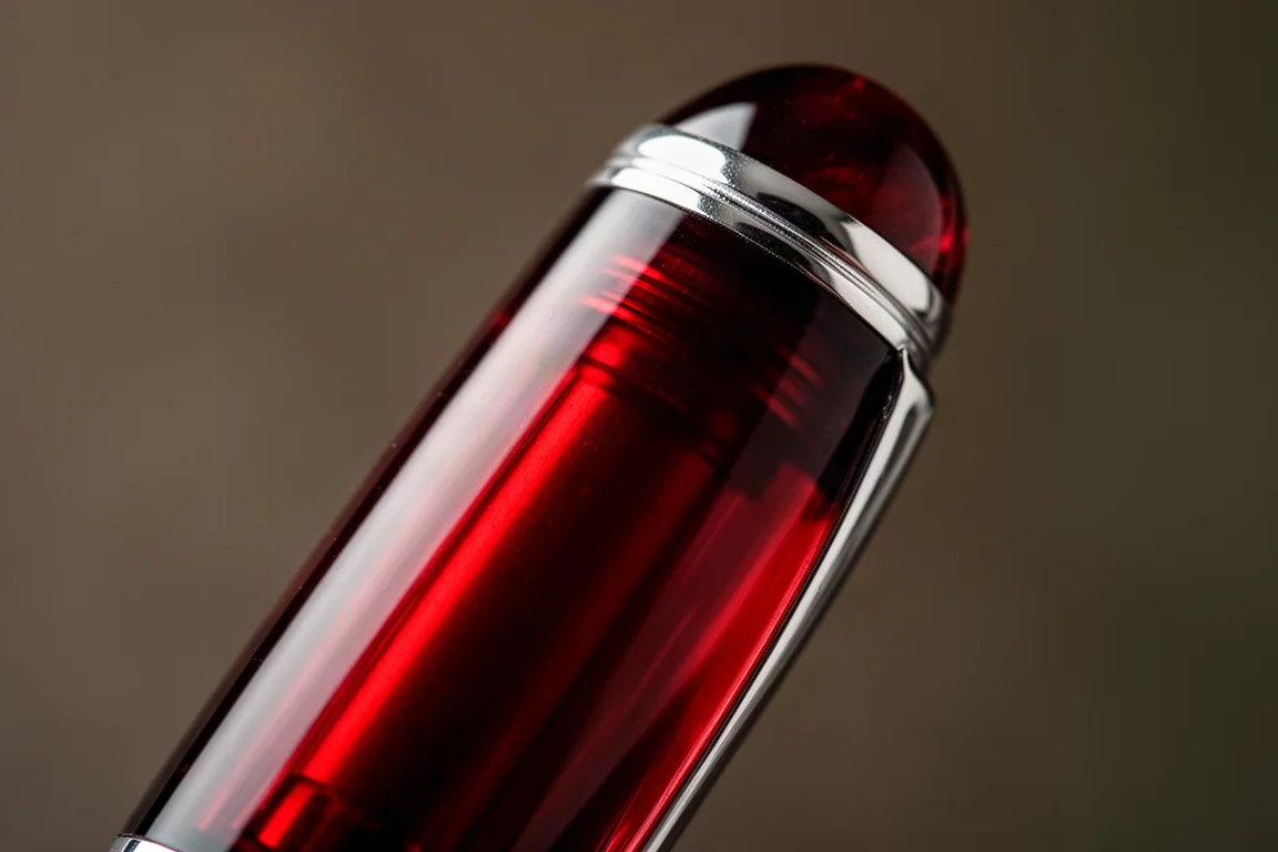
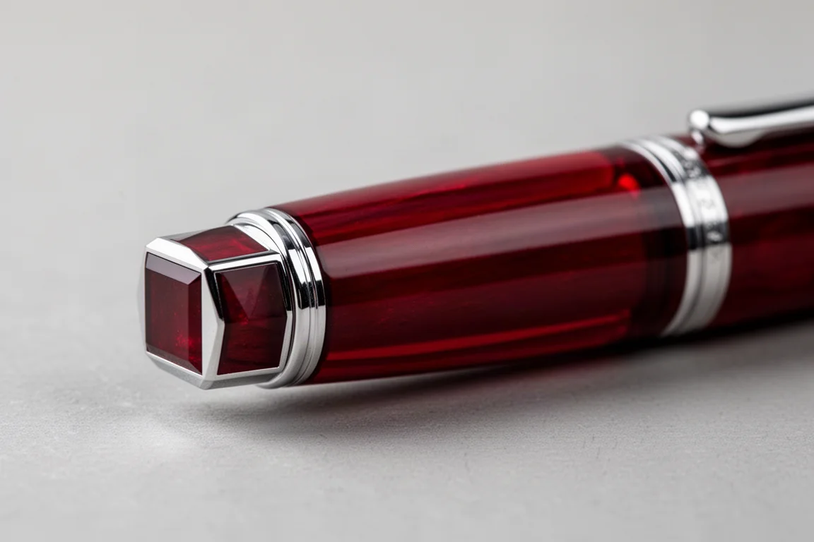
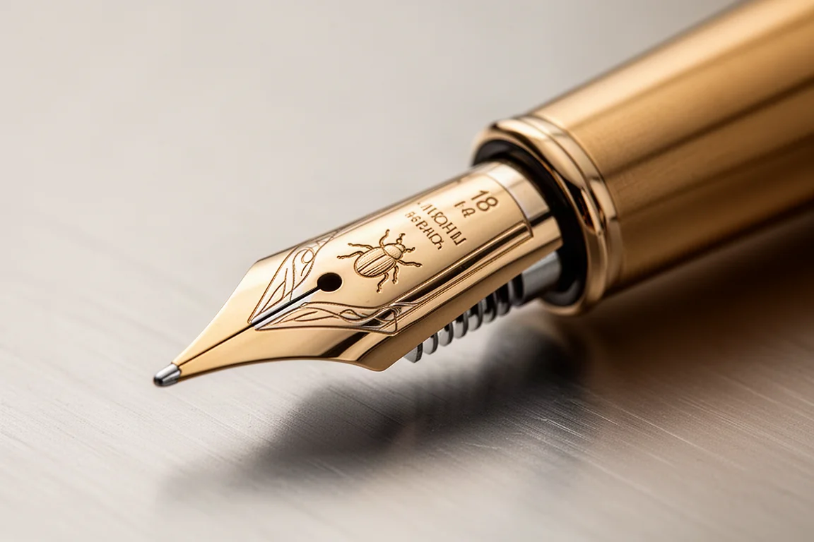
The theme is carried through with unusual subtlety for Montblanc. The end of the barrel is square, and about halfway down the barrel everything becomes round. A square shape turning into a round one is, quite literally, a metamorphosis, and it is a clever and understated way to reference the source material. The cockroach also appears as a small motif on the nib.
The trim is 925 sterling silver, which can tarnish slightly over time, and the finial carries the snow-covered peak emblem at the top of the cap. The clip has a shape that rises and then dips down, which not everyone will love, though it has been suggested that the form may echo a cockroach’s leg. The clip is springy without being too loose or too tight, and nothing on the pen sticks out or feels rough to the touch. The cap end is fully round, the signature of the writer appears on the pen as with all Writers Editions of great characters, and overall the simplicity of the design makes this one of the most successful Writers Edition releases.
Nib and Writing Performance
The Kafka uses an 18 karat gold medium nib. One quirk of Montblanc is that the nib grade is not labeled on the nib itself, so you have to trust the grade as sold. In practice, this medium runs on the narrower side; to many writers it feels closer to a fine than a wide medium, though nib grading has no international standard, so Montblanc’s medium is Montblanc’s medium.
The writing experience is pleasant and well tuned. Even writing quickly, there were no skips, and the feed delivered a balanced flow, neither too dry nor too wet. Montblanc typically makes nice nibs, and this one upholds that reputation.
A few caveats for anyone hoping for line variation: there is a little variation available, but this is not a flex nib, so press carefully. Reverse writing is possible for a couple of words, producing a line so thin it is finer than extra fine, but the feed runs dry quickly if you continue. For normal, right-side-up writing, though, it is a genuinely comfortable and consistent performer.
Filling System: Piston or Captive Converter?
This is the strangest part of the pen. Unscrew the barrel and you find a mechanism that looks like something you would push, but it is not. It is best described as a captive converter: you twist the end, ink is drawn up by a piston that moves up and down. Whether you call it a piston filler or a converter is something of a philosophical question, and it does feel a little odd on a brand so well known for its piston fillers.
On the other hand, the design keeps the barrel’s line clean. There is no external turning knob breaking up the silhouette, and nothing looks tacked on. There is also a small ink window with slats cut into it, which makes it genuinely easy to see how much ink remains.
One practical note on the feed: Montblanc feed fins are known to bend out of shape relatively easily, so handle that area with care. The section tapers down and is not the biggest around, but it is comfortable, and despite threads being present there is enough section length that they are barely felt. The step down from section to barrel is fairly sizable, however, and that step is more noticeable than the threads.
Things to Consider Before Buying
The Kafka’s quirks are few but worth knowing. The filling system sits in an awkward middle ground between converter and piston, and purists may find it underwhelming for a Montblanc of this caliber. The clip shape divides opinion, the step down to the section is pronounced, and the sterling silver trim will tarnish a bit over time, which some will see as patina and others as maintenance.
On the positive side, the deep translucent red body, the clean silver trim, the clever square-to-round metamorphosis motif, and the well-tuned gold nib make it one of the most livable themed pens around. Seen on the market at around $695, roughly the original price and typical of the pre-owned market, it reads as a reasonable price for what is on offer. Notably, while many Writers Editions look fun but feel like too much to actually buy, this is the kind of themed pen a buyer could genuinely consider owning.
Conclusion
The Montblanc Writers Edition Franz Kafka succeeds precisely because it does less. The Metamorphosis theme is woven in through shape and a hidden color rather than ornament, the sterling silver trim keeps it classy, and the 18 karat gold medium nib writes smoothly and consistently. If you have been put off by busier themed editions, this is the one that proves the concept can be done with restraint. Its odd filling system is the main compromise, and for many buyers it will not be a deal breaker.
Product link
View more details for Montblanc Writers Edition Franz Kafka
This product is mentioned in the review. Check the specifications, options, and compatibility before buying.
View more details for Montblanc Writers Edition Franz KafkaFurther reading
Related Reviews
Fountain Pens
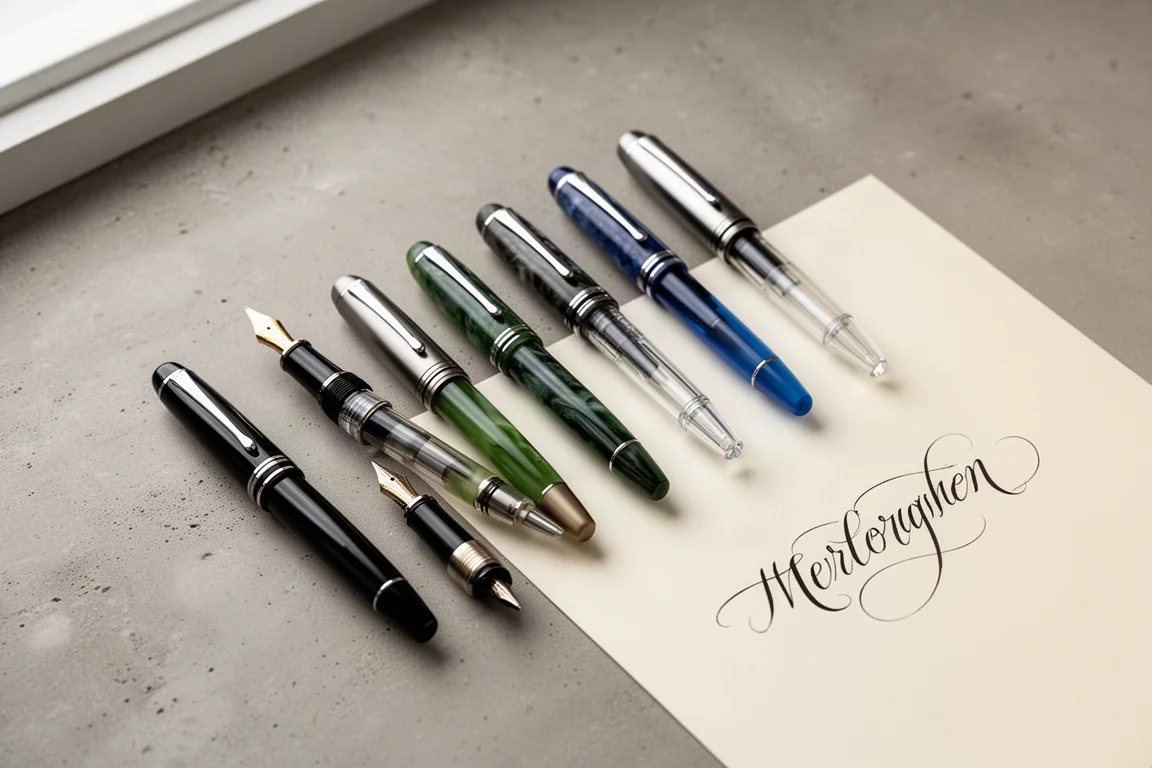
Best Budget Fountain Pens Tested: 9 Pens, One Clear Winner
A hands-on comparison of nine affordable fountain pens for everyday writing, calligraphy, and sketching, with a clear standout for flexible nib fans.
Fountain Pens
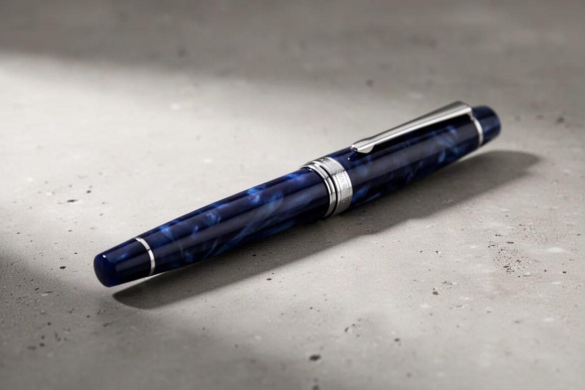
Aurora Optima Review: An Italian Piston Filler That Punches Above Its Price
A 14k gold nib, ebonite feed, and a beautifully deep oraloid body make the Aurora Optima one of the most rewarding piston fillers around.
Fountain Pens
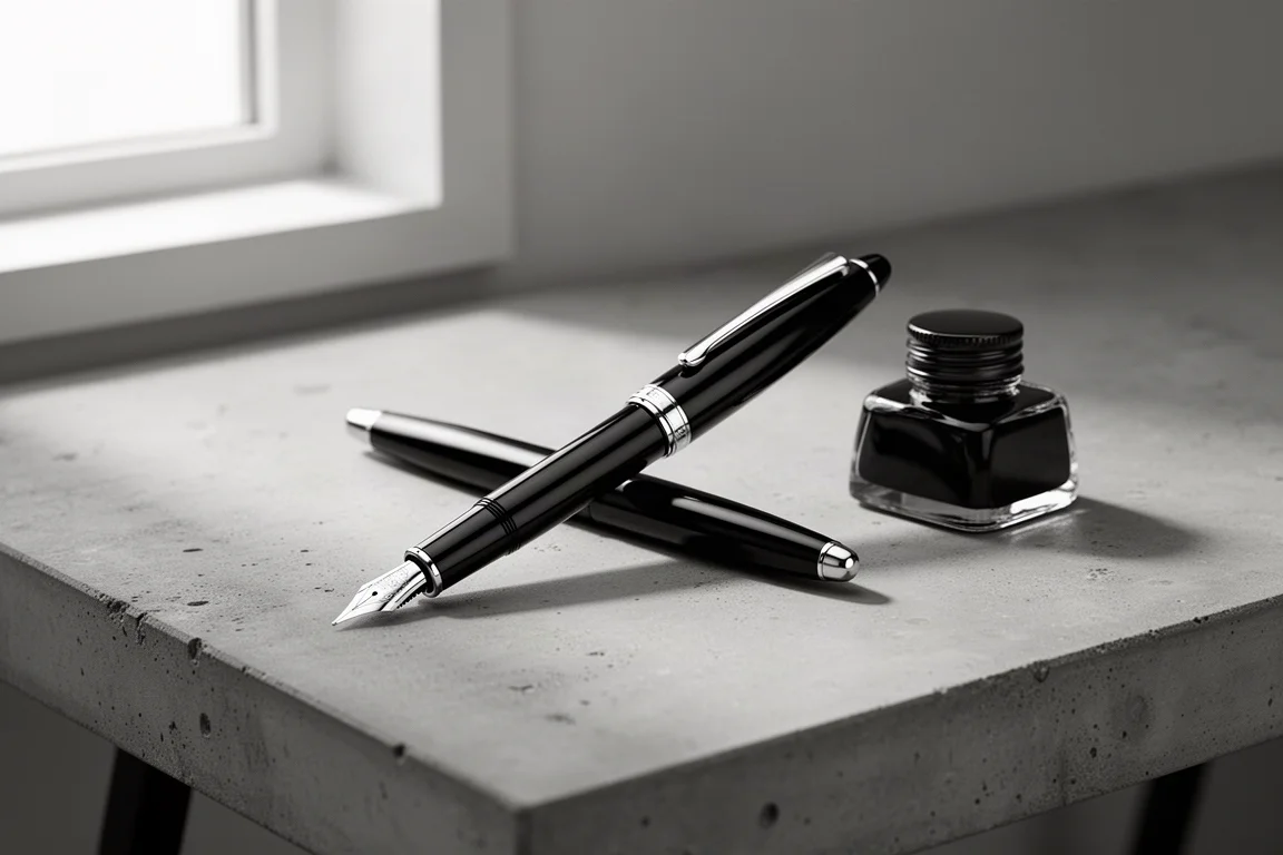
Cross Bailey Light Review: The Entry-Level Fountain Pen Worth Keeping at the Office
A plastic-bodied Cross with a metal clip, snap cap, and famously smooth extra fine steel nib. Around $15, available almost everywhere, and easy to recommend.