Fountain Pens
Magna Carta Urban Amberine Review: A Brush-Style Fountain Pen With Real Character
A resin fountain pen with an upturned fude nib, translucent amber resin, and an ebonite feed, built for expressive line variation and calligraphy.
Introduction
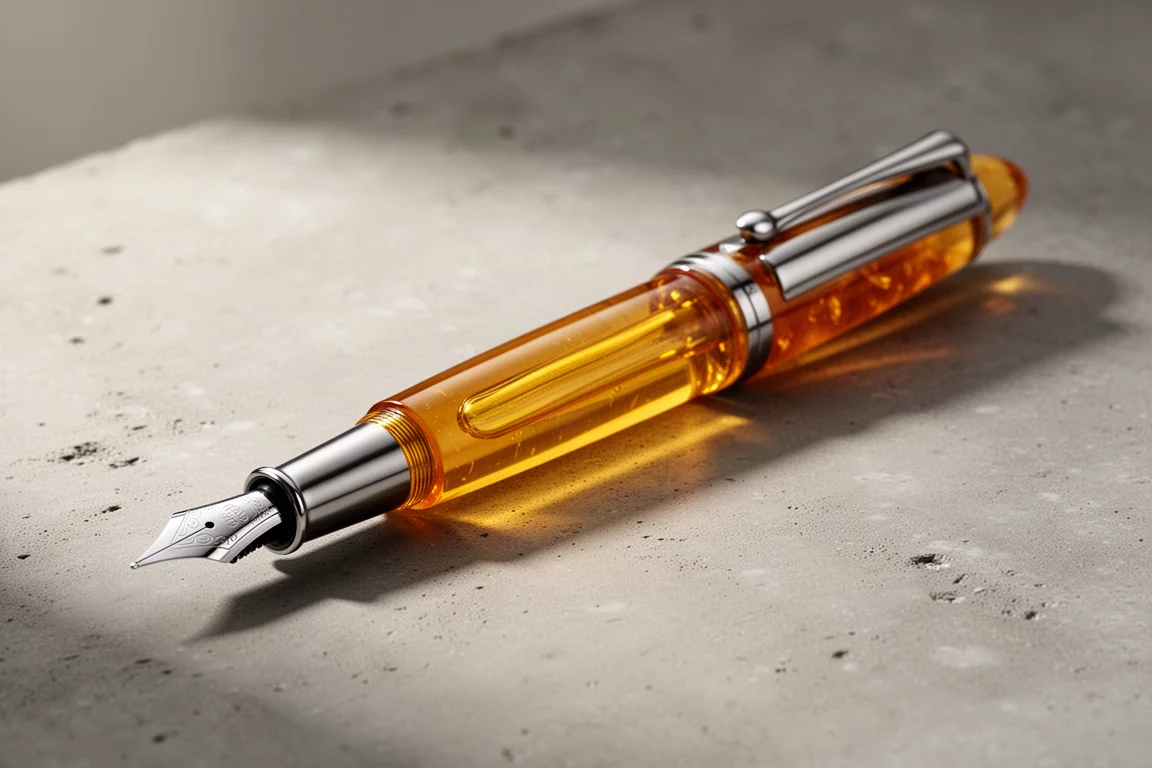
The Magna Carta Urban Amberine is not a pen for blending in. It is a long, slender resin fountain pen with a translucent amber-toned material that genuinely looks like honey, and an upturned steel fude nib modelled after a Japanese brush. That combination makes it a specialist tool: fantastic for expressive strokes, Asian-style calligraphy, and artistic line variation, but an unusual choice for a grocery list.
At €44.63 excluding VAT, it sits in a middle band of the fountain pen market, where buyers rightly start asking whether a steel nib justifies the price. This review walks through the design, the nib, the writing experience, and one startup issue worth knowing about before you buy.
Who This Product Is For
This pen is aimed at artists and calligraphers, particularly anyone drawn to brush-style lettering. The fude nib exists precisely because its upturned tip behaves differently depending on the angle at which it meets the paper, allowing a single nib to sweep from fine to enormously broad. If you write primarily small, everyday text on forms or class notes, other pens will serve you better. If you want a pen that stands out and rewards experimentation, the Urban Amberine makes a strong case for itself.
Design and Build Quality
The resin is the star here. The amber-toned material at the cap finial and the end of the barrel is translucent and warm, and it really does evoke actual amber. The rest of the barrel uses a solid, slightly vintage-feeling resin that pairs well with it. A simple steel clip, a cap that tapers down into the amber material, and a discreet blind-engraved Magna Carta logo complete the look.
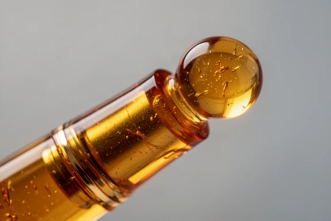
In the hand it is long and fairly skinny rather than girthy, and the proportions deliberately echo a brush. The section is long and comfortable, with a pleasant step-down from the barrel, and the cap posts securely to create an even longer, brush-like instrument. Inside, the pen takes cartridges or a converter, and the ebonite feed is a genuine highlight: ebonite has excellent flow properties and can be heat-set if you ever swap nib sections.
The Fude Nib: Line Variation on Demand
If you have never seen a fude nib, it may look like something went wrong at the factory. The steel nib, marked with the Magna Carta logo and Urban branding, curves upward at the tip. That upturn is the entire point: line width changes dramatically with writing angle.
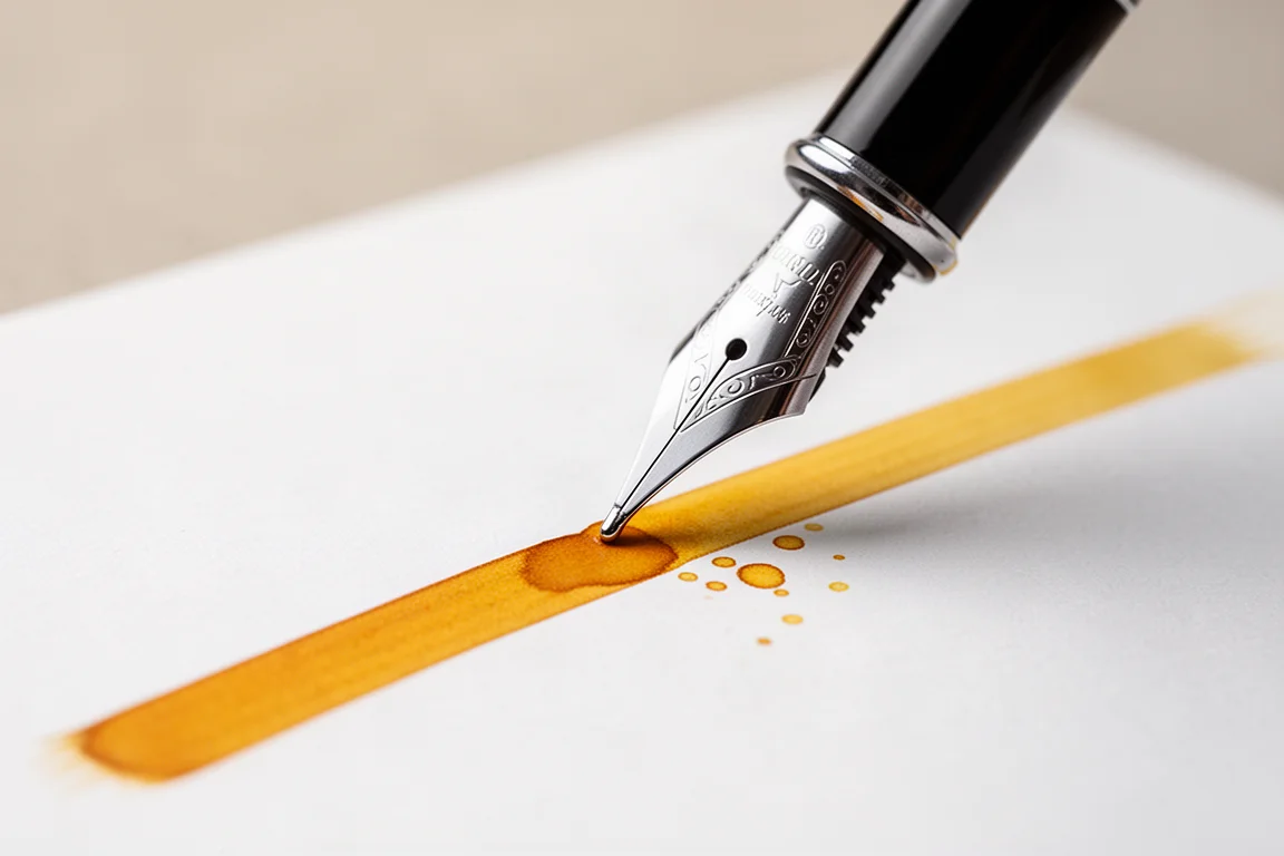
Held at a normal writing angle, it behaves roughly like a fine to medium nib. Tilt it further and the stroke widens to medium-broad territory. Hold it almost perpendicular, with the flat foot of the nib fully aligned to the page, and you get an enormously wide, smooth line, because the entire side of the nib rides the paper. Even upside-down writing is possible, using just the very tip of the nib for a very fine, dry line. That range, from hairline to double-broad and beyond, is what makes this pen fun, and it is also why it rewards saturated inks for the extreme settings.
How It Writes
The writing experience is best described as playful rather than practical. With a broader, richer nib like this, flow matters, and the ebonite feed does its job well. Inks with good shading look particularly dramatic, and lighter yellow-orange inks show off the wide strokes beautifully on camera and on paper.
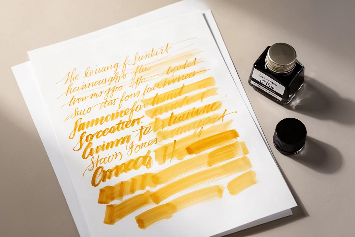
Everyday writing is where compromise appears. The line jumps between widths as the angle shifts, which is charming for display work and frustrating for consistency. For lettering practice, sketching, or calligraphy, though, this is precisely the behavior you are paying for. It is a smooth writer across its range, especially at the broadest angles where the full nib face touches down.
Things to Consider Before Buying
The price is the most common sticking point. At around €44 with a steel nib, you are entering territory where gold-nibbed pens begin to appear, so the value case rests on the unusual nib and the resin quality rather than raw materials alone.
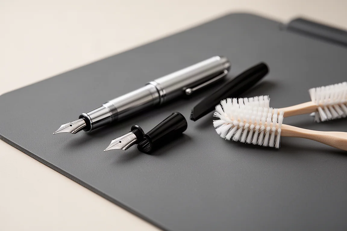
There is also one practical caveat worth knowing. After an initial flush, the sample pen refused to write, laying down only a couple of words before going dry again. The fix, in this case, was pulling the nib and feed and gently brushing the feed with pure dishwashing detergent to remove an oily residue, then rinsing everything thoroughly before reassembly. Nib and feed pull out easily and only fit one way, so alignment is simple. If your unit writes dry out of the box, that cleaning step is worth trying before assuming a defect.
Finally, the fude nib itself is a taste decision. It is subjective rather than a flaw, but anyone who does not enjoy brush-style line variation will likely find this pen hard to love.
Buying Advice
Buy the Urban Amberine if you are an artist, a calligrapher, or simply someone who wants a nib that offers genuine expressive range. Skip it if your priority is consistent everyday writing, small form-filling, or if a steel nib at this price feels like a poor deal. For its intended audience, the material quality, comfortable proportions, reliable posting, and ebonite feed make it a distinctive and enjoyable instrument.
Conclusion
The Magna Carta Urban Amberine is a well-made, strikingly attractive pen with a genuinely unusual nib. It will not suit everyone, and the steel nib at this price gives some buyers pause, but for brush-style calligraphy and expressive artistic writing it delivers exactly what it promises. Know its quirks, clean the feed if flow starts dry, and it becomes a lot of fun to use.
Product link
View more details for Magna Carta Urban Amberine
This product is mentioned in the review. Check the specifications, options, and compatibility before buying.
View more details for Magna Carta Urban AmberineFurther reading
Related Reviews
Fountain Pens
Best Budget Fountain Pens Tested: 9 Pens, One Clear Winner
A hands-on comparison of nine affordable fountain pens for everyday writing, calligraphy, and sketching, with a clear standout for flexible nib fans.
Fountain Pens
Aurora Optima Review: An Italian Piston Filler That Punches Above Its Price
A 14k gold nib, ebonite feed, and a beautifully deep oraloid body make the Aurora Optima one of the most rewarding piston fillers around.
Fountain Pens
Cross Bailey Light Review: The Entry-Level Fountain Pen Worth Keeping at the Office
A plastic-bodied Cross with a metal clip, snap cap, and famously smooth extra fine steel nib. Around $15, available almost everywhere, and easy to recommend.