Fountain Pens
Three Fountain Pen Favorites: J. Herbin Inks and a Rhodia Notepad Worth Trying
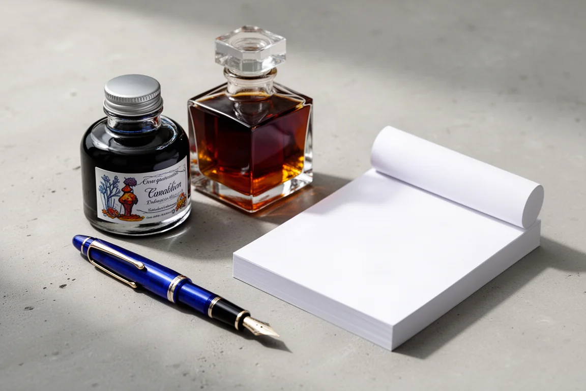
A deep blue from the La Perle des Encres line, a shimmering special edition created with Kenzo Takada, and the white Rhodia Maya notepad that ties it all together.
Introduction
Few stationery brands carry the kind of history J. Herbin does. Established in Paris in 1670, when King Louis XIV was just 32 years old, the company began as a sailor’s venture: its founder traveled to India, absorbed an extraordinary palette of color, and brought it back to France in the form of sealing waxes renowned for their adhesiveness and crisp impressions. From there the brand grew into one of the oldest ink makers in the world, with its La Perle des Encres line dating back to around 1700.
That legacy is part of what makes opening a J. Herbin package feel like an event. We recently spent time with three products from the brand’s world: the Bleu de Profunda ink from the La Perle des Encres line, a special edition ink created in collaboration with Kenzo Takada, and a Rhodia A5 white Maya notepad that turned out to be the perfect testing ground for both.
Why J. Herbin Still Matters
Before the three picks, some context. J. Herbin’s history is genuinely unusual. Its early sealing waxes were designed to bond to both sides of a broken seal, making tampering obvious, and the company later produced an iron gall ink formulated for use aboard ships, using tannins and iron for durability. Napoleon was known to use J. Herbin inks, and in 1829 the company released its own India ink for dip pens, even creating a special color for Victor Hugo in one of the earlier celebrity-endorsed products.
Today the brand’s “D” inks sit in what enthusiasts call the good-guy category: neutral pH, non-corrosive, and safe for any vintage pen. That combination of charm, history, and pen-safe chemistry is exactly why these two inks deserve a closer look.
J. Herbin Bleu de Profunda
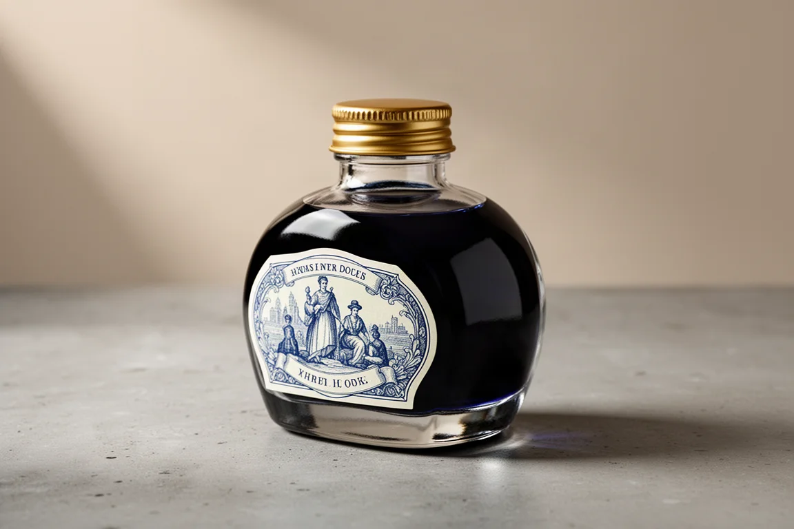
Bleu de Profunda comes in the classic J. Herbin bottle with the charming traditional illustrations that make the brand so recognizable. It contains no shimmer or sheen additives; it is simply a solid, reliable blue. And what a blue it is. On first contact it reads as a very dark midnight shade, romantic and dramatic, with excellent saturation.
Written out on paper, the color is extraordinary: dark enough for office use, rich enough for correspondence and journaling, and contrasty enough to feel confident on ivory or off-white journal pages. Anyone who loves deep, dark, rich blues will get along with this one immediately. It might even challenge long-standing favorites in a personal ink hierarchy, which is high praise for a straightforward, shimmer-free blue.
If you want one blue that works everywhere, from the office to a personal journal, this is an easy recommendation.
J. Herbin x Kenzo Takada Shogun Ink
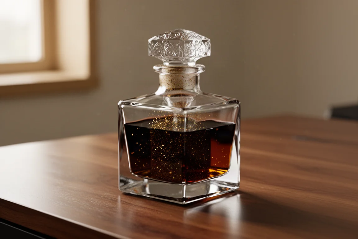
The Kenzo Takada ink is a different kind of pleasure. It arrives in a gorgeous faceted square glass bottle that looks like a perfect whiskey decanter, complete with a beautiful portrait on the packaging and a small booklet. This is a special edition within the J. Herbin line, and the presentation alone makes it feel like a keepsake.
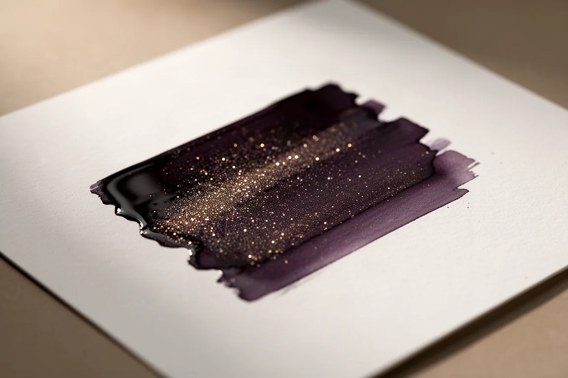
The ink itself is dramatic. It carries a generous amount of shimmer, so give the bottle a good shake before filling. The first swatch is much darker than expected, which is a good thing: darker inks with strong contrast on the page tend to be far more versatile, especially for journaling in books with ivory or off-white pages. There is a subtle sheen that picks up in the light, and the overall impression is a dark, vintage-toned color with a bit of magic sprinkled through it.
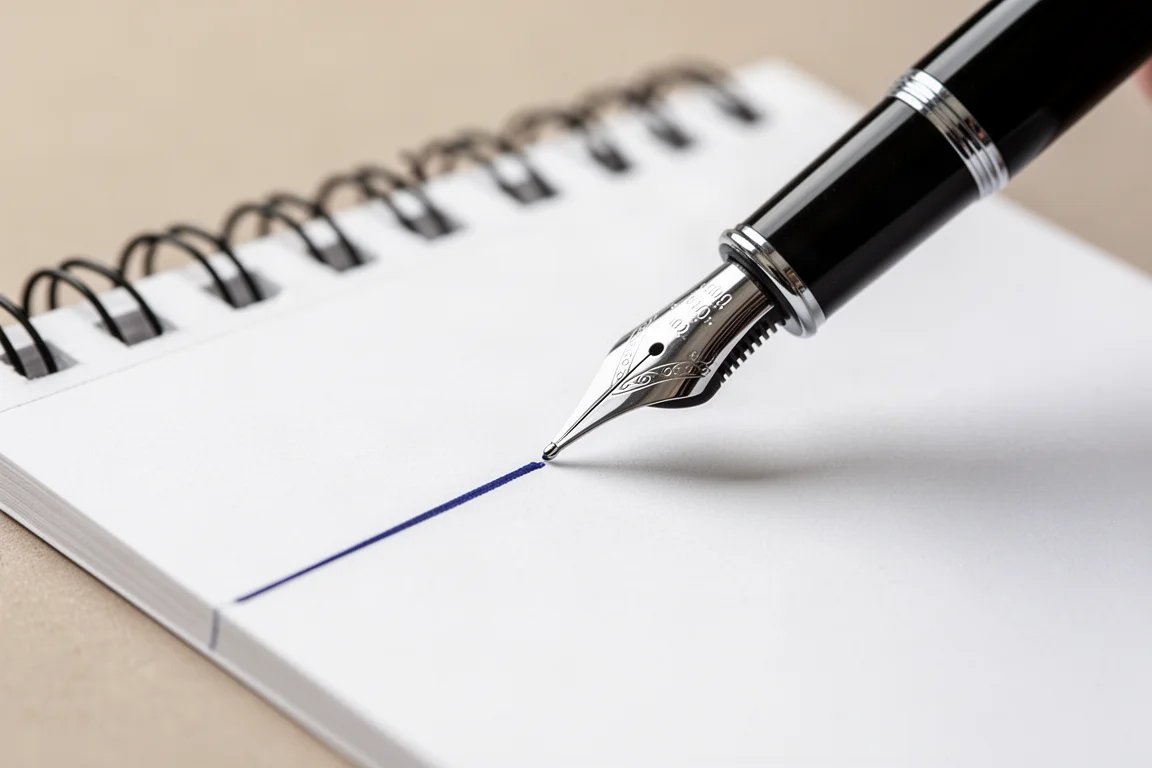
This is a shade that rewards a wider nib. Pairing it with a pen that lays down a generous line lets both the color and the shimmer show fully. It is dark and saturated enough to be taken seriously for business use, but the shimmer keeps it playful enough for personal writing.
Rhodia A5 White Maya Notepad
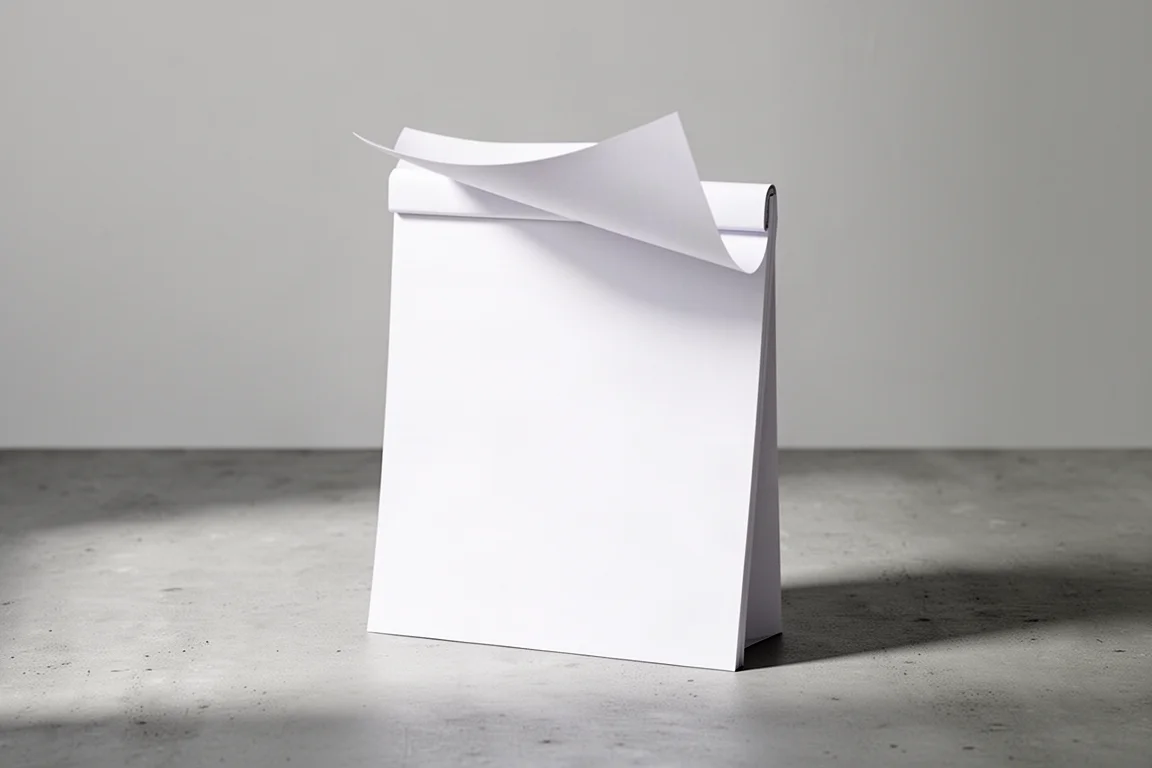
Great ink deserves great paper, and the Rhodia white Maya pad delivered. It is an A5 pad, 14.8 by 21 centimeters, with 50 sheets of 55-pound Maya paper. The pad is top-glued, which is a small detail that makes a big difference: pages flip up cleanly, which is ideal for writing, filming, or simply keeping the desk tidy.
The Maya paper is smooth with a substantial feel, and the writing experience is noticeably better than on heavier watercolor stock. Both inks expressed beautifully on it: crisp lines, clean shading, and no fuss. The bright white surface also makes darker inks like Bleu de Profunda and the Shogun edition look their absolute best, with maximum contrast.
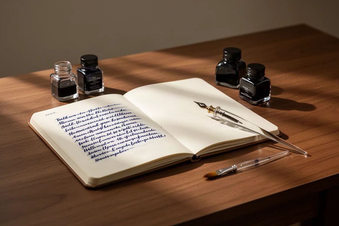
For anyone who demonstrates inks, tests pens, or simply burns through paper with daily writing, this pad is a practical and satisfying companion.
Buying Advice
A few practical notes for choosing between these. If you want a versatile daily blue with no shimmer, Bleu de Profunda is the safer pick: dark, professional, and happy in any pen. If you want an occasion ink, the Kenzo Takada edition is the one to display on the desk and save for entries that deserve some drama; it will shine brightest in a wetter or stub-style nib. The Rhodia Maya pad is a no-brainer either way, since smooth 55-pound white paper flatters both inks and makes everyday writing feel better.
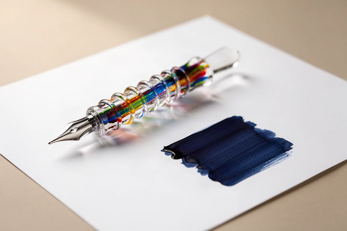
One small tip when using the classic J. Herbin bottles: as the ink level drops, tilting the bottle or using a syringe makes filling easier. And when trying a new ink for the first time, a glass dip pen is a wonderful tool. The grooved glass design holds enough ink to write several lines without puddling, and it puts all the focus on the ink itself.
Conclusion
Three products, one coherent setup: a deep, romantic midnight blue for everyday writing, a shimmer-laden special edition for when the page deserves drama, and a smooth white Rhodia pad that lets both perform at their best. The shared thread is J. Herbin’s 350-year habit of making ink that feels special without being complicated. For anyone curious about fountain pen inks, this is a very rewarding place to start.
Further reading
Related Reviews
Fountain Pens
Best Budget Fountain Pens Tested: 9 Pens, One Clear Winner
A hands-on comparison of nine affordable fountain pens for everyday writing, calligraphy, and sketching, with a clear standout for flexible nib fans.
Fountain Pens
Aurora Optima Review: An Italian Piston Filler That Punches Above Its Price
A 14k gold nib, ebonite feed, and a beautifully deep oraloid body make the Aurora Optima one of the most rewarding piston fillers around.
Fountain Pens
Cross Bailey Light Review: The Entry-Level Fountain Pen Worth Keeping at the Office
A plastic-bodied Cross with a metal clip, snap cap, and famously smooth extra fine steel nib. Around $15, available almost everywhere, and easy to recommend.