Fountain Pens
How Different Nibs Change Your Handwriting: 8 Fountain Pens Worth Exploring
From extra fine to flex, a hands-on look at eight fountain pens and what each nib does to your handwriting.
Introduction
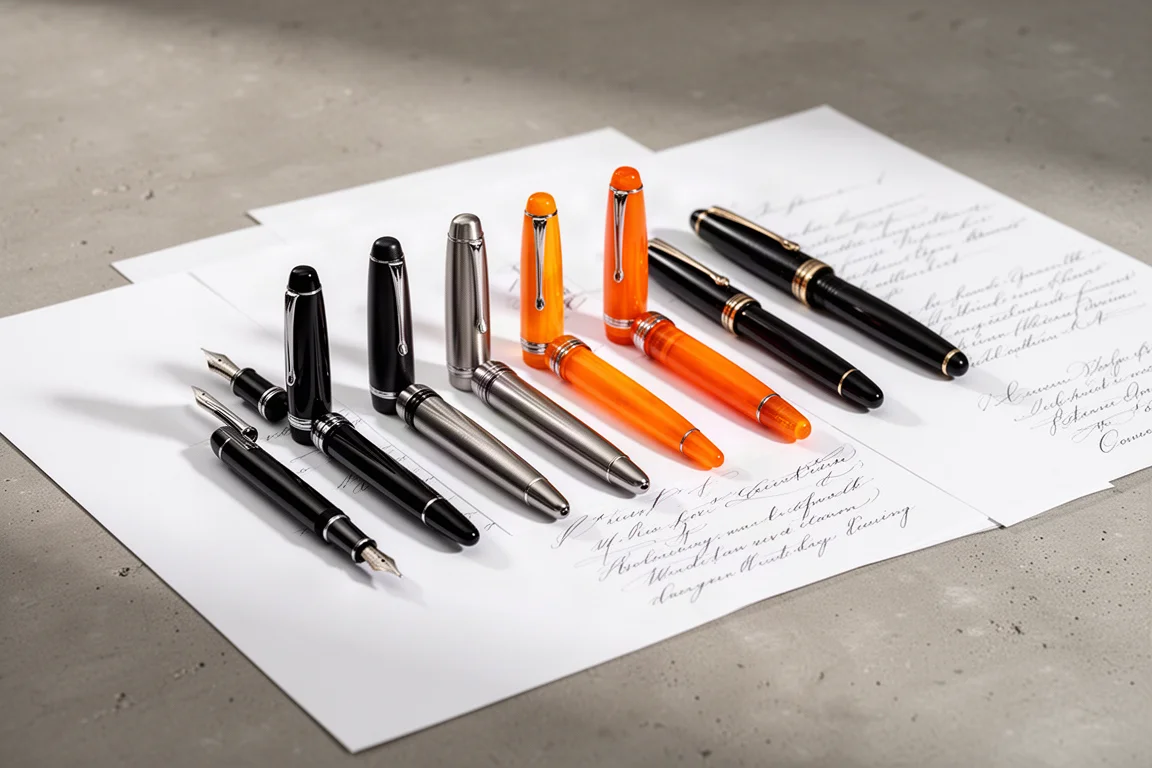
The nib changes everything. The same hand, the same paper, even the same ink can look completely different depending on whether the pen writes an extra fine hairline or a broad, inky ribbon. This roundup walks through eight fountain pens spanning the common nib grades and the more theatrical ones: stubs, italics, and flex. Each section explains what the nib does to the written line, what the writing experience feels like, and who the pen makes sense for.
The test surface was a large A4 sheet of smooth Japanese paper, which expresses shading and sheen in ink particularly well. That matters here, because line variation and ink character are exactly what separate these nibs from one another.
Pilot Custom Urushi: The Medium Benchmark
Medium is the sensible place to start, because it is the balance point most nib sizes are measured against. Extra fines can run slightly scratchy, broads can feel too wide and flowy, and medium sits comfortably between. The Pilot Custom Urushi with a medium nib delivers one of the most pleasant writing experiences available: smooth, cushioned, with a hint of softness and give under the hand. Line variation is minimal, but the sheer comfort makes it easy to write with for hours.
Paired with a saturated blue ink like Pilot Kon-Peki, even a medium line shows tonal shifts as the nib rests on the page and the ink pools. Medium may not be dramatic, but through a pen this well built it never feels boring.
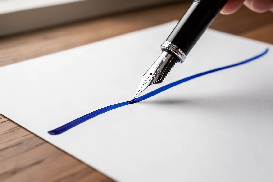
This is the pen for writers who value comfort and reliability above flourish.
Gravitas Vac 2.0: Extra Fine With Flow
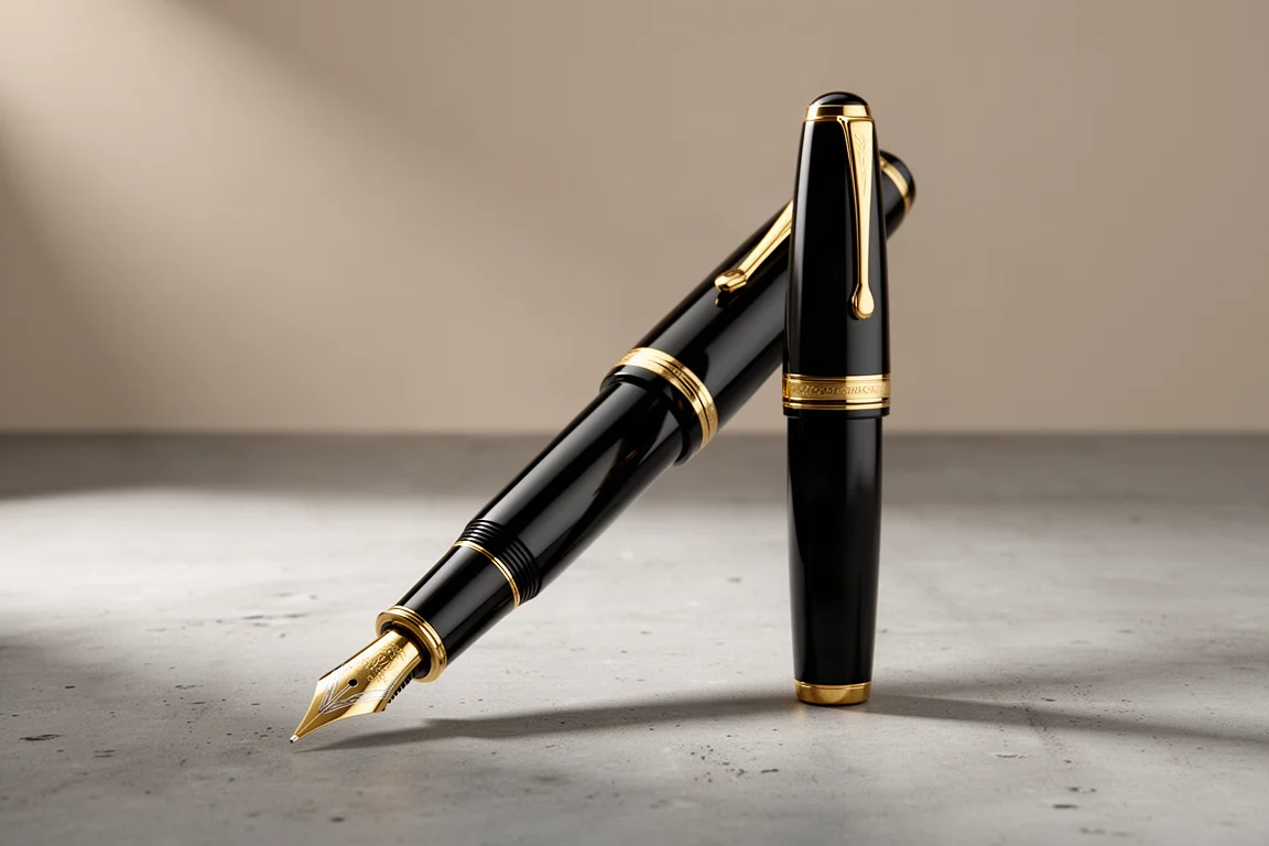
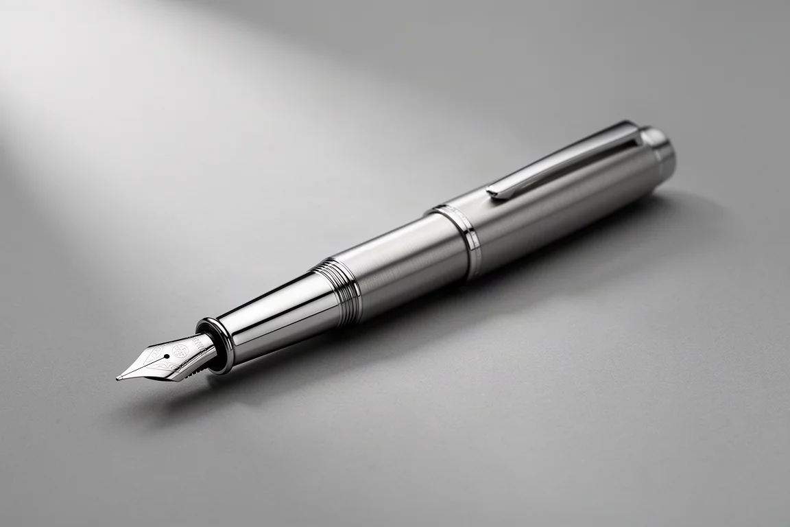
Extra fine nibs often stifle ink flow, leaving lines that feel pinched and dry. The Gravitas Vac 2.0 in titanium is a surprising exception: the extra fine nib here lays down a generous, steady flow with a little shading along the way. The tactile titanium body also solves a common metal-pen problem. Instead of a slippery grip, small grooves give the fingers something to hold onto.
This is a carefully machined pen with tight tolerances, and it shows in the writing feel. If you want the fine line but dread the scratchiness that often comes with it, this is a compelling option. Aurora Sepia suits it well as an ink, since it cleans up easily and shows subtle shading in a fine line.
Montblanc 149: Fine, Cushioned and Indulgent
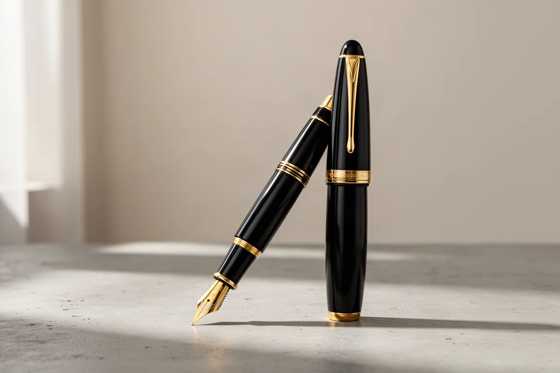
The Montblanc 149 with a fine nib does not look dramatically different from a good extra fine on the page, and that is worth knowing: nib width varies considerably between brands, so a Montblanc fine runs wetter and softer than many other makers’ fines. What sets this pen apart is the experience. The nib is designed with a generous ink flow to cover imperfections in a writer’s hand, producing a cushiony, luxurious stroke.
The dimensions of the pen are as indulgent as the writing. The main caveat is price: at full retail it is hard to justify, but as an object and an experience it is genuinely brilliant. A fine nib tuned by a nib master transforms it further, and some owners regret not going straight for a cursive smooth italic grind. With Montblanc Midnight Blue, it is a pleasure.
Waterman 52: Vintage Flex Character
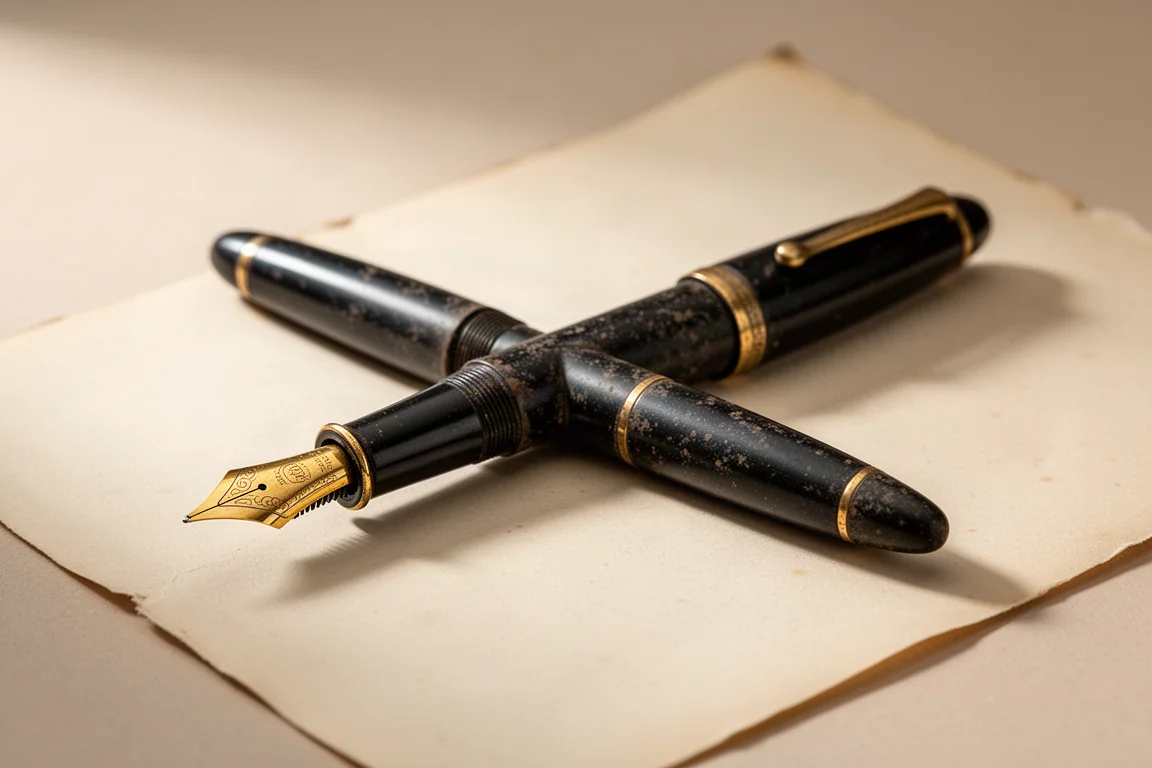
When the conversation turns to flex, vintage is the way to go. The Waterman 52, roughly a century old, carries an Ideal flex nib that is not fully super soft but flexy, springy, and full of personality. Downstrokes swell dramatically and hairlines recover on the upstrokes, the kind of thick-to-thin variation these pens were originally built for in the era of Spencerian writing and hotel registries.
The honest trade-off: flex writing takes effort. Pressing downstrokes on every letter can be tiring over long sessions, so flex is best treated as an expressive tool rather than an everyday workhorse. Paired with a favorite blue like J. Herbin Éclat de Saphir, the vintage flex line is genuinely striking.
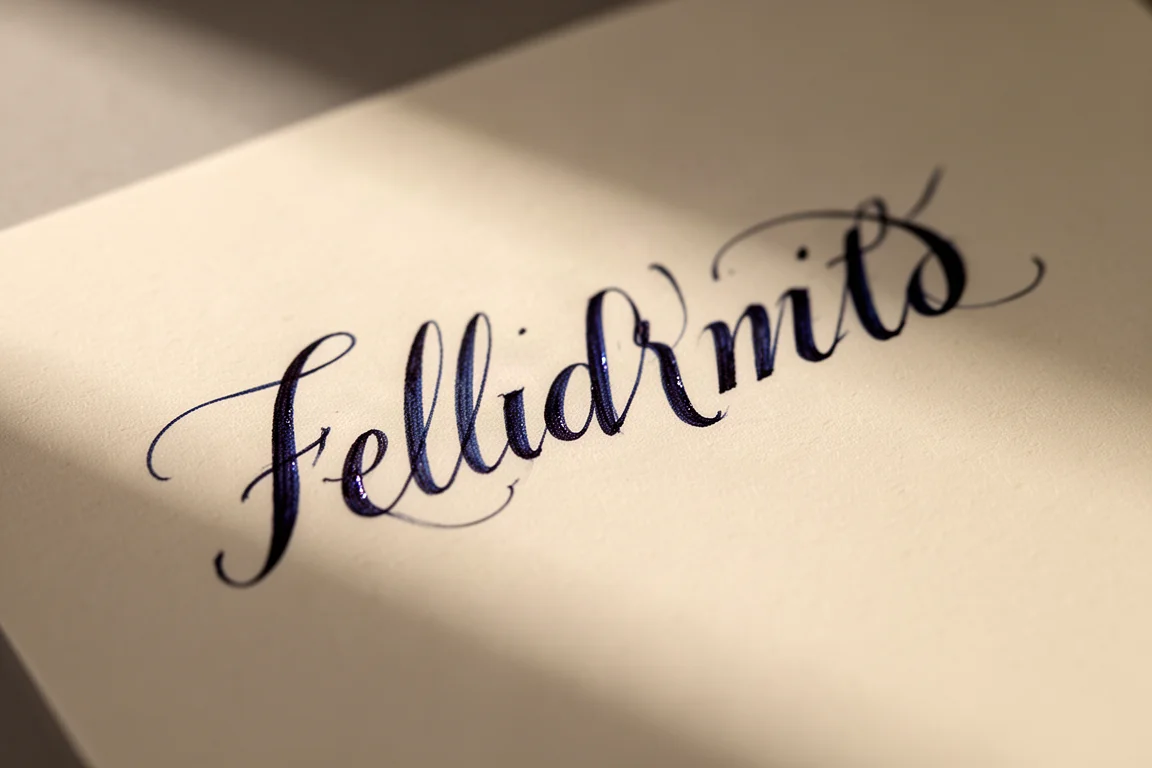
Vintage flex is the choice for anyone chasing old-fashioned thick-and-thin cursive.
TWSBI Eco: The Stub Value Pick
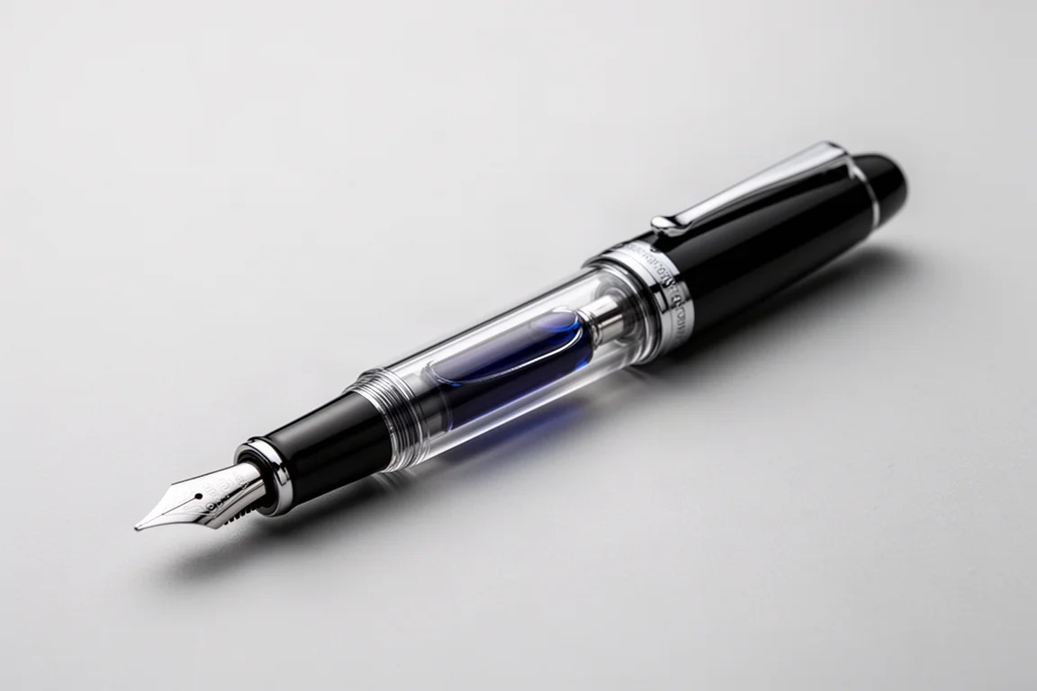
The TWSBI Eco with a 1.1 stub nib is one of the best demonstrations that line variation does not require a vintage pen or a premium budget. The pen itself is quietly handsome: cylindrical barrel, faceted piston knob and cap, a stylized clip, and metal trim around the cap. Nothing elaborate, but rewarding the longer you look.
On the page, the stub is where things get fun. Crisp vertical edges produce strong line contrast, and a shimmering or sheening ink like Tesla Coil can really come alive on smooth paper. A 1.1 stub is wide enough to show off shading and sheen without turning every word into a poster. As an affordable entry into expressive nibs, it is hard to beat.
Aurora Optima: Cursive Smooth Italic
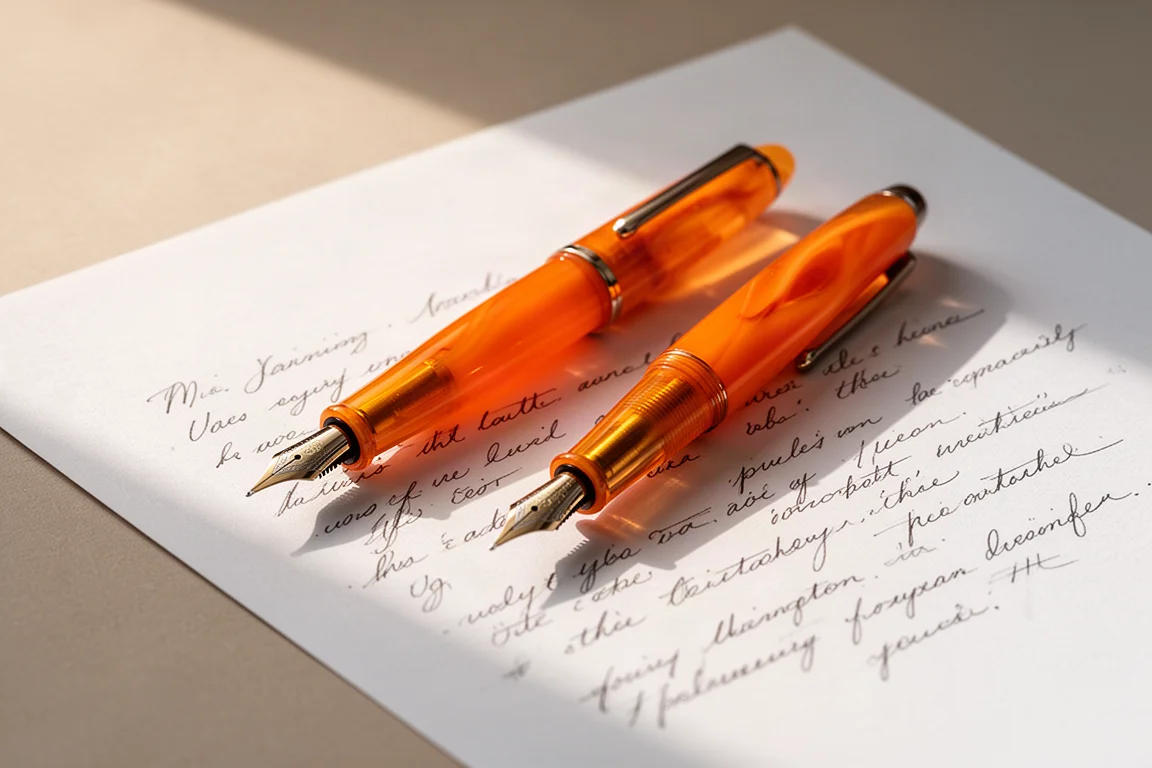
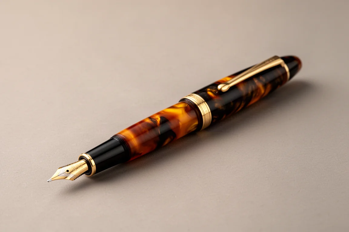
The Aurora Optima is a beautiful pen with serious heritage: the body style first appeared in 1936, and this summer-friendly version is an orange cello. The cursive smooth italic nib is the star here. It sharpens the edges of cursive strokes, adding crispness and contrast that a plain medium or broad cannot match, while staying smooth enough for everyday writing.
An italic like this rewards a cursive hand with more defined letterforms, and it makes capitals especially satisfying to write. The Optima is a lovely way to experience that nib style in a pen with real character.
Lamy Safari: The Rare Cursive Nib
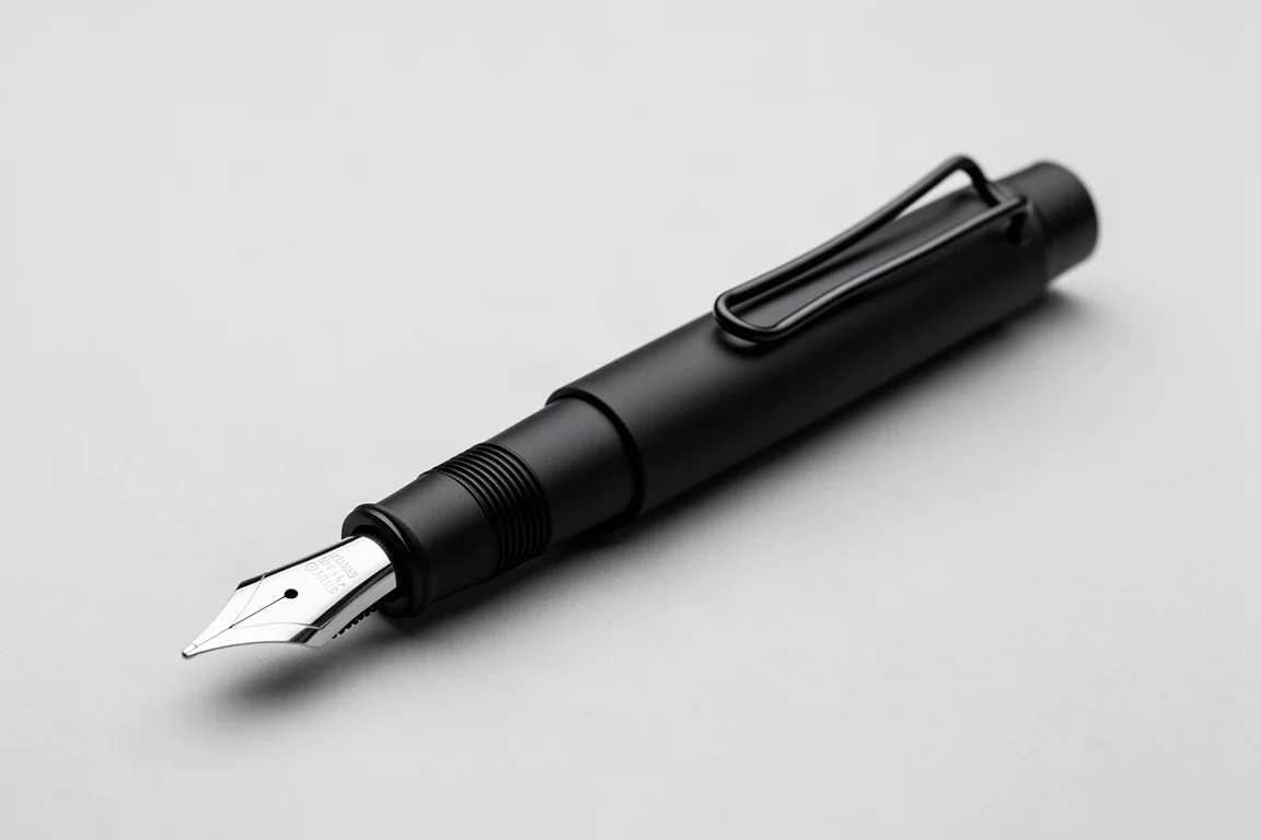
The Lamy Safari is familiar, but the Lamy cursive nib that fits it is far less common. This nib was designed for kanji and other Asian scripts, which means it is not being used to full advantage in Western cursive, yet it still produces a genuinely interesting line. Think of it as a cursive smooth italic narrowed toward a fine: quick, flowing, and slightly offset, with modest but real line variation.
It will not produce the widest line you have ever seen, but it writes fast, flows beautifully, and feels distinctly different from a standard Lamy nib. Safari owners looking to experiment cheaply have an unusually good option here.
Blue Dew: Extra Fine Flex
The Blue Dew writes an extra fine flex line that is very wet, very dramatic, and extremely fun. It is a somewhat challenging pen: rush the strokes and the ink flow runs out, but write slowly and deliberately and the results are on another level. The line variation is expressive enough to stand out immediately, even next to a vintage flex.
In the final comparison of nib styles, the Blue Dew flex produced the most impressive handwriting of the group, ahead of the broad, the stub, and the cursive smooth italic. That is a surprise worth taking seriously: modern extra fine flex offers vintage-style thick-to-thin character with a distinctly inky personality.
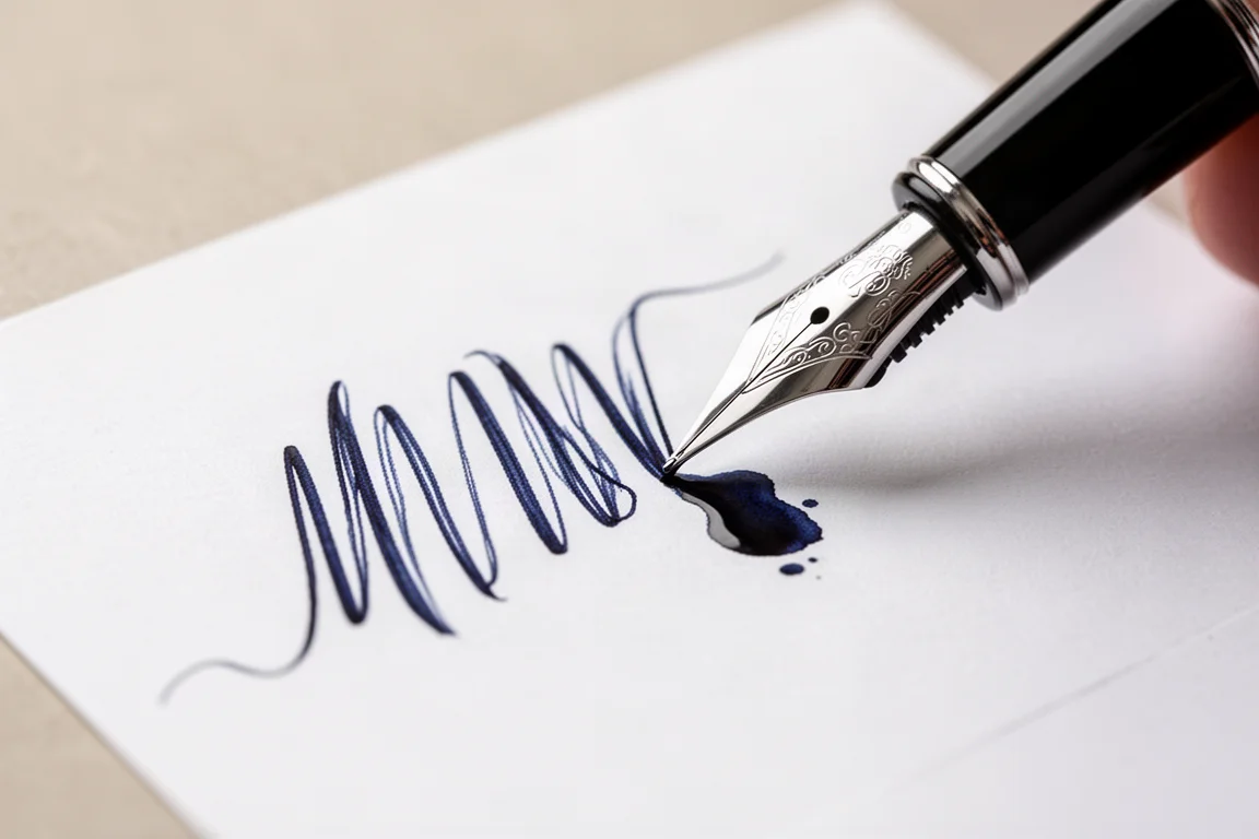
If you are patient with your strokes and want the most dramatic written line possible, this is the pick to beat.
Overall Buying Advice
Ranking these nib styles for pure handwriting drama, broad, stub, cursive smooth italic, and flex all leap off the page, while medium, fine, and extra fine are easier to dismiss visually, even when they are the best daily writers. A few practical takeaways:
- For an all-day, comfortable writer, a well-made medium like the Pilot Custom Urushi remains the benchmark.
- For visible line variation on a budget, the TWSBI Eco’s 1.1 stub delivers the most per dollar.
- For old-school thick-to-thin cursive, vintage flex like the Waterman 52 still has no substitute, though it tires the hand over long sessions.
- For the single most dramatic written line, the Blue Dew’s extra fine flex won this comparison outright.
Nib width also varies hugely between brands, so a fine from one maker can resemble an extra fine from another. If you can, try before you buy, or budget for a nib grind from a specialist if the stock finish disappoints.
Conclusion
No single nib is best, because each excels at a different job: mediums for comfort, fine grades for restraint, stubs and italics for contrast, and flex for theater. The most useful exercise is exactly the one this comparison followed: write the same passage with several nib types and see which one makes your own handwriting look its best. The answer may surprise you.
Further reading
Related Reviews
Fountain Pens
Best Budget Fountain Pens Tested: 9 Pens, One Clear Winner
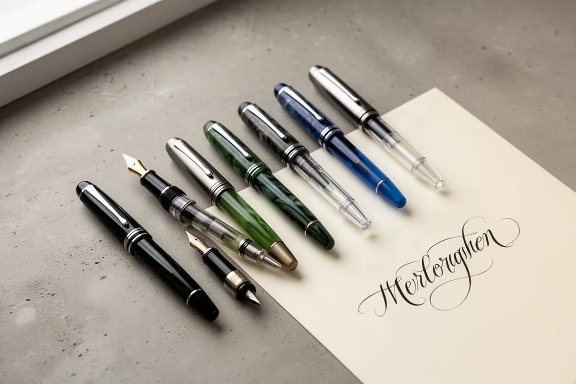
A hands-on comparison of nine affordable fountain pens for everyday writing, calligraphy, and sketching, with a clear standout for flexible nib fans.
Fountain Pens
Aurora Optima Review: An Italian Piston Filler That Punches Above Its Price
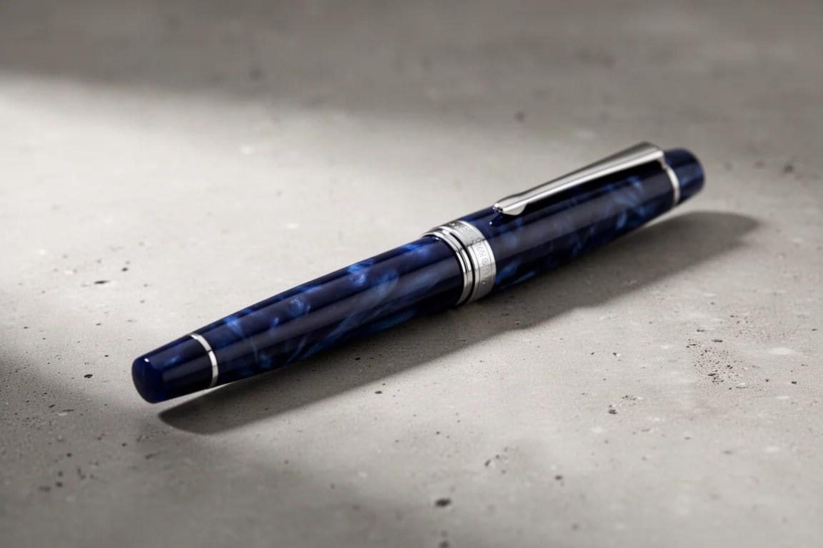
A 14k gold nib, ebonite feed, and a beautifully deep oraloid body make the Aurora Optima one of the most rewarding piston fillers around.
Fountain Pens
Cross Bailey Light Review: The Entry-Level Fountain Pen Worth Keeping at the Office
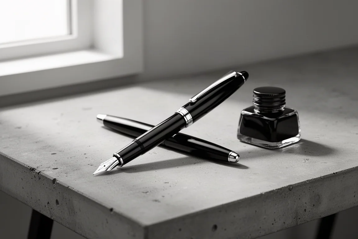
A plastic-bodied Cross with a metal clip, snap cap, and famously smooth extra fine steel nib. Around $15, available almost everywhere, and easy to recommend.