Art Supplies
Cretacolor Fine Art Pastel Pencils 72 Set: A Full-Size Palette Worth a Fresh Look
An Austrian-made 72-pencil pastel set with a beautifully balanced palette, excellent earth tones and greys, and just a couple of practical quirks to know before buying.
Introduction
Cretacolor is an Austrian company with a long pedigree, yet the brand has occasionally been squeezed between budget ranges online and the big premium names like Caran d’Ache, Faber-Castell and Derwent. Lately, though, the company has been pushing out some genuinely attractive new sets, and its name is popping up far more often. That renewed visibility, combined with prices that have come down noticeably from what they used to be, makes this a good moment to look properly at the Cretacolor Fine Art Pastel Pencils 72 Set, the largest set in the range.
Who This Product Is For
Pastel pencils suit artists who love the richness of pastel but dislike handling soft blocks or loose dust. If you work on pet portraits, wildlife, botanical subjects or anything that needs controlled detail, pencils give you far more precision than sticks. They also work well alongside softer pastels: many artists lay broad areas with blocks or pan pastels and come in with pencils for fine detail. If pastels have intimidated you because of the dust, gloves can help, and pencils are a gentler way into the medium altogether.
What’s in the Tin
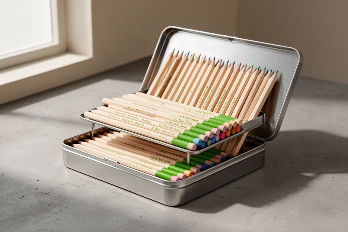
The 72 set arrives in a plain silver tin with the Cretacolor name at the top, a clean look similar to what a few other brands do. Inside there is a small booklet showcasing the wider Cretacolor range, including artist sets, graphite and charcoal sets, monolith graphite, artist powders and their aqua pencils. There is also a genuinely useful touch: a small sheet of fairly coarse sandpaper in a nifty envelope, perfect for refining pencil points after sharpening.
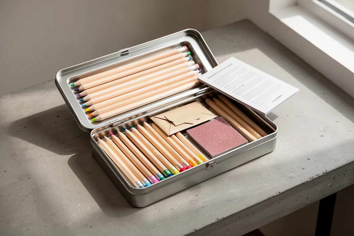
The back of the cardboard sleeve carries multilingual product information, a lightfastness notice explaining the ASTM scale (LF1 being the most lightfast), and notes on non-toxicity and environmental standards such as ASTM D-4236. One caveat: no individual lightfastness ratings are printed for each pencil, so if archival permanence matters for a specific colour, that is something to research further.
The main practical complaint is the inner tray. The 72 set uses two tiers, and the plastic tray is very flimsy, buckling noticeably in the centre when lifted. Most artists store their mediums in their own cases anyway, but if you plan to keep the pencils in the tin, be careful: pastel cores are far more brittle than coloured pencil cores, and a sagging tray is a real risk.
Palette and Pigment Quality
The barrel construction is solid: roughly a 3.8mm core, which is fairly standard for pastel pencils, in a barrel of about 7.5mm. The pale natural wood is printed in an easy-to-read chocolate brown with the brand name, “Fine Art Pastel” and Austria, plus the pigment name and number on the other side. A silver band separates the barrel from a colour identifier dip on the end, which makes grabbing the right pencil quick. The identifiers are close to the core colour but not exact, so making your own swatch on the paper you actually use remains essential.
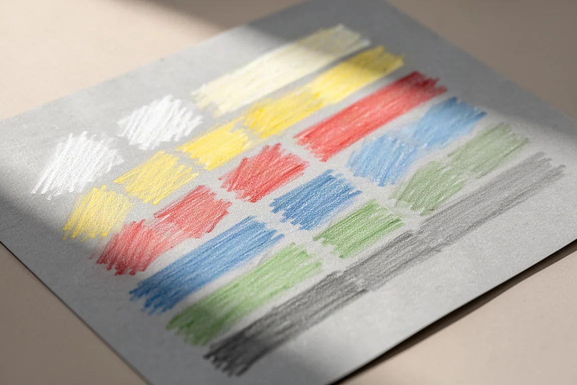
The palette itself is beautifully balanced, with no colour family overweighted. Highlights include a gorgeous madder carmine, mars violet light and dark, rose madder, old rose light and dark, and a strong blue run from ultramarine, indigo and Prussian blue down to glacier and mountain blue. Greens run from turquoise and fir green through olive green light, French green and moss green dark. The earth tones are superb, with English red, sienna, Indian red, sanguine light and dark, sepia light and dark, Van Dyke brown, umber and dark umber. The standout section is the greys: smoky, green, yellow, white, light, cloud, silver, blue, elephant, pearl, black and dark grey, each carrying subtle hints of its named tint. Swatched on Hahnemuhle grey paper, the saturation is impressive for pencils, which are inherently harder and less loaded than handmade soft pastel blocks.
Blending, Mixing and Light Over Dark
Colour mixing works just as it does with coloured pencils, with a little colour theory. Lay a light layer of yellow, add blue on top and work them together for green; add red to yellow for orange; lay red lightly and work blue over it for purple. Keep early layers light, because pressing hard too soon fills the tooth of the paper and makes later layers harder to apply.
One of pastel’s great advantages shows when you lay down a heavy layer of something like dark umber and then come back over it with permanent white for bright highlights. Unlike coloured pencil, where you must preserve the white of the paper or improvise highlights, pastel takes light over dark beautifully. Blending can be done with an angled sponge tool, which pushes pigment in without damaging the paper tooth, or with paper stumps; fingers work too, though they transfer skin oils to the paper.
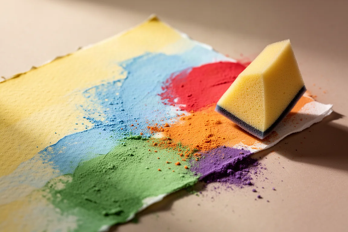
Paper choice matters. Hahnemuhle grey paper works but is flimsy and offers less tooth; Canson Mi-Teintes, Lux Archival and especially Clairefontaine Pastelmat, with its coarser gritty surface, allow more layers and brighter highlights. A test piece of a cat eye on Pastelmat showed dark layers taking lighter ivory and white strokes on top convincingly, and mistakes are generally easier to rectify in pastel than in most dry media.
Sharpening: The Real Learning Curve
Pastel pencils are notoriously difficult to sharpen, and this set is no exception. The core is brittle, so results vary by sharpener and by pencil. Brass bullet-type sharpeners work for some people and not others. Plastic pastel-specific sharpeners rarely worked at all here, and crank sharpeners are hit and miss. A craft knife or Stanley knife lets you shave wood and shape the point quickly, and the included sandpaper sheet or a sanding block refines the tip for detail work.
A smart habit: sharpen over your artwork or a sheet you can tap pigment from, so the shavings are not wasted, then work them in with a blender. For anyone with hand or wrist issues that make sharpening harder, a hand crank sharpener may be the most comfortable option.
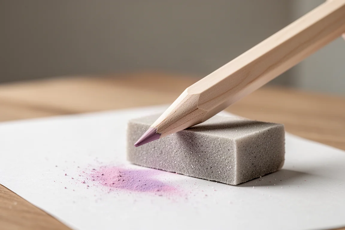
One quality note: a single green grey pencil arrived with a shattered core, cracking along a visible line no matter how it was sharpened. It was not dropped, and it was a shame because it was one of the most-wanted colours. It appears to be an isolated issue rather than a systemic one, but it is worth checking your set on arrival.
Buying Advice
This is one of the strongest pastel pencil palettes available, with an unusually deep selection of earth tones and tinted greys that suit portraiture, wildlife and botanical work. The cores are firm enough for detail but still richly pigmented, and the whole palette marries exactly with Cretacolor’s own pastel blocks, which are available in matching full ranges through retailers such as Jackson’s Art, should you want both formats in identical pigments. Weigh the flimsy two-tier tray and the usual pastel-pencil sharpening challenges against the quality of the pigment and the balance of the colour selection, and the pencils themselves come out clearly ahead.
Conclusion
The Cretacolor Fine Art Pastel Pencils 72 Set earns its place among the better pastel pencil ranges. The palette is thoughtfully balanced, the earth and grey sections are genuinely special, and light-over-dark layering works exactly as pastel should. The flimsy tray and one brittle pencil are minor blemishes on an otherwise excellent set, and for artists moving into pastel detail work, it is an easy recommendation.
Product link
View more details for Cretacolor Fine Art Pastel Pencils 72 Set
This product is mentioned in the review. Check the specifications, options, and compatibility before buying.
View more details for Cretacolor Fine Art Pastel Pencils 72 SetFurther reading
Related Reviews
Art Supplies
Art Pop Watercolor Pencils 48-Color Set: A Thoughtfully Designed Student-Grade Option
The Art Pop 48-color watercolor pencil set blends well, dissolves smoothly, and includes artist-friendly details like barrel-printed color names, all at an affordable price.
Art Supplies
Artics Acrylic Markers 3mm Review: Versatile Paint Markers With a Few Caveats
A 48-color set of water-based acrylic paint markers that blend while wet, dry permanent, and keep the price low, though safety transparency remains a question.
Art Supplies
Best Art Supplies Worth Your Money: Pencils, Pens, Paints, and Paper That Earned Their Spot
After years of daily use and testing, these are the pencils, pens, watercolors, gouache, brushes, sketchbooks, and erasers that stand above the rest.