Art Supplies
Six Orange Watercolors Worth a Spot on Your Palette
From Quinacridone Sienna to Cadmium Orange, a closer look at six orange and orange-adjacent watercolors and how they behave on hot and cold press paper.
Introduction
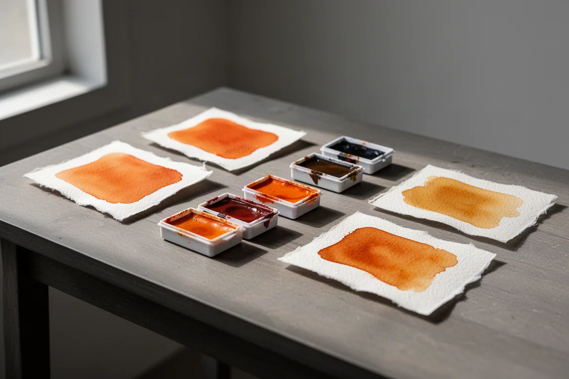
Orange is one of those colors that earns its place on a palette quietly. Get the right one and your autumn foliage, skin tones, and earth mixtures come alive; pick the wrong one and it dominates everything. On a rainy Minnesota winter day, it was the perfect excuse to stay inside and swatch out a range of orange and orange-adjacent watercolors.
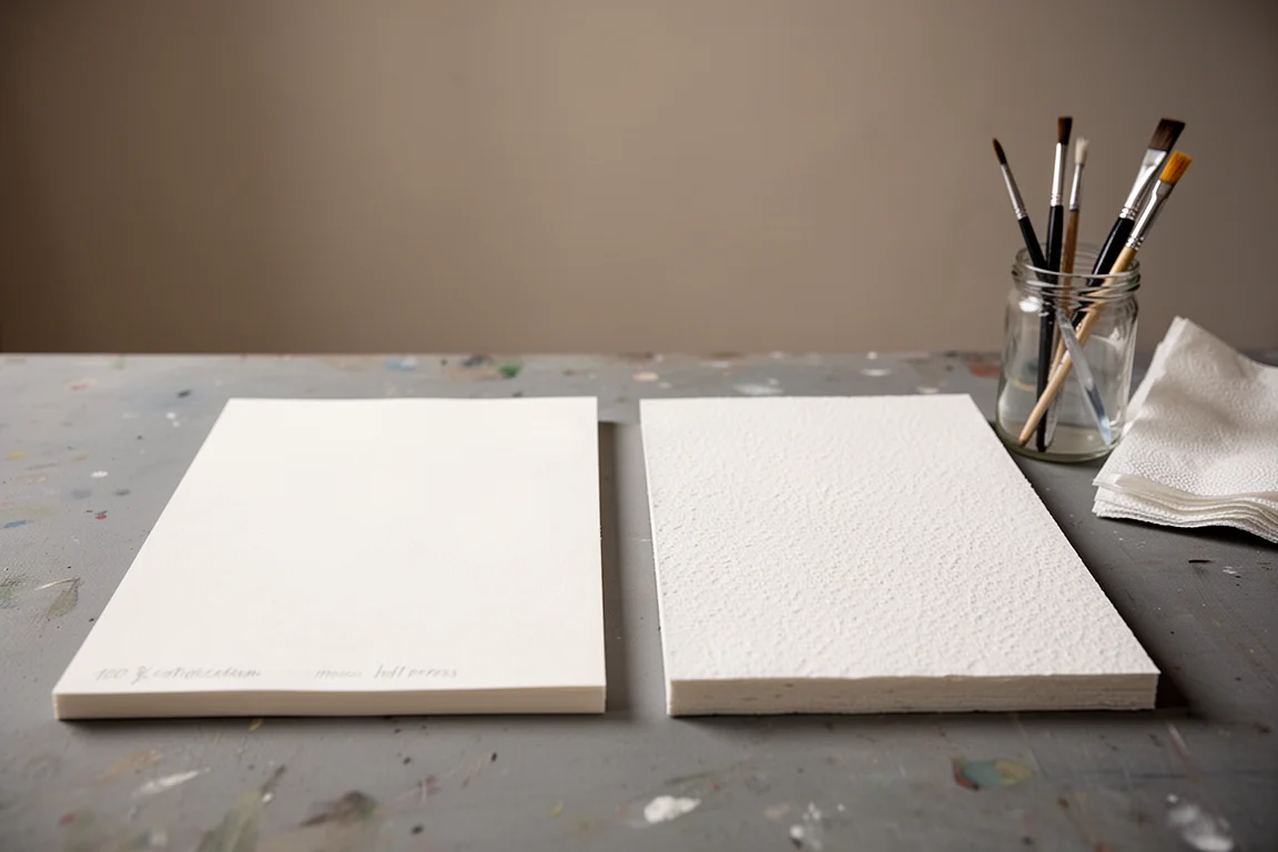
For testing, everything went onto 100 percent cotton watercolor paper in smaller sizes: one sheet of smooth hot press and one of a thicker, heavier cold press. That setup makes the differences between these paints easy to see, and it costs very little to replicate at home.
How These Oranges Behave on Paper
Most of the colors here are Daniel Smith paints, with one exception: the Cadmium Orange, which comes from SCHA. Swatching them side by side on hot press and cold press rough paper shows how differently each pigment settles into the surface.
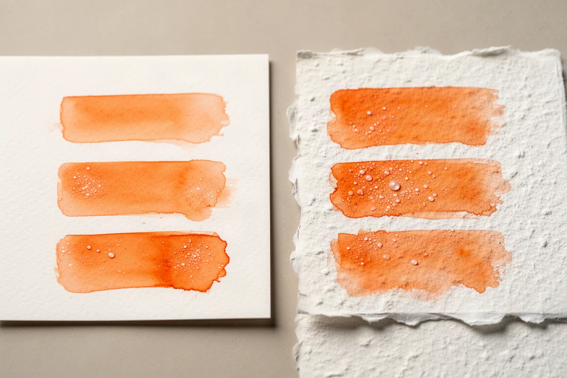
One thing worth noting for any watercolorist: these paints consistently dry a little lighter than they go on wet. On rough cold press paper, the pigment creates a definite textured pattern, with visible spidering as color works its way into the deep fibers of the sheet. On smooth hot press paper there is still a hint of that spidering, but it is far less pronounced.
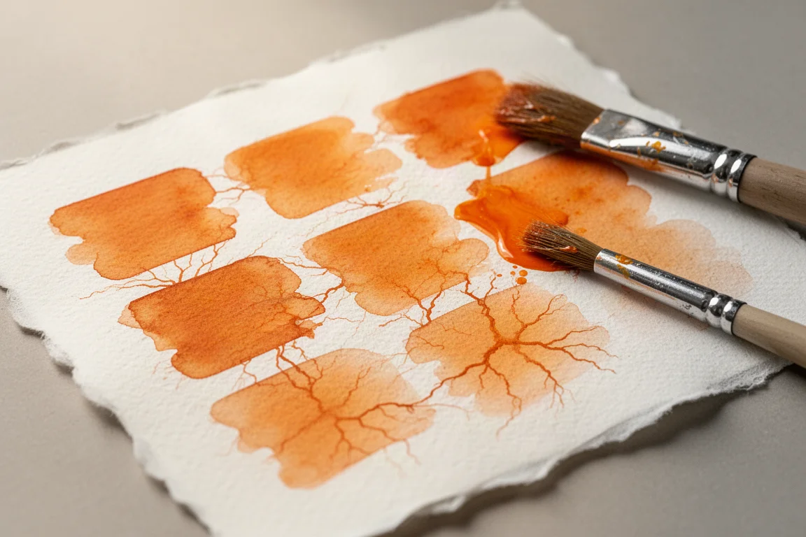
Wet-on-wet is where these paints get interesting. Spraying the paper liberally with water and dropping a touch of each color into the wet puddle lets you watch the pigments bloom and separate. Close up, there is not a huge difference in how the paints lay down across the two paper types, but the practical takeaway is clear: if you want really sharp paint edges, hot press paper is the better choice. If you prefer looser looks, go with cold press.
Daniel Smith Quinacridone Sienna
Quinacridone Sienna is the most versatile of the group. It sits between orange and brown, mixes beautifully with the other warm tones here, and behaves well in wet-on-wet applications. For anyone building a limited warm palette, this is often the first one worth picking up.
SCHA Cadmium Orange
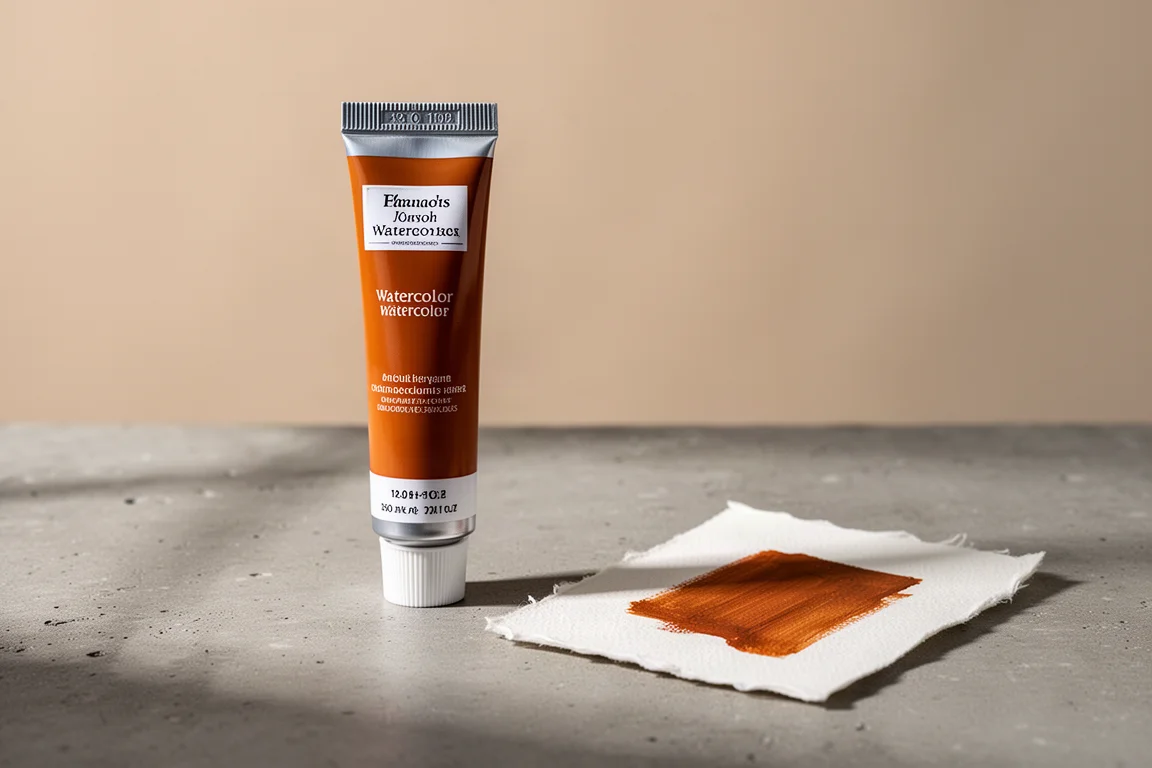
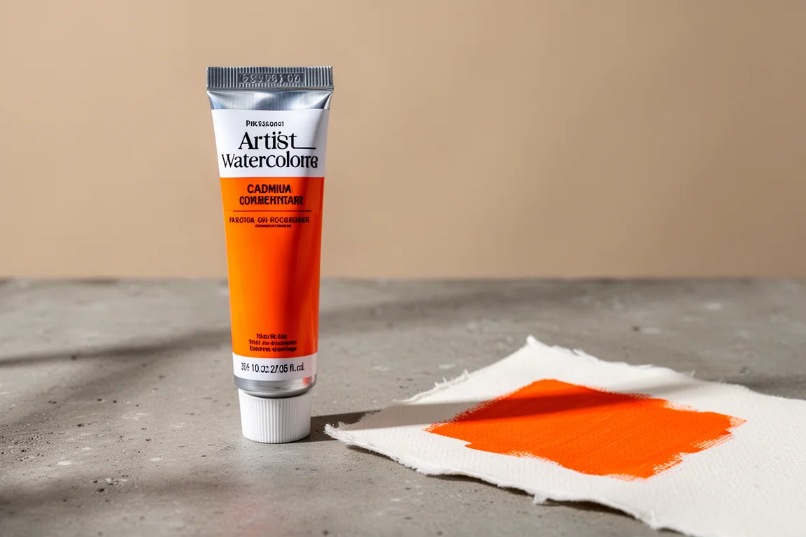
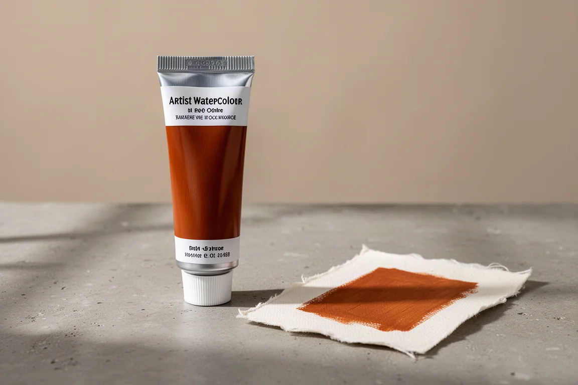
The Cadmium Orange is the only non-Daniel Smith paint in this lineup, and it shows up as the classic, bold, opaque-leaning orange of the set. When you need a strong, confident orange that reads as orange in every mix, this is the one that does that job most directly.
Daniel Smith Pyrrole Orange
Pyrrole Orange is a punchy, saturated orange with real presence on the page. It is the kind of color that carries a painting on its own, and it proved its worth when it came time to put brush to paper for actual subjects rather than swatches.
Daniel Smith Quinacridone Burnt Orange
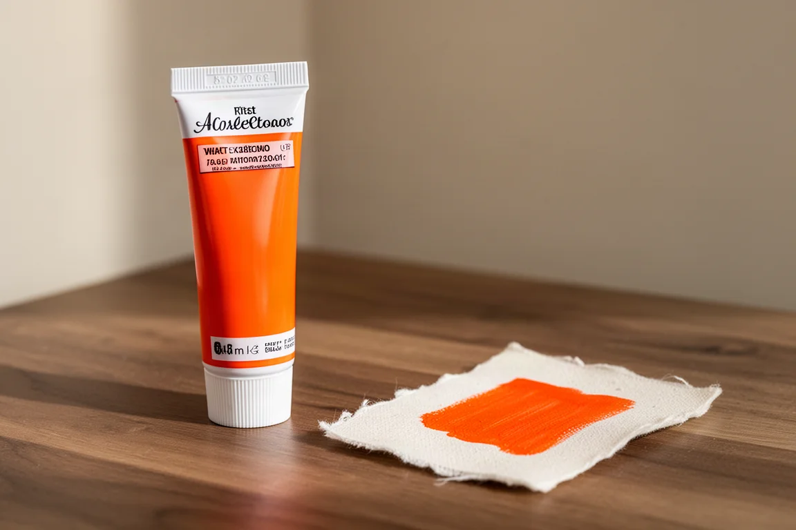
Quinacridone Burnt Orange pushes darker and earthier than the rest. It earns its keep in autumn scenes, shadows, and mixes where a straight orange would be too loud. Paired with Quinacridone Sienna it covers a lot of warm ground with just two tubes.
Daniel Smith Perylene Orange
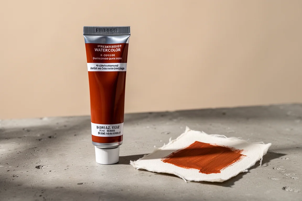
Perylene Orange rounds out the bright end of the range. It offers a rich, deep orange with a slightly different character from the Pyrrole, giving you options when a painting needs more than one voice in the orange family.
Daniel Smith Italian Deep Ochre
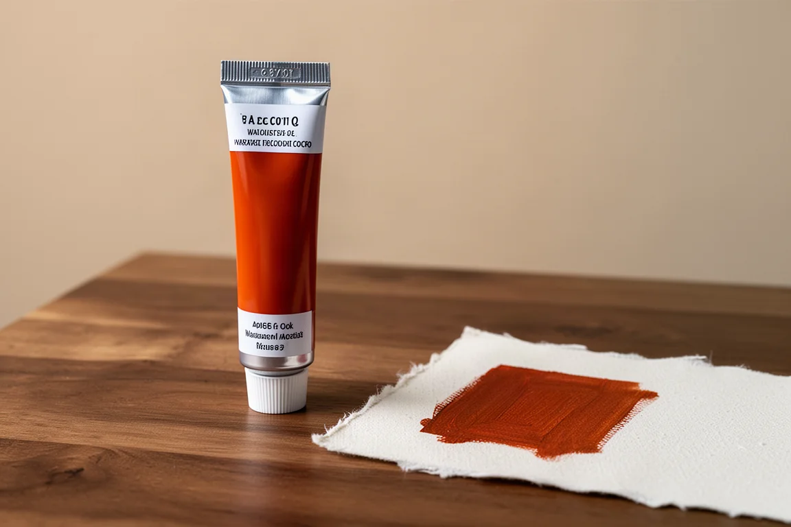
Italian Deep Ochre is the earth-adjacent member of the group. It is a natural fit for landscapes and anywhere a quieter, grittier warm tone is needed. Used sparingly alongside the brighter oranges, it keeps compositions grounded.
Painting With the Palette
Swatches only tell part of the story, so the real test came from painting some autumn trees using nothing but this limited orange and orange-adjacent palette. Keeping the palette deliberately small, without adding anything more complicated, turned out to be a worthwhile constraint: the six colors mixed enough variety to render autumn foliage convincingly.
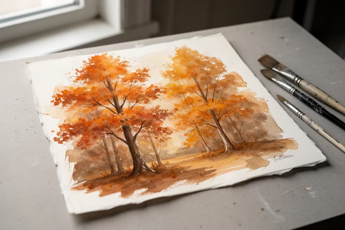
That is the strongest argument for this particular grouping. Individually, each paint has its strengths, but together they function as a coherent warm palette that can carry an entire seasonal scene.
Overall Buying Advice
If you are choosing just one or two, Quinacridone Sienna is the safest all-rounder, with Cadmium Orange or Pyrrole Orange as the pick when you want maximum punch. The burnt orange and deep ochre round out the earthy end, and Perylene Orange gives the brightest option a run for its money.
Whichever you pick, the paper matters as much as the paint. Hot press rewards sharp edges and controlled washes, while cold press rough paper brings out texture and looser, spidering blooms in wet-on-wet work.
Conclusion
These six orange watercolors cover a genuinely useful span, from bold cadmium punch to quiet earthy ochre, and they behave predictably on quality cotton paper. Test them on both hot press and cold press sheets, and you will quickly learn which ones your own painting style needs.
Further reading
Related Reviews
Art Supplies
Art Pop Watercolor Pencils 48-Color Set: A Thoughtfully Designed Student-Grade Option
The Art Pop 48-color watercolor pencil set blends well, dissolves smoothly, and includes artist-friendly details like barrel-printed color names, all at an affordable price.
Art Supplies
Artics Acrylic Markers 3mm Review: Versatile Paint Markers With a Few Caveats
A 48-color set of water-based acrylic paint markers that blend while wet, dry permanent, and keep the price low, though safety transparency remains a question.
Art Supplies
Best Art Supplies Worth Your Money: Pencils, Pens, Paints, and Paper That Earned Their Spot
After years of daily use and testing, these are the pencils, pens, watercolors, gouache, brushes, sketchbooks, and erasers that stand above the rest.