Art Supplies
Ardex Soft Pastels 48 Set Review: A Buttery Palette With a Few Quirks
The Ardex 48 soft pastel set impresses with rich greens, easy blending and thoughtful packaging. We compare it with the Paul Rubens 36 set and flag what to know before buying.
Introduction
When a brand you already trust for pencils and markers launches its first soft pastel set, it is hard not to get excited. That was the feeling going into this hands-on look at the Ardex 48 set of soft pastels, tested alongside a quick comparison with the Paul Rubens Artist Soft Pastels 36 set, which comes from the same parent company.
The short version: this is a genuinely enjoyable set with a palette that leans beautifully into greens, grays and earth tones, and it blends effortlessly. There are a couple of quirks worth knowing about, and neither is a deal breaker.
What We Looked For
The testing focused on the things that matter day to day for pastel artists: how the palette is balanced, how the pastels feel on the paper, how well they blend and layer, and how they behave across different paper surfaces, from smooth gray pastel paper to sanded paper and pastel mat.
Inside the Box and the Palette
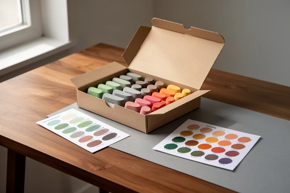
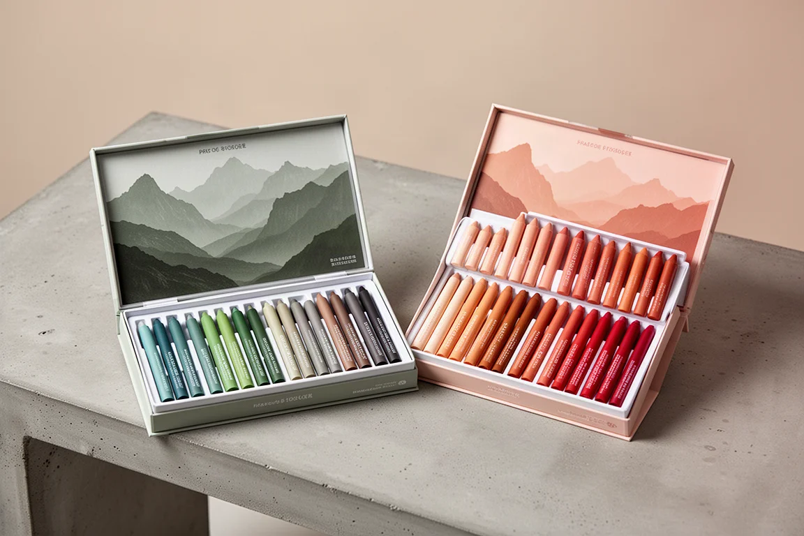
The box itself is sturdy and well made. On the back you get a reference color chart, which is only a rough guide since printed swatches rarely match how pigment sits on paper, but it is a welcome touch. Inside the lid there is a thin rubber foam insert to protect the pastels, plus a slip of glassine-style paper carrying a swatch chart with color names, reference numbers, the pigments behind each color, and a star-based lightfast rating system.
One thing to watch: each pastel is printed with the brand name and color reference in black ink, and on a few colors that ink can transfer onto the paper, especially on bright hues like the yellow. It rubs off easily on scrap paper before you start, so it is more of a heads-up than a flaw.
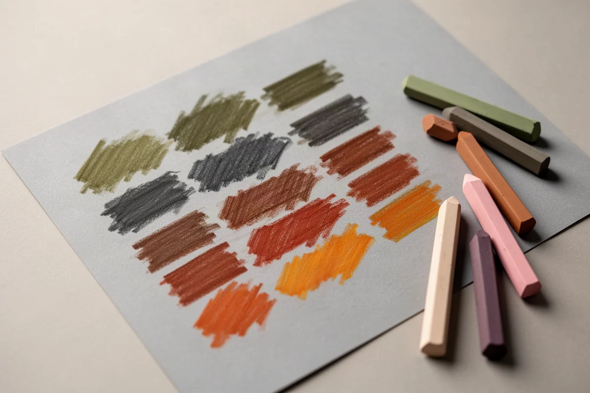
The palette is strong. The dark olive greens, army green and dark gray-green are standout colors, the light, mid and dark grays are useful, and the earth tones, from dark brown and rust to camo and brown, are lovely. The brighter tones are well represented too, with no single color family dominating. If there is one nitpick, it is that the blue and iron blue, and the violet and purple, are very similar, so two sticks could arguably have been swapped for something more distinct.
Blending, Layering and a Real Painting Test
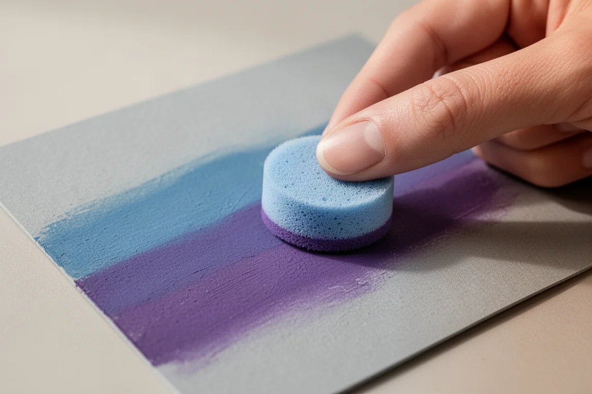
To put the set through its paces, a quick still life of lemons was painted on Clairefontaine Pastelmat in a dove gray tone, taking around 40 to 45 minutes. The background used iron blue layered with a purple to add depth rather than a flat single tone, then blended with a small sponge pad. The result was effortless: the colors moved together smoothly without heavy pressure.
The greens from the set were the whole reason for choosing lemons, and they shone on the leaves and even on the fruit itself. The finished piece speaks for the kind of result a relaxed session with these pastels can produce, even without much detail work. Pastel pencils from other brands were also layered on top for edge cleanup with no issues, which is good news for anyone who likes to combine stick and pencil work.
How Soft Is Soft?
Out of the 48 sticks, one or two are noticeably harder and scratchier than the rest. The yellow is the clearest example: it does not lay down as evenly, and you can hear the difference on the paper. Others, particularly in the green range, are genuinely buttery and give smooth, even coverage with minimal pressure.
This is not unique to this set. Even among the softest pastel brands available, the occasional stick comes out harder than its neighbors. It is simply something to be aware of rather than a reason to pass on the set.
Performance on Different Papers
Testing covered three surfaces: smooth gray pastel paper for swatching, Clairefontaine Pastelmat for the finished piece, and 400-grit sanded paper. On the sanded surface, the pastels layered beautifully, blended cleanly with either a sponge or a finger, and handled light over dark without any trouble, which is one of pastels’ genuine advantages over colored pencils.
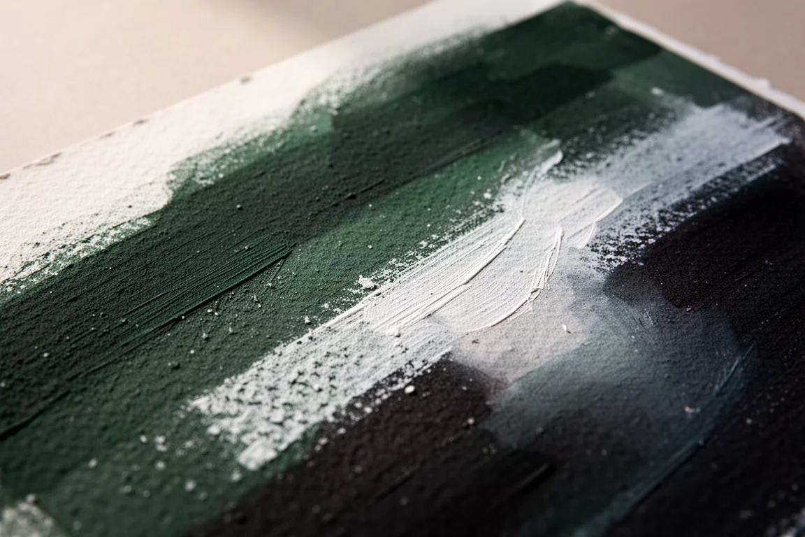
On Pastelmat, keep initial pressure light. The tooth fills quickly with such a soft medium, so restrained layers leave you more room to build. Anyone unsure which sanded grade suits them should consider a small trial pack with several grits before committing to full sheets.
Ardex vs Paul Rubens: Are They the Same Pastels?
Since both brands belong to the same company, it would be easy to assume the Ardex 48 set is simply a repackaged Paul Rubens set. It is not. The two feel different on the paper, and the palettes are noticeably different too. The Paul Rubens 36 set leans toward flesh tones, warm earth colors, reds and oranges, and its blues are quite different from the Ardex blues. Its greens, however, were less convincing in earlier testing.
The Ardex greens, by contrast, are arguably the highlight of the whole set: dark olives, an army tone and a deep gray-green that feel like a gift to landscape and botanical painters. Anyone who already owns the Paul Rubens set will not be buying a duplicate if they add the Ardex 48. At most, one or two colors might feel similar.
Buying Advice
If you have used the brand’s pencils or markers and enjoyed them, this pastel set is a natural next step, especially if you have been looking for an approachable way into soft pastels. It is not a super expensive set, yet the 48-color palette gives you enough range to tackle most genres, and the standout greens and earth tones reward landscape and botanical work in particular. Just remember to wipe any printed ink off a stick before using it on light colors, and keep initial pressure gentle on surfaces like Pastelmat.
Conclusion
The Ardex 48 soft pastel set delivers a thoughtful package, a well-balanced palette with genuinely gorgeous greens, easy blending and solid layering across paper types, with only minor caveats: a couple of harder sticks, some near-duplicate colors, and printed ink that can transfer if you forget to remove it. As an entry point into soft pastels, or as a landscape-focused addition to an existing collection, it is an easy set to recommend.
Product link
View more details for Ardex Soft Pastels 48 Set
This product is mentioned in the review. Check the specifications, options, and compatibility before buying.
View more details for Ardex Soft Pastels 48 SetFurther reading
Related Reviews
Art Supplies
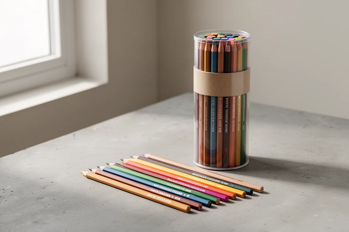
Art Pop Watercolor Pencils 48-Color Set: A Thoughtfully Designed Student-Grade Option
The Art Pop 48-color watercolor pencil set blends well, dissolves smoothly, and includes artist-friendly details like barrel-printed color names, all at an affordable price.
Art Supplies
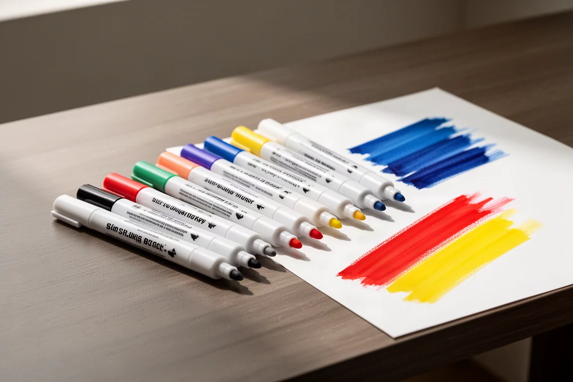
Artics Acrylic Markers 3mm Review: Versatile Paint Markers With a Few Caveats
A 48-color set of water-based acrylic paint markers that blend while wet, dry permanent, and keep the price low, though safety transparency remains a question.
Art Supplies
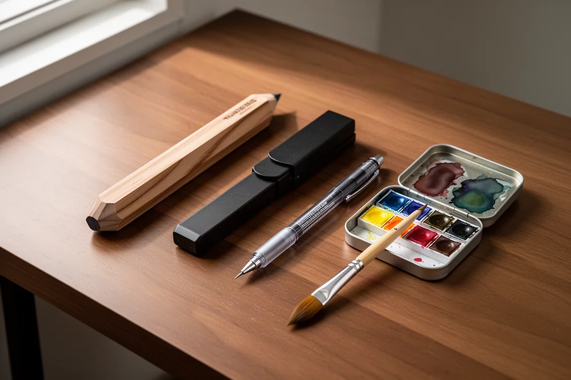
Best Art Supplies Worth Your Money: Pencils, Pens, Paints, and Paper That Earned Their Spot
After years of daily use and testing, these are the pencils, pens, watercolors, gouache, brushes, sketchbooks, and erasers that stand above the rest.