Fountain Pens
April Currently Inked: Four Fountain Pen and Ink Pairings Worth Trying
Four pen-and-ink combinations from a month of daily writing, including a wet wood-bodied flagship, a reliable piston filler, and an ink that changes character with the paper.
Introduction
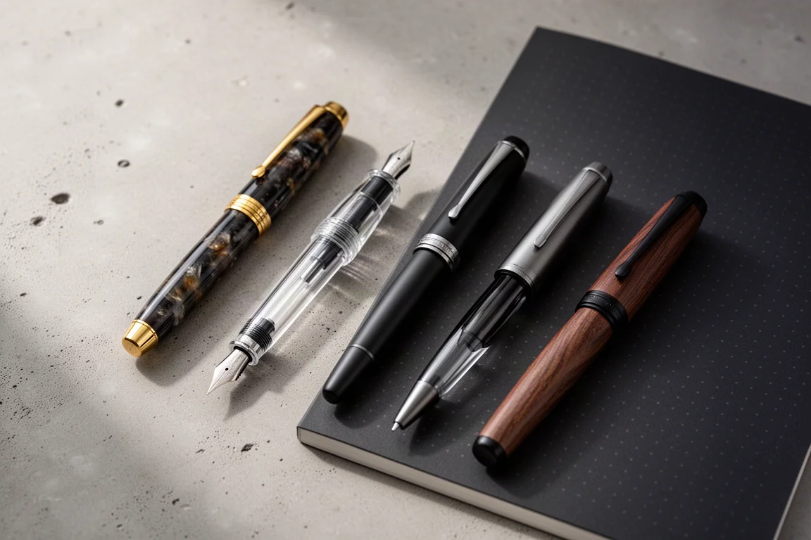
A new month means a fresh lineup of pens inked and ready to go. This round covers four pairings that each earned a spot through daily note-taking, letter writing, and a fair amount of swabbing on paper. Some are trusted carryovers, one is a brand-new acquisition that instantly became the standout of the month, and one combination is still being tested with mixed feelings.
Everything was written out on A5 dot-grid paper to keep the comparisons fair, and each pairing was judged on how the pen writes, how the ink behaves on the page, and whether the two bring out the best in each other.
What Makes a Good Pen and Ink Pairing
The best combinations are not always the flashiest ones. A dry-leaning ink can transform in a wet writer, and a light ink can go from charming to unreadable depending on nib width and paper. Nib material, wetness, and ink character all interact, which is exactly why pairing matters as much as the individual products.
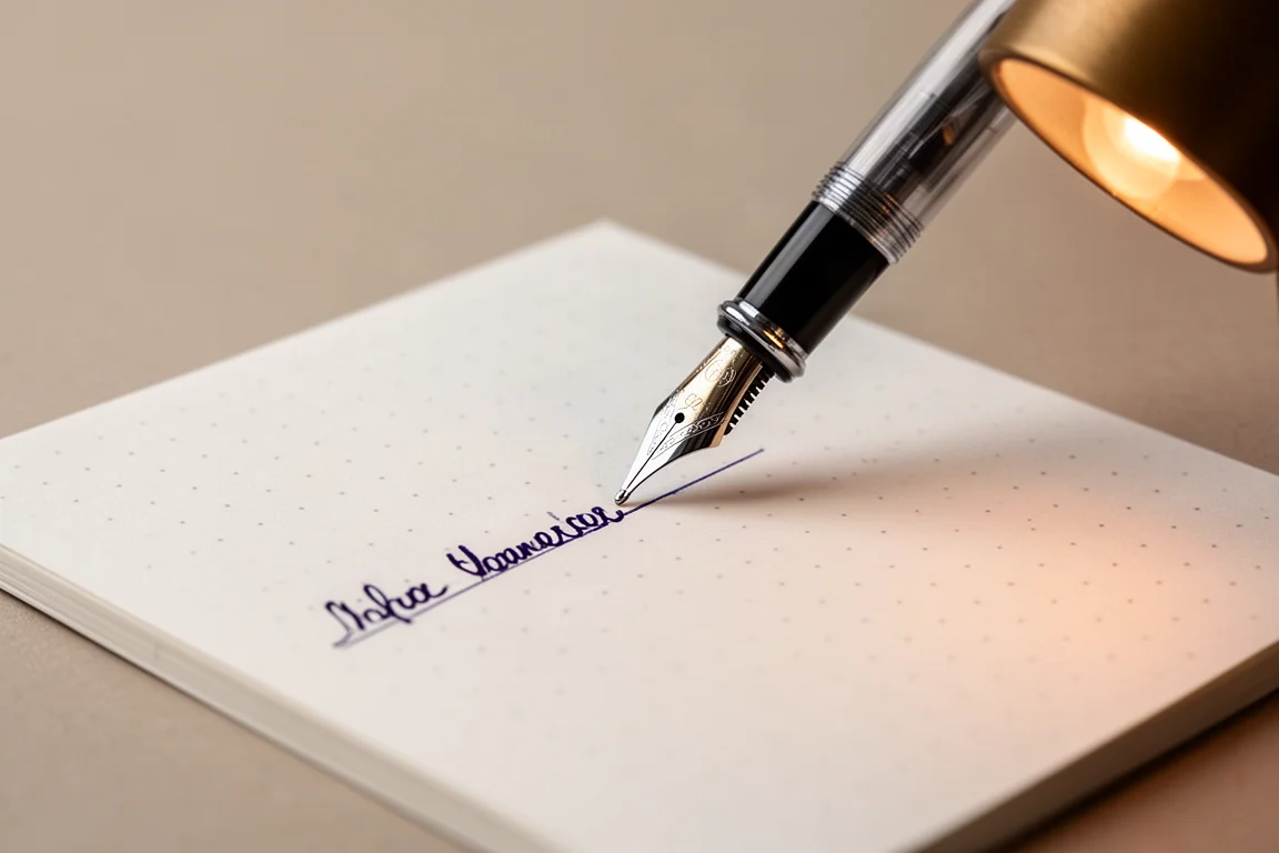
There is also the question of purpose. A dark, understated ink in a discreet pen works as a business tool; a vivid sheening blue makes notes memorable; a true yellow demands the right reader and the right paper. With those criteria in mind, here is what earned a place in the lineup this month.
Platinum 3776 with Pilot Iroshizuku Tsutsuji
First up is a carryover from last month: the Platinum 3776. This was a first-ever Platinum, inked last month as part of a lineup of pens where duplicates of the same model were compared, and with a little ink left in the converter it rolled right into this month. It has served as a fairly trusty note-taking pen throughout.
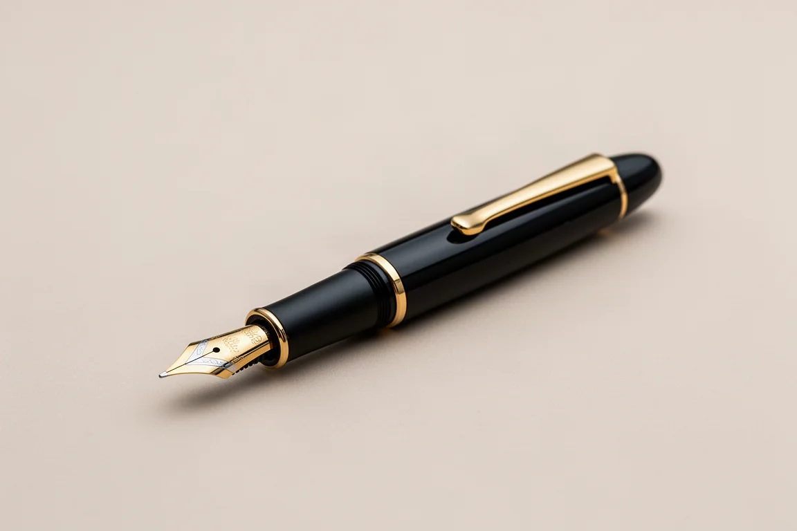
Platinum pens are some of the best writers around. The 14-karat gold fine nib is beautiful on the page and matches what many writers look for in a daily pen. If there is one caveat, it is that the build quality could be a touch better for the tier, but the nib experience more than compensates.
The ink is Pilot Iroshizuku Tsutsuji, a discontinued ink that can still be found in bottles, though often at steep prices. A sample is the sensible route, and there is about a milliliter and a third left of one before it is gone for good. Honestly, that is fine. It is a good ink and enjoyable to use, but with so many excellent browns available, it is not a grail-level hunt.
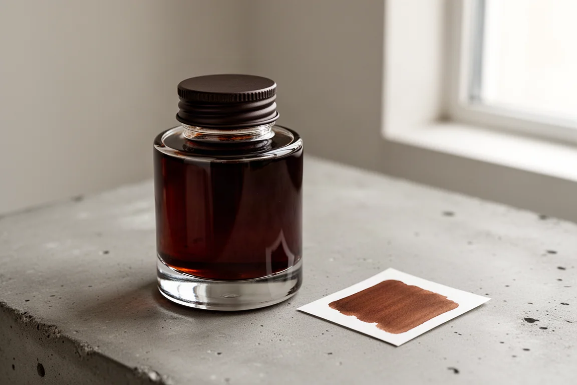
The interesting part is how paper-dependent this ink is. On this dot-grid paper it reads as a chestnut brown, but on other papers a strong red component comes out, and a slight greenish sheen can occasionally appear. That shifting personality keeps it interesting even if it never quite becomes essential.
TWSBI Eco with Diamine Majestic Blue
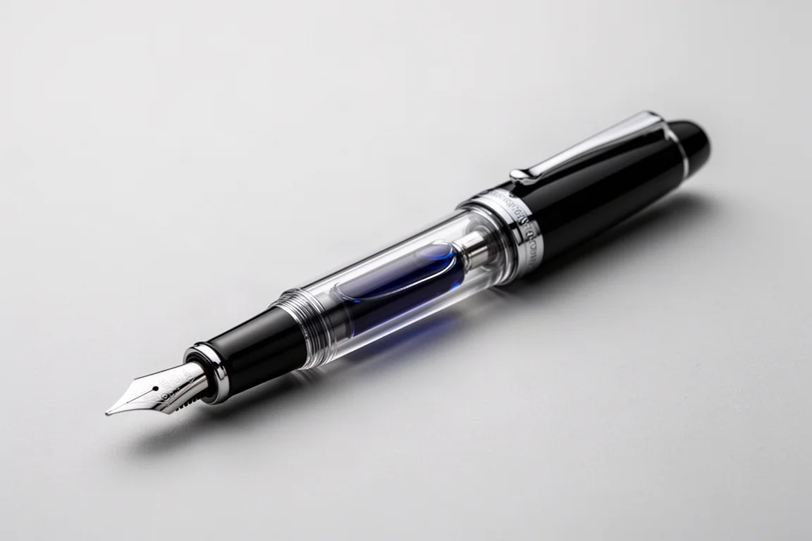
Next is the trusty TWSBI Eco, a first-ever TWSBI fitted with a stub nib. It works well, looks good on the page, and the large piston capacity makes it a workhorse for everyday writing sessions.
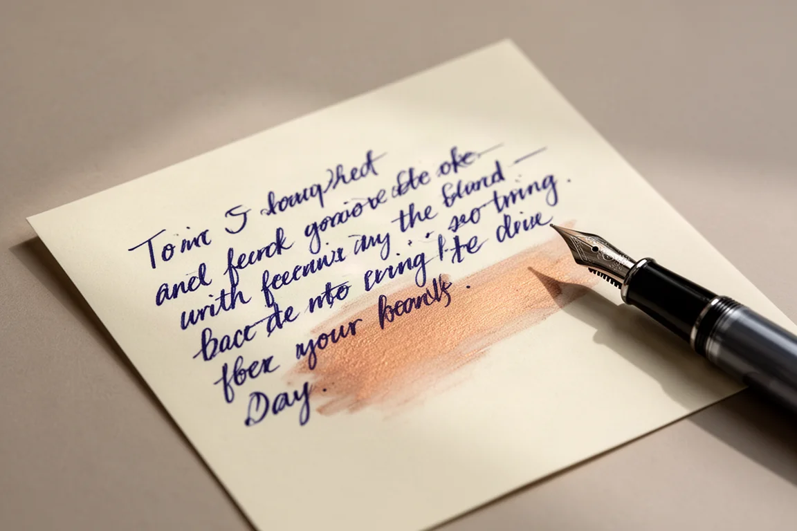
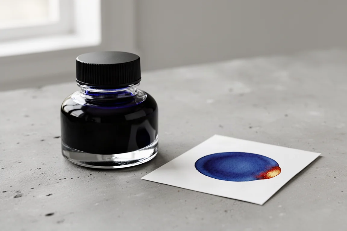
The ink here is Diamine Majestic Blue, and it might be a little underrated these days. Years ago it was basically the sheening ink, but as ultra-sheeners and more extreme inks arrived, Majestic Blue quietly took a backseat. That is a shame, because the coppery or bronzy sheen shows up clearly here, both in swabs and in actual writing.
This pairing has real social proof too: notes written with it have prompted recipients to ask what ink was used. It is super wet, reliably beautiful, and a genuinely great combination that has been a joy to use all month.
How the Ink Colors Behave on Different Papers
One theme that ran through the whole month is how much paper changes ink. The Tsutsuji swings between chestnut brown and red. Sheen appears on some pages and disappears on others. Even a pale yellow can look readable in a photo yet taxing on the eyes in person.
It is worth swatching any ink on two or three different papers before committing a full fill. The same ink can genuinely feel like two different products, and that flexibility can either be a bonus or a dealbreaker depending on what you need from your writing.
Lamy 2000 with Colorverse Golden Leaves
The Lamy 2000 is inked this month but has not seen a lot of writing yet, mostly because the ink inside is the one that is hardest to evaluate. The pen itself is easy to love, with a 14-karat gold medium nib that lays down a big, juicy line, exactly the kind of writer that gives a light ink its best possible shot.
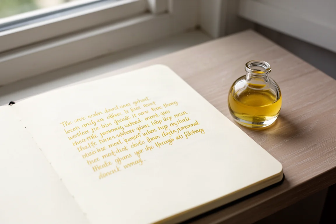
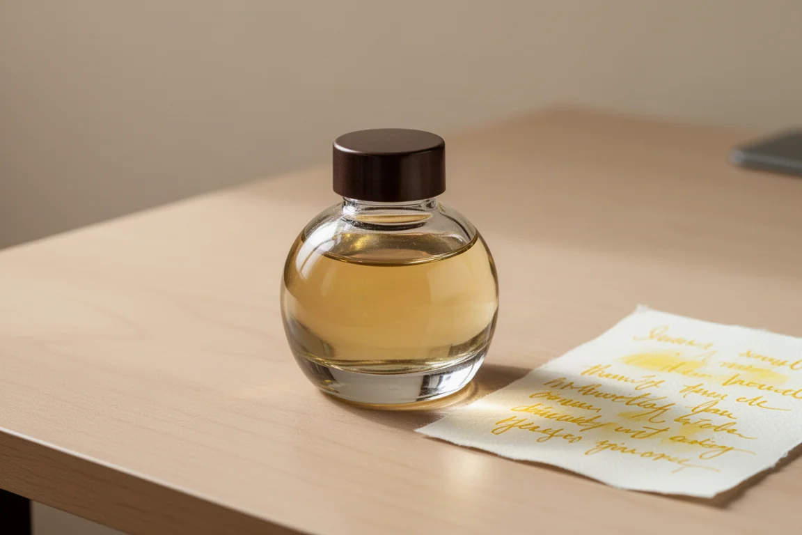
The ink is Colorverse Golden Leaves, the small 50 ml companion bottle to the Ginko tree ink, which is a lovely orangey, shading light brown. Golden Leaves itself would honestly be better described as yellow leaves than gold. It has nice shading and looks pleasant, but it is a true true yellow, which can be hit or miss.
Many yellow inks lean orange and shade that way, which helps them stay readable. Golden Leaves does not, so a sentence or two is fine, but a whole page becomes overwhelming and taxing to read. The verdict is still open, and it may depend heavily on the paper and how it dries. As a letter-writing ink, it would be hard to recommend for fear the recipient simply cannot read it.
Graf von Faber-Castell Classic Makassar with Rohrer & Klingner Sepia
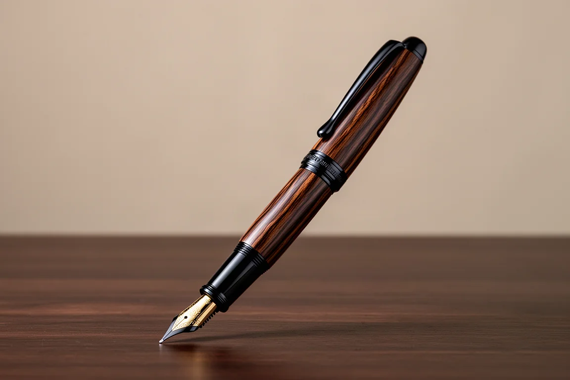
The superstar of the month is a new-to-me Graf von Faber-Castell Classic in Makassar. Dark Makassar wood with blacked-out ruthenium-plated trim gives it the character of an old ship, and the 18-karat gold fine nib is also black ruthenium-plated to match. It was found second-hand at an unbeatable price, and there are no regrets at all.
This is not the first Classic in the collection, but where the other is an extra fine in ebony, this one is a fine, and it writes super wet. That matters because the ink it is paired with, Rohrer & Klingner Sepia, leans toward the drier end, at best a medium wetness. In a gusher of a pen, that dryness works out perfectly.
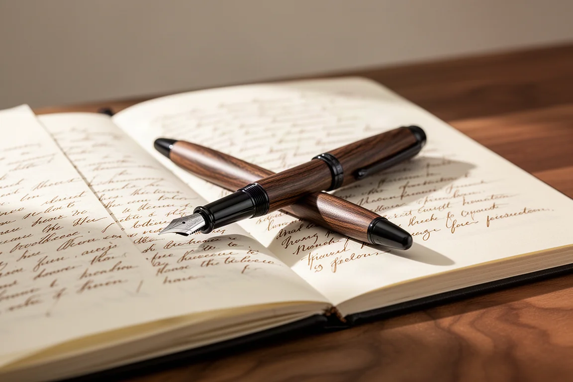
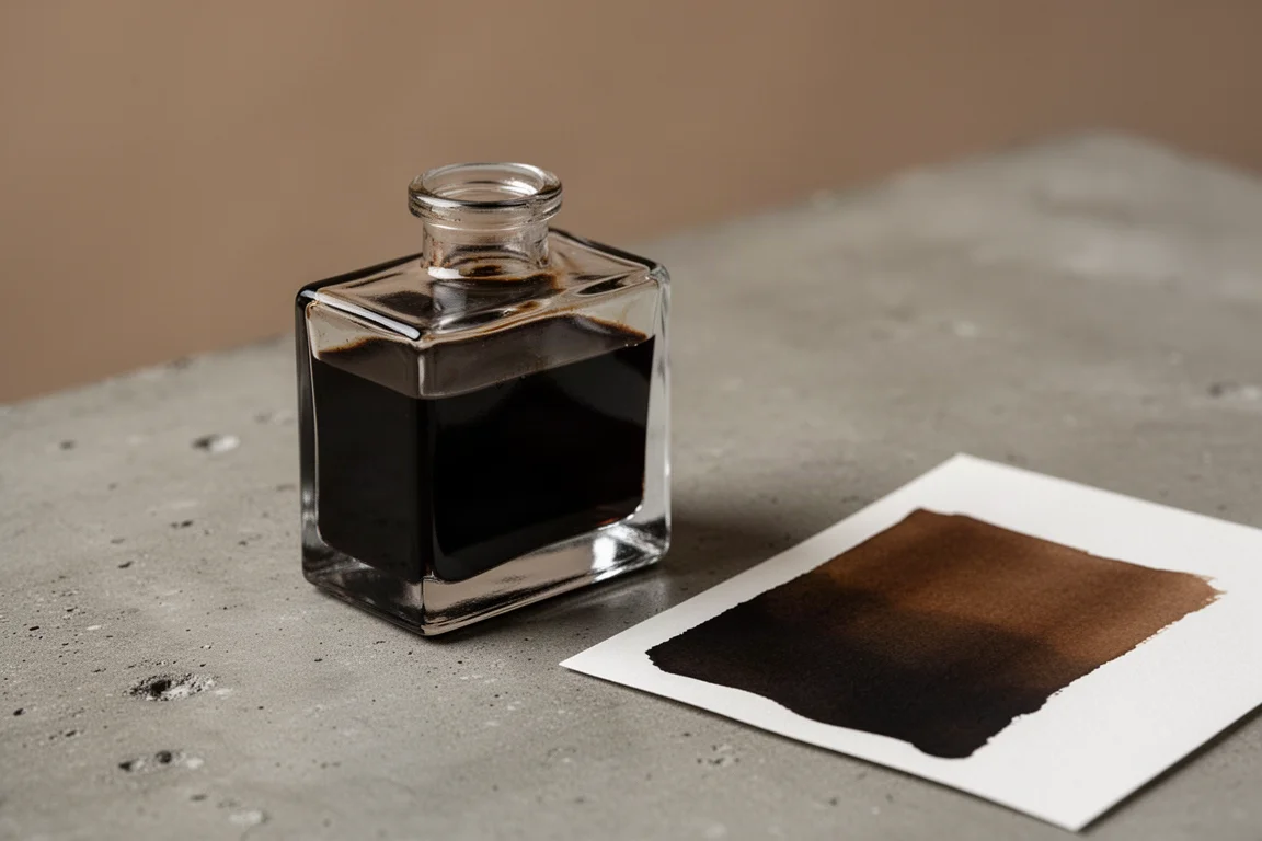
Rohrer & Klingner Sepia is a real true sepia in my view, a black-leaning brown or brown-leaning black. It is available as an affordable sample, and a couple of milliliters remain from one. On a swab it goes down lighter and more brown, but written through the super wet nib it lands darker, closer to black or dark grey. The dark wood and dark trim theme matches the ink beautifully, and the pairing works for anything from incognito business use to journaling and letter writing.
Buying Advice
If you want a nib-first purchase, the Platinum 3776 is one of the finest writers available at its tier, with the caveat of slightly modest build quality. If capacity and value matter most, the TWSBI Eco is the obvious pick, especially with a stub nib and a sheening classic like Majestic Blue loaded inside.
The Lamy 2000 remains a benchmark wet writer, but pair it with an ink that has enough depth to stay readable; save true yellow inks for swatches and short notes. And if a special occasion pen is on the list, the Graf von Faber-Castell Classic Makassar pairs beautifully with drier inks like Rohrer & Klingner Sepia, so a second-hand find is worth watching for.
Conclusion
Four pairings, four very different lessons. The Platinum 3776 with Tsutsuji shows how paper changes everything. The TWSBI Eco with Majestic Blue proves a classic sheener still holds up. The Lamy 2000 with Golden Leaves is a reminder that beautiful color and usable color are not always the same thing. And the Graf von Faber-Castell Makassar with Sepia is the combination of the month: wet writing, dark wood, and a true sepia that suits it perfectly.
Further reading
Related Reviews
Fountain Pens
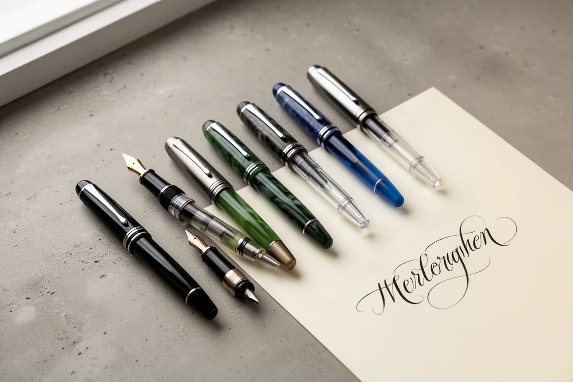
Best Budget Fountain Pens Tested: 9 Pens, One Clear Winner
A hands-on comparison of nine affordable fountain pens for everyday writing, calligraphy, and sketching, with a clear standout for flexible nib fans.
Fountain Pens
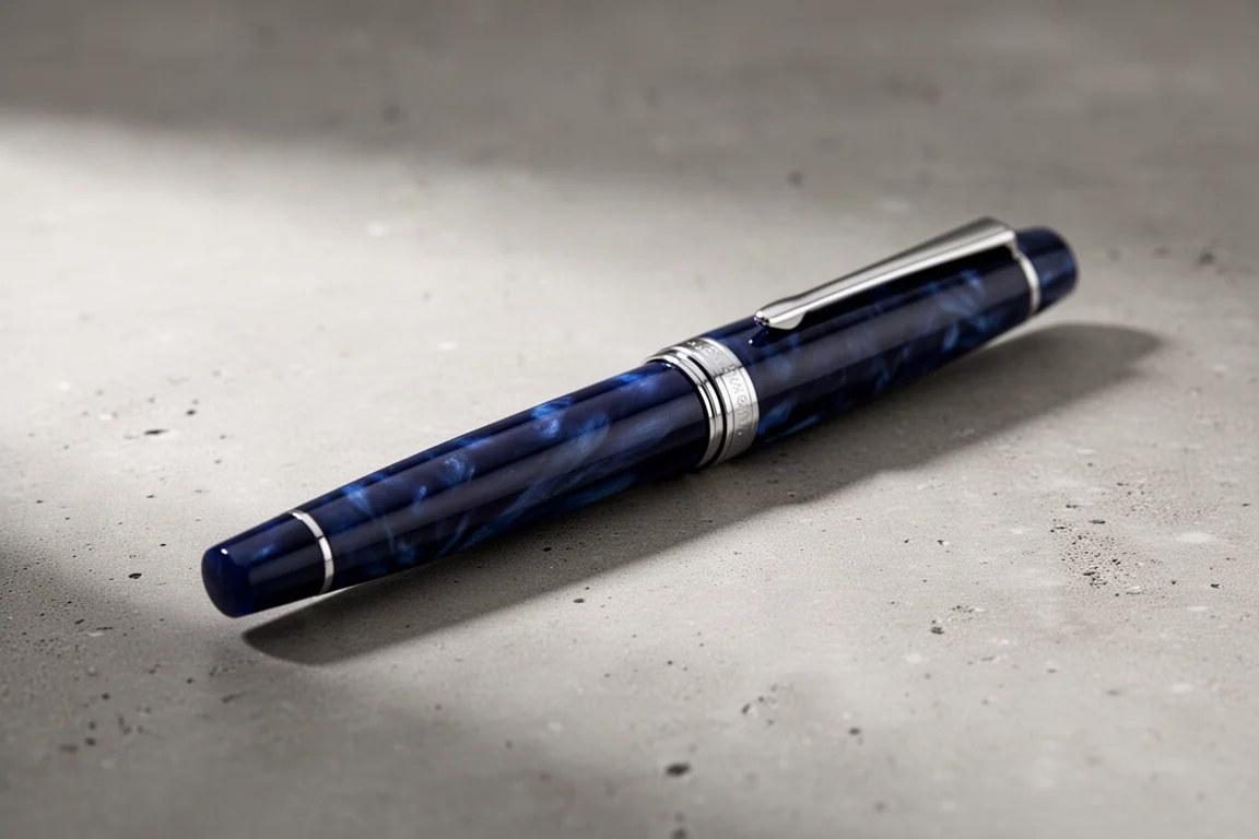
Aurora Optima Review: An Italian Piston Filler That Punches Above Its Price
A 14k gold nib, ebonite feed, and a beautifully deep oraloid body make the Aurora Optima one of the most rewarding piston fillers around.
Fountain Pens
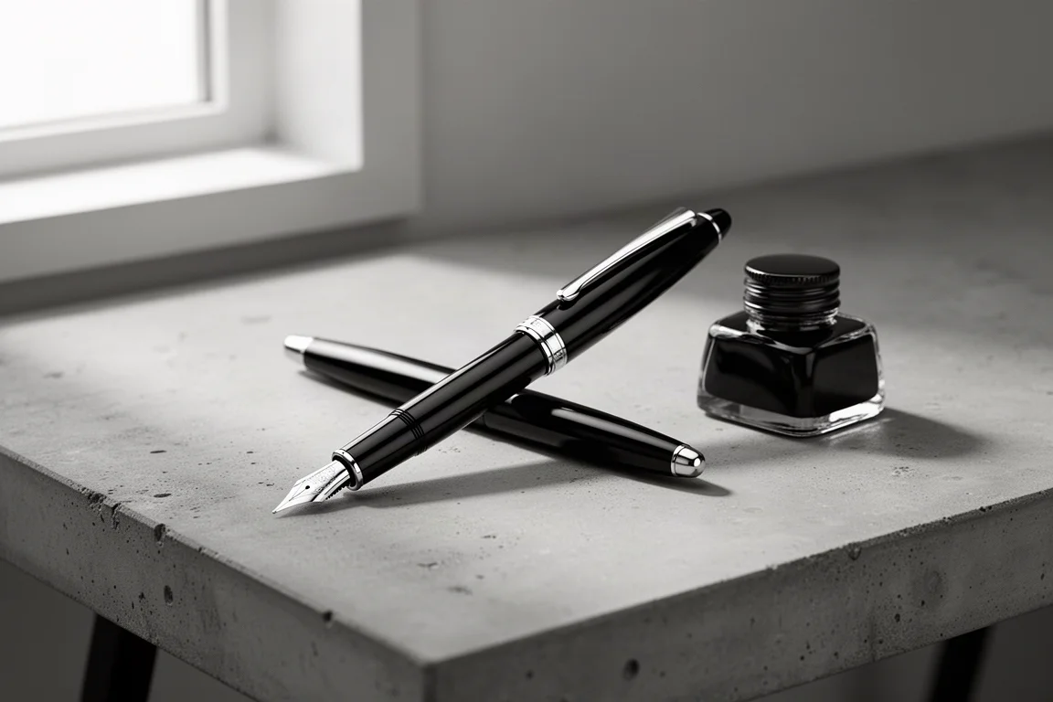
Cross Bailey Light Review: The Entry-Level Fountain Pen Worth Keeping at the Office
A plastic-bodied Cross with a metal clip, snap cap, and famously smooth extra fine steel nib. Around $15, available almost everywhere, and easy to recommend.