Fountain Pen Ink
Ferris Wheel Press Frontenac Blue: An Icy Teal Tribute to Old Quebec
A shimmering fountain pen ink inspired by the Chateau Frontenac, with beautiful presentation and a few bottle quirks worth knowing before you buy.
Introduction
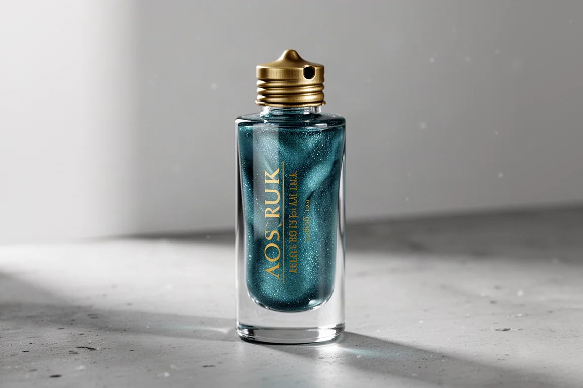
When a fountain pen ink brand names a colour after a place you love, it is hard not to pay attention. Frontenac Blue from Ferris Wheel Press is inspired by the Chateau Frontenac in Old Quebec, and it arrives with the kind of presentation the brand is known for: a gorgeous box, a glistening genie-like bottle, and an icy teal-blue ink with blue shimmer. But alongside the charm, there are some real design quirks with the bottle that buyers should know about.
The Inspiration: A Castle on the St Lawrence
The Chateau Frontenac sits high on Cape Diamond at the eastern side of the Upper City of Old Quebec, overlooking the frozen banks of the St Lawrence River. It is part fortress and part fairy-tale castle, with an imposing central tower inspired by 14th-century architecture, steep copper roofs, circular turrets, and a delightful asymmetry that makes it feel wonderfully unique.

The hotel rises 18 stories and up to 80 metres, with 610 rooms. Designed by New York architect Bruce Price, it opened in 1893 as a hub for Canadian Pacific Railway passengers and is now operated by Fairmont. It is thought to be one of the most photographed hotels in the world and is on Canada’s list of national historic sites.
The Bottle: Beautiful but Tricky
Ferris Wheel Press boxes have lovely graphics, but they are not always easy to open. To preserve the box, slip a flat object such as a slim pocket knife under the flap and give it a gentle twist to lift it cleanly without tearing.
The bottle itself is the brand’s signature tall, high-glass vessel with gold lettering and a nut-shaped brass-toned cap. It looks magical, but it is also an elongated bottle on a narrow flat base topped with a heavy piece of metal, which makes it wobbly and top-heavy. Be very careful, especially when removing the cap.
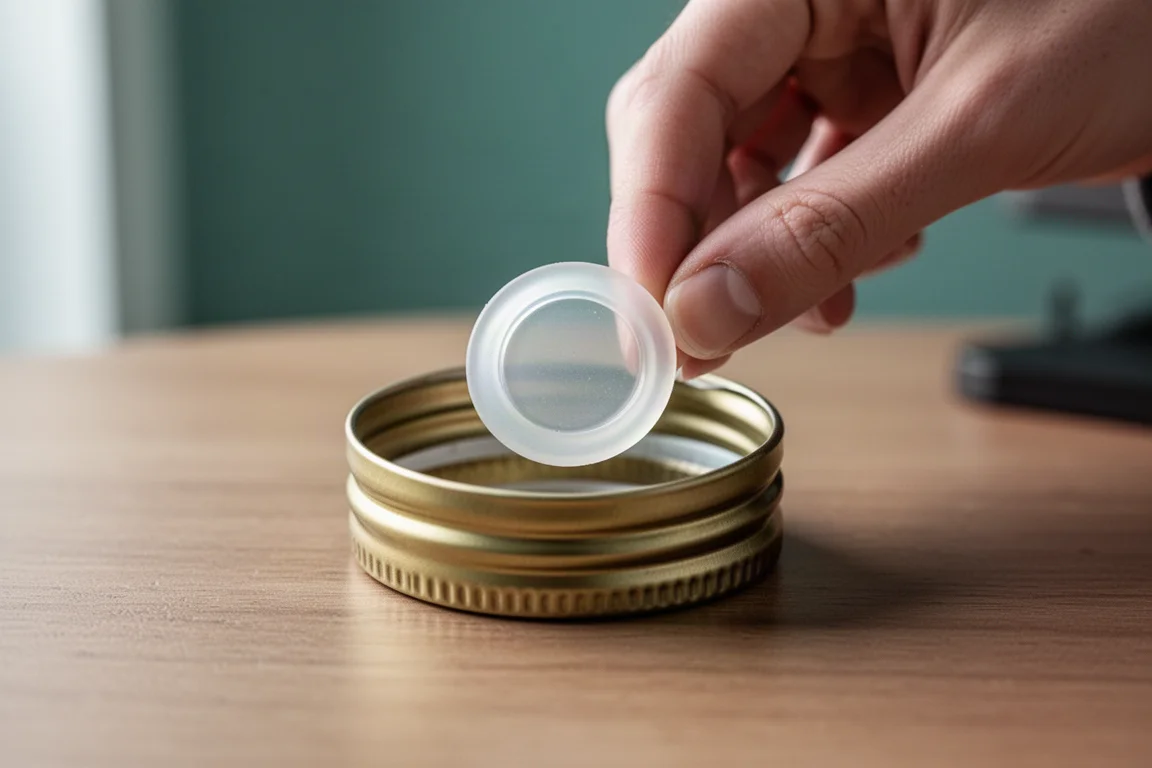
There is one detail that is easy to miss: a small silicone seal stuck on top of the bottle. Do not throw it away. Place it firmly inside the cap to prevent leaking. No instructions on the box or bottle mention this, and it matters even more with a shimmer ink, since you will shake the bottle often to distribute the shimmer evenly. The throat of the bottle is also very narrow, so getting a thicker pen in there requires caution.
The Ink: An Icy Teal with Frost-Like Shimmer
Ferris Wheel Press describes Frontenac Blue as an icy teal blue with blue shimmer. It is a very cool teal, like the cast of twilight as the sky cools, with shimmer that recalls frost catching the sun. It also ties naturally to the St Lawrence River and the icy tone of the frozen city in winter.
Some may question whether teal is the most obvious choice for the chateau itself; a deeper blue might feel more literal. But the cool tones do evoke the quality of light in Old Quebec, the way shadows stretch across the snow, and the frost that shimmers on the ground and river.
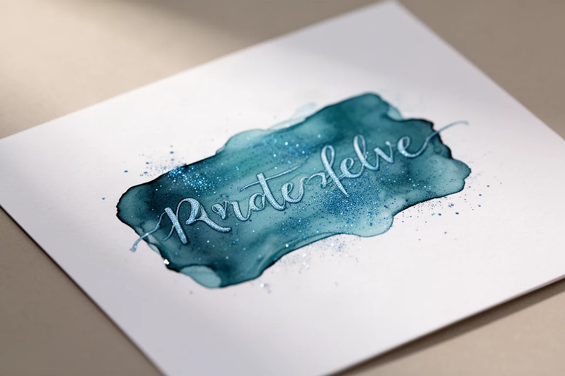
A common criticism of Ferris Wheel Press inks is that they are so light and pretty that they feel more suited to art than serious writing. Frontenac Blue fortunately has darker tones with good contrast, which makes it genuinely usable as a writing ink rather than just a pretty colour to look at.
Should You Buy It?
If you have a connection to Old Quebec, or you simply love cool teal-blue shimmer inks that still work for everyday writing, Frontenac Blue is easy to recommend. The associations make it feel special every time you uncap your pen. Just handle the bottle with care: keep the silicone seal inside the cap, shake gently to wake up the shimmer, and mind that narrow throat and top-heavy base.

Conclusion
Frontenac Blue is a lovely, usable shimmer ink with a romantic backstory and presentation to match. The bottle design demands some patience and care, but the colour itself earns its place on the desk, especially for anyone who has wandered the snowy streets of Old Quebec and dreamed of the chateau on the hill.
Product link
View more details for Ferris Wheel Press Frontenac Blue
This product is mentioned in the review. Check the specifications, options, and compatibility before buying.
View more details for Ferris Wheel Press Frontenac BlueFurther reading
Related Reviews
Fountain Pen Ink
Platinum Chou Kuro Review: A Premium Black Ink That Lives Up to the Hype
Platinum's premium carbon-black ink promises the blackest black. We tested it against Sailor Black and Pelikan 4001 Brilliant Black to see if it justifies the price.
Fountain Pen Ink
Faber-Castell India Red Review: A Straight-Down-the-Middle Red Ink
A true, balanced red fountain pen ink in a generous 75ml bottle, with an easy-on-the-eyes saturation level and reliable everyday flow.
Fountain Pen Ink
Papier Plume The Count Ink Set: A Halloween Limited Edition Worth Sealing
A dusty purple limited-edition fountain pen ink from New Orleans-based Papier Plume, packaged in a coffin box with wax, a custom seal, and silver wax cream.