Fountain Pen Ink
Diamine Neptune Blue: A Deep Blue-Black Worth a Second Look
A rich, true blue-black fountain pen ink with a subtle red sheen, tested across fine, medium, broad, and italic nibs.
Introduction
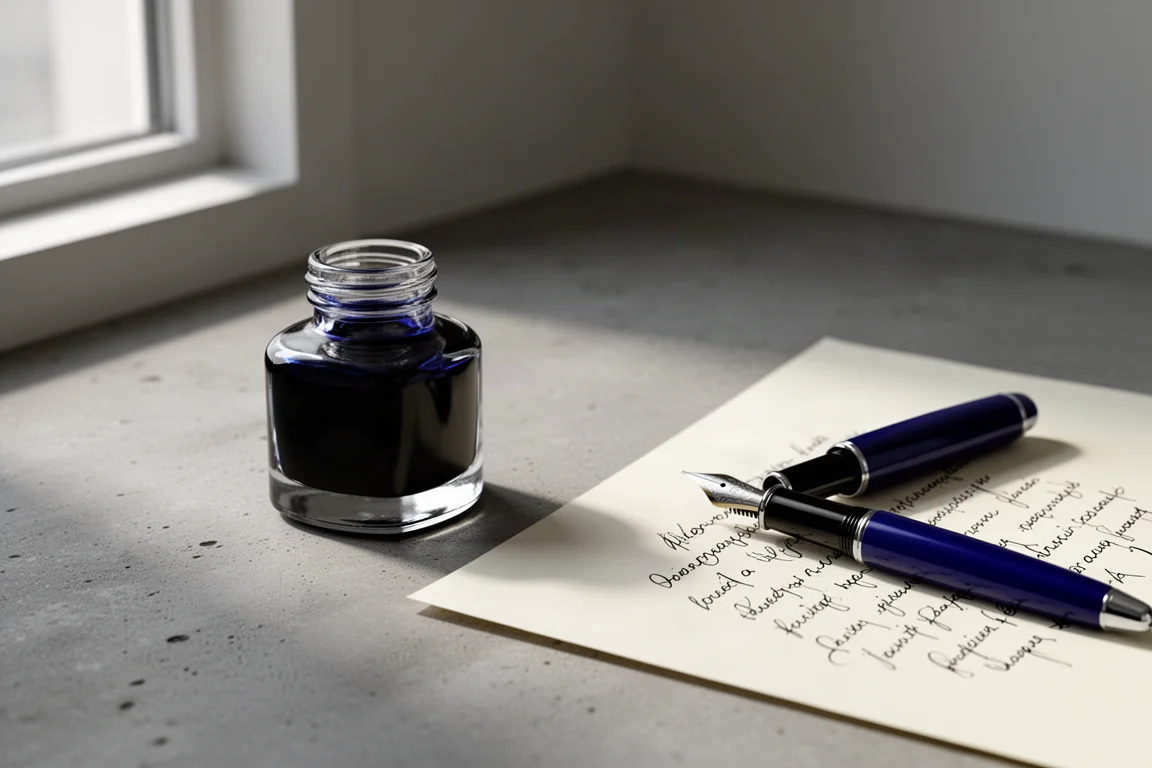
Every so often an ink comes along that makes the cleaning, photographing, and testing worth the effort. Diamine Neptune Blue is one of those. It came into circulation almost by accident, tucked in alongside some pens sent over by Pen Venture, and it turned out to answer a search that had been running for a while: finding a genuinely good blue-black.
When asking around for blue-black recommendations, nobody mentioned this one. That is a shame, because after inking up four pens with it, the verdict is clear: this is a beautiful, well-balanced blue-black that deserves a spot on more shortlists.
About Diamine
Diamine is based in the north of England and has been a reliable name in fountain pen ink for a long time. One of the strongest reasons to keep coming back to the brand is consistency: no Diamine ink has ever caused trouble in a pen. Some inks are more saturated and therefore a little harder to clean out, but that applies to any brand. As an ink maker, Diamine remains one of the few brands worth returning to again and again.
How It Writes Across Different Nibs
To get a real feel for the ink, it was tested in four pens with very different nibs, from fine to italic.
A fine nib in a Gravitas Ultimis showed a beautiful blue-black line. Fine nibs are not the best at showing off an ink’s character, but even at this width the color reads as a deep, confident blue-black. Up close, the ink also reveals a red sheen, which adds a layer of interest to the writing.

A Scriveiner pen with a medium nib delivered a pleasant, smooth writing experience. The pen itself is slimmer in the hand but genuinely nice to use, and the ink flowed cleanly and consistently.
In a broad 14k nib on an SBRE Brown 2.0 pen in Canadian Winter acrylic made by Jonathan Brooks, the ink’s intense darkness really shows. In the widest nibs you can truly appreciate how well mixed this color is. It is a true blue-black, deep and dramatic without muddiness.
Sheen and Saturation
One of the most pleasant surprises here is the red sheen. It is subtle enough not to dominate, but visible in the right light and in wetter, broader nibs. It gives an otherwise classic blue-black a bit of personality.
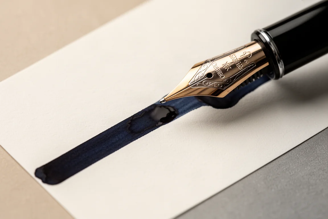
The saturation level is high in the best way. Broad and italic nibs show just how deep and dark this ink goes, and the overall impression is of a very carefully balanced color. In an italic nib on a Visconti Homo Sapiens with a wet, ruthenium-covered nib, the ink looked almost iron-gall-like in its character, with the darkness coming through as stellar.
Water Resistance
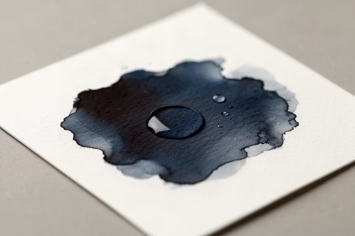
Curiosity got the better of things here, so a wet patch test was done to see how the ink handles water. After the swatch dried fully, water was applied and left to dry.
The short answer: it would not be called tremendously waterproof. Some of the ink does move when wet. However, the result looked reasonably good after the water dried, and a fully dried sample was set aside to document how it holds up completely. If document longevity matters to you, treat this as a fountain-pen-grade ink rather than a waterproof one.
Things to Consider Before Buying
- This is a blue-black first and foremost. If you are after a bright or mid-tone blue, this is not that ink.
- The red sheen is a bonus, but it shows up best in wetter and broader nibs. Fine nib users will mostly see the clean blue-black.
- Water resistance is limited, so signed documents or notes that might get wet deserve a different ink.
- Being a saturated ink, expect a slightly longer clean-up than with lighter inks.
Buying Advice
If you have been hunting for a blue-black and have not landed on one yet, Neptune Blue is a genuinely strong candidate. It is deliciously deep, behaves well in a range of pens and nibs, and the red sheen adds character that most blue-blacks lack. It also comes from a brand with a track record of trouble-free performance in pens, which removes a lot of the usual risk from trying a new ink.
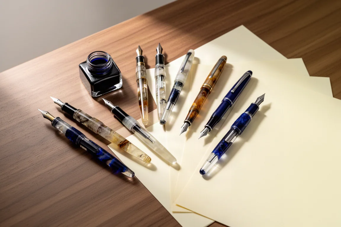
Pair it with a medium or broad nib to get the most out of the darkness and sheen. Fine nib users will still enjoy the color, just with less drama.
Conclusion
Diamine Neptune Blue is a very interesting ink and a genuine pleasure to use: a deep, true blue-black that is beautifully mixed, with a subtle red sheen and reliable behavior across nib sizes. It may not be the first name that comes up in blue-black recommendations, but after extended use across four pens, it absolutely should be on that list.
Product link
View more details for Diamine Neptune Blue
This product is mentioned in the review. Check the specifications, options, and compatibility before buying.
View more details for Diamine Neptune BlueFurther reading
Related Reviews
Fountain Pen Ink
Platinum Chou Kuro Review: A Premium Black Ink That Lives Up to the Hype
Platinum's premium carbon-black ink promises the blackest black. We tested it against Sailor Black and Pelikan 4001 Brilliant Black to see if it justifies the price.
Fountain Pen Ink
Faber-Castell India Red Review: A Straight-Down-the-Middle Red Ink
A true, balanced red fountain pen ink in a generous 75ml bottle, with an easy-on-the-eyes saturation level and reliable everyday flow.
Fountain Pen Ink
Papier Plume The Count Ink Set: A Halloween Limited Edition Worth Sealing
A dusty purple limited-edition fountain pen ink from New Orleans-based Papier Plume, packaged in a coffin box with wax, a custom seal, and silver wax cream.